Posts written by Thomas Lumley (2645)

avatar

Thomas Lumley (@tslumley) is Professor of Biostatistics at the University of Auckland. His research interests include semiparametric models, survey sampling, statistical computing, foundations of statistics, and whatever methodological problems his medical collaborators come up with. He also blogs at Biased and Inefficient

January 2, 2014

Toll, poll, and tolerance.

The Herald has a story that  has something for everyone.  On the front page of the website it’s labelled “Support for lower speed limit“, but when you click through it’s actually about the tighter tolerance (4km/h, rather than 10km/h) for infringement notices being used on the existing speed limits.

The story is about a real poll, which found about 2/3 support for the summer trial of tighter speed limits. Unfortunately, the poll seems to have had really badly designed questions. Either that, or the reporting is jumping to unsupportable conclusions:

The poll showed that two-thirds of respondents felt that the policy was fair because it was about safety. Just 29 per cent said that it was unfair and was about raising revenue.

That is, apparently the alternatives given for respondents combined both whether they approved of the policy and what they thought the reason was.  That’s a bad idea for two reasons. Firstly, it confuses the respondents, when it’s hard enough getting good information to begin with. Secondly, it pushes them towards an answer.   The story is decorated with a bogus clicky poll, which has a better set of questions, but, of course, largely meaningless results.

The story also quotes the Police Minister attributing a 25% lower death toll during  the Queen’s Birthday weekends to the tighter tolerance

“That means there is an average of 30 people alive today who can celebrate Christmas who might not otherwise have been,” Mrs Tolley said.

We’ve looked at this claim before. It doesn’t hold up. Firstly, there has been a consistently lower road toll, not just at holiday weekends.  And secondly, the Ministry of Transport says that driving too fast for the conditions is a only even one of the contributing factors in 29% of fatal crashes, so getting a 25% reduction in deaths just from tightening the tolerance seems beyond belief.  To be fair, the Minister only said the policy “contributed” to the reduction, so even one death prevented would technically count, but that’s not the impression being given.

What’s a bit depressing is that none of the media discussion I’ve seen of the summer campaign has asked what tolerance is actually needed, based on accuracy of speedometers and police speed measurements. And while stories mention that the summer campaign is a trial run to be continued if it is successful, no-one seems to have asked what the evaluation criteria will be and whether they make sense.

(suggested by Nick Iversen)
January 1, 2014

Pretty things

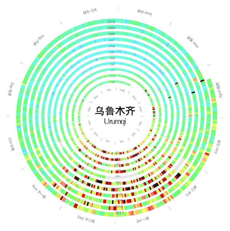
1. Xiaoji Chen (陈晓霁) has graphs of air pollution in some cities in China, spiralling to show the seasons

Urumqi


2. The Cooper-Hewitt collection at the Smithsonian lets you search by colour, with up to five representative colours for each piece

colorsearch


I found this from Chris McDowall’s page that summarises a set of photos by their dominant colours.

tomatocolourtomato


There’s a lot of information loss in reducing a photo to four or five pixels, but finding good ways to reduce information is exactly what statistics is about

I can haz public opinion?

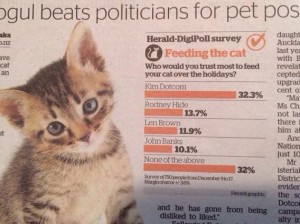
Usually it’s a problem for opinion polls that respondents tend to answer based on political or group affiliation rather than their actual opinion about the real issue.  Today’s Herald has a poll where that’s basically the point. This is a real poll, not one of those bogus clicky things, but the question was “Who would you trust most to feed you cat over the holidays?”

cat

Now, to start with, just over half of NZ households do not haz cat, so the question is pretty meaningless for them. Even for the 48% with feline overlords,  the answers supplied didn’t include anyone you might actually get to feed your cat over the holidays. (And isn’t the kitten in the photo a bit young to be left alone like that?)

The choices were one MP (out of 121), one big-city mayor (out of, say, four to six), one internet celebrity (out of an indeterminate set), and one former MP and climate-change denier. No women. No-one on the paper’s New Zealanders of the Year list. Unsurprisingly, one in three of the people they managed to get to answer the question looked at the options and said something along the lines of “Do not want”. 

It’s unusual for a statistician to say this, but sometimes getting a properly representative sample doesn’t really help all that much. The one person on the list who is actually known for his commitment to animal welfare came last.

(picture via @ChrisKeall)

December 31, 2013

Problems with genetic testing

Genetic testing has had a lot of overmarketing — even the most obvious poster-child application in clinical medicine, setting doses of warfarin, has been disappointing in clinical trials. Here are two recent pieces you might want to read

In a New York Times story, a journalist had her DNA tested by three companies.  The level of agreement was not, shall we say, ideal

After my tests had been sent, I braced myself for the revelations about my DNA. It took about two months to receive all the results, and when I did, the discrepancies were striking.

23andMe said my most elevated risks — about double the average for women of European ethnicity — were for psoriasis and rheumatoid arthritis, with my lifetime odds of getting the diseases at 20.2 percent and 8.2 percent. But according to Genetic Testing Laboratories, my lowest risks were for — you guessed it — psoriasis (2 percent) and rheumatoid arthritis (2.6 percent).

If you actually work with genome-wide disease data it’s not surprising that the predictions are neither accurate nor consistent, but that isn’t the impression the industry is promoting.

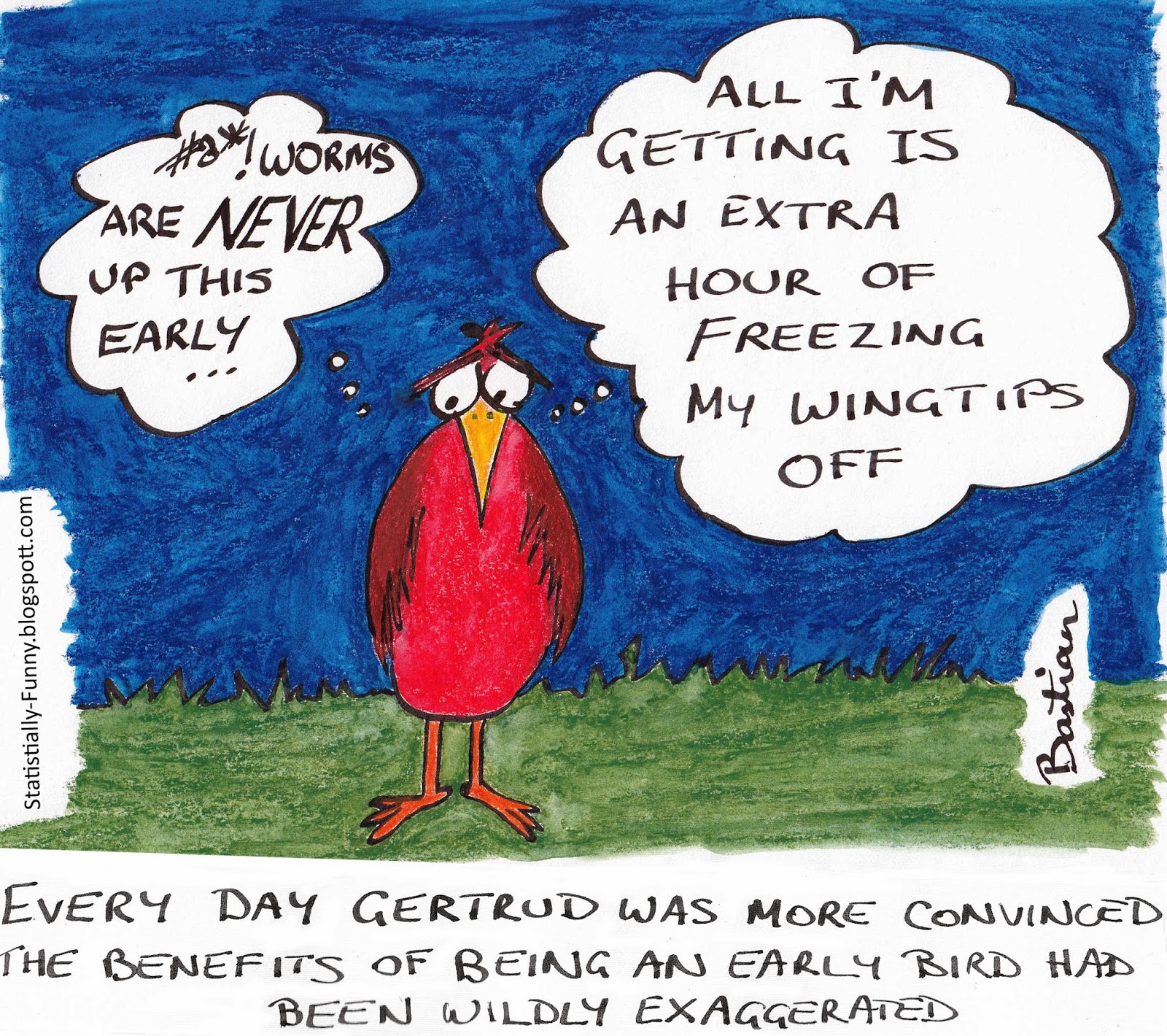
Hilda Bastian drew this cartoon at Statistically Funny

Early-bird

heading a general post about the problems with early-detection programs.

There’s a general bias in favour of screening and early detection, because it seems obviously good. And, in fact, there’s a standard mathematical result that the value of information can’t be negative. But the key assumptions in this result are that you know what information you’ve got and that you can just ignore the result if you want to. It doesn’t apply to real-life medical testing.

December 30, 2013

Diversification

There’s a story on NPR news about college advertising brochures.

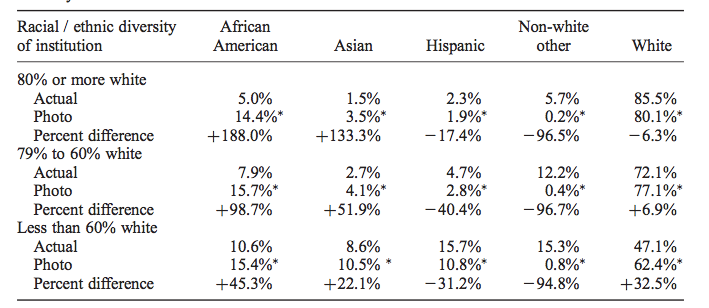
Pippert and his researchers looked at more than 10,000 images from college brochures, comparing the racial breakdown of students in the pictures to the colleges’ actual demographics. They found that, overall, the whiter the school, the more diversity depicted in the brochures, especially for certain groups.

When you look at the research paper it turns out that’s not quite right. The main data table (Table 3) is

diversity

What it shows is that the proportion of African-American students in photos in the brochure is actually pretty much constant, regardless of the proportion at the university. It’s the exaggeration that increases for whiter campuses.  It would have been nice to see this in a graph (and also perhaps see White+Asian pooled), but sociology doesn’t routinely do graphs (Kieran Healy has a paper trying to get them to)

Interestingly, the 15% or so proportion of African-American students in photos is above the proportion in the population as a whole (12.4%), but is very close to the proportion in the 16-19 age band, which includes the target audience for these brochures. That may well be just a coincidence, since there’s enough geographical variation that basically no-one is exposed to what the US population proportion looks like.

December 29, 2013

Auckland population density

This is a satellite photo of the 5th most densely populated census area unit (out of 411) in the Auckland supercity, based on 2013 census data.

burbank
(more…)

Brute force and ignorance

My grandfather, a high school maths teacher, characterised a mathematician as someone who would rather spend an hour working out the quick way to solve a problem than fifteen minutes doing it the slow way.

Computers are so fast nowadays that many traditional ‘recreational maths’ problems can be solved by some brute-force approach. Christian Robert translates an example from Le Monde,

A regular die takes the values 4, 8 and 2 on three adjacent faces. Summit values are defined by the product of the three connected faces, e.g., 64 for the above. What values do the three other faces take if the sum of the eight summit values is 1768? 

and provides R code that just tries lots of possibilities. On my laptop, the code runs in about a quarter of a second.

More practically, the same applies to a lot of calculations in statistics –for example, if you need to work out what sample size is needed for an experiment, it’s often easier to simulate the experiment at different sizes and see what happens than to work out the solution mathematically.

There’s a similar problem for quizzes that are often made trivial by Google. Often, but not always. The famous Christmas quiz from King William’s College, on the Isle of Man is made easier by search engines, but still takes effort. For example, the first question:

In the year 1913: what famous club was founded at Vrijstraat 20?

You won’t get the answer just by Googling “Vrijstaat 20”, at least not yet (eventually Google will pick up on it), but with a bit of extra effort you can determine it must be PSV Eindhoven (select the white text, if you want the answer).

Some graph links


December 28, 2013

Other blogs you should maybe read

A non-comprehensive collection of blogs on relevant topics that I read fairly regularly and you might like. These average more technical than StatsChat.

Statistics, Graphics, and Data Science

Statistics-adjacent

Other social science

Stuff about science

Journalism

Other recommendations welcome in the comments: in particular, I’m well aware that my regular technical blog reading seems to be dominated by white men.

December 27, 2013

Briefly

  • When petrol companies raise prices, they always claim it’s due to increased costs. Wouldn’t it be nice if you could tell whether they were lying liars who lie or impotent cogs in the uncaring machine of international trade? Well, as we regularly point out, the NZ Government tracks the difference between import costs and retail costs for petrol, precisely so you can tell.  They aren’t up to their usual standard right now, because of the holidays, but they start surveying again on Jan 7.
  • UK charity Sense about Science has decided not to put out its annual summary of misleading science claims by celebrities, because it hasn’t been as bad as usual this year. They made a ‘greatest hits’ summary instead.
  • Google Ads, for some reason, thinks I would be interested in a rubber wristband that purports to generate anions to improve health.  There are physics problems (it probably doesn’t generate anions), medical problems (if it did, they wouldn’t help), general cluelessness (a mylar hologram is described as not containing technology), but there’s also a statistical problem. They say “Most Endevr™ users report positive benefits with our products” but unless they are in league with the NSA (or Santa) they couldn’t possible know this — a national survey would have to sample huge numbers to collect a reasonable group of users, and since the bracelet is sold over the counter at Target and some pharmacy chains, they can’t sample users directly.