Posts written by Thomas Lumley (2645)

avatar

Thomas Lumley (@tslumley) is Professor of Biostatistics at the University of Auckland. His research interests include semiparametric models, survey sampling, statistical computing, foundations of statistics, and whatever methodological problems his medical collaborators come up with. He also blogs at Biased and Inefficient

December 26, 2013

Back on topic

Some links

  • NHS Choices has good reviews of health stories in the (UK) news. Their current one is about a story claiming frankincense can cure cancer, based on an irresponsible press release from the University of Leicester.
  • From the ‘Tracker’ blog at Knight School of Journalism, MIT: the year we cured cancer three times.
  • An interview with NY Times graphics expert Amanda Cox
  • A good story with bizarre scare headline in Stuff. The headline is “Kids at risk of strep-throat rise”, the actual story is about a throat-swab testing program to identify at-risk kids — the number identified is rising because that’s what happens as you test people.

On the feast of Stephen

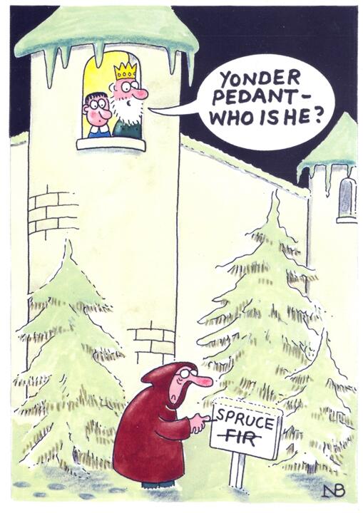
A 2003 card from UK satirical magazine Private Eye that seems perfect for StatsChat

yonder-pedant


and, yes, today, 26 December is St Stephen’s day.

(via @david_colquhoun)

December 24, 2013

Non-statistical Xmas fun

These have absolutely nothing to do with statistics in the media, but it’s our day off.

Comparing median houses

Auckland’s median house price is very high, but that’s partly the fault of Auckland’s median house.  While waiting for my olive bread to cook, I looked at some of the most expensive cities in the US for housing, based on data from the Center for Housing Policy, and then used the real-estate site Zillow to browse for a price near the median.

What you get for the median price in these cities is smaller, and on much less land than most TradeMe listings near the Auckland median price.

San Francisco: US$585k median>

Example: 1 bedroom, 1 bathroom apartment, 56.7 square meters,

New York: US$450k median

Example: a 6-bedroom apartment in the Bronx, a 2-bedroom apartment in Harlem, a house on 200 square meters in Brooklyn.

San Jose: US$443k median

Example: 2-bedroom unit on 268 sq metres.

Cambridge, MA: US$370k median

Example: 1 bedroom condo apartment, 58 sq meters

Houses are expensive in Auckland, and that’s partly because land is expensive, but it’s also because you’re forced to buy so much land with your home, whether you want it or not.


Grandma got run over by a reindeer

This year I’ve seen two versions of the “beware of holiday accidents” story, on 3News and in Stuff.

3News had dramatized re-enactments of accidents, and quoted the scary-sounding numbers

In the week over Christmas last year, ACC received over 36,000 claims, costing around $24 million. Almost 10 percent of those claims were on Christmas Day.

If you watch the video, you see this was 36,500 claims for the 9-day ‘week’ Dec 25 to Jan 2. The number you need to remember for ACC stories is 4500 claims/day on average. So, in other words, Christmas ‘week’ was below average for the year, and Christmas Day was slightly below average for that week.

Stuff gets a lot of credit for actually coming out and saying this, quoting the ACC’s Stephanie Melville

“Christmas is an exciting time but it can also be tiring, stressful and frantic,” she said.

“Add alcohol to the mix and you have an injury cocktail in the making.”

She urged people to slow down, plan ahead and think about their actions and surroundings.

“While there isn’t an increase in the number of accidents at this time of year, the consequences can mean your holiday fun is curtained.”

That’s a sensible, evidence-based message. Congratulations.

December 23, 2013

More on gender pay gaps

Two things from Twitter today

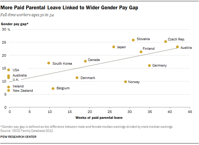
1.  A graph relating the gender pay gap and paid parental leave, from Pew Research
scatter


The positive relationship could be because gender discrimination (even if illegal) is more tempting when women are more likely to have prolonged parental leave.  You could think of plenty of other possible explanations, too.

However, a fairly large fraction of the StatsChat audience should be looking at the bottom left corner of that graph and saying “Wait, what?”

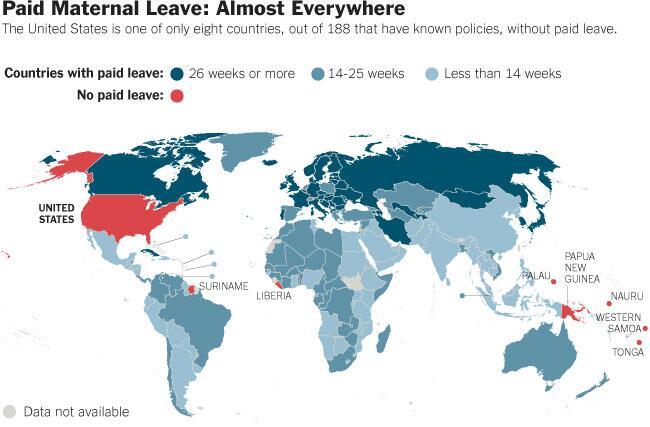
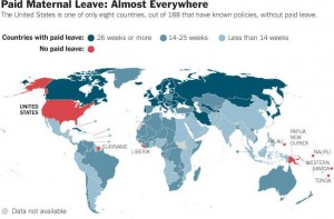
2. Because, as shown in this map from the New York Times, New Zealand and Australia (and the UK and Ireland) actually have paid parental leave.
map


In a Twitter conversation it transpired that the OECD figures were only for parental leave that could be taken by either parent, not for maternity leave. But (a) that’s just bizarre if you want to explain gender pay gaps, and (b) it’s still wrong, as NZ parental leave can be transferred to the father, at least in part, and the same is true in Australia


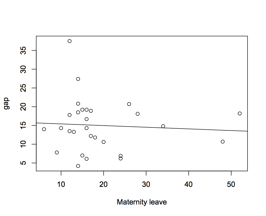
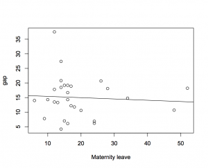
Update: For comparison, if you plot gender pay gap from here against maternity leave from here you get this, with no sign of a relationship. So, at very least the relationship is quite sensitive to how you define parental leave.  We would need a story about how leave entitlements for the father depress women’s income more than leave entitlements for the mother.
maternityleave-paygap


and as is so often the case, the Pew Research graph was “OECD highlights”, not all the OECD members for which the OECD has data.

December 20, 2013

Best? Worst? It’s all just numbers

From the Herald, based on a survey by a human resource company that’s lost its shift key

“New Zealand lags behind other Asia-Pacific countries in wage equality”

From the Ministry of Women’s Affairs, based on the Quarterly Employment Survey

New Zealand’s gender pay gap is the equal lowest in the OECD (along with Ireland). The gender pay gap at 10.1 percent (2013) is the lowest in the Asia-Pacific region.

It’s not that Herald personnel don’t know about the Government figures: about a month ago they ran a story describing the small but worrying increase in the governments estimate of the pay gap.

Now, it could be that both these things are true — perhaps they define the pay gap in different ways, or maybe the gap is much larger in some industries (and, necessarily, smaller in others).  But if you’re going to run a dramatically different estimate of such an important national statistic, it would be helpful to explain why it is different and how it was estimated, and say something about the implications of the difference.

Especially as once you find the company on the web (quite hard, since their name is “font”), you will also find they run an online salary survey website that provides self-reported salaries for a self-selected sample.  I hope that isn’t where the gender pay gap information is coming from.


Some Twitter statistics

John Bruner, at O’Reilly, took a random sample of about 400,000 Twitter accounts and looked at how many followers they had and how many they were following.  More than half of the accounts had no followers or only one, but that includes a lot of accounts that have never posted anything.  90% of accounts have 458 or fewer followers (@statschat has 608. Go, us!). Restricting to accounts that had posted in the past month, the median number of followers was 61, and the median number of accounts followed was 117, in contrast to the enforced symmetry of Facebook.

Some people, on the other hand, have lots of followers. Our biggest spike in readership this year was when @bengoldacre mentioned our Royal Baby Coronation Lifetables, and half a percent of his followers turned up within the next 20 minutes.

The Pew Internet Center did a survey of social media use in the US.  If you’re not familiar with Twitter, perhaps the most surprising statistic was than Black Americans are more likely to use it than others, even after you take into account that they are less likely to have internet access. Black Twitter is a thing.

At this time of year I’m probably supposed to give you a list of top statisticians to follow on Twitter. But (a) you can just see who I follow, and (b) that’s where a lot of the StatsChat links come from, so why would I want to encourage you?

December 19, 2013

Difficulties in interpreting rare responses in surveys

If some event is rare, then your survey sample won’t have many people who truly experienced it, so even a small rate of error or false reporting will overwhelm the true events, and can lead to estimates that are off by a lot more than the theoretical margin of sampling error.

The Herald has picked up on one of the other papers (open access, not linked) in this year’s Christmas BMJ, which looks at data from the National Longitudinal Study of Youth, in the US. This is an important social and health survey, and the paper is written completely seriously. Except for the topic

Of 7870 eligible women, 5340 reported a pregnancy, of whom 45 (0.8% of pregnant women) reported a virgin pregnancy (table 1). Perceived importance of religion was associated with virginity but not with virgin pregnancy. The prevalence of abstinence pledges was 15.5%. The virgins who reported pregnancies were more likely to have pledged chastity (30.5%) than the non-virgins who reported pregnancies (15.0%, P=0.01) or the other virgins (21.2%, P=0.007).

and

A third group of women (n=244) not included in analysis, “born again virgins,” reported a history of sexual intercourse early in the study but later provided a conflicting report indicating virginity. Reports of pregnancy among born again virgins were associated with greater knowledge of contraception methods with higher failure rates (withdrawal and rhythm methods) and lower interview quality (data not shown), and reports from this group may be subject to greater misclassification error.

The survey had carefully-designed and tested questions, and used computer-assisted interviewing to make participants more willing to answer potentially embarrassing questions. It’s about as good as you can get. But it’s not perfect.

December 18, 2013

Briefly

But, of course, time behind the wheel is time not doing anything else, and if we’re going to properly calculate an optimum speed, we really ought to put some monetary value on that, as well.