Posts written by Thomas Lumley (2645)

avatar

Thomas Lumley (@tslumley) is Professor of Biostatistics at the University of Auckland. His research interests include semiparametric models, survey sampling, statistical computing, foundations of statistics, and whatever methodological problems his medical collaborators come up with. He also blogs at Biased and Inefficient

September 9, 2013

Checking the facts

Two examples from other blogs

Mark Liberman, in two posts at Language Log, tackles the claim

Perhaps unsurprisingly, the paper, “Cluttered Writing: Adjectives and Adverbs in academia,” finds that social science papers contain the highest density, followed by humanities and history. Natural science and mathematics contain the lowest frequency, followed by medicine and business and economics.

The difference between the social and the natural sciences is about 15 percent. “Is there a reason that a social scientist cannot write as clearly as a natural scientist?” the paper asks.

He shows that the paper doesn’t provide reliable evidence for the claims, and, in the second post, that neither the claim that social scientists use more modifiers, nor the claim that clear writing uses fewer modifiers is supported by data.

Frances Woolley, at Worthwhile Canadian Initiative, uses life tables to examine the question of grandparents’ funerals as a student excuse. She finds

It turns out, given the age and gender distribution assumed above, and Canadian mortality rates, the odds of all 200 grandparents surviving the term is just 16 percent. In large undergraduate classes, some grandparents will pass away almost every semester.

and

I think some undergraduate students don’t realize just how public and well documented deaths are. It’s far easier to verify whether or not a grandmother died than it is to know whether or not a student was genuinely too sick to complete an assignment. 


September 8, 2013

Confounding by indication

One of the many quotes attributed to film producer Samuel Goldwyn is

Any man who goes to a psychiatrist ought to have his head examined.

This neatly summarises what epidemiologists call ‘confounding by indication’, that is, the fact that treatments tend to look harmful just because they are only given to sick people.  For example, in a study I worked on in Seattle, elderly people who were taking blood-pressure medication were about 20% more likely to have heart attackes than those not taking blood-pressure medication, although we know from randomised trials that these blood-pressure medications actually reduce heart attacks by about 20%.

The impact can easily be much more dramatic: about 12% of people receiving a heart transplant die within a year, compared to 0.6% of all Kiwis, a 20-fold higher rate, and the HIV deniers have made much of the fact that nearly  all AIDS deaths in Western countries are in people who have received antiretroviral treatment for HIV infection.

In the Herald, Rodney Hide doesn’t seem to appreciate the power of confounding by indication.

The benefit-supported children were six times more likely to be abused than those who were not benefit-supported. And they were 14 times more likely to be known to Youth Justice.

Those in households benefit-dependent for nine or more years were 13 times more likely to be abused and 29 times more likely to be known to Youth Justice.

He concedes that the numbers don’t prove that the benefit support is the cause, and describes some of the factors that might lead to confounding by indication, but says

Nonetheless, the ministry factsheet is suggestive. If the benefit system were a commercial product the Government would demand a warning: Danger: Taking a benefit can endanger your children.

and describes the Ministry’s

“These findings are consistent with associations between low income and measures of child maltreatment found both across and within countries. They do not, however, establish that being supported by the benefit system causes a child to be more at risk of these outcomes.”

as doublespeak.  But in fact, the Ministry is quite right.  Comparing people who need and qualify for benefits to the rest of the country isn’t even suggestive, any more than a comparison of heart transplant recipients or people taking antiretroviral drugs to the rest of us.  And that’s without even considering the ‘PC’ issues such as whether abusing your kids might be harder to hide if you’re on benefit than if you’re rich.

Readers of history or classic literature will recall that poor children didn’t fare all that well before benefits were introducted, and a brief look at the UNICEF web site will confirm that today children can be much worse off in countries where there isn’t a functioning government benefit system.  Is that “suggestive” too?


September 4, 2013

NZ tax/benefit system is moderately progressive

In the run up to the US election, there was a popular factoid to the effect that  50% of the US population paid no tax. This was, of course, untrue, but it could be arrived at by minor blurring of a true statement:  47% of tax units (family or individual) paid no net federal income tax.   The US has a strongly progressive federal income tax (more so than NZ), combined with a moderately regressive federal payroll tax and state and local taxes.  The average tax rate ranges from 17% for the poorest 20% of people, to 25% for the middle 20%, to 29% for the richest 1%. These figures are potentially misleading in the other direction, since they don’t count benefits, but the US benefit system is relatively limited and the figures for the middle 20% and up would not be appreciably different.

Doing this sort of calculation precisely is surprisingly difficult, because it’s not as easy as you might think to work out who really pays which taxes.  For example, you might assume that shoppers pay GST and land owners pay land taxes/rates, but in fact renters end up paying a chunk of the rates in increased rent, and retailers pay a small part of GST in reduced profits.   In New Zealand it’s probably a reasonable approximation to just count income tax and GST, and to assume these are effectively paid by earners and buyers.  It’s not a reasonable approximation to just count income tax — and publishing estimates of tax share that only use income tax and benefits, even if you do it with scrupulous accuracy, is likely to lead to the sort of misquotation that we saw in the US.

Over at pundit.co.nz, Rob Salmond does some calculations, and while I think the tone is unnecessarily inflammatory, the final numbers look plausible. The 10% highest-income households  get about 30% of the income and they (actually, ‘we’, I think) pay 43% of the net tax.  [Rob also mentions the highest-wealth 10% of families, implying incorrectly that these are the same people].

For comparison, in the US, it’s the highest-income 5% of the population that gets 35% of the income and they pay 37% of the tax. Since benefits are about 28% of US federal spending, they are about 18% of all taxes, and so the share of net taxes for the top 5% will be about 44%. NZ is both less unequal and has a slightly more progressive tax and transfer system (and we have a national health system, too).  In the other direction, we have more inequality and a less progressive tax and transfer system than, say, Sweden.

If we stipulate that a mix of income tax and GST, with few deductions, is what we’re working with, making the  tax system more progressive has obvious benefits in terms of reducing inequality, and costs in terms of reducing productivity.  Making this tradeoff is a policy issue rather than a technical one, and it’s perfectly reasonable for people to argue for their own positions as strongly as they can: inequality and productivity are worth arguing about.

On the other hand, if you’re going to use a relatively unnatural statistic based on income tax and benefits but not GST, aggregated in an unusual way, I think you have the responsibility to point out carefully  and explicitly that you’ve left out GST (and, ideally, explain why). Bill English said ” The 1.3 million households with incomes under $110,000 a year collectively pay no net tax—that is, their total income support payments match their combined income tax.” The clause before the dash is simply false. The clause after the dash is true, but I don’t think it’s a contribution to informed public debate.

September 2, 2013

Evidence-based interviewing?

Two links,

Deciding who to interview: Aline Lerner looked at resumes of 300 candidates interviewed at a Silicon Valley company to see what predicted getting the job. The biggest factor wasn’t grades or degree or experience, it was typos  — and this was among people who got an interview.

Did it work? An interview with a Google exec by the New York Times

We looked at tens of thousands of interviews, and everyone who had done the interviews and what they scored the candidate, and how that person ultimately performed in their job. We found zero relationship. It’s a complete random mess, except for one guy who was highly predictive because he only interviewed people for a very specialized area, where he happened to be the world’s leading expert.

September 1, 2013

Bogus expat salary headlines

A couple of years ago, the Herald won Stat of the Week with a story headlined “Goodbye NZ, hello $100,000“. They have fallen for this year’s version of the same survey again, with a story headlined $100,000 easy for our expats” claiming that more than half of Kiwi expats make over $100000. It should be pretty obvious that this story can’t actually be true, especially given their recurring stories about problems Kiwis face in Australia.

The story comes from a survey by Kea, ‘New Zealand’s Global Network’, of about 30000 of its members, ie, a self-selected, non-representative group making up about 3-5% of Kiwi expats.  Basically, Kea have successfully gotten the paper to report as news their ability to contact and market to a large, high-income set of expats.


Update: For example, at the 2006 Census, average income for Kiwis aged 25-44 working in Australia was just under AU$50,000 (Table 15), about 25% higher than in NZ for the same jobs. It will have gone up a bit since then, but not doubled.

August 31, 2013

West Island elections

Australia, as you may have noticed, is having an election. Some statistical analysis links


More misplaced creativity

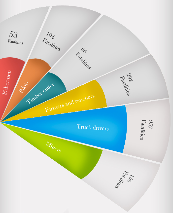
The site “WTF Visualizations” does basically what it says on the tin: collecting really badly-inspired data graphics. For example

tumblr_ms9pq9mvtR1sgh0voo1_1280


and

fan

Some of the entries seem too good to be true, a suspicion reinforced by the fact that Google’s reverse image search can’t find them anywhere else on the web, but it is certainly entertaining.

August 26, 2013

Change and decay in all around I see

There’s an op-ed piece in the New York Times (by a physicist, Adam Frank) about how no-one pays attention to science any more, and it’s all political, with creationism and climate change denial as the main examples.

Chad Orzel (also a physicist) is unconvinced

 [T]he question is whether we’ve fallen off from some golden age when everybody listened raptly to the best science had to offer…. After all, as depressing as it may be for forty-odd percent of the population to want to align themselves with a creationist position (whether from honest belief or out of tribal identification), that’s probably an improvement from the days of the actual Scopes trial. Which, it should be noted, Scopes lost, unlike the several more recent cases where teaching of creationism has been soundly rejected by the courts.

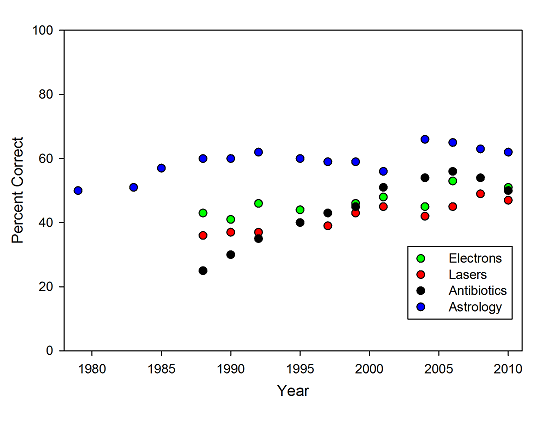
 He points to other questions whether there hasn’t been as much political propaganda and where basic scientific knowledge is improving.

noncontroversial


Again, there’s plenty that’s bad, I’m not going to deny it. But just because we’re not winning as fast as we’d like doesn’t mean that we’re in decline. Though frustration might make it seem that way at times.

August 23, 2013

Just making it easier to understand?

From the Journal of Nutritional Science

Young adult males (n 35) were supplemented with either half or two kiwifruit/d for 6 weeks. Profile of Mood States questionnaires were completed at baseline and following the intervention. No effect on overall mood was observed in the half a kiwifruit/d group; however, a 35 % (P = 0·06) trend towards a decrease in total mood disturbance and a 32 % (P = 0·063) trend towards a decrease in depression were observed in the two kiwifruit/d group. Subgroup analysis indicated that participants with higher baseline mood disturbance exhibited a significant 38 % (P = 0·029) decrease in total mood disturbance, as well as a 38 % (P = 0·048) decrease in fatigue, 31 % (P = 0·024) increase in vigour and a 34 % (P = 0·075) trend towards a decrease in depression, following supplementation with two kiwifruit/d. There was no effect of two kiwifruit/d on the mood scores of participants with lower baseline mood disturbance

From the Otago press release

Eating two kiwifruit a day can improve a person’s mood and give them extra energy, new research from the University of Otago, Christchurch (UOC) shows.

Over a six-week period, normally-healthy young men either ate two kiwifruit a day or half a kiwifruit daily as part of a research study into the potential mood-enhancing effects of the fruit.

Researchers found those eating two kiwifruit daily experienced significantly less fatigue and depression than the other group. They also felt they had more energy. These changes appeared to be related to the optimising of vitamin C intake with the two kiwifruit dose

From the Herald

Eating two kiwifruit a day can improve mood and energy levels, a new University of Otago study shows.

Those eating two kiwifruit were found to experience significantly less fatigue and depression than the others. They also felt they had more energy.

I’m not criticizing the research, which was a perfectly reasonable designed experiment, but if the findings are newsworthy, they are also worth presenting accurately.

Political polling

Two episodes to be noted

First, the GCSB bill.

We’ve had a nomination for Stat of the Week for the Campbell Live bogus poll finding 89% opposition to the bill: you just can’t draw that sort of conclusion from self-selected phone-in polls.  On the other hand, they did get over 50000 identified individuals voting, so as a petition it isn’t completely negligible — that’s a bit more than 1.5% of voters.

The Fairfax/Ipsos real poll found a bare majority who trusted the government to protect privacy and only about 30% who were seriously opposed to the bill.  The pollster or the papers fell down badly by not giving us a party breakdown of these figures.  If half the 30% were National voters, the government should have been concerned, but if, like me, they were mostly Labour/Greens voters already, there isn’t any political problem in ignoring them. It’s also a pity there wasn’t any polling relevant to the most obvious pressure point in the coalition – “Would you vote for ACT if they voted against the bill?” would have been an interesting and important thing to know.

Second, the West Island.

As you may have heard, they are having an election soon. In addition to the traditional election polls there are new automated ‘robopolls’ that are sufficiently cheaper that it’s possible to get a useful sample size in single electorates. Or perhaps not. The Sydney Morning Herald has an interesting report

Lonergan’s own national poll reports only a 2 per cent swing against Labor. Yet in the three seats it polled individually, it found an average swing of 10 per cent. That’s huge, far bigger than we have seen in any Federal election since 1943.