Posts written by Thomas Lumley (2645)

avatar

Thomas Lumley (@tslumley) is Professor of Biostatistics at the University of Auckland. His research interests include semiparametric models, survey sampling, statistical computing, foundations of statistics, and whatever methodological problems his medical collaborators come up with. He also blogs at Biased and Inefficient

September 11, 2013

Some stats talks

If you’re in Palmerston Nth, next Tuesday 17th, James Curran is talking as part of the Royal Society’s 10×10 series of maths presentations around the country

Advances in science have allowed forensic practitioners to recover and quantify evidence from crime scenes in more ways than ever before. As a consequence, judges, lawyers, and juries struggle to decide or understand what the value of scientific evidence might be, and how it impacts on the case at hand. This talk will look at how statistics is being used to aid in the legal process.

And if you’re in Auckland on October 1, I’m presenting at Nerdnite again, (6:30 for 7pm, Nectar bar, above the Kingslander)

“The game of rock, paper, scissors was known in Asia millennia ago. At about the time of Captain Cook, a French political scientist discovered that it isn’t always possible to construct an ordering by considering things two at a time.  In the 1970s a statistician showed how to cheat at dice using this idea. The implications for experiments with a treatment group and a control group are still underappreciated.”


 

Cumulative totals tend to increase

One of our early Stat-of-the-Week awards was for this graph from The Standard

Among the problems is that the graph is cumulative, so it unavoidably goes up.  It’s a good choice if you want the impression of a relentless increase regardless of the data; not so good if you’re trying to inform.

Tim Cook, of Apple, did something similar with iPhone sales at the product release yesterday

iphone-sales

David Yanofsky, at Quartz, overlays the quarterly sales reports

iphone-quarterly


It’s clear that quarterly sales have been declining recently, although it’s also clear that each new iPhone leads to a sales surge.  The quarterly reports actually tell you something about the sales pattern; the cumulative reports really don’t.

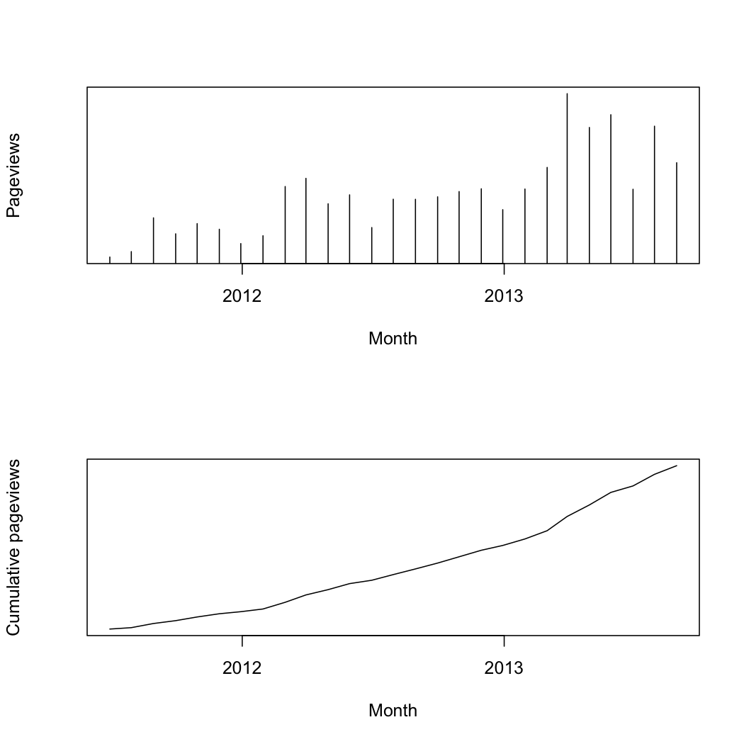
In the same way, although these two graphs of StatsChat page views contain the same information, the first one lets you see  patterns over time, such as the start of the rugby-prediction season, and the times I’m away. Cumulative charts are usually less useful and often misleading, whether deliberately or not.

pageviews

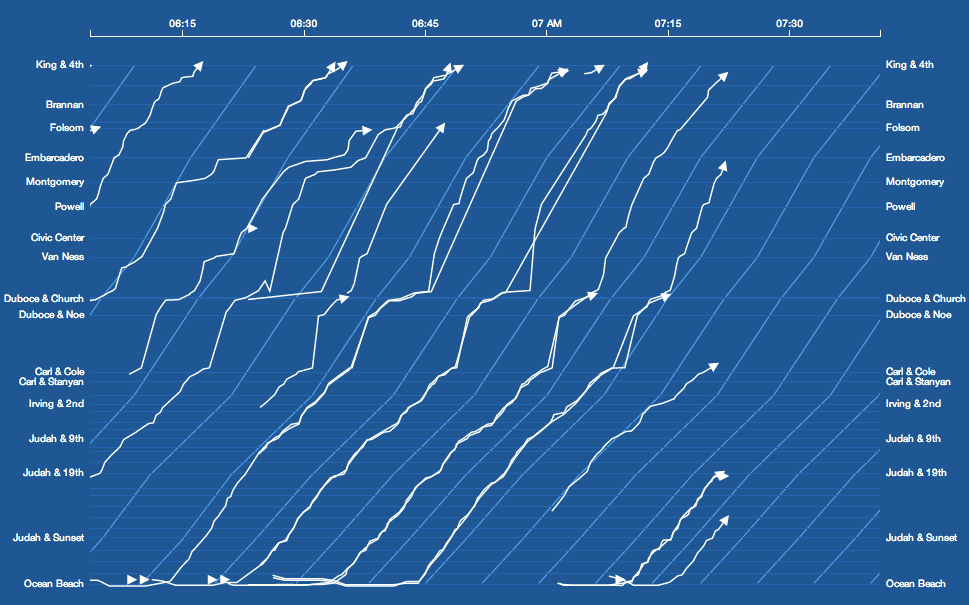
Where’s my tram

A live visualisation of  locations for a light-rail system in San Francisco. The diagonal lines show the timetable schedule, so you can see speed as well as lateness

sfbus


Something like this for Auckland buses would be neat, but, sadly, the bus location data are secret.

September 10, 2013

Excellence in statistical reporting award

I missed this when it came out in early August. Alan Schwarz, of the New York Times, has won this year’s award for excellence in statistical reporting, from the American Statistical Association.

He’s probably best known for his reporting on concussion and brain injury in footballers, which was a finalist for the Pulitzer Prize in 2011. Similar issues are now being raised in rugby.

Tell us what you really think

From the Herald (and originally the Daily Mail)

People who bottle up their feelings are at least a third more likely to die young than those who regularly express what they’re thinking.

Not what the study says — there is a hazard ratio of 1.35 but even the researchers only claim this is a 3 year reduction in life expectancy and they don’t say anything about how likely people are to die young.

But when the researchers looked at specific causes of death they discovered that the risks increased by 47 per cent for heart disease and 70 per cent for cancer.

This was a fairly small study, with only 34 heart disease deaths and 37 cancer deaths, and the authors make it pretty clear the evidence for heart disease was too weak even for them to be comfortable — they say

Findings for CVD death were in a direction and of a magnitude consistent with prior work though they did not reach statistical significance.

How do I know all this? Well the story doesn’t give the names of any of the researchers, let alone link, but it does give the journal name and it turns out the paper appeared only a month ago, so it didn’t take too much work.

Assuming the correlation is real, it could still easily be due to other factors.  The researchers deliberately didn’t attempt any control for health risks, in case these were due to emotion suppression. For example, they didn’t distinguish smokers and non-smokers, because of the concern that smoking might be due to emotion suppression.  They didn’t even ask if people already had a cancer diagnosis at the start of the study.

The story does quote an independent expert. Well, sort of.

London-based business psychologist Voula Grand said: “It has long been thought that cancers are partly the result of suppressed emotions.

Judging from their web sites about cancer prevention, neither the American Cancer Society nor Cancer Research UK seems to know about this. They might be more reliable than the Daily Mail.


Marking predictions to market

A couple of weeks ago, I wrote about a Sydney Morning Herald story on new electorate-specific robopolls and their surprising predictions. Tim Colebatch at the SMH wrote

Uh-huh. Lonergan’s own national poll reports only a 2 per cent swing against Labor. Yet in the three seats it polled individually, it found an average swing of 10 per cent. That’s huge, far bigger than we have seen in any Federal election since 1943.

and I was similarly dubious.

We now have the facts: the national (two-party preferred) swing against Labour is just over 3%, and the swing in Kevin Rudd’s seat of Griffith, one of the three specifically polled and predicted to have a swing of 10.5%, was 5.42%. The other two seats mentioned in the story as polled by Lonergan were Forde (robopoll swing 8.5%, actual swing 2.5%) and Lindsay (robopoll swing 11%, voters 3.9%)

It looks as though the robopoll skeptics were right. Even though the national swing was larger than the poll predicted, the swings in the target electorates were much smaller.

The data speaks for itself

Wednesday, Sept 4, NZ Herald, lead

Latest Auckland house price stats show a largely flat property market over the past five months and one economist says we may have seen the first sign of regional price pressure easing.

Monday, Sept 9, NZ Herald, lead

Rising New Zealand property values accelerated last month as the lack of listings in Canterbury and Auckland continue to overheat the market, 


September 9, 2013

Prevention vs cure

From Slate

The most important difference between the world today and 150 years ago isn’t airplane flight or nuclear weapons or the Internet. It’s lifespan. We used to live 35 or 40 years on average in the United States, but now we live almost 80. We used to get one life. Now we get two.

The medical developments in the story are important

  • Adrian’s lung spontaneously collapsed when he was 18.
  • Becky had an ectopic pregnancy that caused massive internal bleeding.
  • Carl had St. Anthony’s Fire, a strep infection of the skin that killed John Stuart Mill.*
  • Dahlia would have died delivering a child (twice) or later of a ruptured gall bladder.
  • David had an aortic valve replaced.
  • Hanna acquired Type 1 diabetes during a pregnancy and would die without insulin.
  • Julia had a burst appendix at age 14.
  • Katherine was diagnosed with pernicious anemia in her 20s. She treats it with supplements of vitamin B-12, but in the past she would have withered away.
  • Laura (that’s me) had scarlet fever when she was 2, which was once a leading cause of death among children but is now easily treatable with antibiotics.
  • Mitch was bitten by a cat  and had to have emergency surgery and a month of antibiotics or he would have died of cat scratch fever.

but also tend to emphasize treatment over cure.

For example,  St Anthony’s Fire and scarlet fever (both serious streptococcal infections) could kill, but only in a minority of cases. Type I diabetes and pernicious anemia used to be uniformly fatal, but Type I diabetes occurs in 1-25 per 100,000 and pernicious anemia in about 1 per 1000. Treatment of streptococcal infections was a breakthrough, and we should be really scared of the possibility than Strep. pyogenes finally learns how to beat penicillin, but they aren’t responsible for that much of the improvement in life expectancy.

Dehydration due to gastrointestinal disease, one of the really important killers of infants and children, isn’t mentioned, because the lack of it isn’t salient.  Hardly anyone says “I shouldn’t be alive now because I should have caught rotavirus or cholera at age 2 and died, but didn’t because of clean water, ”  but that’s probably the most important single change we have seen.

Prevention isn’t visible, but it’s still real.

—-ing good survey

From the Broadcasting Standards Authority, via @ColeyTangerina

Scope

  • Quantitative research to provide a monitor of the acceptability of the use of swear words, blasphemies and other expletives in broadcasting over time

Methodology

  • Administered national survey with 1,500 randomly selected individuals aged 18 years and over, stratified by region, age group, gender and ethnicity
  • Online methodology survey was the same approach as used in 2010. This is differentiated from the 1999 and 2005 surveys which made use of a face-to-face interview technique.

It’s pretty clear that the report is going to be unsuitable for some workplaces (that’s kind of the point) but the findings are interesting.  The ranking of unacceptability is not what I would have expected (I’m biased having lived in the US).

Of the 31 words they surveyed, in the context of a movie screening after 8:30pm with a criminal swearing at a police officer, the 27th is one that has been used on this blog (“bullshit”), with 20% unacceptability rating.  The worst-ranked word had  70% unacceptability.  Personally, I don’t think any of the words is unacceptable in that context, but there are several whose use would lower my opinion of the speaker.

They also looked at other scenarios, and the general conclusion seemed to be that it was worse not as bad for actors than for ‘real people’ to swear.

Seeing history

There’s a website that shows a map of all the buildings in the Netherlands, colour-coded by age. To start you off, here’s central Amsterdam

amsterdam


(from Abi Sutherland)