Posts written by Thomas Lumley (2645)

avatar

Thomas Lumley (@tslumley) is Professor of Biostatistics at the University of Auckland. His research interests include semiparametric models, survey sampling, statistical computing, foundations of statistics, and whatever methodological problems his medical collaborators come up with. He also blogs at Biased and Inefficient

July 8, 2013

Kids today moral panic

Stuff has a story with the headline “More kids committing sexual abuse” and the lead

Easy access to increasingly hardcore pornography and the sexualisation of childhood are being blamed for a rise in the number of children sexually abusing each other.

However, if you actually read the story, the only real information is on number of prosecutions, and

 Police say the jump in prosecutions was due to better knowledge and increased reporting of sexual abuse, rather than a rise in incidents.

No other evidence or expert opinion is given to support the claim of a real increase in abuse, which seems to be entirely made up.

And while on the subject of factchecking, Netsafe chief technology officer Sean Lyons is quoted as saying

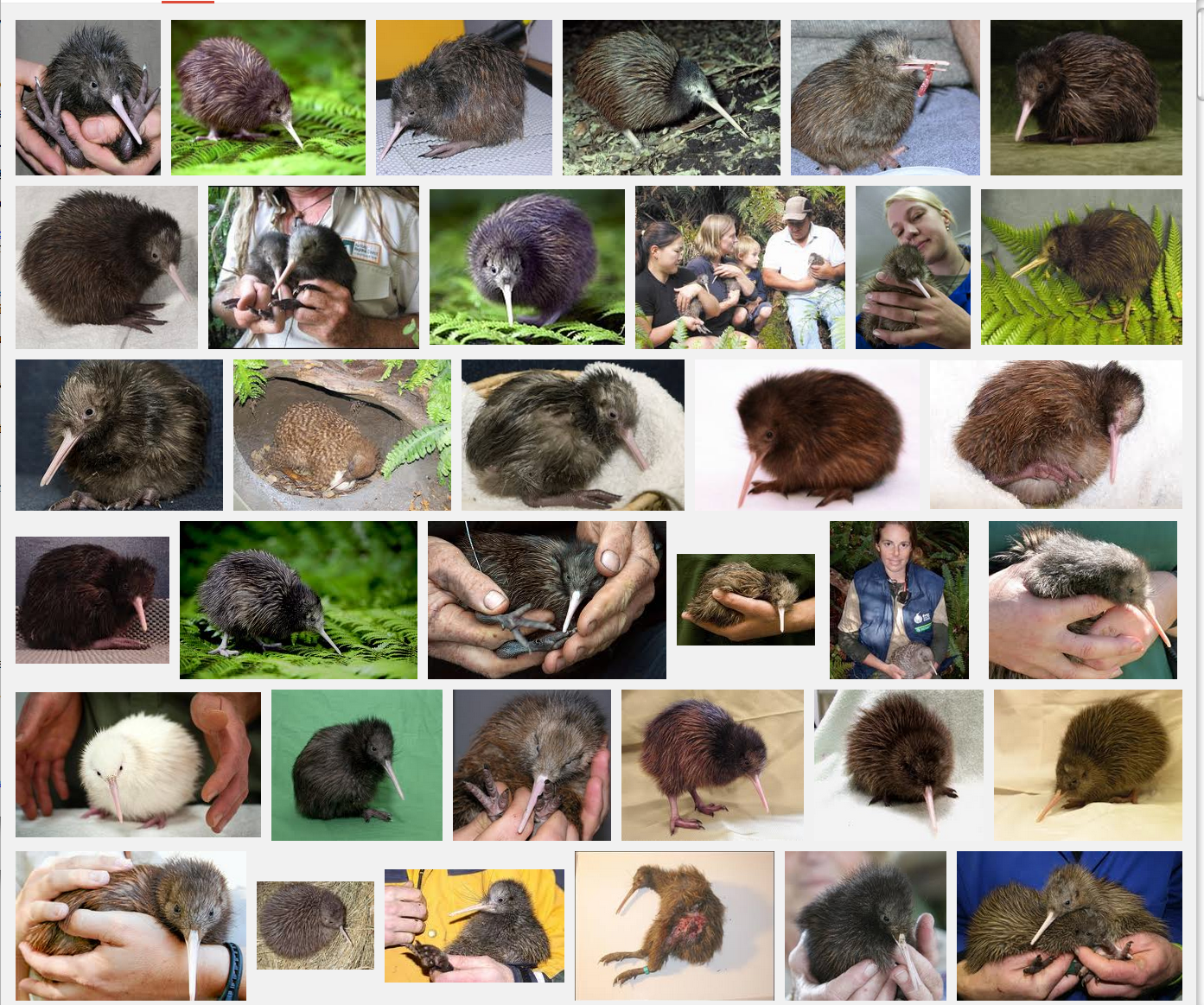
“You type ‘kiwi chicks’ into Google and the images that come back won’t be small feathered birds.”

I tried this. On the first page of results, eight links and the only image displayed were for small feathered birds, one was to a museum project “‘Kiwi Chicks: New Zealand Girl History/Ngā Kōhine Kiwi: He Hitori Taitamāhine o Aotearoa’”, and one was to a page at TheRockFM, which might offend some people but is not anything shocking for kids.

I got basically the same page using lmgtfy.com in a browser not logged into any Google services, so it isn’t just my pure and innocent search history that’s biasing the results.


Update: here’s the first screenfull of results from a Google image search for ‘kiwi chicks’
kiwichicks

July 7, 2013

Who is on the (UK) front pages

From the inimitable Dan Davies, a post on how often you’d expect all the front-page photos in major UK newspapers to be of white people

So a while ago on Twitter, I saw this storify by @KateDaddie, talking about ethnic minority representation in the British media, in the context of this article by Joseph Harker in the British Journalism Review. As I am a notorious stats pedant and practically compulsive mansplainer, my initial reaction was to fire up the Pedantoscope and start nitpicking. On the face of it, it is not difficult to think up Devastating Critiques[1] of the idea of counting “#AllWhiteFrontPages” as an indicator of more or less anything. But if I’ve learned one thing from a working life dealing with numbers (and from reading all those Nassim Taleb and Anthony Stafford Beer books), it’s that the central limit theorem will not be denied, and that simple, robust metrics with a broad-brush correlation to the thing you’re trying to measure are usually better management tools than fragile customised metrics which look like they might in principle be better.

July 6, 2013

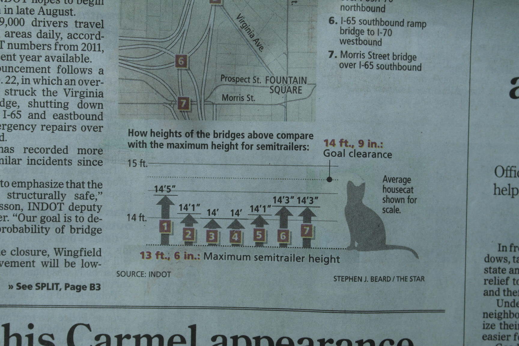
Average housecat shown for scale

Via Edward Tufte on Twitter, from an Indiana newspaper

P4uh78P (more…)

July 5, 2013

How recommendation systems work: beer

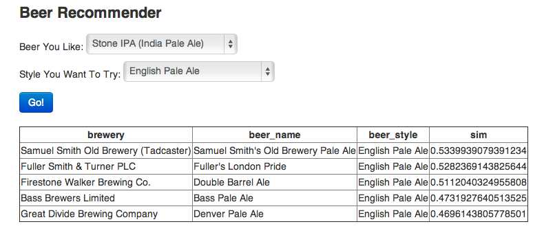
It’s nearly that time of the week, so here’s a post describing a simple beer recommendation system using 1.5 million ratings from BeerAdvocate.com and analysis in R

I don’t need a statistical model to tell me that someone who likes Fat Tire is probably going to like Dale’s Pale Ale more than Michelob Ultra. But what about picking between Dale’s Pale Ale and Sierra Nevada Pale Ale? Things get a little more complicated. For this reason (and because we don’t want to manually select between each beer pair), we’re going to write a distance function that will quantify similarity.

For our similarity metric we’re going to use a weighted average of the correlation of each metric. In other words, for each two-beer-pair we calculate the corelation of review_overallreview_aromareview_palate, and review_taste seperately. Then we take a weighted average each result to consolidate them into one number.

The resulting tool lets you put in a specific beer you like and then ask for recommendations in a category, eg,

beer

Email metadata

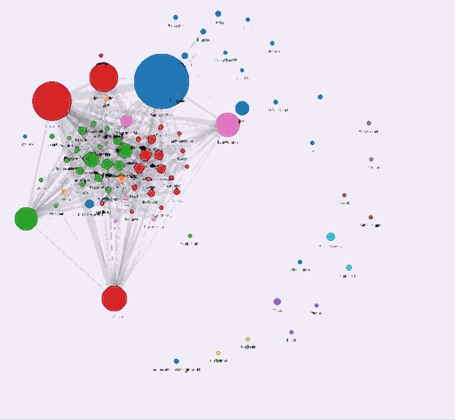
Some folks at the MIT Media Lab have put together a simple web app that takes your Gmail headers and builds a social network.

Once you log in, Immersion will use only the From, To, Cc and Timestamp fields of the emails in the account you are signing in with. It will not access the subject or the body content of any of your emails.

Here’s mine, from my University of Washington email (with the names blurred, not that communicating with me is all that incriminating)

immersion


Obviously my email headers reveal who I email, and, unsurprisingly, the little outlying clusters are small groups or individuals involved in specific projects.  More interesting is how the main clump breaks down:  the blue and pink circles are statisticians, the red are epidemiology and genomics people that I have worked with in person in Seattle, and the green are epidemiology and genomics people that I work with only via email.

July 4, 2013

Not dead yet

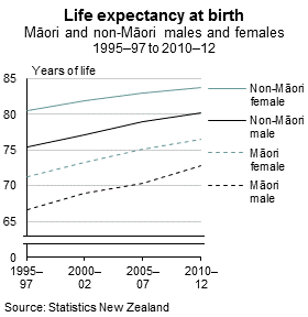
On Stuff’s front page there’s a headline “Life expectancies heading down.” Clicking through gives “Kiwi kids destined for shorter lives than parents”.

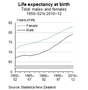
Here’s the New Zealand life expectancy over time, from StatsNZ, first by gender, then (for a shorter time period) by gender and Maori/non-Maori ethnicity

LE at BirthTotal LE at Birth M and NM


Life expectancy has been increasing for a long time, and over the past 25 years (a reasonable definition of a generation) there has been an increase of about eight years.

The story is saying that this increase may soon start to slow down and reverse. That’s possible, and even plausible, but it hasn’t started to happen yet, and it would take a lot for life expectancy curves to not just flatten but to decrease fast enough to give an eight-year reduction, so that kids born today have a shorter life expectancy than their parents’ generation.

July 3, 2013

Data sonification

An interestesting video from the Geography department at the University of Minnesota. The cellist, Minnesota student Daniel Crawford, plays the historical earth mean temperature record converted to music

One difficulty with sonic display of data is scaling: the video uses a semitone for 0.03 Celsius, but that seems like quite a big pitch change for a barely-measurable temperature difference.  The scaling gives a range of three octaves (rather more than a typical singers voice) for just over 1 degree, which is a meaningful but not catastrophic change in temperature.  I think it’s fair to say the pitch scaling is a bit exaggerated.

It’s hard to say what would be appropriate, since we don’t have the research and practical experience that informs axis choices for graphs.  One approach might be to take advantage of vibrato in cello performance, and scale so that the minimum measurement uncertainty is the same as the vibrato variation.  The Google suggests that cello vibrato is about 1/5 to 1/4 semitone, and mapping this to a minimum confidence interval width (from the Berkeley data) of 0.04C gives a scaling of 0.16 to 0.2 degrees per semitone, or a total range for the whole piece of about half an octave.

Compared to what?

From itnews

A mobility programme using Apple iPhones and iPads has changed the way New Zealand Police officers work, and the force is partly attributing a sharp drop in crime to the rollout of the devices.

According to figures published by NZ Police, using the devices within the Policing Excellence programme [PDF] has contributed to a 13 per cent reduction in crime for the year to May 31.

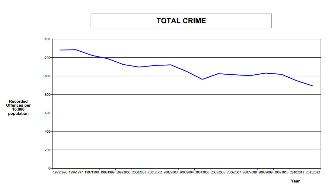
The Police press release is here, and you can see that they are the source of the claims. But if you look at the linked PDF, the 13% reduction is based on comparing (partly provisional) data for June 2012-May 2013 and June 2008-May 2009.  Crime has been decreasing steadily over this time: here’s the graph for 1995-2012 from NZ police (PDF, p16)

crime


The decrease from fiscal year 2008/9 to fiscal year 2011/12 (before the iPads) is from 1031.9 per 10,000 population to 891.9 per 10,000 population, or just over 14% — slightly larger than the decrease claimed when the iPad revolution is included.

It’s not surprising that the new mobility initiative isn’t showing up clearly in crime figures yet — the devices are still being rolled out. In fact the NZ Police report is talking about their whole modernisation initiative (started in August 2010) , though it’s still not possible to say how much of the 13% decrease is due to the changes, and the overall downward trend in crime would be sufficient to explain the entire decrease.


Briefly

On sports journalism

I’ve commented on several occasions that it would be great if science journalism was as good as sports journalism.  Here’s a more-detailed quote from Noam Chomsky on the same issue


When I’m driving, I sometimes turn on the radio and I find very often that what I’m listening to is a discussion of sports. These are telephone conversations. People call in and have long and intricate discussions, and it’s plain that quite a high degree of thought and analysis is going into that. People know a tremendous amount. They know all sorts of complicated details and enter into far-reaching discussion about whether the coach made the right decision yesterday and so on. These are ordinary people, not professionals, who are applying their intelligence and analytic skills in these areas and accumulating quite a lot of knowledge and, for all I know, understanding. On the other hand, when I hear people talk about, say, international affairs or domestic problems, it’s at a level of superficiality that’s beyond belief.

(via Chad Orzel, who thinks there’s a snappier version of this out there, but can’t find it)