Posts written by Thomas Lumley (2645)

avatar

Thomas Lumley (@tslumley) is Professor of Biostatistics at the University of Auckland. His research interests include semiparametric models, survey sampling, statistical computing, foundations of statistics, and whatever methodological problems his medical collaborators come up with. He also blogs at Biased and Inefficient

June 13, 2013

What you can learn by mining metadata

Kieran Healy uses data from the time of the American Revolution to show how membership of organisations can be turned into social network information

Rest assured that we only collected metadata on these people, and no actual conversations were recorded or meetings transcribed. All I know is whether someone was a member of an organization or not. Surely this is but a small encroachment on the freedom of the Crown’s subjects. I have been asked, on the basis of this poor information, to present some names for our field agents in the Colonies to work with. It seems an unlikely task.

If you want to follow along yourself, there is a secret repository containing the data and the appropriate commands for your portable analytical engine.


You may well already have seen this, but I’ve been travelling.

June 9, 2013

What the NSA can’t do by data mining

In the Herald, in late May, there was a commentary on the importance of freeing-up the GCSB to do more surveillance. Aaron Lim wrote

The recent bombings at the Boston Marathon are a vivid example of the fragmented nature of modern warfare, and changes to the GCSB legislation are a necessary safeguard against a similar incident in New Zealand.

 …

Ceding a measure of privacy to our intelligence agencies is a small price to pay for safe-guarding the country against a low-probability but high-impact domestic incident.

Unfortunately for him, it took only a couple of weeks for this to be proved wrong: in the US, vastly more information was being routinely collected, and it did nothing to prevent the Boston bombing.  Why not?  The NSA and FBI have huge resources and talented and dedicated staff, and have managed to hook into a vast array of internet sites. Why couldn’t they stop the Tsarnaevs, or the Undabomber, or other threats?

The statistical problem is that terrorism is very rare.  The IRD can catch tax evaders, because their accounts look like the accounts of many known tax evaders, and because even a moderate rate of detection will help deter evasion.  The banks can catch credit-card fraud, because the patterns of card use look like the patterns of card use in many known fraud cases, and because even a moderate rate of detection will help deter fraud.  Doctors can predict heart disease, because the patterns of risk factors and biochemical meausurements match those of many known heart attacks, and because even a moderate level of accuracy allows for useful gains in public health.

The NSA just doesn’t have that large a sample of terrorists to work with.  As the FBI pointed out after the Boston bombing, lots of people don’t like the United States, and there’s nothing illegal about that.  Very few of them end up attempting to kill lots of people, and it is so rare that there aren’t good patterns to match against.   It’s quite likely that the NSA can do some useful things with the information, but it clearly can’t stop `low-probability, high-impact domestic incidents’, because it doesn’t.  The GCSB is even more limited, because it’s unlikely to be able to convince major US internet firms to hand over data or the private keys needed to break https security.

Aaron Lim’s piece ended with the typical surveillance cliche

And if you have nothing to hide from the GCSB, then you have nothing to fear

Computer security expert Bruce Schneier has written about this one extensively, so I’ll just add that if you believe that, you can easily deduce Kristofferson’s Corollary

Freedom’s just another word for nothing left to lose.

June 7, 2013

Proper use of denominators

Mathew Dearnaley, in the Herald, has a story today about dangerous roads where he observes that the largest number of deaths is in the Auckland region, but immediately points out that what matters is the individual risk, estimated by fatalities per million km travelled.  We’ve been over this point quite a lot on StatsChat, so it’s great to see proper use of denominators in public.

When you divide by total distance travelled, to get a fair comparison, it  turns out that Gisborne has the most dangerous roads, followed by Taranaki, and that Auckland, like Wellington, is relatively safe.

Although Waikato roads claimed 66 lives – more than a fifth of a national toll of 308 deaths – the odds of being among the 10 people who died in crashes between the Wharerata Hills south of Gisborne and East Cape were almost twice as high as in the busier northern region.

One problem with the story is the issue of random variation.  According to NZTA, Hawkes Bay and Gisborne together had a total of 16 deaths last year, up from 8 the previous year.  There’s a lot of noise in these numbers, and even though the story sensibly looked at serious injuries as well, it’s hard to tell how much of the difference between regions is real and how much is chance.

It would be helpful to add up data over multiple years, though even then there is a problem, since we know that road deaths decreased noticeably in mid-2010, and this decrease may not have been uniform across regions.

You don’t sound like you’re from round here

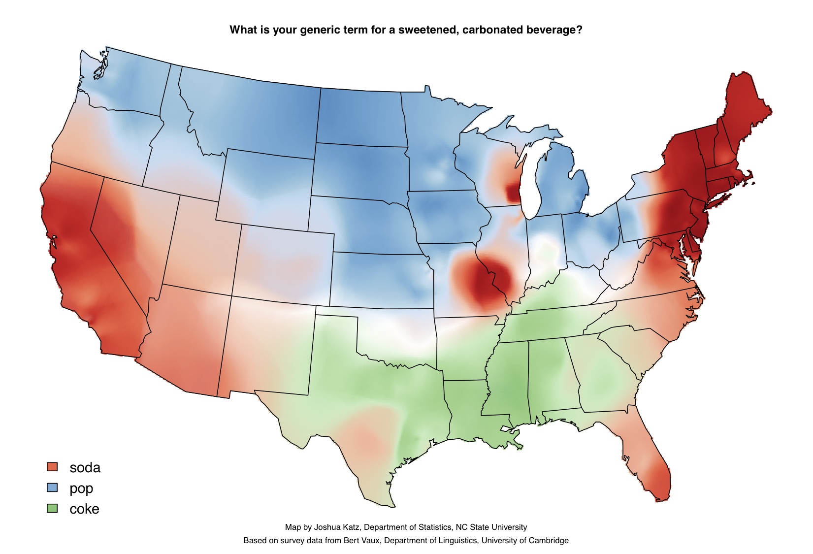
Joshua Katz, a statistics PhD student at North Carolina State University, has produced a beautiful set of maps of US dialect.  He used data from the Dialect Survey conducted by Bruce Vaux, of Harvard University.

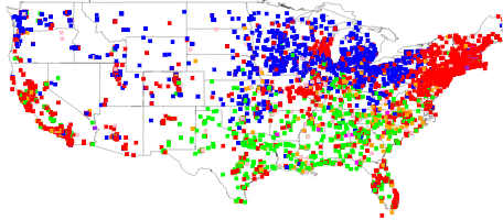
As an example, people in various parts of the US were asked about their generic name for sweetened carbonated soft drinks: soda, pop, or coke.

spcMap


The original maps by Prof Vaux were closer to the data, since they showed dots for individual respondents, but they have visual artifacts due to population density — the clear vertical edge running north from Texas is a rainfall threshold, not a dialect boundary.

sodamap

Don’t worry, we don’t mean it

While looking into mobile internet options for a trip to Europe, I saw an ad for one of those products that’s supposed to stop dangerous mobile-phone radiation — as usual, it probably wouldn’t work even if dangerous mobile-phone radiation existed.

The company (which is in NZ), says

Cellguard® uses Frequency Infused Technology (FIT) which works to enhance the Bio energy function of the body.

With enhanced Bio energy function your body is better able to maintain an optimum state of wellbeing and significantly reduce the impact of the considered effects of mobile phone use.

which I think qualifies as “not even false”.  They also sell a product that is supposed to improve the acid/alkaline balance in your body — if you drink it, or rub on your skin or sprayed it up your  nose.

a modified liquid silica that is high in oxygen and is highly alkaline to help offset our acidic lifestyles. Alka Vita has a high pH of around 14.3 and is non corrosive ..

The ‘high in oxygen’ doesn’t sound plausible, but who knows? On the other hand, if it has a pH of 14.3 and is non-corrosive, they clearly don’t mean what chemists mean by ‘pH’.  14.3 is more alkaline than drain cleaner, and 60 times more alkaline than the NZ legal limit for dishwasher detergent.

Fortunately, the legal disclaimer page says

The information provided on this website is not intended as professional advice, but as guidelines for convenience only, upon the condition that you, by receiving or reading the material contained on this website, agree not to act in reliance upon it without first satisfying yourself by independent inquiry or advice as to the suitability, appropriateness, relevance, nature, fitness or purpose, likely side effects or long term effects, accuracy, reliability or otherwise of that material, having regard (without limitation) to your physical state, and your general fitness or medical condition.

June 4, 2013

Survey respondents are lying, not ignorant

At least, that’s the conclusion of a new paper from the National Bureau of Economic Research.

It’s a common observation that some survey responses, if taken seriously, imply many partisans are dumber than a sack of hammers.  My favorite example is the 32% of respondents who said the Gulf of Mexico oil well explosion made them more likely to support off-shore oil drilling.

As Dylan Matthews writes in the Washington Post, though, the research suggests people do know better. Ordinarily they give the approved politically-correct answer for their party

In the control group, the authors find what Bartels, Nyhan and Reifler found: There are big partisan gaps in the accuracy of responses. …. For example, Republicans were likelier than Democrats to correctly state that U.S. casualties in Iraq fell from 2007 to 2008, and Democrats were likelier than Republicans to correctly state that unemployment and inflation rose under Bush’s presidency.

But in an experimental group where correct answers increased your chance of winning a prize, the accuracy improved markedly:

Take unemployment: Without any money involved, Democrats’ estimates of the change in unemployment under Bush were about 0.9 points higher than Republicans’ estimates. But when correct answers were rewarded, that gap shrank to 0.4 points. When correct answers and “don’t knows” were rewarded, it shrank to 0.2 points.

This is probably good news for journalism and for democracy.  It’s not such good news for statisticians.

Nonlinear time

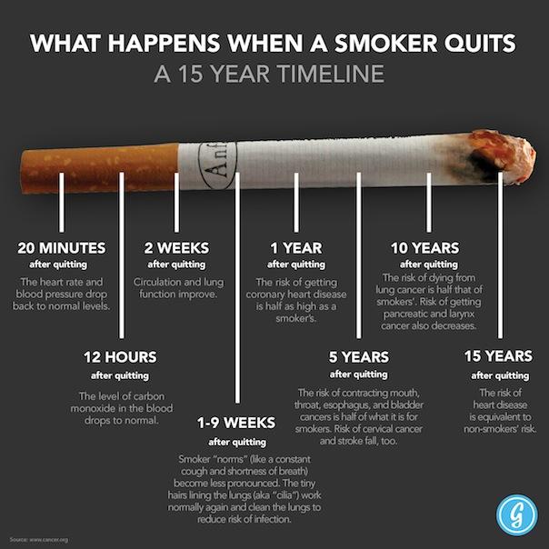
Allan Hansen sends in this infographic from Greatist, showing the benefits of quitting smoking

Smokers-Timeline-1

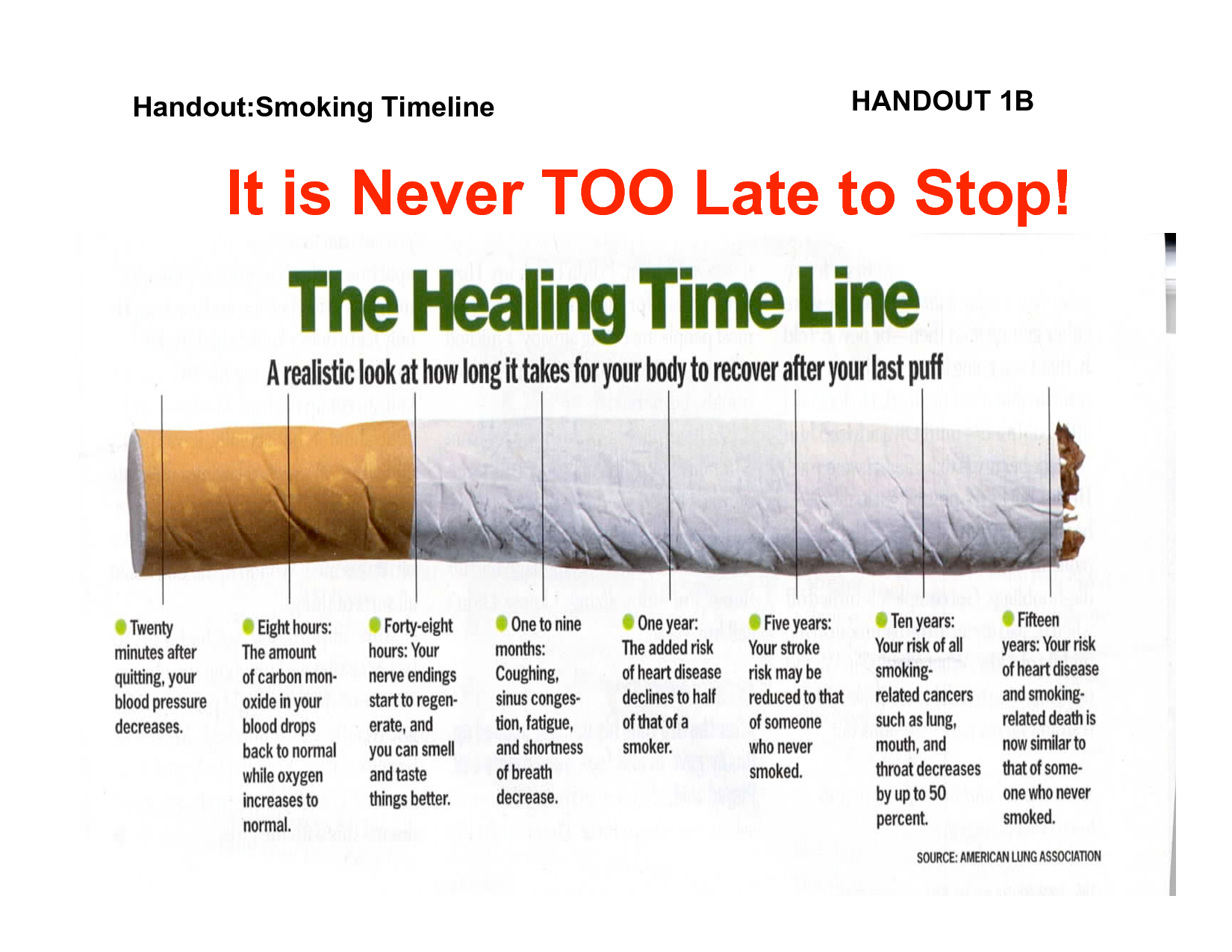
He points out the non-linear time scale — equally spaced intervals range from 20 minutes to five years.  It’s also a bit strange that time progresses in the opposite direction to the burning of the cigarette — perhaps it should have been flipped left to right.

Other versions of this information are common, and they nearly all have the same nonlinear time scale

Smoking-timeline-2smoking_times-3smoking-timeline-4Smoke Timeline-5


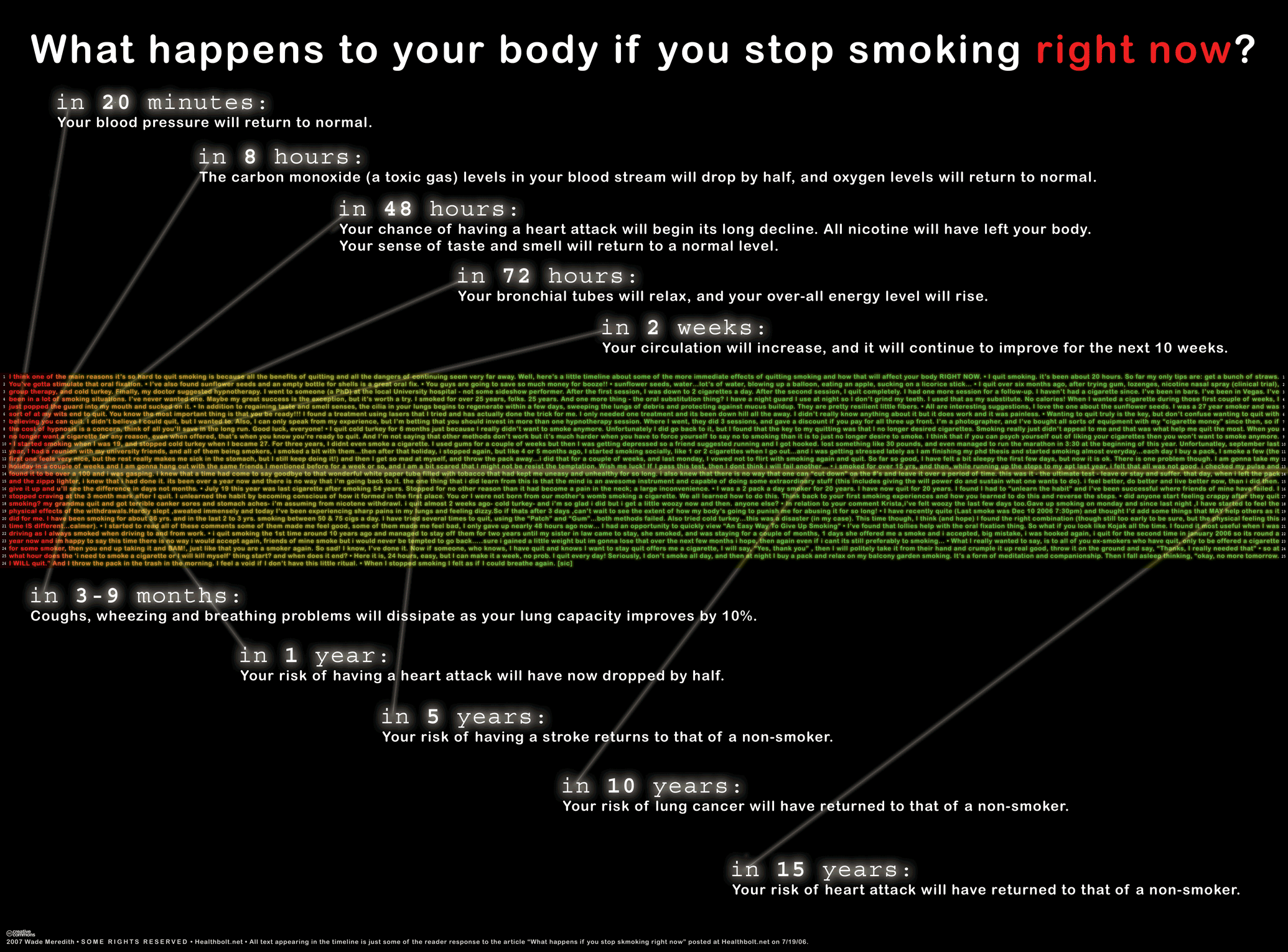
One notable exception is from Blisstree, where the evenly-spaced text is linked to accurately-scaled times by lines.  This graphic also avoids the direction-of-burning problem, using comments from former smokers as the background.

smoking_timeline_2070x1530

June 3, 2013

The research loophole

We keep going on here about the importance of publishing clinical trials.  Today (in Britain), the BBC program Panorama is showing a documentary about a doctor who has been running clinical trials of the same basic treatment regimen for twenty years, without publishing any results. And it’s not that these are trials that take a long time to run — the participants have advanced cancer. If the treatment was effective, it would have been easy to gather and publish convincing evidence by now, many times over.

These haven’t been especially good clinical trials by usual standards — not randomized, not controlled — and they have been anomalous in other ways as well. For example, patients participating in the trial are charged large sums of money for the treatment being tested (not just for other care), which is very unusual.  Unusual, but not illegal.  Without published evidence that the treatment works, it couldn’t be sold outside trials, but it’s still entirely legal to charge money for the treatment in research. It’s a bit like whaling.

According to the BBC, Dr Burzynski says it’s not his decision to keep the results secret

He said the medical authorities in the US would not let him release this information: “Clinical trials, phase two clinical trials, were completed just a few months ago. I cannot release this information to you at this moment.”

If true, that would be very unusual. I don’t know of any occasion when the FDA has restricted scientific publication of trial results, and it’s entirely routine to publish results for treatments that have not been approved or even where other research is still ongoing. The BBC also checked with the FDA:

But the FDA told us this was not true and he was allowed to share the results of his trials.

This is all a long way away from New Zealand, and we can’t even watch the documentary, so why am I mentioning it? Last year, the parents of an NZ kid were trying to raise money to send him to the Burzynski clinic, with the help of the Herald.   You can’t fault the parents for trying to buy hope at any cost, but you sure can fault the people selling it.

Wikipedia has pretty good coverage  if you want more detail.

June 2, 2013

Making data meaningful

A guide from the UN Economic Commission for Europe

  1. A guide to writing stories about numbers
  2. A guide to presenting statistics
  3. A guide to communicating with the media

And for local examples, check the @StatisticsNZ Twitter feed


[update: link fixed]

Submissions are for reading, not counting

The Herald, writing about Hamilton’s pending removal of fluoridation from their water supply

A Hamilton City Council tribunal examining the topic has re-ignited intense public debate on the issue, with 89 per cent of the 1,557 submissions made to it in favour of stopping fluoridation. In 2006, 70 per cent of residents who voted in a referendum backed fluoride.

This actually isn’t evidence or even a suggestion of a change in opinion. All we can tell from the numbers is that 1386 people now want fluoride removed.  Public submissions are useful qualitatively, not quantitatively.

It may be true that the people of Hamilton don’t want fluoride in their water, in which case I think they are unwise, but it’s their problem. Confusing self-selected numbers with referendum votes  isn’t going to help determine what they want, [and neither is the exclusion from voting of three of twelve council members on the grounds that they also sit on the DHB and so have thought about the issues before]