Posts written by Thomas Lumley (2645)

avatar

Thomas Lumley (@tslumley) is Professor of Biostatistics at the University of Auckland. His research interests include semiparametric models, survey sampling, statistical computing, foundations of statistics, and whatever methodological problems his medical collaborators come up with. He also blogs at Biased and Inefficient

June 1, 2013

Statistical criticism with teeth

Andrew Dillnot has the dream job for a statistics blogger — he is responsible for telling British MPs and government departments that their misrepresentations of official statistics are naughty.  From a Guardian story

But the big number was – there is no other word for it – a lie. Dilnot, now responsible for protecting the integrity of official statistics, exposed it as a lie this week, albeit using mild Whitehall language in letters to Shapps and Iain Duncan Smith, the work and pensions secretary. The 878,300 alleged malingerers had never received incapacity benefit. They were new claimants, aggregated over three-and-a-half years. Many (probably most) withdrew their claim because they recovered from their condition or found a new job. In 2011-12, out of 603,600 established benefit claimants referred for the new medical tests, just 19,700 (3.3%) withdrew before taking them. That figure – which most of us would think small – represented the true scale of people pretending to be sick.
 

Information and its consequences, on BBC radio

From BBC Radio: listen online

On Start the Week Emily Maitlis talks to the Executive Chairman of Google, Eric Schmidt about the digital future. A future where everyone is connected, but ideas of privacy, security and community are transformed. Former Wikileaks employee James Ball asks how free we are online. The curator Honor Harger looks to art to understand this new world of technology. And worried about this brave new world? David Spiegelhalter, offers a guide to personal risk and the numbers behind it.

(via @cjbayesian)

Briefly

Science communication fightback edition

  • “Archaeologists Officially Declare Collective Sigh over Paleo Diet” –FRANKFURT- In a rare display of professional consensus, an international consortium of anthropologists, archaeologists, and molecular biologists have formally released an exasperated sigh over the popularity of the so-called “Paleo Diet” during a two-day conference dedicated to the topic.
  •  Technocrats and Big Data:  It was especially interesting to see how this second guy reacted when the single somewhat thoughtful and informed Congressman, whose name I didn’t catch because he came in and left quickly and his name tag was miniscule, asked him about whether or not he taught his students to be skeptical. The guy was like, I teach my students to be ready to deal with big data just like their employers want. The congressman was like, no that’s not what I asked, I asked whether they can be skeptical of perceived signals versus noise, whether they can avoid making huge costly mistakes with big data. The guy was like, I teach my students to deal with big data.
  • Artist Creates Portraits from DNA. Scientists say “That’s Impossible”. But though our genetic privacy may not be safe, our faces probably are.  Dewey-Hagborg’s portraits may rarely resemble the people whose DNA she’s using to generate them. The whole thing — most disturbingly the fact that she’s been contacted by law enforcement officials — shows how ill-prepared we are for dealing not only with what biotech may do in the future, but for what biotech can do now. She needs to work at making her message clearer. 
May 29, 2013

More on design of graphics

Since it’s clearly Night of the Living Data here, another link on data visualisation (via @zentree), a long essay from Bret Victor  “Magic Ink: information software and the graphical interface”

A person experiences modern software almost exclusively through two channels:

  • She reads and interprets pictures on a screen.
  • She points and pushes at things represented on the screen, using a mouse as a proxy finger.

Thus, software design involves the design of two types of artifact:

  • Pictures.
  • Things to push.

These are not brave new realms of human endeavor. We share the blood of cavemen who pushed spears into mammoths and drew pictures of them in the living room. By now, these two activities have evolved into well-established design disciplines: graphic design and industrial design.

The software designer can thus approach her art as a fusion of graphic design and industrial design. Now, let’s consider how a user approaches software, and more importantly, why.

(and even if you aren’t a dataviz enthusiast, someone whose hypothetical example books are called ‘Waiting for Good Dough”, “The Bun Also Rises”, and “Yeast of Eden”, is definitely worth reading)

Good information display

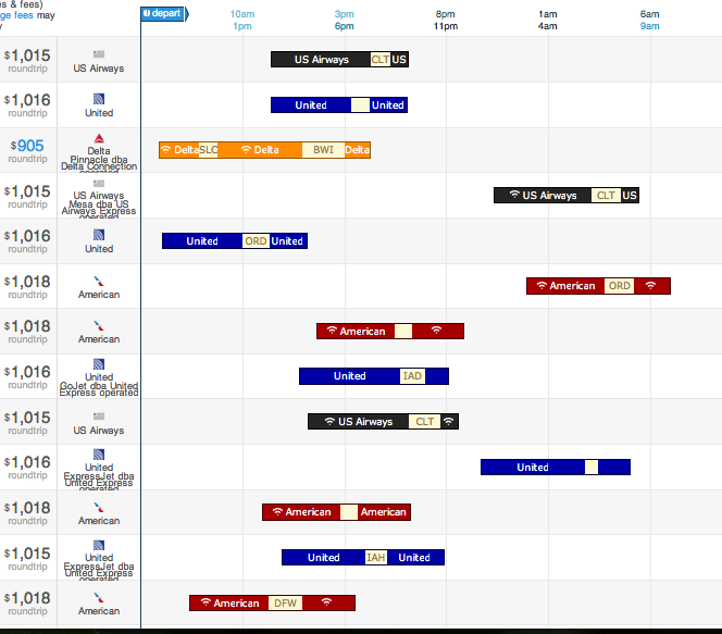
Recommended by Noah Iliinsky (@noahi), via @keith_ng, a display from the US travel-booking site Hipmunk (click to embiggen)

hip


The bars display options for, in this case, a flight from Seattle (where I used to live) to Raleigh, NC, where the Environmental Protection Agency lives.  The coloured segments are flights; the pale segments are layovers (labelled with the airport).  The colour indicates the airline, and there are also symbols indicating availability of WiFi on the plane.

From the graph you can see at a glance that there’s no good way to get from Seattle to Raleigh, but also what all the options are.

Noah Iliinsky also has relatively sparse blog (Complex Diagrams) and gives a lot of talks.  A good short one is “Data Visualizations Done Wrong”, where he does a lot of the easy pointing and laughing, but also talks about the relationship between the structure of information and its display.

Best place to live

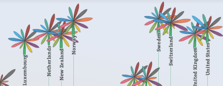
The Herald has a big spread on the OECD Better Life Index today — the graphics don’t show up in the online version, so I didn’t notice initially.

As long-time readers will remember from two years ago, the best thing about the OECD data is that their website lets you see what rankings result from giving different importance to different parts of their survey.  For example, New Zealand does well overall, but does relatively poorly on income, so its ranking is quite sensitive to how important you think income is.

This year’s interactive website is here (the Herald, sadly, doesn’t link). Go play.

daisies

Two graphs, three trends

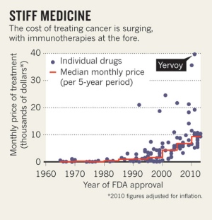
First, the serious one.  Nature News has a story about new immune-based cancer treatments (like Herceptin for breast cancer), some of which are very effective, but which are increasingly expensive.  In contrast to previous `small molecule’ drugs, these won’t necessarily get cheap when the patent runs out, since generic  (technically, `biosimilar’) versions are harder to make and test.

ASCO-cancer-graph


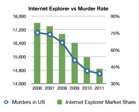
Now for something completely different

iemurder


By @altonncf — via various people on Twitter who don’t cite original sources. Pro tip: Google Image Search is quite good at finding originals.

More on communicating with journalists

Two physicists (and long-time bloggers) responding to Ed Yong’s post on how to talk to journalists:

Chad Orzel

As a physicist, I’m fond of simple universal principles from which all other results are derived. When a journalist is interviewing a scientist for a story, I think the important underlying idea is that each is doing the other a favor. A quote from a prominent scientist will make a story better, but it’s not an absolute requirement, and there’s certainly no obligation to deal with any particular scientist. Being quoted in a media report about some new discovery incrementally raises a scientist’s profile, but the only concrete benefit is providing a clipping that your parents might read.

..

The temptation for each party in this situation is to try to push as much of the work to the other as possible, and that’s where most advice from journalists to scientists (or vice versa) fails. Each side treats the conventions of their particular profession as immutable laws of nature that the other must adjust to accommodate. Even when offered with the best of intentions, as with Ed Yong’s post last week, the advice ends up sounding one-sided: “Here’s what you need to do to work with me.”

Tim Swanson:

There’s a reason you should take some of the advice in Ed Yong’s post with a grain of salt (as I’ve come to realize over several years of hearing or reading advice from Ed): because it comes from Ed Yong. Now, let me explain — this isn’t a dig at Ed. Quite the opposite. He’s an excellent science journalist, and the tips he gives other science journalists about journalism is quite good. But this is a different subject, and given that there are a lot of journalists out there, you probably aren’t going to be asked for commentary from Ed Yong.


May 28, 2013

Analytics is beating statistics

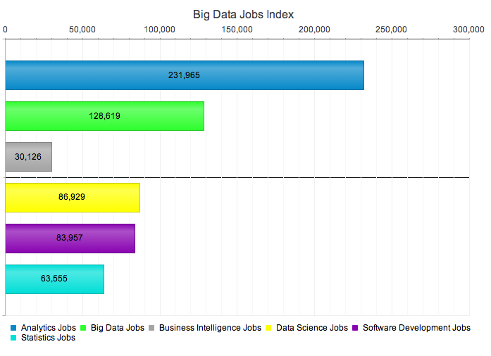
icrunchdata, which is a data-related jobs site, has introduced what it is calling the Big Data Jobs Index

crunchy


If you believe the numbers, it looks as though analytics is way ahead in the synonym game, followed by data science, but at least statistics is still ahead of business intelligence. And at least this is a bar chart, though not an index in any usual sense of the term.

The company describes Big Data as having ‘fueled one of the most hyper-growth niches of employment in a century’, but since their projection is for the sector to grow to nearly 1% of the US job market by 2015, we clearly need to be careful of the definition of fast growth

May 27, 2013

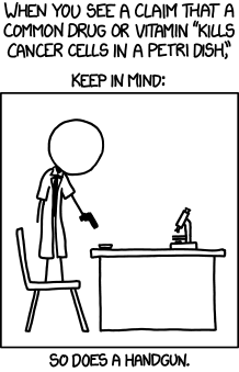
Kills cancer cells