Posts written by Thomas Lumley (2645)

avatar

Thomas Lumley (@tslumley) is Professor of Biostatistics at the University of Auckland. His research interests include semiparametric models, survey sampling, statistical computing, foundations of statistics, and whatever methodological problems his medical collaborators come up with. He also blogs at Biased and Inefficient

November 11, 2012

Point A to Point B

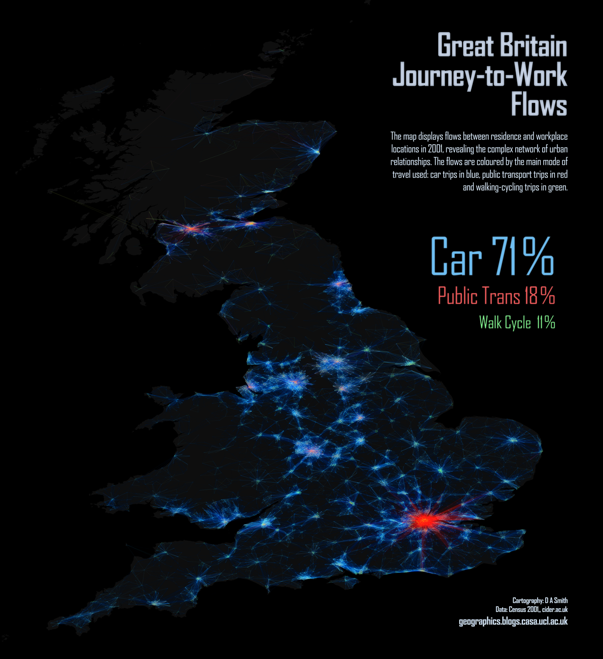
From the Mapping London blog, a picture of commuter flows in Great Britain. The difference in public transport use between London and the other cities is dramatic.  They have lots of other maps, including one of language use in London based on Twitter messages.  That would be interesting to do for NZ cities.

XKCD misfire

The comic XKCD is usually spot-on in statistical commentary, but the most recent attempt doesn’t really work.  There’s a tendency for people who learnt frequentist statistics from bad textbooks and Bayesian statistics from good statisticians to think it’s the philosophy that makes the textbook bad, rather than the textbook that makes the philosophy bad.

I might be considered biased, so I’m outsourcing the details of this complaint to a well-known Bayesian statistician

What do people tweet all day?

We saw the American Time Use Survey earlier this week, but a paper has just been published using a different source of publically-available time use data.

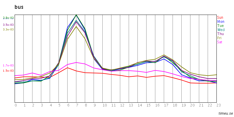
The site timeu.se collects information from Twitter and parses it to extract activities. For example: bus

On weekdays lots of people catch the bus in to work, and then teleport home. Or perhaps commuting home is just less tweet-worthy.

In any case, the data could be useful for picking up strong trends.  The new paper is about migraines, using time-of-day data from the website. The researchers found the expected differences between men and women, and between workdays and weekends/holidays, and the expected early morning peak, suggesting that tweet-mining at least isn’t completely bogus.

Numbers don’t have to make sense?

Stuff is reporting that Vodafone (who sell communications, including specific teleworking products) has done a survey about working from home in NZ.

As usual, we don’t know how the survey participants were recruited, just that they were “476 people of all ages, regions and industries.”  If they really were from all industries, it’s not surprising that many of them didn’t work from home: it’s pretty difficult for a barista, or a hospital nurse, or a factory worker, or a forester.  Anyway, in this case the big problem is that we don’t have the questions, so it’s hard to work out what’s actually going on in the apparently contradictory responses.  For example

  • 61 per cent reported they couldn’t work away from the office because their manager liked to be able to “brief off work” immediately
  • 37 per cent of people felt their managers were not supportive of them working away from the office.

So, by subtraction, at least 24% of people couldn’t work away from the office because of their manager’s working style but still felt that their managers were supportive of them working away from the office?  As the story points out, we also don’t know whether the managers really were opposed to people working from home, or whether the employees just thought they were.

Comparing this survey to last week’s Randstad survey reported in the Herald, we see that the Randstad survey found “67.89 per cent said the option of working from home was either appealing or very appealing.”   (No, I don’t know why the Herald quoted the results to the nearest tenth of a respondent) but the Vodafone poll found “77 per cent of people saying that if they were changing jobs, the ability to work from anywhere would make the job more attractive.” Clearly, sampling error is not the biggest problem in interpreting these surveys.

The last line of the Stuff story is “Meanwhile, 42 per cent of people, who worked away from the office regularly, said they often did overtime.”  As written, this says 42% worked away from the office regularly, which seems to contradict the earlier results and the general tone of the story.  Here I don’t think it’s the survey’s fault. It seems more likely that an editing error added the commas and changed the implied denominator. Grammar can make a difference in statistics, too.

November 9, 2012

Treatment delivery, not just discovery

Two stories in the Herald today have the related theme of health problems where we know the answer in theory, just not how to get it done in practice.

Prof. Norman Sharpe, from the Heart Foundation, describes NZ’s record on rheumatic fever as ‘shameful’.  I’d put it differently. NZ’s record on child poverty is shameful. The record on rheumatic fever is embarrassing.  Rheumatic fever is an anachronism. You couldn’t even put it in a soap opera nowadays.  It’s the sort of obscure historical disease that appears in ‘House‘.

Economic inequality is a major reason why the underlying infections spread widely in some subsets of Kiwi kids, but that isn’t the whole story.  The US and the UK have child poverty, but they don’t have rheumatic fever.  Rheumatic fever is an autoimmune reaction to untreated streptococcal throat infections.  Unlike many infectious diseases where antibiotic resistance is a problem, these streptococci are uniformly susceptible to ordinary penicillin. The cost to Pharmac of a 10-day course of penicillin is about $5,  but we obviously haven’t managed to set up an infrastructure that will reliably get the treatment to the kids who need it.

The other story had the slightly-misleading lead

Letting children out to play on their own could do a lot more to combat obesity, rather than structured exercise, a study shows.

The study actually looked about attitudes to ‘active play’ and ‘physical exercise’ in kids and families in a South Auckland school. The researchers found that ‘physical exercise’ was regarded as healthy, but active play was regarded as fun.  They suggest that encouraging kids to play outside in an unorganised way would be a more effective way of getting them to exercise.  We don’t know if this will actually work, but it is targetting the right part of the problem.  We know that exercise improves health, we just don’t know what to do to get people to exercise.


[Update: On Twitter, @dr2go says NZ isn’t an outlier.  That’s true for NZ as a whole, and the rates in Pakeha are similar to those in US whites.  I don’t think it’s true for Maori or Pacific children,  where the rates are higher even than US minority groups had in the 1960s (reference), and there’s been a big decline since then]

November 8, 2012

Journalism and data analysis

The occasion is Nate Silver and the data-based predictions of the US election, but Mark Coddington raises a much more general point about the difference between ways of knowing things in journalism and science.

The journalistic norm of objectivity is more than just a careful neutrality or attempt to appear unbiased; for journalists, it’s the grounds on which they claim the authority to describe reality to us. And the authority of objectivity is rooted in a particular process.

But science finds things out differently, so journalists and scientists have difficulty communicating with each other.  In political journalism, the journalist gets access to insider information from multiple sources, cross-checks it, evaluates it for reliability, and tells us things we didn’t know.  In data-based journalism there aren’t inside secrets. Anyone could put together these information sources, and quite a few people did.  It doesn’t take any of the skills and judgment that journalists learn; it takes different skills and different sorts of judgment.

TL;DR: Political journalists are skeptical of Nate Silver because they don’t understand and don’t trust the means by which he knows what he knows. And they don’t understand it because it’s completely different from journalists have always known things, and how they’ve claimed authority to declare those things to the public.


99% punctuality

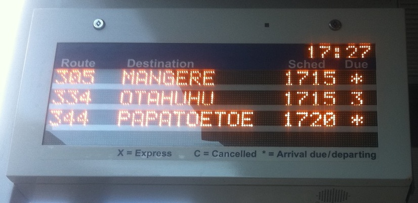
There are new bus prediction boards at some stops (this one is in Newmarket), which show the scheduled time and the estimated time to arrival.

The most obvious benefit of these is that you can verify how the prediction system is unreasonably optimistic for buses still a long way off and then gets more realistic as they approach.  They also make clear how detached from reality the official punctuality statistics are.

Our only source of punctuality data for the 99%+ figures that keep getting reported is the companies themselves, and the definition of punctuality (the bus is no more than 5 minutes late at the start of the route and doesn’t get abducted by aliens on the way) is so useless that (pace Brian Rudman  and others) the companies would hardly need to lie about it.

Given that Auckland Transport thinks it knows where the buses are, it wouldn’t be too hard to switch to a meaningful definition: something like “proportion of specified timetable points where the bus is no more than 5 minutes late or 1 minute early”.  The figures would be lower, but that’s ok.  It’s hard to run buses to a tight schedule through a congested central city, and some of them will be late.  But you’re not going to get on-time arrival at bus stops by monitoring on-time departure at the start of the route.

I’d also note that the new bus prediction boards have missed a big opportunity.  According to the sign, the asterisk indicates that a bus is about to arrive.  Since the sign displays the scheduled time, they could have used the asterisk or some other symbol to indicate that the system didn’t currently have reliably location information for that bus.  It’s obvious that sometimes the system is using actual locations and sometimes it’s just relying on the timetable, and telling us what is going on would make it measurably less annoying when the time counts down to zero and no bus appears.

November 7, 2012

Now that’s over with

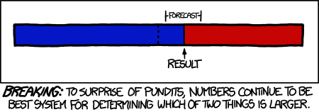
XKCD:

Compact and contiguous

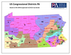
Another random note on the US elections: the Congressional districts have been redrawn after the 2010 Census. In most states, this is done by the incumbent state government.   In a perfect world, the possible electoral advantages wouldn’t affect the boundaries.  As an example, look at the Pennsylvania map (especially districts 7 and 12)

Article II, Section 16 of the Pennsylvania Constitution says that the Commonwealth’s 50 senatorial districts and 203 representative districts “shall be composed of compact and contiguous territory as nearly equal in population as practicable.” It also says that “Unless absolutely necessary, no county, city, incorporated town, borough township or ward shall be divided in forming either a senatorial or representative district.”   


Briefly

  • Stuff has a story about real estate that goes beyond nominal prices and has meaningful comparisons with the past (based on ratios to average household disposable income)
  • If you want somewhere to obsessively follow the US election, there’s live blogging at fivethirtyeight.com
  • The Washington Post looks at Google trends for the query “who is running for president?”
  • Stuff has a story about studies of multivitamins, reporting that they didn’t find the health benefits they were looking for, and then concluding “The bottom line: Dietary supplements have varied effects, and whether one is right for you may depend on your personal health profile, diet and lifestyle.” You could have said that (more convincingly) without the research