Posts written by Thomas Lumley (2645)

avatar

Thomas Lumley (@tslumley) is Professor of Biostatistics at the University of Auckland. His research interests include semiparametric models, survey sampling, statistical computing, foundations of statistics, and whatever methodological problems his medical collaborators come up with. He also blogs at Biased and Inefficient

November 6, 2012

What do people do all day?

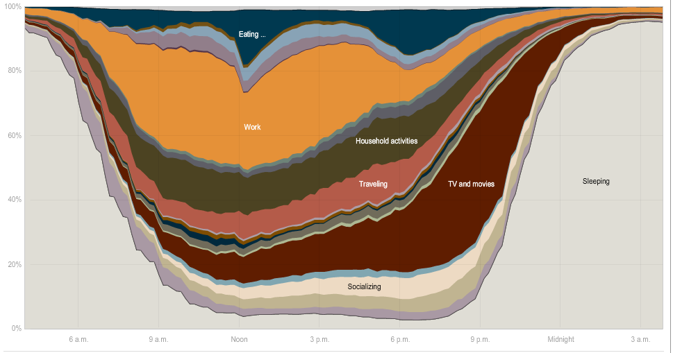
An interactive graphic from the New York Times, using data from the American Time Use Survey, where a representative sample of people is phoned up and asked what they did the previous day.

Compare the NY Times graphic to the charts produced by the Bureau of Labor Statistics, which are much less fun to explore, but do present some useful comparisons in simple formats.

November 5, 2012

Australians follow US lead

That’s lead, Pb, the element. The Herald has a headline “Dangerous lead levels in Aussie kids – experts”. The article says

Health experts are calling for new national guidelines amid fears that up to 100,000 young Australian children could have dangerously high levels of lead in their blood.

 but near the end of the piece

There is no recent data for lead levels in Australian children, so the figures were estimated using US exposure rates and applying them to the Australian population.

That seemed a bit strange, so I checked in the original journal letter, and, yes, it says

The potential risk of low lead exposure in Australian children can be estimated using US exposure rates and Australian population data. About 7.4% of US children aged 1–5 years have a blood lead level above 5 μg/dL. Applying this rate to Australian children aged 0–4 years suggests that about 100 000 may have blood lead levels associated with adverse health outcomes.

There will be a lot of uncertainty in extrapolating a US average to an Australian average, since there is a lot of variation within the US (or at least, there was ten years ago). And a fairly recent UK study (paper) found 27% of participating children had blood lead over the 5 μg/dL, though the rates in the UK may be higher due to older houses.

As context, It’s also worth pointing out that those of us who grew up before unleaded petrol all had ‘dangerously high levels of lead’ in our blood — lead exposure has plummeted since unleaded petrol, and the concern is just that the fall is slowing down. The adverse effects of lead are real, but the exposure isn’t new.

But more importantly, if 7.4% of Australian children are at risk based on extrapolation from US figures, there is just as much evidence that 7.4%  of Kiwi children are at risk, something you would have thought the Herald might mention.

Does it work? Does it matter?

The new proposed law for ‘natural remedies’ will provide some limits on health claims: they must be supported by scientific evidence or traditional evidence.  It’s depressing that this has to be considered an improvement over the current situation.  It’s also unfortunate that there is a special exemption for the largest category of health claims that have support neither from tradition nor science: homeopathic remedies (invented in 1796).

If ‘traditional’ evidence required a tradition of use of the product in essentially the form being sold and for essentially the indication being marketed, I wouldn’t object.  So, for example, it’s reasonable to say that ginger has been used traditionally in China to stop coughing, because it has. Many people would consider this sufficient reason to buy and use ginger for coughs, and I don’t see why there’s a vital national interest in deterring them.  What should be stopped is the ability to claim that a treatment is known to work simply because it has been traditionally used, and the ability to make up new ‘traditional’ uses for marketing convenience.

In the end, the impact of the law will depend on regulations and enforcement, not on statute.

Requiring ‘scientific evidence’ won’t get us very far without standards for the level of evidence required.  As StatsChat readers know, a huge variety of plant extracts have been shown to kill cancer cells in test tubes, or affect biochemical measurements in cell cultures. Newspapers are willing to take this as sufficient basis for stories and headlines claiming ‘can prevent cancer’ or ‘is helpful in treating diabetes’. If the proposed Authority takes a similar view, almost anything will be allowed.

Enforcement is also critical.  In theory, the US requires vendors to have scientific evidence for claimed health effects of natural remedies, but in practice they can get away with almost anything, because the FDA doesn’t have the resources for enforcement and there’s no practical way for private citizens to act. At the moment, the NZ Advertising Standards Authority has the ability to remove ads making health claims for which the vendor cannot supply evidence, and they have the willingness to act on public complaints from anyone who is unhappy about misleading health claims. The new law’s requirement for prior notification of health claims could strengthen enforcement, or weaken it, depending on how the requirement for evidence is interpreted.

November 4, 2012

More Hurricane Sandy scale

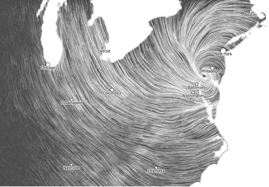
This wind map (click to embiggen) is from hint.fm, who we’ve linked to before.  It shows the national short-term forecast wind grid, just after Sandy crossed the coast.  For scale, the distance between Boston (top right) and Charlotte (bottom) is almost exactly the distance between Auckland and Invercargill

November 3, 2012

Nerdnite again

It’s Nerdnite time again, Tuesday night, 6:30pm, at Nectar (470 New North Rd, above the Kingslander).

The speakers this time:

  •  Cather Simpson, director of the Photon Factory, on lasers
  • Matthew Dentith, epistemologist, on conspiracy theories
  • Mike Dickison, giant flightless bird fancier, on why birds aren’t larger.

Incidentally, if you aren’t one of the 58273 people who have seen Mike Dickison’s hilarious presentation “Paedomorphic flightlessness and taxonomic affinities of an enormous Recent bird”, what are you waiting for?

Can we have some CPI adjustment?

Once again, NZ homes are at record nominal asking prices.

The real estate industry doesn’t make it easy to do inflation adjustment, but according to this, the average asking price in May last year of $429k  was 2% above the previous month and ‘just topped’ the October 2007 level that was when Realestate.co.nz started publishing the statistic. That means the October 2007 national average asking price was between $420k and $429k.

Suppose you bought a house in October 2007 for $420k and sold it now for the national average asking price of  $445,529.  Those 2007 dollars are worth about $479k  in today’s money, so you would have lost 8%, or about $34,000 in 2012 dollars.   That’s before taking into account maintenance, insurance, interest, and transaction costs.  The conclusion is about the same if you compare to an index of average wages: all these are helpfully provided by the Reserve Bank’s inflation calculator.

The comparison for Auckland may be more favorable — I can’t find what the 2007 average asking price was, but if it was below $535000, then we are at a new peak (or the top of a new bubble).

In May last year, Stuff had a good article on house prices and inflation, and even an infographic that told you more than ‘up’ or ‘down’, but that seems to have been an exception.

November 2, 2012

I’m normal, you’re normal

Frances Woolley at Worthwhile Canadian Initiative has another fascinating graph.  This one’s based on US data from the World Values Survey, where people were asked which income decile they are in:


As she describes, it doesn’t seem to be that the survey has accidentally undersampled the poor and the rich.  People seem to be deluded about where their income fits in the national distribution.

There are a number of possible explanations.  At the high end, there is the fact that people with more money than you are more visible, so it’s easy to overestimate how many of them there are.  At the low end, part of the explanation may be that young people whose family income has been higher in the past and will be higher in the future place themselves higher up in the distribution. The obvious example is university students, who in some ways behave more like their parents than like non-students with similar household income.

Part of it, though, is that people just overestimate how normal they are, just as  you (and I) probably overestimate how many people care about statistics in the media.

What a 72% chance means

For those of you who have been living in a cave on Mars with your eyes closed and your fingers in your ears, the US is having a presidential election.

Nate Silver, a former baseball nerd who has climbed to fame by computing averages of opinion polls, said earlier this week that  Obama had a 72% chance of winning.  Old-fashioned political pundits disagreed, saying the race was too close to call (they also accuse Silver of just computing averages of opinion polls).

Andrew Gelman, a stats professor at Columbia University, has an opinion piece in the New York Times explaining what 72% means:

What I’m saying is that I can simultaneously (a) accept that Obama has a 72 percent chance of winning and (b) say the election is too close to call. What if the weatherman told you there was a 30 percent chance of rain — would you be shocked if it rained that day? No.

For Kiwi readers, a useful analogy might be rugby.  The All Blacks have beaten Australia in 70% of their games overall, and 75% in NZ.

November 1, 2012

A small insight

Surveys really are the best way to get free advertising space.

Speight’s did some sort of survey of Kiwi men, and it’s turning up all over the place. They asked 504 men some incompletely described set of questions with no hint as to how they were selected.

Highlights of the results:

  • A staggering 97% claim they would pay the correct amount of money when buying from an honesty box.  We can conclude that men who are financially dishonest also lie on surveys.
  • Just over 80 per cent said they would help a stranded motorist on the road, but in Otago only 76 per cent said they would stop to lend a hand.  If there are 504 respondents across the country, you might wonder if there are enough in any one region to distinguish 76% from 80%.  No way.

The press release quotes Anna Gestro from Speight’s as saying  “The Speight’s survey is a small insight into the Kiwi male psyche.” 

How small? Very, very small.

October 31, 2012

Diet story with added fizz

According to Stuff, a Japanese research study has found that sugary drinks cause strokes. In women, not men (they found a weak association in the opposite direction in men).  And only strokes, not heart disease. And when they say “sugary”, this isn’t based on the sugar content, since 100% fruit juices were excluded.   The researchers have some fairly unconvincing excuses for why only strokes were increased, and only in men.

The headline was “Female? Put down the fizzy drinks”, which manages to capture the implausible part of the findings while getting the plausible part completely wrong: the research looked at drinks with added sugar, not drinks with added fizz.

The story does better than the headline, at least putting the research in context with the other findings that suggest the impact isn’t restricted to strokes in women. They also quoted an expert from the Cleveland Clinic, who sensibly ignored most of the details of the study findings and said:

”It makes sense, if (sugar sweetened beverages) increase the risk for obesity, diabetes, insulin resistance, inflammation, then it should, in fact, raise the risk for cardiovascular disease, and that’s what we’re seeing,” said Adam Bernstein, a researcher at the Cleveland Clinic, who was not involved with the study.

Other sources did far worse than Stuff. For example, the site Food Navigator completely misrepresented the results, saying that “one fizzy soft drink per day could bump up the risk of stroke by up to 80%”, when the actual figure in the abstract is 21% for total stroke (something that they got right later in their story). They also said the risk was increased in men, which is the opposite of what the paper says, and that the participants were all between 40 and 49, when in fact they were between 40 and 59 at the start of the study and between 58 and 77 at the end of the study.

The really interesting question is why this study, which doesn’t actually add much to what we already know, has made global news.  We’d have to ask Reuters about that.