Posts written by Thomas Lumley (2645)

avatar

Thomas Lumley (@tslumley) is Professor of Biostatistics at the University of Auckland. His research interests include semiparametric models, survey sampling, statistical computing, foundations of statistics, and whatever methodological problems his medical collaborators come up with. He also blogs at Biased and Inefficient

October 6, 2012

Statistics conspiracy theories

This week, the  US Bureau of Labor Statistics issued a new jobs estimate that was more favorable than the previous one: good economic news, for a change.

Since the US is in an election campaign (as it is about half the time), a few conspiracy theorists came up with the idea that the new jobs weren’t real, but were part of a plot to re-elect the President.  The theory comes in two flavours: either that unemployed Democrats all over the country lied about having part time jobs in order to improve Obama’s position, or that the Bureau of Labor Statistics faked the numbers.

The idea that millions of people have just now, for the first time, decided simultaneously to pretend to have jobs collapses under its own weight. The idea of an official statistics conspiracy makes sense only if you don’t know anything about the Bureau of Labor Statistics.

Well-run official statistics agencies, such as the US and Canadian ones (and Stats NZ) are set up to make it hard for the current government to fudge the figures.  Even for something much less important than the employment figures, attempts by the White House to change the results would, at the minimum, result in senior public servants deciding to spend more time with their families or explore exciting new employment opportunities outside the government sector.  (see, for example, the Canadian census debacle)

The employment figures are guarded much more carefully, because of their impacts on politics, economics, and the financial markets.  If the Democrats, who are already ahead in the polls,  were going to risk a scandal that would dwarf Watergate, they’d want to get more out of it than three tenths of a percentage point in the unemployment rate, about 1.5 times the margin of error.
 

October 5, 2012

Colour choice by people

Two more colour links for your weekend:

  • the XKCD colour survey has colour names based on more than 200,000 user sessions and five million submitted names. (this is barney purple and this is mahogany)
  • Crowdflower has a multilingual version, though with a much smaller sample size (via)

Colour choice for computers

There are lots of resources for colour choice out there, my favorite being ColorBrewer .

Here’s an interesting article about algorithms for choosing sets of colours, for when you want clear and attractive colours, but you don’t want the same ones each time. (via)

Junk food science

One of my favorite ambiguously-hyphenated phrases, but in this example the hyphen definitely goes after the second word.

The Herald tells us (or reprints the Daily Mail telling us):

Children who eat junk food will grow up to have a lower IQ than those who regularly eat fresh, home-cooked cooked meals, a study reveals.

Childhood nutrition has long lasting effects on IQ, even after previous intelligence and wealth and social status are taken into account, according to the paper.

 You’d think from that description that the study looked at children growing up, and that they found effects of meals in the past rather than the present. And that the effects were big.  None of these is the case.

The paper (paywalled) looked at cognitive function tests and meals at ages 3 and 5 for a group of children.  The analysis found that 5-year IQ was related to meals at age 5, but not (or more weakly) to meals at age 3, and, to quote the researchers themselves

 Overall, having more often slow meals accounted for negligible amounts of variance in cognitive change.

where `negligible’ means less than 1%.

You’d also worry about other differences between families that might be associated with IQ-test performance.  The quote tells us that previous intelligence and wealth and social status were taken into account, but the ‘wealth and social status’ in the statistical models was just a single five-point scale, and there’s no way that could reliably account for socio-economic differences.

Someone who needs a trip to NZ

Matthew Yglesias, who writes a generally sensible and data-heavy opinion column at Slate, has been arguing (correctly) that US immigration policy deserves much more attention than it gets:

Imagine a counterfactual history of the United States in which we had slightly different tax and budget policies over the centuries, and you’re imagining an extremely boring scenario. Most likely, things would be about the same. But imagine a counterfactual history of the United States in which we never opened our borders to the ethnic “others” of the past—the Catholics and Jews of Eastern and Southern Europe, then more recently Asians and Latin Americans. That is a very different vision of America. Not a bad place, necessarily, but probably one that looks a lot more like New Zealand—pleasant, much less densely populated, much more focused on primary commodities, somewhat poorer, and much more monolithically focused on the originally settled port cities.

He clearly doesn’t realise that nearly a quarter of NZ residents were born elsewhere, a figure the US has not approached for at least 150 years.

Social costs and double-counting

Things that save lives often cost money, and governments and individuals around the world need to decide how much they are willing to give up in order to save one life or prevent one serious injury.  These decisions imply some value for a death prevented, and under some moderately unrealistic assumptions about how people think, you could argue that the implied values should be consistent for different decisions, giving us social costs of various policy issues.

But if you are going to say, as Stuff quotes Godfrey Bridger saying

“There’s also the enormous saving in human suffering and misery which isn’t captured in these statistics. A national road lighting upgrade is a no-brainer.”

you can’t also quote costs that do ‘capture the human suffering and misery’, such as

the estimated $1.2 billion annual cost of night-time road deaths and injuries.

The estimated $1.2 billion annual cost is for 61 deaths and 1538 injuries on the roads at night.  It’s immediately obvious that these can’t be actual cash costs — nearly a million dollars per injury — so they must include some sort of value of a life.  It’s less clear whether they also include physical and emotional pain from injuries, but if they don’t, the estimated value of a life lost must be very high.  This is one the journalists should have caught: the basic journalism rule for numbers is “if you have two numbers, do something with them”. In this case, divide them.

You can either separate out monetary and non-monetary costs, on the grounds that different people weigh them differently, or combine them, on the grounds that government spending should treat all lives the same, but you can’t have it both ways.

You could put it that way

….but why?

The Herald passes on figures from a

New Zealand is overweight – collectively the adult population weighs more than 232,000 tonnes.

But while New Zealand accounts for only 0.08 per cent of the total weight of the world adult population, it makes up 0.22 per cent of the world’s excess weight due to obesity, according to a new study.

It makes sense to talk about NZ having more than its share of carbon emissions, because this is a global resource that is valuable to everyone.  Obesity, not so much. Alternatively, it could make sense if there was a linearly increasing health risk with weight, but again there isn’t: there’s a broad low-risk region with health risks increasing dramatically at higher or lower levels.

October 4, 2012

Science communication training through blogging

Mind the Science Gap is a blog from the University of Michigan:

Each semester, ten Master of Public Health students from the University of Michigan participate in a course on Communicating Science through Social Media. Each student on the course is required to post weekly articles here as they learn how to translate complex science into something a broad audience can understand and appreciate. And in doing so they are evaluated in the most brutal way possible – by you: the audience they are writing for!

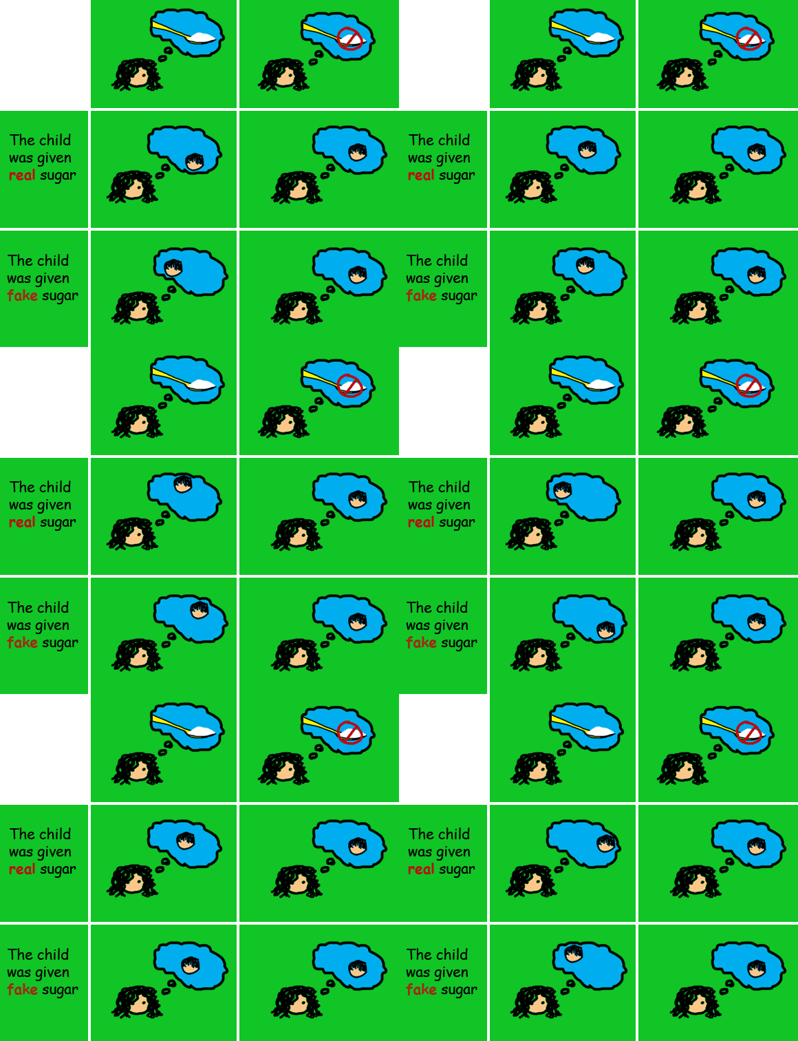
The post that attracted me to the blog was on sugar and hyperactivity in kids, not just for the science, but because someone has actually found a good use for animated GIFs in communicating information: click to see the effect, since embedding it in WordPress seems to kill it.

October 2, 2012

Fishy journalism

By comparison with NZ, the UK media are a target-rich environment for statistical and scientific criticism.  The Telegraph ran a headline “Just 100 cod left in North Sea”, and similar stories popped up across the political spectrum from the Sun to the Socialist Worker.

The North Sea, for those of you who haven’t seen it, is quite big. It’s about three times the size of New Zealand.  You’d have a really hard time distinguishing 100 cod in the North Sea from no cod.  An additional sign that something might be wrong comes later on in the Telegraph story, where they say

Scientists have appealed for a reduction in the cod quote from the North Sea down to 25,600 tons next year.

If there are only 100 cod, they must be pretty big to add up to 25,600 tons of catch. They’re not only rarer than whales, they are much bigger.

It turns out (explains the BBC news magazine) that the figure of 100 was for cod over 13 years old. The papers assumed that 13 was some basic adult age, but they should have been thinking in dog years rather than human years.  A 13-year old cod isn’t listening to boy bands, it’s getting free public transport and looking forward to a telegram from the Queen.

The government department responsible for the original figures issued an update, clarifying that the number of adult cod in the North Sea was actually about 21 million.

October 1, 2012

Computer hardware failure statistics

Ed Nightingale, John Douceur, and Vince Orgovan at Microsoft Research have analyzed hardware failure data from a million ordinary consumer PCs, using data from automated crash-reporting systems. (via)

Their main finding is that if something goes wrong with your computer, you should panic immediately, rather than being relieved when it seems to recover. Machines that accumulated at least 5 days full-time use over eight months had a 1/470 chance of a hard disk failure, but those that had one hard disk failure had a 30% chance of a second failure, and those with a second failure had nearly a 60% chance of a third failure.  Do you feel lucky?

It’s obvious that the set of computers that have a failure are basically doomed, but this still leaves open an interesting statistical question.  Does the risk of a second failure increase because the first failure damages the computer, or because the first failure picks out a set of computers that were always a bit dodgy?   I think the researchers missed something here: they tested for whether the times between failures have an exponential distribution (which is the distribution for events that don’t have any memory), and found that it didn’t.  That doesn’t distinguish between the situation where each computer has its own constant risk of failure, and the situation where each machine starts off the same but some of them have risk increasing over time.

For computers, it doesn’t matter very much which of these possibilities is true, but in some other contexts it does.   For example, if young people sent to prison are more likely to reoffend, we want to know whether the prison exposure was partly responsible, or whether these particular people were likely to reoffend anway. Unfortunately, this turns out to be hard.