Posts written by Thomas Lumley (2645)

avatar

Thomas Lumley (@tslumley) is Professor of Biostatistics at the University of Auckland. His research interests include semiparametric models, survey sampling, statistical computing, foundations of statistics, and whatever methodological problems his medical collaborators come up with. He also blogs at Biased and Inefficient

October 1, 2012

Let’s-all-panic colour scheme

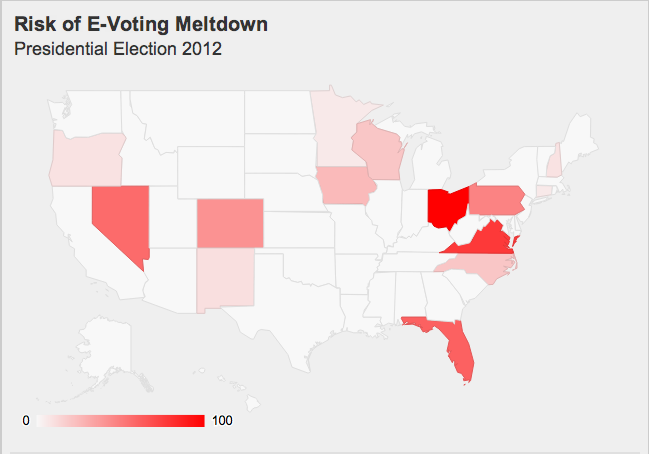
The excellent blog Freedom to Tinker, which focuses on political and social policy concerns related to computing, has an interactive graphic showing where problems with electronic voting are most likely to have a serious impact on the US election. Here’s a snapshot:


The ‘risk’ is scaled so that the top state, Ohio, is at 100. Because of the association of 100 with 100% that probably tends to exaggerate the impact, but the color scheme is worse. There’s almost no visible difference between Ohio at 100 and Virginia at 77, but Pennsylvania (47) is visibly paler than Nevada (57).  For comparison with the colour scale in the map, here’s a colour scale that tries to be uniform (a straight line in CIE Lab space)

Looking at this scale (and using a color picker program for better matching), Virginia seems to be at about 85, and Florida(61) well above 70.  So there really is a distortion of the visual impression.  The distortion probably isn’t deliberate, but comes from using linear interpolation on a scale that doesn’t match visual perception as well.

Worthless degrees

The Herald, overcoming its dislike of education league tables,  says that NZ degrees are the most worthless in the developed world

New Zealand is at the bottom of the global league tables. The net value of a man’s tertiary education is just $63,000 over his working life, compared with $395,000 in the US. For a Kiwi woman, it’s $38,000 over her working life.

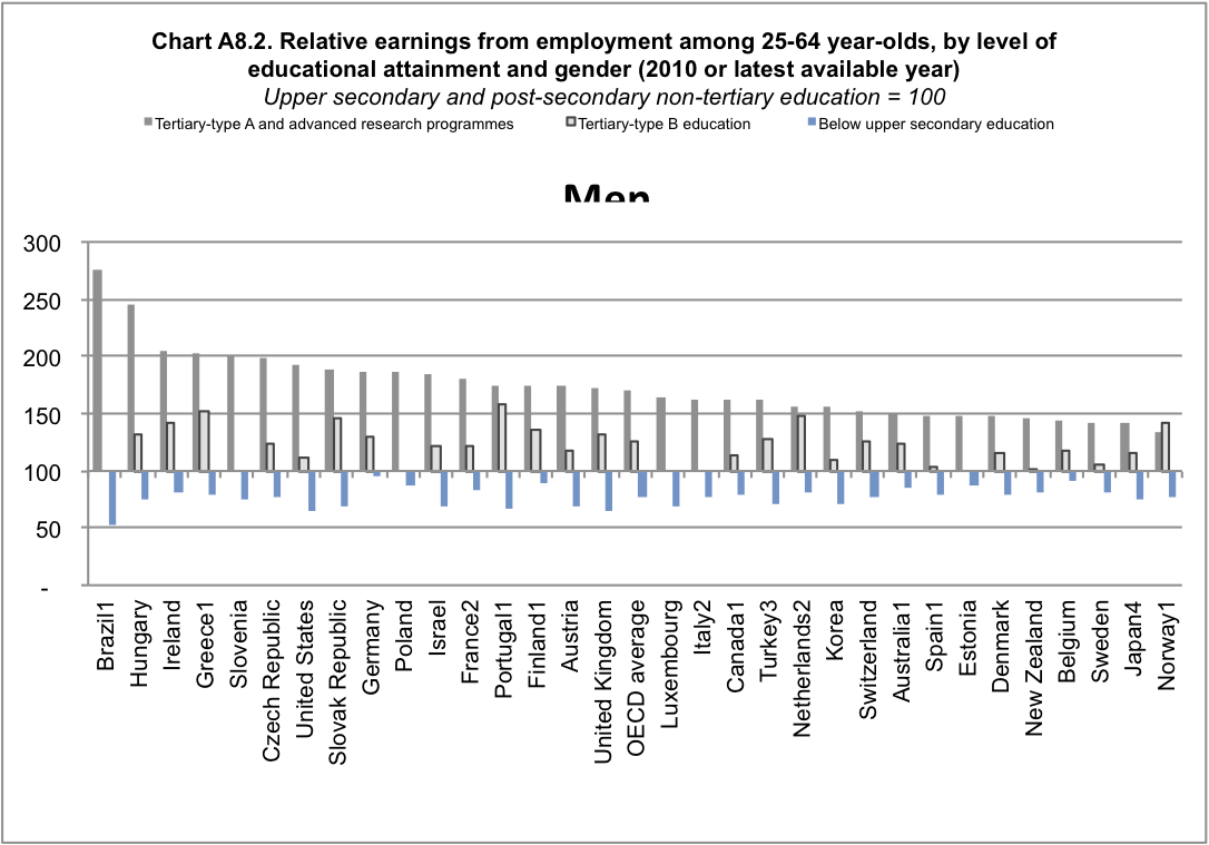
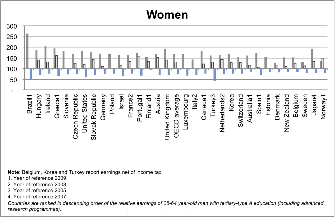
They don’t actually say what OECD report they looked at, but if you go to the OECD Directorate for Education and look at the most recent report, you can get these graphs (click to embiggen)


From the graphs, it’s fairly clear that for ‘Tertiary type-A and advanced research” degrees, NZ is not in fact at the bottom, but people with “Tertiary B-type” degrees do not seem to have any difference in income from those without degrees.  So what are these types: Type A is

Largely theory-based programmes designed to provide sufficient qualifications for entry to advanced research programmes and professions with high skill requirements, such as medicine, dentistry or architecture. Duration at least three years full-time, though usually four or more years

and Type B is

Programmes are typically shorter than those of tertiary-type A and focus on practical, technical or occupational skills for direct entry into the labour market, although some theoretical foundations may be covered in the respective programmes. They have a minimum duration of two years full-time equivalent at the tertiary level.

So, people with traditional university degrees do earn more in NZ, but people with other tertiary qualifications may well not.  It’s also important to remember that these are people in NZ with these degrees: the earnings of Kiwis who migrate overseas are not counted, but the degrees of migrants to NZ are counted even if they aren’t really recognised here.


The other interesting thing about the graph is who else is at the low end: Norway is at the bottom, Sweden and Denmark are both low.  It’s useful to think about the reasons that people with university degree might have higher incomes

  • Specific training: your degree gives you skills and knowledge that are helpful in your specific occupation
  • General training: a degree gives you transferable skills that are helpful in many occupations
  • Signalling: completing a degree shows employers that you can complete a degree
  • Stratification: higher education is a way for the wealthy to perpetuate their advantages through hiring ‘people like us’ for good  jobs

The first two of these are beneficial to the individual and to society as a whole.  The third may be beneficial to the individual, but not to society as a whole, and the fourth is actively harmful.  Among developed countries, those with low social mobility (such as the UK and the USA) have larger differences in income between those with and without degrees than those with higher social mobility (such as the Scandinavian countries).

This context sheds a different light on one of the comments quoted by the Herald

Employers and Manufacturers Association boss Kim Campbell agreed. People at the top in business weren’t paid anything near what counterparts overseas were getting because we didn’t have the big companies that paid top dollar.

A top-level executive in New Zealand would be lucky to get 10 times the entry-level pay rate, he said. In the US, it was not uncommon to get 200 times that level.

You don’t have to be a raving lefty to be dubious about this as an argument in favour of the US system.

September 28, 2012

Coincidences

There’s a been a lot of coverage around the world of the Oksnes family in Norway: three of them have won significant sums in the lottery, all three at times close to when one family member, Hege Jeanette, was giving birth.

We’ve been asked what the probability was.  This isn’t even really a well-defined question, because it’s hard to say what would count as the same event.  Presumably a different Norwegian family would still count, and probably a Chilean family.  What if the family members won near their own 30th birthdays rather than near the time their child/niece/nephew was born? Or if they’d each won on the day they graduated college? If we can agree on what counts as the same event it’s then hard to work out the probability because we’d need data on number of lottery players all around the world, and on how many of them had children.

There are some things we can compute.  Suppose that there is one lottery prize a week in Norway, and that about 1 million of the country’s 4.9 million people play.  Divide them up into groups of six people.  The chance that three prizes end up in the same group of six people over ten years would be about 1.5 in ten thousand. Extending this to the whole world, it’s pretty likely that three people in the same family have won. That doesn’t cover the pregnancy, which restricts us to three periods of a few weeks in the ten years. Suppose we say that it’s three three-week periods that would give a close enough match.  The chance of all the wins lining up with the births would be about five in a million.  So, if we specified that the coincidence had to be about giving birth, it’s pretty unlikely.

Alternatively, we could ask how likely is it that a coincidence remarkable enough to get reported around the world would happen in a lottery.  The probability of that is pretty high, and we can tell, because lots of unlikely lottery coincidences do get reported.

Finally, we could ask what is the probability that the coincidence was really just due to chance. The answer to this one is easy. 100%.

Visualising health findings

The Cochrane Collaboration are holding their annual conference in Auckland starting on Sunday.  They are a decentralised, grassroots effort to collate and summarise all randomised clinical trials, to make sure that the information isn’t buried, but is available to clinicians and patients.  The online Cochrane Library of Systematic Reviews is available free to anyone in New Zealand, thanks to funding from the DHBs and the Ministry of Health.  As with many organisations, they award a variety of prizes in their field of work.  In contrast to many organizations, one of the prizes is awarded for the best criticism of the organization’s work.

Anyway, the conference is an excuse to link to a video by the Cambridge “Understanding Uncertainty” group.  They are working on animations to further improve the summaries of health findings from the Cochrane systematic reviews.

DIY statistics

From a Herald editorial

There is much intolerance of any use of this “ropey” information. A high priesthood of data analysis bemoans news media interest, however hedged with caveats, as betraying the apple in favour of the orange. Yet the combined “wisdom of the crowd” of thousands of schools and teachers, warts and all, does suggest, for example, fewer children meet standards in writing nationally than reading or mathematics.

I, like many people, was against the use of the data for league tables, though I thought it was probably inevitable.  But if the high priesthood of data analysis has issued any edicts on analysis of the data, they forgot to copy me on the email. Perhaps it’s because I wasn’t wearing the high priestly hat.

At StatsChat we’re in favour of more people doing DIY statistics, which is why we keep linking to data sources when newspapers don’t provide them.  As with any form of DIY, though, the results will be better if you have the right materials for the job at hand.

For any given set of data there are some questions that obviously can be answered (do fewer kids meet the writing standards?), and some that obviously can’t (are the writing standards just harder?).   There are also many questions where the results will be unclear because it’s not possible to reliably separate out the huge socioeconomic effects.  For example, it looks as though Maori children perform worse than non-minority children even within the same decile, but ‘within the same decile’ is a pretty broad range of schools, and the conclusion has to be pretty weak.

September 27, 2012

Something beginning with ‘A’?

The Herald website front page asks

New Zealand has been allocated 2000 of the 10,000 places available for the 2015 dawn service at Gallipoli – guess which country gets the rest?

The guess isn’t that hard, and the allocation seems pretty fair to NZ.  Australia gets 4 times as many places. It has 4.9 times as many people now, had 5.9 times as many serving in the campaign, and 3.7 2.2 times as many died.

September 26, 2012

Betting on a sure thing

Intrade is a company that hosts betting on political events, to “tap the wisdom of crowds”.  Matthew Yglesias posted the graph below, which shows the difference between the Intrade betting percentage on “Barack Obama wins the presidential election” and “The Democrats win the presidential election”.

The spikes above zero could theoretically just about be rational — if Obama dies before the election, the Democrats could win without Obama winning — although a probability of even 1% of this seems too high.  The spikes below zero imply that Obama wins without the Democrats winning, which really isn’t conceivable.  If you bet against the Democrats winning and in favor of Obama winning (or vice versa) at the right times you could make guaranteed free money.

The problem is that Intrade is small enough that it’s not worth people with lots of money hanging on it trying to exploit minor irrationalities, even for big events like the presidential election, especially when you take transaction costs into account. Betting markets tend not to leave $20 notes lying on the table, but they can drop the occasional handful of change.


Teaching statistics

I haven’t had the time or energy to do any analyses of the National Standards data, but other statistical bloggers haven’t had the same problem.

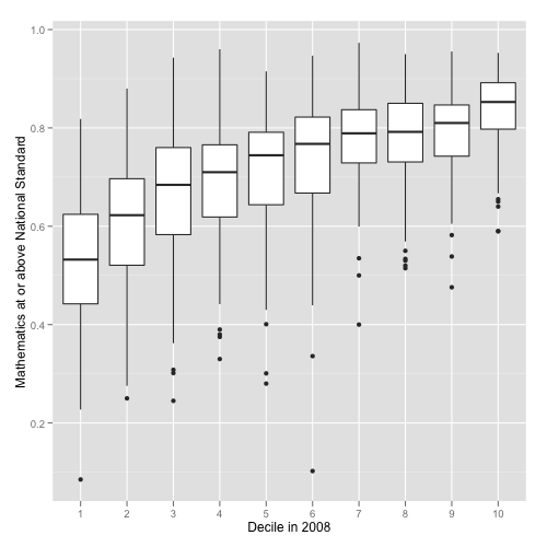
Luis Apiolaza has some dramatic graphics, such as this one showing the distribution of proportion achieving at or above the maths standard, by decile.  The top decile 1 school is below the median for deciles 9 and 10, and the upper quartile for decile 1 is about the same as the lower quartile for decile 4.

Eric Crampton has been doing regression modelling. He’s using Stata rather than R and has fewer pictures, because he’s an economist (but we like him anyway).

Eric comments on the strong decile differences, and notes that these make it hard to be confident about ethnic differences (schools with more Maori and Pacific students do worse, but on reading and perhaps on writing so do schools with more Asian students).  He also notes that there’s a lot of variation between schools that isn’t explained by the available socioeconomic data.  I’d be interested to know how much of this is random variation based on the limited number of students per school and how much is real variation that could be explained but isn’t.

Both Eric and Luis have put their data files and code where anyone else can easily get them, and they have left the data in much better shape than they found them, for the benefit of anyone else who might want to do some analysis.

September 24, 2012

Data Science in Harvard Business Review

They say it’s the sexiest job of the 21st century.  Perhaps if people are calling statistics “data science” they will stop calling it “business intelligence” (via)

September 23, 2012

A mathematician, an economist, and a tango dancer walk into a bar

….and the bartender asks them if they need help setting up for their talks.

The second episode of Nerdnite Auckland is on Tuesday October 2, at Nectar, in Kingsland (if you have trouble finding it, it’s upstairs, above the Kingslander). Presumably it starts at closer to 6:30 this time, since the bugs should have been worked out of the system.

Also, on Wednesday September 26, Cafe Scientifique is on at the Horse and Trap, with Gillian Turner, from Vic Uni Wellington, talking: “Flips and Wiggles — the mystery of Earth’s magnetism”.  They recommend arriving at 6ish for a 6:30 start to the formalities.