Posts written by Thomas Lumley (2645)

avatar

Thomas Lumley (@tslumley) is Professor of Biostatistics at the University of Auckland. His research interests include semiparametric models, survey sampling, statistical computing, foundations of statistics, and whatever methodological problems his medical collaborators come up with. He also blogs at Biased and Inefficient

June 28, 2012

Open data discussions

The political/social science/etc blog Crooked Timber is having a seminar on Open Data, which is highly recommended.  In one of the posts, Steven Berlin Johnson writes about the mid-19th century efforts of William Farr to publish more information on causes of death, information later used by John Snow in attributing cholera to contaminated water.

He concludes:

Yes, information abundance meant that the newspapers lost their local advertising monopolies to Craigslist and Groupon, but it also means that the crucial data they used to have to unearth by hanging around City Hall for months is now available to anyone with a Web browser or an API key. We may well have fewer investigative journalists on the payroll of newspapers, but if we play our Open Data cards right, we might well end up with more investigations.


[Update: these are now all collected in a post and PDF and epub]

Alpine fault: can we panic now?

The Herald has a good report of research to be published in Science tomorrow, studying earthquakes on the Alpine fault.  By looking at a river site where quakes disrupted water flow, interrupting peat deposition with a layer of sediment, the researchers could get a history of large quakes going back 8000 years. They don’t know exactly how big any of the quakes were, but they were big enough to rupture the surface and affect water flow, so at the least they would mess up roads and bridges, and disrupt tourism.

Based on this 8000-year history, it seems that the Alpine fault is relatively regular in how often it has earthquakes: more so than the San Andreas Fault in California, for example.  Since the fault has major earthquakes about every 330 years, and the most recent one was 295 years ago, it’s likely to go off soon.  Of course, ‘soon’ here doesn’t mean “before the Super 15 final”; the time scales are a bit longer than that.

We can look at some graphs to get a rough idea of the risk over different time scales.  I’m going to roughly approximate the distribution of the times between earthquakes by a log-normal distribution, that is, the logarithm of the times has a Normal distribution.
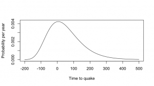
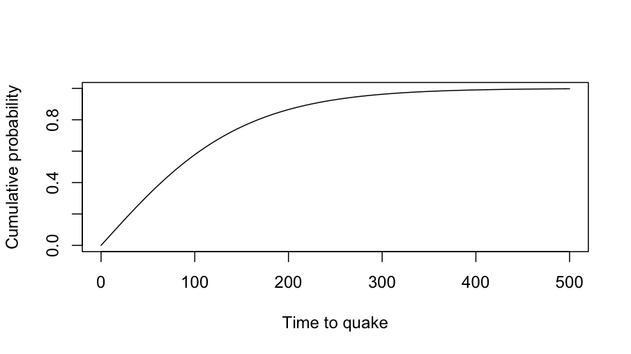
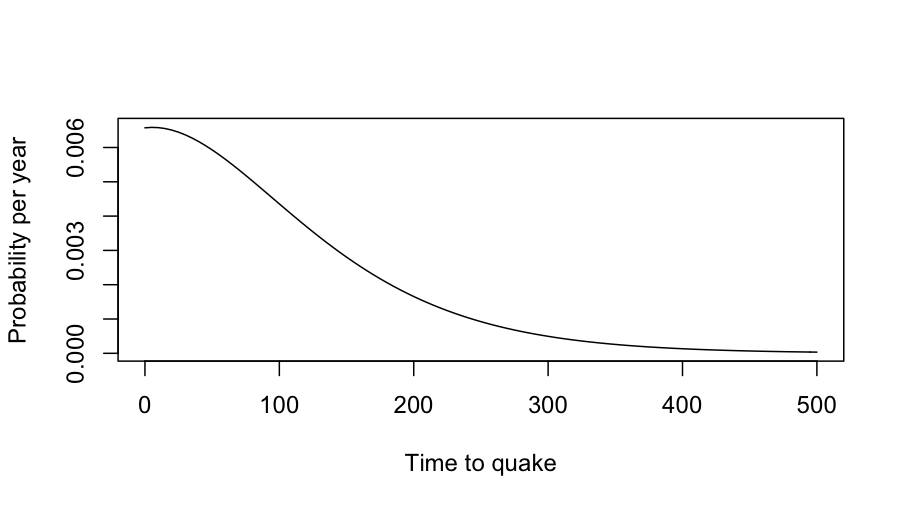
This is a simple and reasonable model for time intervals, and it also has the virtue of giving the same answers that the researchers gave to the press.  Using the estimates of mean and variation in the paper, the distribution of times to the next big quake looks like the first graph.  The quake is relatively predictable, but “relatively” in this sense means “give or take a century”.
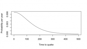
Now, by definition, the next big quake hasn’t happened yet, so we can throw away the part of this distribution that’s less than zero, and rescale the distribution so it still adds up to 1, getting the second graph.  The chance of a big quake is a bit less than 1% per year — not very high, but certainly worth doing something about.  For comparison, it’s about 2-3 times the risk per year of being diagnosed with breast cancer for middle-aged women.
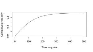
The Herald article (and the press release) quote a 30% chance over 50 years, which matches this lognormal model.  At 80 years there’s a roughly 50:50 chance, and if we wait long enough the quake has to happen eventually.

The risk of a major quake in any given year isn’t all that high, but the problem isn’t going away and the quake is going to make a serious mess when it happens.


[Update: Stuff also has an article. They quote me  (via the Science Media Centre) , but I’m just describing one of the graphs in the paper: Figure 3B, if you want to go and check that I can do simple arithmetic]

June 21, 2012

Why Nigeria?

A fairly large fraction of the spam advertising the chance to capitalise on stolen riches is sent by Nigerian criminals.  What should be more surprising is the fact that a lot of the spam actually says it’s from Nigeria (or other West African nations).  Since everyone knows about Nigerian scams, why don’t the spammers claim to be from somewhere else? It’s not as if they have an aversion to lying about other things.

A new paper from Cormac Herley at Microsoft Research has a statistically-interesting explanation:  the largest cost in spam operations is in dealing with the people who respond to the first email.  Some of these people later realise what’s going on and drop out without paying; from the spammer’s point of view these are false positives — they cost time and money to handle, but don’t end up paying off.   A spammer ideally wants only to engage with the most gullible potential victims; the fact that ‘Nigeria’ will spark suspicions in many people is actually a feature, not a bug.


If it’s not worth doing, it’s not worth doing well?

League tables work well in sports.  The way the competition is defined means that ‘games won’ really is the dominant factor in ordering teams,  it matters who is at the top, and people don’t try to use the table for inappropriate purposes such as deciding which team to support.  For schools and hospitals, not so much.

The main problems with league tables for schools (as proposed in NZ) or hospitals (as implemented in the UK) are, first, that a ranking requires you to choose a way of collapsing multidimensional information into a rank, and second, that there is usually massive uncertainty in the ranking, which is hard to convey.   There doesn’t have to be one school in NZ that is better than all the others, but there does have to be one school at the top of the table.  None of this is new: we have looked at the problems of collapsing multidimensional information before, with rankings of US law schools, and the uncertainty problem with rates of bowel cancer across UK local government areas.

This isn’t to say that school performance data shouldn’t be used.  Reporting back to schools how they are doing, and how it compares to other similar schools, is valuable.  My first professional software development project (for my mother) was writing a program (in BASIC, driving an Epson dot-matrix printer) to automate the reports to hospitals from the Victorian Perinatal Data Collection Unit.  The idea was to give each hospital the statewide box plots of risk factors (teenagers, no ante-natal care), adverse outcomes (deaths, preterm births, malformations), and interventions (induction of labor, caesarean section), with their own data highlighted by a line.   Many of the adverse outcomes were not the hospital’s fault, and many of the interventions could be either positive or negative depending on the circumstances, so collapsing to a single ‘hospital quality’ score would be silly, but it was still useful for hospitals to know how they compare.  In that case the data was sent only to the hospital, but for school data there’s a good argument for making it public.

While it’s easy to see why teachers might be suspicious of the government’s intentions, the rationale given by John Key for exploring some form of official league table is sensible.  It’s definitely better not to have a simple ranking, and it might arguably be better not to have a set of official comparative reports, but the data are available under the Official Information Act.  The media may currently be shocked and appalled at the idea of league tables, but does anyone really believe this would stop a plague of incomplete, badly-analyzed, sensationally-reported exposés of “New Zealand’s Worst Schools!!”?  It would be much better for the Department of Education to produce useful summaries, preferably not including a league-table ranking, as a prophylactic measure.

June 9, 2012

The data speak for themselves

May 14, NZ Herald:  Housing boom cuts mortgagee sales.  The number of mortgagee listings has been falling nationally since the recession, and Auckland is leading the charge.

May 31: Stuff: More people losing the family home.  High numbers of ”mum and dad” homeowners are losing family homes to mortgagee sales, new figures show.

June 1: Stuff: Rise in family home mortgagee sales. Family homes are making up an increasing number of the more than 2200 mortgagee sales in New Zealand, new figures show.

June 9: NZ Herald: Mortgagee sales: Landlords feel pain. Mortgagee sales have hit record numbers, and landlords are the new victims.

The housing market doesn’t change that much from week to week.

June 8, 2012

How dare you measure our air pollution!

For some time, the US Embassy in Beijing has been sending out measurements of local air pollution on Twitter.  These have not always been entirely in agreement with the official readings.  Subsequently, the  Guangzhou and Shanghai consulates have done the same thing.

The government of the People’s Republic of China has formally objected.  They claim that readings from just a few locations are too unreliable to report (a problem that doesn’t seem to affect other nations), and “not only doesn’t abide by the spirits of the Vienna Convention on Diplomatic Relations and Vienna Convention on Consular Relations, but also violates relevant provisions of environmental protection.” 

(via)

Liquorice even better than beer?

And this time it’s Stuff’s turn.  The headline “Liquorice loaded with health benefits” turns out to be an experiment on diabetic mice using not liquorice but specific chemicals extracted from liquorice root.

The story then admits

 “The amount of amorfrutin molecules in a piece of licorice available for human consumption is far too low to cause the same beneficial effects that were identified in the diabetic mice.”

But wait, there’s more!

Glycyrrhizin is the active agent in liquorice that combats illnesses such as upper respiratory infections, and is said to lessen the symptoms of chronic fatigue syndrome and fibromyalgia.

No actual evidence is adduced to support these claims (and we don’t even learn by whom ‘it is said‘), but it doesn’t really matter since

… the amount of real liquorice found in liquorice sweets is not standardised, making it far more safe and effective to take the recommended quantity of liquorice root or extract as a pill or powder.

so that doesn’t work either.

The take home message: the confectionery form of  liquorice  is loaded with sugar and starch, and some people like the taste.

Beer even better than chocolate?

Q:  Isn’t Friday, after the morning rush, a great time to publish a story about benefits of beer?

A:  Yes, the Herald did much better than Medical Daily or Cell Metabolism on that front.

Q: Did the researchers study beer effects in humans, or was it another mouse study?

A: It was a mouse study, but no beer was harmed during the research. The mice were fed nicotinamide riboside directly.

Q: What’s this nicotinawhatsit beer vitamin?

A: It’s related to the real vitamin niacin (B3), and the body can turn it into the same thing, called NADH or NAD+

Q: And?

A: In mice, at least, it’s good for cholesterol and also has effects on some molecules thought to be related to aging.

Q: Wasn’t that supposed to be red wine, not beer?

A: Yes, resveratrol in red wine was also supposed to affect the same molecules.  There has been some controversy about the research, though.

Q: How much beer would you need to drink to get enough nicotinawhatsit?

A: The research paper doesn’t mention beer at all, nor does the video interview linked at Medical Daily.  The researcher just say the compound is found in “milk and some other foods”.

Q: So where does the beer come from?

A: Well, it makes a good story.  And brewer’s yeast, like all organisms, does produce some of the compound, so it could be in beer.  There’s also a patent for using mutant yeast to make it. And there’s no evidence that it isn’t found in beer.


Fractional companies or fractional women?

We have a Stat of the Week submission, for the NZ Herald’s claim that

Of Australia’s top 200 listed companies, 12.7 per cent had female directors by the beginning of August, compared to 9.3 per cent for the top 100 listed companies here.

That is, 25.4 of the Australian companies and 9.3 of the NZ companies have female directors.  Perhaps the 0.3 is either only partly a company or partly female.

Or perhaps, since the story mentions earlier that about 9% of all private-sector directors are female, you might guess that 9.3% is the proportion of females among all directors of the NZ 100.  That implies the proportion of companies with at least one female director is almost certainly higher than 9%.

A little Googling confirms this: 43% of the NZ 100 companies (that’s 43 companies, for those of you playing along at home) have at least one female director. 13% have more than one.

June 7, 2012

In real terms

Auckland’s housing prices just hit a new record, says Stuff.  The average (?median, ?mean) price in May according to Barfoot & Thompson was $582285, higher than their reported 2007 peak of $538000. But the dollars are smaller than they were back in 2007.

If you bought a house for $538000 in 2007 dollars and sold it for $582285 in 2012 dollars, you would have made a loss of about $25000 2007 dollars before legal and bank costs.  And with 20% deposit and 6% interest, you’d be paying more than $2500 each month for the privilege (and nearly $4000 for the first couple of years, when interest rates were up at 10%)