Posts written by Thomas Lumley (2645)

avatar

Thomas Lumley (@tslumley) is Professor of Biostatistics at the University of Auckland. His research interests include semiparametric models, survey sampling, statistical computing, foundations of statistics, and whatever methodological problems his medical collaborators come up with. He also blogs at Biased and Inefficient

March 29, 2012

Data visualisations

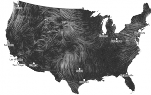
A flowing wind map of the USA, from hint.fm, who also have other beautiful infographics. Click for the live version

Very like a whale

The Herald has managed to top Stuff’s suggestion that Powerball is in Wairarapa with a story saying it’s “in the stars”.

Of course, they don’t mean the actual stars, they mean European-style astrological birth signs.  Allegedly (and it’s hardly the sort of claim that it’s worth verifying),  15% of winners over the past two years were born under Taurus.   Now, since there are 104 winners and 12 astrological signs, it’s arithmetically unavoidable that some signs will get more winners than others, but how many more would you expect in a typical two-year period?

The easiest way to approximate this is to ignore the fact that slightly more births occur in some months and just sample 104 winners equally from 12 groups.  Repeating this 10,000 times takes a few seconds, and we get a table showing the percentage chance that the most-sampled star sign will have at least 10, 11, 12, … winners.

10 11 12 13 14 15 16 17 18 19
1 100.00 99.70 94.50 76.30 50.50 28.40 14.40 6.30 2.80 1.20

Getting 15% in one group is not at all  surprising.

This still overestimates the surprise: if there hadn’t been an overall pattern, the story could have said that the chance of winning depends on your star sign and on the time of year, for example.    In fact, they did this as well: the second part of the story says that Taurus is lucky now, but that Capricorn will be lucky in a  few weeks.   Of course, the fact that the second part contradicts the first part isn’t mentioned anywhere, and no data are presented to gesture in the direction of evidence for the claim.

We’re very good at seeing patterns, even when they don’t exist, and statistics is one way of ameliorating this problem.

So what is the best time to buy a lottery ticket?  As Scott Adams shows, the day after the drawing — they are a lot cheaper then.
March 28, 2012

Internet congestion

There’s recently been a lot of publicity about the views on internet congestion of a visiting Brit.  Next Tuesday, in Auckland, there’s a public lecture on internet congestion by a different visiting Brit, one who actually knows something about the topic.   Frank Kelly is a Professor of Mathematics at Cambridge, and a Fellow of the Royal Society.  His research is on the design and control of  networks: both abstract ones and concrete ones such as the Internet and the traffic system.

Professor Kelly is visiting the University of Auckland to work with researchers here, and will kick off his visit with the public lecture:

The Internet has attracted the attention of many theoreticians, eager to understand the remarkable success of this diverse and complex artefact. One strand of this effort has been a framework that allows the various detailed algorithms used to control congestion, choose routes and allocate resources to be seen as a distributed mechanism solving a global optimization problem. The talk will review the framework, and discuss topics such as fairness and stability, as well as current engineering efforts to improve the reliability and robustness of the Internet.

 Venue:  Fale Pasifika, University of Auckland (20 Wynyard St, Auckland Central)
Time: 6pm-8pm, Tuesday April 3.

Publishing statistics

Stuff has an interesting story on self-publishing and how e-books and Amazon make it easier.  I’m in favor of anything that produces more good books, but I would like to give two warning notes, one statistical and from my experience, and one non-statistical and from other people’s experience.

The statistical warning note is that most books on Amazon don’t sell much, if at all.  I have a book, a graduate text in a minor area of statistics, for which Amazon gives me sales data.  This book sells 2-4 copies a week through all North American bookstores (and so less than that just through Amazon). Even so, it has never been out of the top 10% of Amazon’s sales rank, it usually is at about the 95th percentile, and sometimes makes it into the top 1%.   Nearly all books on Amazon sell less than this.

The non-statistical warning note is that the self-publishing industry is historically noted for having a lot of scams.  A bit of Google due diligence is useful before you spend money on things.

March 27, 2012

Why isn’t this libel?

The Dominion Post has a story,  nominated for Stat of the Week, headlined “Wairarapa has best odds for tonight’s $22m Powerball”.

If this were true, it would imply serious fraud or incompetence by the people running Powerball.  The story doesn’t come out and say that explicitly.  What it says is

Sales and prize data provided to The Dominion Post by the Lotteries Commission show the Wairarapa region averaged the highest return per dollar spent last year.

which is, of course, would be irrelevant to future odds in any honest and competent lottery.  So why does the Dominion Post mention it here?  Is this a subtle accusation? Do they not understand how lotteries work? Or do they just think you don’t?

Heart disease is bad for your sleep

Another heart-disease related story in the Herald (the American College of Cardiology is having its annual meeting now) talks about a link between sleep  and heart disease.  The Herald quotes the principal investigator, Rohit Arora

We now have an indication that sleep can impact heart health, and it should be a priority.

Based on these findings, it seems getting six to eight hours of sleep everyday probably confers the least risk for cardiovascular disease over the long term.

The study actually looked backwards in time, asking people how much sleep they (currently) get per night, and whether they have previously been diagnosed with various heart conditions.  So, it really doesn’t say much about the effect of sleep on heart disease.  Other news sources used a different quote from Dr Arora

“We don’t know whether sleeping longer causes heart complications or whether the heart problems cause someone to sleep longer”

Indeed we don’t.

It’s also a bit strange that the study, based on the large US NHANES survey involved only 3019 people.  NHANES examines more than 10000 people in each two-year wave, and even restricting to people over 45 should leave more than 3000 of them.

Some more good news

The Herald has a story today about weight-loss surgery and Type II diabetes.  They say that two studies reported improvements in blood sugar control in people having the surgery, with complete remission of diabetes in some.    The story tells you where the research was published, and even has a comment from an independent researcher.  The only thing it misses is that it doesn’t come out and say that the studies were randomized: patients were randomly allocated to surgical or medical treatment, so the results are highly credible.

The two papers and a commentary are (currently) free-access at the New England Journal of Medicine, so you can even read the evidence for yourself.

Better than nothing

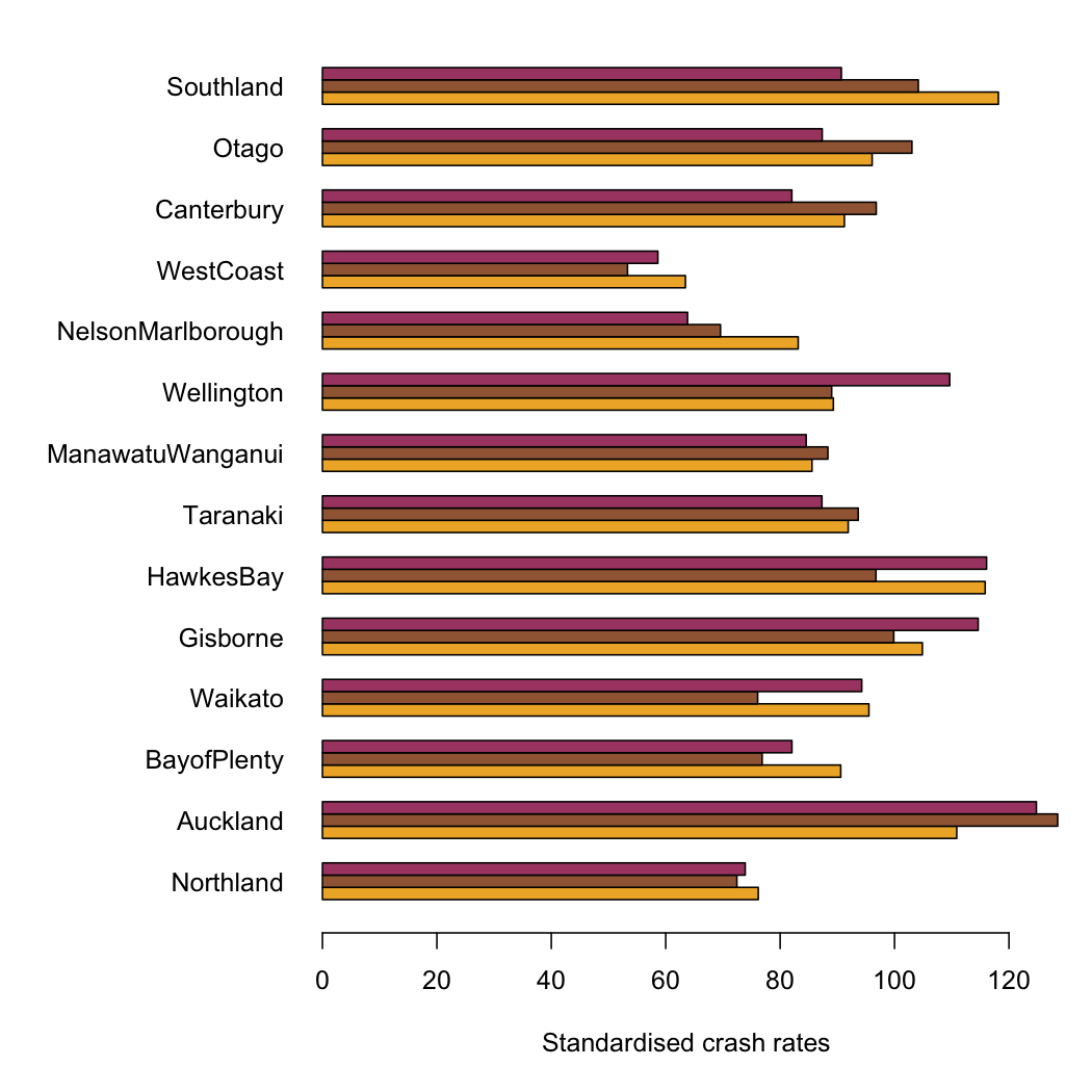
Our helpful commenters provided alternative suggestions on how the intersection car crash rates could have been standardised, instead of using population of each region

Number of registered vehicles is a bit of a pain, because it is reported for postal districts, not for regions.  I assumed that postal districts are a partition of regions (I couldn’t confirm or deny this immediately), and did a bit of Wikipedia. Presumably an NZ journalist could do this quicker than me, and would already know, for example, that the Canterbury:Otago border passes between Timaru and Oamaru.

It doesn’t matter a lot which standardisation you use.  The graph below (click to embiggen) shows all three, scaled so NZ as a whole is 100.  The orange bars are by population, the brown bars by km, and the maroon bars by registered vehicles.  The most striking difference is probably for Wellington, where the rate per registered vehicle is high: there are fewer registered vehicles per capita than in the rest of the country.

All three versions confirm that there is much less variation than the Herald story would suggest, and that  urbanisation is likely responsible.  Error bars would be nice, but I don’t know what the uncertainties in the NZTA denominators are like.

March 26, 2012

Student drinking

A story in Stuff about student drinking at Otago illustrates an important problem with surveys.  According to the story, the students drank on average two nights a week, and consumed 7.2 drinks per night of drinking.  That gives an average of about two drinks per day, which is about the same as average for the whole country based on total alcohol sales.

I don’t know about you, but I find this a little hard to believe. The newspapers should find it even harder to believe, since it contradicts their usual line about Otago students.

My guess is that Otago students do drink a bit more than the average Kiwi, but that asking people to report their drinking leads to underreporting compared to looking at total sales.  There could be several reasons.  One is that people might not want to admit how much they drink, another is that there may be difficulties in converting actual glass sizes into standard doses, and a third is that people’s “average week” is usually different from their actual week.  Perhaps you `usually’ drink less, but this week was Sam’s birthday and you drank more.  And last week was the keg party. And before that was the start of semester. And so on.

That’s not the point of the story, though.  The point is that new research finds heavy drinking can make you feel unwell and have difficulty concentrating even the next day;  the effects seem to hang over and affect your daily activities. Perhaps someone could come up with a catchy name for this phenomenon…

Auckland is still bigger than Wellington

According to the Herald,

Figures compiled from 2006 to 2010 show, on average, Auckland makes up about one third of all intersection crashes around the country.

 They don’t say how they are defining “Auckland”, but since the comparisons are with Canterbury and Wellington, it looks like the Auckland Region is what they mean.  The Auckland region has 1/3 of the country’s population and just over 1/3 of the crashes.   Canterbury, with 13% of the population, had 12% of the crashes.
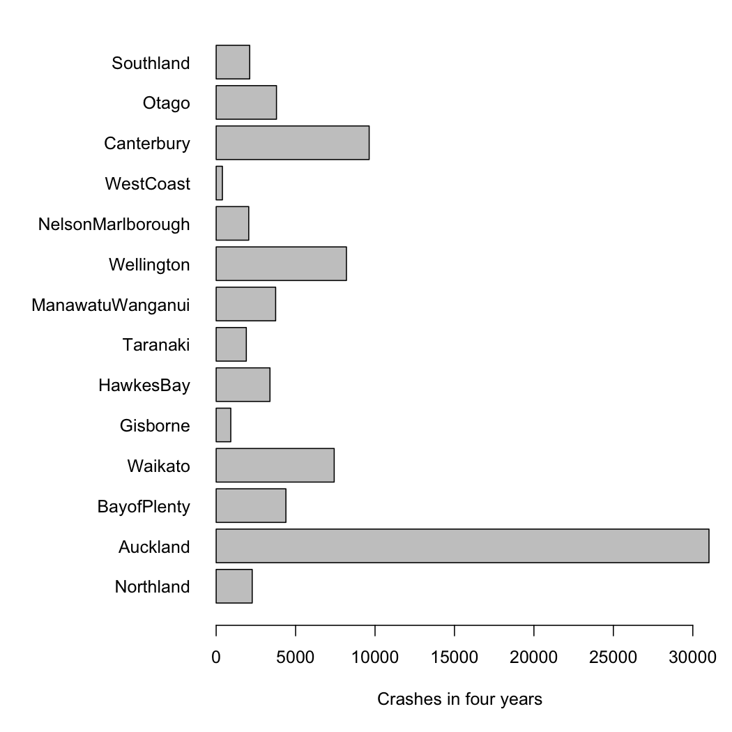
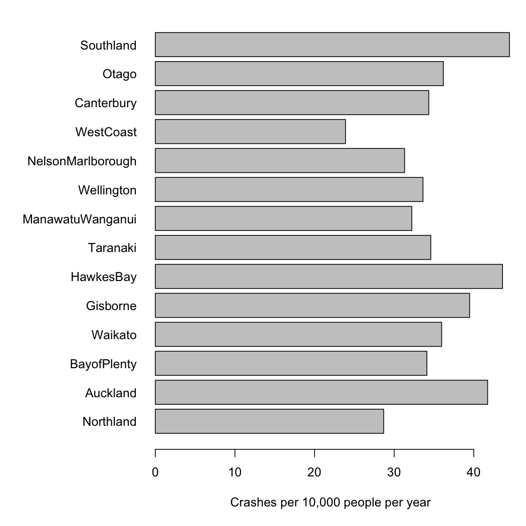
Failing to divide by population size makes it impossible to see any real variations between regions.  For example, you would expect more intersection crashes in more urbanised regions and it would be interesting to see how big this effect is.   The first graph is what the Herald is telling you, total intersection crashs over five years (with more complete data from NZTA).

The variation between regions is almost all due to differences in population, and so doesn’t tell us anything we didn’t already know. The second graph is intersection crashes per year, per 10000 population, which might actually be useful.

Even better would be a graph that indicated the uncertainties, but I don’t have time right now.

NZTA, whose press release is responsible for the story, says

The NZ Transport Agency (NZTA) is providing media organisations with background data on intersection crashes in New Zealand to assist with coverage of the implementation of new give way rules which come into force at 5am on Sunday 25 March.

It probably did assist in getting stories into the paper.  Unfortunately, the story didn’t emphasize what they wanted, which is that intersection crashes are common.  The story tried to do a comparison — as the old journalism rule says, “when you have two numbers, do something with them”. Unfortunately, they divided the wrong two numbers.