Auckland is still bigger than Wellington
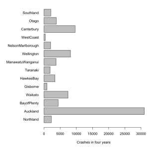
Figures compiled from 2006 to 2010 show, on average, Auckland makes up about one third of all intersection crashes around the country.
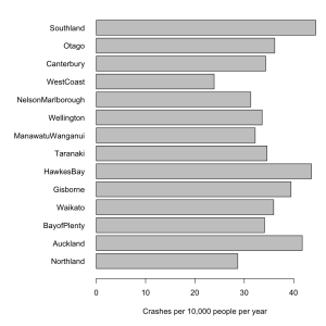
The variation between regions is almost all due to differences in population, and so doesn’t tell us anything we didn’t already know. The second graph is intersection crashes per year, per 10000 population, which might actually be useful.
NZTA, whose press release is responsible for the story, says
The NZ Transport Agency (NZTA) is providing media organisations with background data on intersection crashes in New Zealand to assist with coverage of the implementation of new give way rules which come into force at 5am on Sunday 25 March.
It probably did assist in getting stories into the paper. Unfortunately, the story didn’t emphasize what they wanted, which is that intersection crashes are common. The story tried to do a comparison — as the old journalism rule says, “when you have two numbers, do something with them”. Unfortunately, they divided the wrong two numbers.
Thomas Lumley (@tslumley) is Professor of Biostatistics at the University of Auckland. His research interests include semiparametric models, survey sampling, statistical computing, foundations of statistics, and whatever methodological problems his medical collaborators come up with. He also blogs at Biased and Inefficient See all posts by Thomas Lumley »


Maybe another way of looking at the problem would be crashes for every 10,000 licensed vehicles (with data from Table 36 of this NZTA document). Just looking at Auckland (291), Christchurch (217) and Wellington (289) shows that, at the vehicle level, we seem to be doing better in ChCh.
14 years ago
Or look at crashes per person km traveled (data here. By this measure, it’s safest to be in a car in the Waikato or the West Coast (about 16 accidents per 100 million person kms) while Auckland and the Bay of Plenty are a bit riskier (about 45 etc).
14 years ago
They were specifically interested in intersection crashes, because of the new law, so in this context standardising by driver-kms isn’t as useful as it would usually be.
14 years ago