Posts written by Thomas Lumley (2645)

avatar

Thomas Lumley (@tslumley) is Professor of Biostatistics at the University of Auckland. His research interests include semiparametric models, survey sampling, statistical computing, foundations of statistics, and whatever methodological problems his medical collaborators come up with. He also blogs at Biased and Inefficient

February 5, 2012

Explaining risks

Stuff has an article on home birth, including statistics from the Oz & NZ obstetricians (whose policy is uniform disapproval, in contrast to British obstetricians) showing that home birth is more dangerous for the infant.

Getting a good idea of the risks is not easy:  you don’t want to compare births that end up at home with those that end up in the hospital, since some births at home were planned to be in the hospital, until something went wrong, and some hospital births were planned to be at home, until something went wrong.   You also can’t just compare births where nothing went wrong, since that misses the whole point of risk estimation.  The statistics compare women who planned to give birth at home with those who planned to give birth in the hospital (but didn’t have any special risks that would have prevented a home birth).  That’s the closest you can get to a fair comparison, though it’s obviously not perfect.    In general, people who tend to do what their doctors want also tend to be healthier — even if what their doctors are telling them isn’t actually helpful — and we know that obstetricians want women to give birth in hospital.  You could also think of biases in the other direction if you spend a few minutes on it.

However, if the numbers are more or less correct, there’s still the question of how to present them.  The obstetricians say the rate of neonatal death was almost three times higher for the women in the studies who planned to have a home birth.  The article in Stuff points out that this is 0.15% vs 0.04%, so the absolute risk is small.  A better way to present numbers like this is in terms of deaths per 10,000 births. Although the information is the same, there’s a surprisingly large amount of evidence that people understand counts better than proportions, especially small proportions.  So: 10,000 pregnant women similar to those in the studies would have about 15 neonatal deaths if they all planned a home birth and about 4 neonatal deaths if they all planned a hospital birth. For context, 10,000 births is all Auckland births for about five months, or all Wellington births for about 18 months.
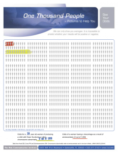
It’s even better to present this sort of information in visual form, using something like the Paling Palettes from the Risk Communication Institute.  These allow you to see both absolute and relative risks easily.  The example on the left is from their website, and is a pregnancy-related example.  On the background of 1000 people are two colored risks. The red is the risk of miscarriage from amniocentesis; the green is the risk of Down Syndrome in a child of a 39-year-old woman.

[Updated to add:  of course, you should do the same thing with the various reduced risks for the mothers — the 10,000 planned home births would also prevent nearly 1500 cases of vaginal laceration, about 130 of them serious (3rd degree)]


February 3, 2012

HIV trends

Given this blog’s recent focus on things claiming unconvincingly to be surveys, you must be expecting a post on the statistic that 20% of HIV-positive gay men in Auckland don’t know they’re infected.

It’s obviously going to be hard to get an accurate estimate, since we don’t have a citywide list of gay men in Auckland. We don’t know what proportion of the population is gay; in fact, we wouldn’t even be able to get consensus on what the definition would be.

The approach used by the Otago researchers was to visit places like bars, and events like Big Gay Out.   This gives a reasonably well-defined sampling frame — the sample isn’t from all gay men in Auckland, but we do know who was targetted.   About 50% of the people they approached agreed to fill in a questionnaire, and 80% of those gave a saliva sample that was subsequently tested.   It’s not perfect, but it’s the best you are likely to be able to do in practice; a sharp contrast with the bogus polls on the farm sales, where simple random-digit dialing for a sample of ten people would have been better.

The final numbers supporting the conclusion are small:  68 men were HIV-positive; 15 of them were not diagnosed. The  ‘1 in 15’ figure could be as low as 1 in 20 or as high as 1 in 12, and that’s before you start worrying about bias from non-responders being different. A comparison to other surveys of this kind in NZ and in other parts of the world is still sensible, and the research paper says the infection rate is lower than in most places, but the proportion who don’t know they are infected is higher.

There’s a lot of research currently on ways to sample from populations that can’t be reached effectively by random-digit dialling, but where there are social links between members: jazz musicians, injecting drug users, homeless people.  The general approach is to get people to recruit each other, and the difficult part is to try to correct for the bias this causes, but it’s not clear that the current methods actually work.


Incidentally, the NZ Herald report contains the strange paragraph

The researchers compared respondents’ self-reported HIV test history with their saliva result to find 1.3 per cent of HIV positive men did not know they were infected.

which initially doesn’t seem to make any sense and contradicts the headline.  Most of the problem is the usual inattention to denominators:  take 15/1068, to get the proportion of testable samples that were HIV positive and undiagnosed, and you get close to 1.4%.  That is 1.4% of sampled men were HIV positive and didn’t know it. Confusing P(A and B) with P(A|B) is a bit unusual — usually the Herald confuses P(A|B) with P(B|A).

The 1.3% figure actually appears in the research paper, and it seems to be a problem of premature rounding:  round the proportion HIV positive to 6.5% and the proportion of those undiagnosed to 20%, and you get 6.5%×20%=1.3%.


February 1, 2012

More potential StatsChat readers!

The Auckland population is predicted to hit 1.5 million this week, and we actually have an example of good reporting of statistics to commemorate the occasion.

Of course, I did find one point to nitpick: the Stats NZ expert quoted by the Herald,  Andrea Blackburn, says

“The 1.5 millionth person could be a migrant coming from overseas, or from within New Zealand, but it is most likely to be a baby, because births add more than net migration to Auckland’s population growth.”

Surely in this context it’s gross rather than net migration that counts.  Suppose net migration were zero — that wouldn’t mean that the 1.5 millionth person was certain to be a baby rather than an immigrant. And what if net migration were negative?

There don’t seem to be figures for gross immigration rather than births, but if we ignore migration within NZ and conservatively guess that Auckland gets about 1/3 of the country’s immigrants, that would mean about 28000 permanent and long-term arrivals per year, compared to about 23000 births.  The 1.5 millionth Aucklander has about an even chance of being a migrant or being a cute little baby.

[Update: as commenter Andrew points out, the Mayor has annointed his own cute little 1.5Mbaby.   Also, a lot of the media seem to think citizenship and residence are the same: Auckland has 1.5m residents, not citizens.  And the mayor of Invercargill thinks moving to Auckland is unfair and should be stopped].

January 30, 2012

Global temperatures for 2011

NASA’s annual summary of global temperatures is out.  2011 was not the warmest year on record, it was only ninth, a whole eighth of a degree cooler than last year.  One of the years that beat 2011 wasn’t even in the twenty-first century. [It was 1998.]

January 29, 2012

Bogus polls compared

The Crafar farms decision has inspired multiple bogus polls asking whether it was the right decision, which gives us an opportunity for comparisons.

Current or recent polls include:

  • NZ Herald: 34% in favour of the decision
  • Stuff: 22% in favour
  • Campbell Live: 3% in favour

(I would link, but these polls tend to disappear quickly from web pages. The pre-decision polls already seem to be gone. )

The Stuff and NZ Herald polls both claim about 18000 votes. If this were a real poll, the maximum margin of error would be under 1%. Clearly the actual error is at least 19%, and quite possibly more.

If the true proportion was about 20% (as in the real poll taken late last year) and you had a real poll with a sample size of just ten you would have a 3 in 4 chance of getting within 10% of the true answer.  The chance of having a 30% spread over three polls of size ten would be only 1 in 5.  So, on this issue, the self-selected polls are worse than a random sample of just ten people.  You can see why we like the term ‘bogus’.

Bogus polls are worse than useless because of anchoring bias. Seeing the results is likely to make your beliefs less accurate, even if you know the information content is effectively zero.


January 26, 2012

Unfaithful to the data, too.

When I were young, the Serious News Outlets  probably wouldn’t have admitted the existence of extra-marital affairs by non-celebrities, let alone written an article that’s basically advertising from an infidelity website press release.

In some ways the data are better-quality than most advertorials, because the website has complete data on its NZ members.  They have even gone as far as using population sizes for NZ cities to estimate their, um, market penetration, which varied across the five main cities by as much as 0.06%.  No, that doesn’t exceed the margin of error.

The Herald’s article starts off

If your partner supports National, has a PC, drinks Coke, eats meat, has a tattoo, smokes and is a Christian, be warned – they could be a cheater.

Leaving aside the gaping logical chasm in identifying website members as representative of all ‘cheaters’, what the data actually say is that more members support National, not that more National supporters are members.   As you may recall, we determined not so long ago that more New Zealanders of all descriptions support National than any other party, so that’s what you would expect for members of the website.   The proportion of National supporters in the election was 47%, among website members it’s 33%, so National supporters are substantially less likely to be members of the website than supporters of other parties. The proportion identifying as Christian among website members is very similar to the proportion in the 2006 census.   79% of website users are on PC (vs Mac).  Again that’s a lower proportion of PCs than in the population of NZ computers (the Herald said 10% were Macs in July 2010, and for Aus+NZ combined, IDC now says 15%) but one explanation is that Macs have more of the home market than the business market.  More members drinking Coke vs Pepsi is also not surprising — I couldn’t find population figures, but Coke dominates the NZ cola market.

The story doesn’t say, but we can also be pretty confident that the website members are more likely to be Pakeha than Maori, more likely to be accountants than statisticians, and more likely to have a pet cat than a pet camel.


Another smoking survey

Today it’s Hamilton’s turn:

A survey of 111 residents at Hamilton Lake and Innes Common playgrounds, the city bus station and Waikato University in mid-2011 found 94 per cent wanted children’s playgrounds to be smokefree.

This is much more sensible than the website poll on Auckland’s initiative that was magically translated into “a majority of New Zealanders”.

The poll will be a biased sample of the population, because it will over-represent people who go to children’s playgrounds, but it’s perfectly reasonable for them to have more say about smoking there.   I assume (I have to assume, because the facts aren’t given) that the survey also asked if the bus station and the University campus should be smoke-free, and that the results were less favorable.

We also aren’t told who did the survey, and what the questions were.   You might get quite different responses for a survey conducted by the Council and one conducted by the Cancer Society.

Even accounting for this, it looks as though there’s a lot of support, and I’d say the poll qualifies as not completely useless.

January 21, 2012

Eggs for breakfast

Earlier in the week I complained that the Egg Foundation and the Herald were over-interpreting a lab study of mouse brain cells.  The study was a perfectly reasonable, and probably technically difficult, piece of basic biological research.  It’s the sort of research that answers the question “By what mechanisms might different foods affect brain function differently?”.   It doesn’t answer the question “What’s for breakfast?”.

If you wanted to know whether a high-protein breakfast such as eggs really increases alertness there are at least two ways to set up a relevant study.    The first would be an open-label randomized comparison of eggs and something else; the second would be a double-blind study of high-protein and high-carbohydrate versions of the same breakfast.  In both cases, you recruit people and randomly allocate them to higher-protein breakfasts on some days and lower-protein on other days.

In an open-label study you have to be careful to minimise response bias, so you would tell participants, truthfully, that some people think protein for breakfast is better and others think complex carbohydrates are better.  You would have to be careful not to indicate what you believed,  and it would be a good idea to measure some addition information beyond alertness, such as hunger, what people ended up eating for lunch.   There’s always some potential for bias, and one strategy is to ask participants about something that you don’t expect to be affected, like headaches.  This strategy was used in the home heating randomized trial that underlies the government’s ‘warm home’ advertising, which found that asthma was reduced by better heating, but twisted ankles were not.

In a blinded version of the study, you might recruit muesli eaters and, perhaps with the help of a cereal manufacturer, randomize them to higher-protein and lower-protein versions of breakfast.  This would be a bit more expensive, but perfectly feasible.  There would be less risk of reporting bias, since neither the participant nor the people recording the data would know whether the meals were higher or lower in protein on a particular day.  At the end of the study, you unmask the breakfasts and compare alertness.   The main disadvantage of this approach is the same as its main advantage — you learn about higher-protein vs lower-protein muesli, and have to make some assumptions to generalize this to eggs vs cereal or toast.

If it really mattered whether eggs for breakfast increased alertness, these studies would be worth doing.  But the Egg Foundation is unlikely to be interested, since it wouldn’t benefit from knowing the facts.  The mouse brain study is enough of a fig-leaf to let the claim stand up in public, and they don’t want to risk finding out that it doesn’t have any clothes.


January 20, 2012

Predicting whether you’ll live to 100.

From the Herald

Scientists are claiming a genetic test can predict whether someone will live to 100 years old.

The study…claims to be able to predict exceptional longevity with 60 to 85 percent accuracy, depending on the subject’s age.

You can read the paper, which is in the open-access journal PLoS One.

Whether the prediction really works comes down in part to what you mean by “60 to 85% accuracy”.  There’s a very easy way to predict whether someone will live to 100 years old, with better than 99% accuracy.  Ask them if they are over 100. If they say “Yes”, predict “Yes”; if they say “No”, predict “No”.  Since almost no-one lives to be 100 you will almost always be right.

The new test is not as useless as this, but it still isn’t terribly accurate.  Distinguishing people who live to 90 from those who live to 100, the test gets the correct prediction for about  half of the centenarians and for about two-thirds of the non-centenarians.  You could probably predict that well in 90+ year olds by asking them how their health is, and whether they can get around on their own.  The ability to predict survival to 105 among 100-year-olds is slightly better, but again, probably not as accurate as you could get more easily from health information.  The point of the paper isn’t really prediction. It’s to find genes that are connected with longevity, which are still not well understood, and the reason for talking about prediction is to make the point that genetic variations do matter in extreme old age.  Even from this point of view the results are a bit over-sold, since the biggest component of the genetics is a well-known gene, APO E, where commercial testing has been (controversially) available for years.

This study has attracted a lot of media attention around the world. Some stories mentioned this note from the journal editors:

While we recognize that aspects of this study will attract attention owing to the history and the strong claims made in the paper, the handling editor, Greg Gibson, made the decision that publication is warranted, balancing the extensive peer review and the spirit of PLoS ONE to allow important new results and approaches to be available to the scientific community so long as scientific standards have been met.  We trust that publication will facilitate full evaluation of the study.

Others didn’t.

Bogus smoking poll.

From the NZ Herald

Auckland councillors are divided over a proposed smoking ban in public outdoor areas, but the majority of New Zealanders say the idea is either sensible or good in theory.

If you read the article, it turns out that the claim about the majority of New Zealanders is based on the clicky poll on the Herald website.  That is, the data come from what the newspapers ordinarily call “an unscientific poll”, and we at StatsChat prefer to call “a bogus poll“.   Last week I criticised the Drug Foundation online poll results as ‘dodgy numbers’.  This is well beyond ‘dodgy’.

In the Drug Foundation poll, the point was that a non-negligible fraction of people believed drug driving was safe, and the poll provided at least some support for the argument even if the numbers were unreliable.  And the Drug Foundation collected a lot of demographic information so it was possible to say something about the ways in which the sample was biased.

In this example it really matters whether the support is, say , 40% or 70%, and we have no idea of the extent of the bias, except that there are probably responses from people outside Auckland.

If a ban on smoking in public outdoor areas had sufficiently strong majority support (perhaps 2/3 majority), I wouldn’t necessarily be against it, but we need real numbers, based on real opinions of a concrete plan.