Posts written by Thomas Lumley (2645)

avatar

Thomas Lumley (@tslumley) is Professor of Biostatistics at the University of Auckland. His research interests include semiparametric models, survey sampling, statistical computing, foundations of statistics, and whatever methodological problems his medical collaborators come up with. He also blogs at Biased and Inefficient

February 13, 2012

Adjusting for smoking?

Today the Herald is reporting that soft drinks give you asthma and COPD.  To be fair, the problems with this story are mostly not the Herald’s fault (except for the headline).

The research paper found that asthma and COPD are more common in people who drink a lot of soft drinks.  The main concern with findings like these is that smoking has a huge effect on COPD, and obesity has a fairly large effect, so you would worry that the correlation is just due to smoking and weight. [Or, if you believe some of the other recent new stories, due to bottle-feeding as a baby].

The researchers attempted to remove the effect of smoking and overweight, but their ability to do this is fairly limited.  The idea of regression adjustment is that you can estimate what someone’s risk would have been with a different level of smoking or weight, and so you can extrapolate to make the soft-drink and non-soft-drink groups comparable.  In this case the data came from a telephone survey, and the information they used for adjustment is a three-level smoking variable (never, former, current) and a two-level overweight variable based on self-reported height and weight (BMI < 25 or >25).    If duration of smoking or amount of smoking is important, or if weight distinctions within “overweight” are important, their confounding effects will still be present in the final estimates.

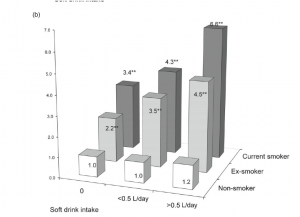
I can’t resist showing you the graph of COPD risks from the paper, which is an excellent example of why not to use fake 3d in graphs. The 3d layout makes it harder to compare the bars — a fairly reliable indication of a bad graph is that it is so unreadable that the data values need to be printed there too.
A 2d barchart will almost always be better than a 3d barchart, and this is no exception.  The comparisons are clearer, and in particular it is clear how big the effect of smoking really is.  It’s only in never-smokers that we have a precise description of smoking, and these are the only group that doesn’t show a trend.
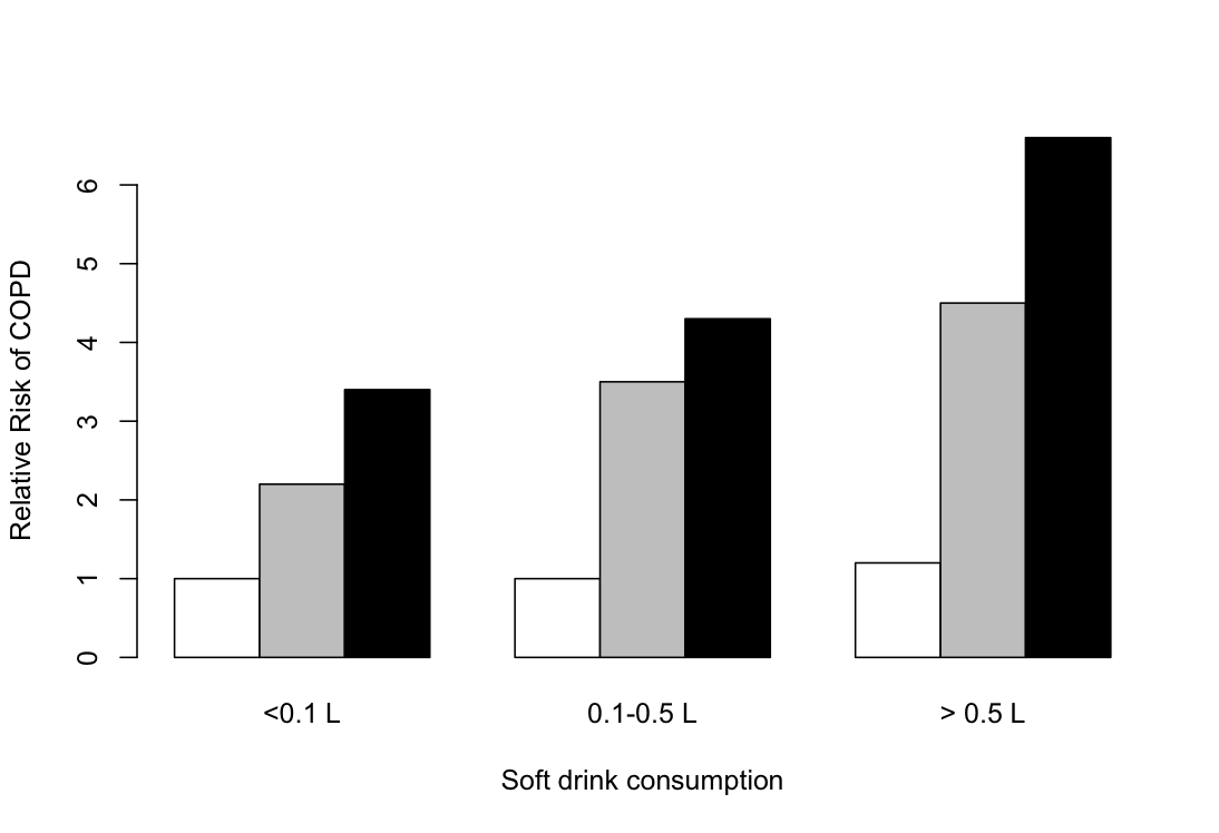
But even the 2d barchart is misleading here.  The key  rules for a barchart are that zero must be a relevant value, and that uncertainty must be relatively unimportant. Zero relative risk is an impossible value — the “null” value for relative risk is 1.0 — and there is a lot of uncertainty in these numbers (although unfortunately the researchers don’t tell us how much).  A dot chart is better, with a logarithmic scale for relative risk so that the `null’ value is 1 rather than 0.
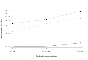
Needs standard errors, which in our case we have not got.


February 12, 2012

Thresholds and tolerances

The post on road deaths sparked off a bit of discussion in comments about whether there should be a `tolerance’ for prosecution for speeding.  Part of this is a statistical issue that’s even more important when it comes to setting environmental standards, but speeding is a familiar place to start.

A speed limit of 100km/h seems like a simple concept, but there are actually three numbers involved: the speed the car is actually going, the car’s speedometer reading, and a doppler radar reading in a speed camera or radar gun.  If these numbers were all the same there would be no problem, but they aren’t.   Worse still, the motorist knows the second number, the police know the third number, and no-one knows the actual speed.

So, what basis should the police use to prosecute a driver:

  • the radar reading was above 100km/h, ignoring all the sources of uncertainty?
  • their true speed was definitely above 100km/h, accounting for uncertainty in the radar?
  • their true speed might have been above 100km/h, accounting for uncertainty in the radar?
  • we can be reasonably sure their speedometer registered above 100km/h, accounting for both uncertainties?
  • their true speed was definitely above 100km/h, accounting for uncertainty in the radar and it’s likely that their speedometer registered above 100km/h, accounting for both uncertainties?

(more…)

Vote early, vote often

The West Island seems to have an even worse problem with bogus polls than we do.  The Sydney Morning Herald carried an article on the Friends of Science in Medicine, and their campaign to have medical degrees only teach stuff that actually, you know, works. This article was accompanied by a poll.  According to the poll, 230% of readers of the article wanted alternative medicine taught in medical degrees, and the other 570% didn’t.  That is, eight times as many people voted as read the article.

It gets better.  The SMH followed up with a story about the poll rigging, and for some reason included a new poll asking whether people regarded website poll results as serious, vaguely informative, purely for entertainment, or misleading.    Yesterday morning “Serious” had 87% of the vote.  Now it’s 95%, with vote totals almost as high as the previous inflated figures.

If you’re even tempted to believe bogus media website polls, we have a bridge we can name after you.

[thanks for the link, Brendon]

February 10, 2012

Not incoherent, just wrong.

NZ Herald yesterday

Since Queen’s Birthday weekend 2010, the tolerance has been lowered for speeding drivers to only 4km/h for public holidays, which police say has led to a drop in fatal crashes during these periods.A police spokesperson told the Dominion Post crashes during holiday periods had been cut by 46 per cent.

 Clive Matthew-Wilson, editor of the Dog and Lemon Guide, … accused the police of “massaging the statistics to suit their argument”. “When the road toll goes down over a holiday weekend, the police claim credit. When it rises by nearly 50 per cent, as it did last Christmas, they blame the drivers. They can’t have it both ways.”

In fact, it’s not at all impossible that the reduction in deaths was due to the lower speeding tolerance, and that the increase over last Christmas was due to unusually bad driving.  The police argument is not logically incoherent.  It is, however, somewhat implausible.  And not really consistent with the data.


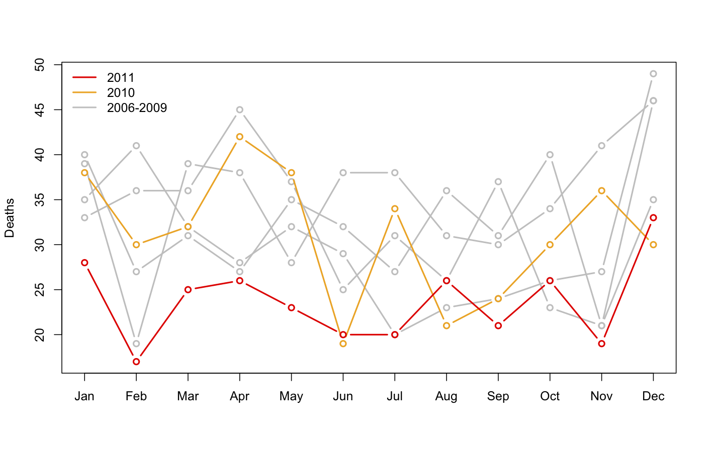
monthly road deaths since 2006If the reduction during holiday periods since the Queen’s Birthday 2010 was down to the lowered tolerance for speeding, you would expect the reduction to be confined to holiday periods, or at least to have been greater in holiday periods.  In fact, there was a large and consistent decrease in road deaths over the whole year. The new pattern didn’t start in June 2010: July, October, and November 2010 had death tolls well inside the historical range.

The real reason for the reduction is deaths is a bit of a mystery.  There isn’t a shortage of possible explanations, but it’s hard to find one that predicts this dramatic decrease, and only for last year.  If it’s police activities, why didn’t the police campaigns in previous years work?  If it’s the recession, why did it kick in so late, and why is it so much more dramatic than previous recessions or the current recession in other countries?  The Automobile Association would probably like to say it’s due to better driving, but that’s a tautology, not an explanation, unless they can say why driving has improved.

February 8, 2012

Breakfast wars

“High carb breakfasts boost brain power”.  Now, why does that sound familiar.. Oh, yes.  Last month it was the Egg Foundation pushing “Eggs may increase alertness”. This time it’s the Glycemic Index Foundation.

As the school year gets under way, new research is adding further weight to evidence that breakfast is the most important meal of the day, especially for children.

Research published last June, so it’s hardly new for the new school year. And the research only studied children who regularly eat breakfast, so it can’t really be evidence that breakfast is the most important meal of the day, or say whether this is more true for children.

Research by three British institutions 

Author names? Journal names? Institution names?  I’ve seen at least five universities in Britain with my own eyes, and am reliably informed there are several more.

has shown a strong link  between low GI, higher carbohydrate breakfasts and better academic  performance.

We can allow “strong link” as mere puffery, but the research did not include any data whatsoever about academic performance

The study, which involved 60 students, found that a low GI,  higher carbohydrate breakfast helped students do maths tasks more  quickly and accurately, and improved attentiveness.

I suppose counting backwards from 100 by 7s just about qualifies as a maths task, even for teenagers, but it’s a bit of a stretch.

The Glycemic Index (GI) is a measure of how effective  carbohydrates – sugars and starches – are on blood glucose levels.

GI is a measure of how fast or slowly carbohydrates affect blood glucose levels.  Wikipedia has it much more clearly “Carbohydrates that break down quickly during digestion and release glucose rapidly into the bloodstream have a high GI; carbohydrates that break down more slowly, releasing glucose more gradually into the bloodstream, have a low GI.”

At least, by quoting Dr Alan Barclay, of the Glycemic Index Foundation, the story did make it possible to track down the real research. Dr Barclay’s blog has a link to the paper, which was published in the European Journal of Clinical Nutrition.   Unless you’re at a university, you will have to pay to read it, so I will summarise.

Of the 60 children recruited, 19 had a “High GL, low GI” breakfast. This meant they were in the lower half for GI and the upper half for glycemic load (total carbohydrates), not that their breakfasts were high or low GI on an absolute scale.  There were three other groups, from the three other combinations of high/low GI and  GL.

The children had seven cognitive function tests. Three of the seven didn’t show any differences between the breakfast groups. For the other four tests the results were mixed:

Specifically, high-GI was associated with better immediate recall (short-term memory), high-GL with better matrices performance (inductive reasoning), and low-GI and high-GL with better speed of information processing (vigilance, sustained attention) and serial sevens performance (vigilance, working memory).

And this is before we start worrying about the correlation vs causation issue, the fact that the high-GL,low-GI breakfast averaged more total calories, or the fact that 13 of the 19 teenagers in the high-GL, low-GI group were girls.

Day care wars

There’s a good article in Stuff today on day-care.  The reporters describe the anti-daycare research of Dr Aric Signman being pushed by Family First, but also the reaction of the scientific community to that research.    As usual, no-one links to sources, so as a public service


[Update: The Herald now also has a story, and it is also good.  On the other hand, their bogus poll for today asks “Is daycare harmful for young children?”  They could at least stick to questions where majority opinion would be relevant.]

February 7, 2012

Superbowl statistics

American football games, like many sporting events, start with a coin toss, in this case to decide which team is playing in which direction.   At the last 14 Superbowls, the team from the National Football Conference has won the toss (via).  In a standard test of the hypothesis that the coin was fair, the p-value would be 0.0001.  So, does this mean the NFC is cheating? Well, no.  We have overwhelmingly good reasons to believe that coin tosses are very close to fair, and a mere 1 in 8000 coincidence shouldn’t change our minds.   As Tom Stoppard put it in  Rosencrantz and Guildensten Are Dead: “A spectacular vindication of the principle that each coin, spun individually, is just as likely to come up head as tails, and should cause no surprise each individual time it does.”

The generalization of this principle to studies purporting to find small, but statistically significant, benefits of homeopathy is left as an exercise to the reader.

Inequality graph

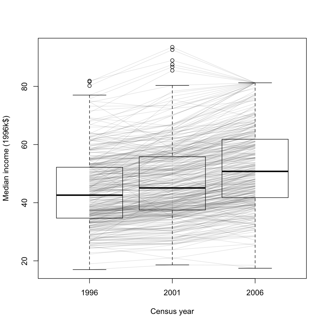
I think this graph is an improvement over the density plot from StatsNZ I showed earlier.  It’s a box plot of median income for all census meshblocks in the Auckland region, in 1996, 2001, and 2006 (except for the ones that were too small to have data released publically). The data are from Stats New Zealand, rescaled to 1996 dollars

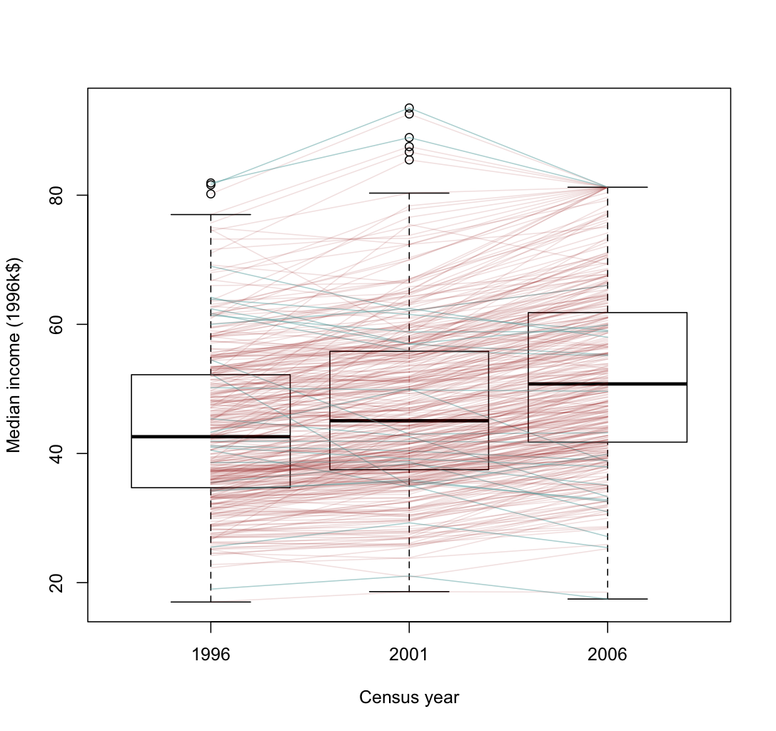
It’s clear from this graph that most areas had an increase in median income, but that the increase was larger in wealthier areas.   A few areas went up sharply, then down again, presumably in the dotcom crash.  Some of the larger decreases are probably due to changes in housing mix: two meshblocks in Auckland Central have declined a lot, and I expect that’s due to more small apartments.

It’s also worth noting that the percentage increase in median income is much closer to being constant across meshblocks.  In that sense the increase in inequality is not as bad as in the US, where increases in GDP have almost entirely ended up with the rich.


[Update: here’s a version where the areas that decreased from 1996 to 2006 are in a different color.  I don’t know if it helps for seeing the overall pattern.  Given more time and if WordPress took SVG, it would be possible to have mouseover labels for the meshblocks so you could see which is which.]

Drug driving tests

Stuff is reporting on drugged drivers caught since the new laws were introduced in November 2009.  The results show the police are a lot better than I expected at picking people to test:  of 514 who had a compulsory field impairment test,  455 failed, and 429 of those tested positive for one or more illegal drugs.   The drug-driving policies, at least so far, are targeting people who are a real risk (in sharp contrast to workplace drug testing, for example).

Income, taxes, and gaps

Today’s ‘Divided Auckland’ story in the NZ Herald is on taxes, claiming that taxes on the rich are lower and taxes on the poor are higher here than anywhere else in the OECD.  Now, I moved from another OECD member country about eighteen months ago, and while I’m not in the John Key category I would be safely in the upper 20% of household income both here and in the USA.  There is no question that I pay more taxes here — and I’m fine with that.

(more…)