Posts written by Thomas Lumley (2645)

avatar

Thomas Lumley (@tslumley) is Professor of Biostatistics at the University of Auckland. His research interests include semiparametric models, survey sampling, statistical computing, foundations of statistics, and whatever methodological problems his medical collaborators come up with. He also blogs at Biased and Inefficient

December 26, 2011

Compared to what?

From Sonia Pollak’s winning Stat of the Week

Now, if we look at the number of people who lodged a claim on Christmas day: this was 3040.
In the 07/08 financial year there was 1.8 million claims, an average of around 5000 a day.

Telling people to look out over the Christmas period and take care is good, but from this, it would appear that actually, Christmas day has less, if not accidents, claims than the average day.

Another famous example in journalism is by Eric Meyer, (via Robert Niles)

My personal favorite was a habit we use to have years ago, when I was working in Milwaukee. Whenever it snowed heavily, we’d call the sheriff’s office, which was responsible for patrolling the freeways, and ask how many fender-benders had been reported that day. Inevitably, we’d have a lede that said something like, “A fierce winter storm dumped 8 inches of snow on Milwaukee, snarled rush-hour traffic and caused 28 fender-benders on county freeways” — until one day I dared to ask the sheriff’s department how many fender-benders were reported on clear, sunny days. The answer — 48 — made me wonder whether in the future we’d run stories saying, “A fierce winter snowstorm prevented 20 fender-benders on county freeways today.” There may or may not have been more accidents per mile traveled in the snow, but clearly there were fewer accidents when it snowed than when it did not. (more…)

December 24, 2011

Zeno’s Advent Calendar

For mathematicians, philosophers, or those of you who left things a bit late….

[From XKCD, of course. PS: Confused?]

December 23, 2011

Net immigration figures

Now that the election is over and the question is less urgently political, it might be safe to ask why the NZ media is so fixated on Australia.

NZ net emigration figures for  November have just been released and widely reported on.  At least, net emigration to Australia has been widely reported on.  Total net emigration last month (50 people) hasn’t made the news anywhere except New York.

I’m sure I’m not the only person moving to NZ from somewhere other than Australia who wonders why we don’t count.

December 22, 2011

Bimodal distributions really exist

starting salaries for US lawyers


The NALP has released data on starting salaries for US lawyers in 2011, and the distribution is really weird.

Usually we expect salary distributions to be skewed, with a long upper tail, but in this case there are two modes: a large group earning around $45k and a smaller group earning about $160k. The mean income is about $80k, the median is about $60k, and neither is a good summary of what someone is likely to make.

The distribution didn’t always look like this. Twenty years ago, starting salaries for lawyers had a more familiar skewed distribution, with a single mode around $30k.


Over the twenty-year period, the income at the lower mode has rised by about 50%, but US median household income has roughly doubled, and the CPI has increased by about 65%.  Some law graduates are raking it in; most are not, and they nearly all have to pay off huge sums in student loans.

In reality the figures are probably worse than this for the majority: there’s a lot of missing data.  As Paul Campos puts it “People without salaries are reluctant to report their salaries”

December 21, 2011

You’re all individuals!

The Early Breast Cancer Trialists Collaborative Group has published a combined analysis of over 400 trials of breast cancer treatments, in 400,000 women.  They were trying to ‘personalise’ treatment

Moderate differences in efficacy between adjuvant chemotherapy regimens for breast cancer are plausible, and could affect treatment choices. We sought any such differences.

And what did they find?

 In all meta-analyses involving taxane-based or anthracycline-based regimens, proportional risk reductions were little affected by age, nodal status, tumour diameter or differentiation (moderate or poor; few were well differentiated), oestrogen receptor status, or tamoxifen use.

That is, based on all the characteristics they had available, there really wasn’t any way to predict which treatment would work best for which subset of the women.


Now, we know that some more-recent treatments do only work on a subset of tumours. In breast cancer there is Herceptin, which targets one particular tumour growth mechanism and only works on tumours that grow that way, and there are similar specific inhibitors for some other cancer subtypes.  It’s still striking how difficult it is to detect  any useful variation between people in treatment effectiveness, a finding that’s also be true in other areas of medicine.  So-called ‘personalized medicine’ may one day be possible, but it’s a long way off and current technologies don’t give us any way to get there.

December 19, 2011

Actual air pollution figures

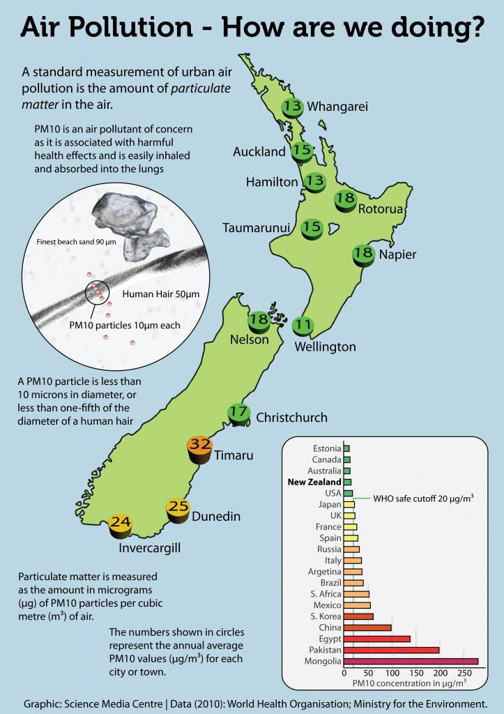
You may remember the story about Auckland air pollution being worse than Tokyo, due to data entry errors by the World Health Organization.  The Science Media Centre has put out a new graphic showing actual air pollution levels around the country and around the world. [They also have the right spelling and location for Dunedin]

Levels are moderately high in the south of the South Island, due largely to the use of wood fires for heating.  It’s worth noting that woodsmoke seems to have different health effects from the car and truck exhaust and factory emissions that dominate the fine-particle air pollution in other places with dirty air.  Seattle, where I used to live, had a similar problem with wood smoke, and there has been a lot of study of the health effects. It looks as though wood smoke has harmful effects on the lungs, especially in triggering asthma attacks, but that it doesn’t have as much effect on the heart. Studies in Seattle find no relationship between heart disease and PM10, in contrast to cities where coal or diesel emissions are the main pollutant and associations are found consistently.

Windblown dust also seems to be less harmful: at the Biometric Society conference in Australia a couple of weeks ago there was a presentation on the 2009 Sydney dust storm, which raised PM10 levels to an amazing 15,000 micrograms per cubic meter.  Even at these massive doses the researchers saw no increase in hospital admissions for cardiovascular disease, and a only modest 15% increase for asthma admissions and 25% increase for asthma hospital visits.

December 18, 2011

Cancer survival up, deaths constant?

The Age (yes, I’m just back from the West Island) has an article on the annual cancer statistics report from the Victorian Cancer Council.  Survival from diagnosis is up for many cancers, and that’s the headline, but in only some of these diseases is there a reduction in the death rate.

The problem is that survival from diagnosis measures the interval between two time points: diagnosis, and death.  You can increase your survival time by dying later, which is a Good Thing, or by being diagnosed earlier and dying at the same time, which many people would consider bad.

(more…)

December 17, 2011

Seasonally-adjusted good news.

The Herald, along with many other sources, reports on US employment: “Far fewer Americans are seeking unemployment benefits than just three months ago – a sign that layoffs are falling sharply.”  By the standards of the US recession, this qualifies as good news, though the bar has to be set pretty low.  A fall in layoffs, on its own, just means that things aren’t getting worse as quickly, and the time limit on eligibility means that an increasing number  of  people are falling off the end of benefits.

Actual unemployment figures are also positive, but a bit less so.  The unemployment rate fell by 0.5%, but half of that was people who stopped looking for work.  Total employment is up, by an estimated 280,000 people, which is promising [the figure of 120,000 given by the Herald is ‘total non-farm payroll employment’].

The real problem in interpreting these numbers is that the increase in employment and the decrease in applications for benefits are both much smaller than the seasonal adjustment factor (as Brad DeLong points out).  Without seasonal adjustment, the total increase in jobs was only 80,000, more than three times smaller.

The basic idea of seasonal adjustment is uncontroversial  — there’s lots of variation over the year in employment in retail, construction, and  farming, and the education system releases a wave of new labour force members at the end of each academic year.  However, in a recession that’s unprecedented since good-quality records began, it’s hard to predict the seasonal variations exactly right.   A small error in the seasonal adjustment could wipe out the apparent gains entirely. And a while seasonally-adjusted employment is the right indicator for the economy as a whole, you can’t afford much Christmas cheer with only a seasonally-adjusted new income.


December 16, 2011

Freakonomics: what went wrong

Andrew Gelman and Kaiser Fung have an article in American Scientist

As the authors of statistics-themed books for general audiences, we can attest that Levitt and Dubner’s success is not easily attained. And as teachers of statistics, we recognize the challenge of creating interest in the subject without resorting to clichéd examples such as baseball averages, movie grosses and political polls. The other side of this challenge, though, is presenting ideas in interesting ways without oversimplifying them or misleading readers. We and others have noted a discouraging tendency in the Freakonomics body of work to present speculative or even erroneous claims with an air of certainty. Considering such problems yields useful lessons for those who wish to popularize statistical ideas.

December 14, 2011

We are the 0.01%?


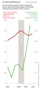
New Scientist has an interesting article on peer-to-peer lending, a crowd-sourced alternative to borrowing from banks.  Unfortunately, it’s illustrated by an extremely misleading graph.

The graph title says ” As the recession caused US loans to plummet, peer-to-peer lenders began to fill the gap”, and the graph certainly makes the rise in peer-to-peer lending (green) look dramatic compared to total US consumer debt (red). However, the axis scale for the green line is 10,000 times smaller than for the red line. The point where the red and green lines cross is where peer-to-peer first reached 0.01% of all consumer lending.

If the two lines used the same y-axis scale, the green line would be horizontal and indistinguishable from the zero line.  Perhaps peer-to-peer lenders “began” to fill the gap, but they will have to expand a thousand fold before they are even visible on the same scale as total US consumer debt.