Posts written by Thomas Lumley (2645)

avatar

Thomas Lumley (@tslumley) is Professor of Biostatistics at the University of Auckland. His research interests include semiparametric models, survey sampling, statistical computing, foundations of statistics, and whatever methodological problems his medical collaborators come up with. He also blogs at Biased and Inefficient

October 7, 2011

Asking for trouble.

According to the New York Times, the US Preventive Services Taskforce is about to recommend against routine prostate-cancer screening, based on the results of randomized trials that didn’t show any decrease in overall deaths.   We’ll come back and discuss the report when it actually appears, but this recommendation is going to be profoundly unpopular with certain groups, most dramatically with men who have had prostate cancers detected and removed.

One of the biggest problems in recommending against an existing screening method or treatment is all the complaints from people who think they have personal experience of its effectiveness (most of whom, I can safely predict, won’t actually bother reading the report before denouncing it).  The idea that an individual can know that a treatment works, based just on personal experience, is a very powerful cognitive illusion.  It can’t possibly be true — medical science would be so much simpler if it were — but the perception is unavoidable.   For example, I had mild `walking’ pneumonia a few years ago, and got sicker over a period of weeks, then got treated, and suddenly started to feel better.  It certainly felt as if the treatment worked, but when I later talked to some experts I found out that there is very little reason to believe that antibiotics are helpful for the sort of illness I had, and suddenly starting to feel better is exactly what happens when your body finally gets on top of an infection.  Even so, if you hooked me up to a polygraph you would find I still believe the treatment worked for me.

Cognitive illusions are much like optical illusions: these lines don’t look straight, and you can’t learn to see them as straight, no matter how much optics you study. You just have to decide who you are going to believe — the evidence, or your own lying eyes?
 

Medicine for muggles

Scientific American’s blog is having a series of posts on how clinical trials for new medicines work (the author describes the series as ‘medicine for muggles’).

October 4, 2011

Brain scans don’t make it true.

The New York Times has an op-ed piece titled “You love your iPhone. Literally”.  The author claims that fMRI imaging of the brains of iPhone owners showed `The subjects’ brains responded to the sound of their phones as they would respond to the presence or proximity of a girlfriend, boyfriend or family member’.  This sounds, um, difficult to believe and invites the classic Tui ad response: “Yeah, right”. But it’s based on shiny high-tech neuroimaging, so it must be true.

There’s a good summary at BoingBoing and another at Prefrontal.org of the problems: the simplest one is that this particular area of the brain lights up for all sorts of things. Seeing activation of the insula is only  slightly more surprising than seeing the All Blacks win a rugby game.

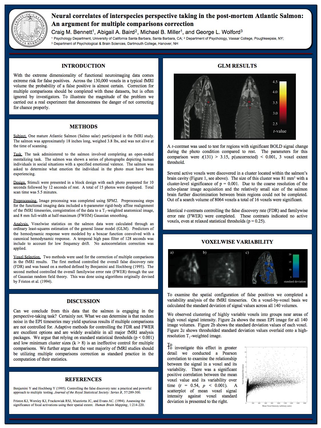
While you’re at Prefrontal.org, make sure to look at their all-time classic “Neural correlates of interspecies perspective-taking in the post-mortem Atlantic Salmon“, where they demonstrate that some standard fMRI statistical procedures let them find emotional responses to photographs in 3.8lbs of Atlantic salmon from the local supermarket.

October 3, 2011

Emigration graphics

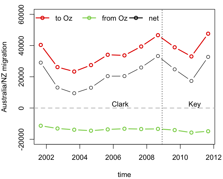
The big problem with our stat-of-the-week was the graphics.  While David Farrar’s redesign to add the early years of Helen Clark’s government provides some context, a cumulative graph is not a good way to see changes over time.   For anyone who actually wants to see the immigration/emigration rates over time, rather than just making a political point, here is a non-cumulative graph using data I downloaded from Stats New Zealand.  The dots are totals for the 12 months ending August each year (the most up-to-date values available).

Disaggregating immigration and emigration is helpful here: immigration from Australia has been roughly constant, but emigration to Australia fluctuates a lot, on top of a weak upwards trend.

Noted for the record

One of the reasons statistics is difficult is the ‘availability heuristic’. That is, we estimate probabilities based on things we can remember, and it’s a lot easier to remember dramatic events than boring ones.  It’s not just that correlation doesn’t imply causation; our perception of correlation doesn’t even imply correlation.

To help with availability, I’d like to make two boring and predictable observations about recent events.

1.  This winter, despite the Icy Polar Blast™, was slightly warmer than the historical average, as forecast.

2. There wasn’t a major earthquake in ChCh in the last week of September, despite the position of the moon or the alignment of Uranus (or anything else round and irrelevant).

September 29, 2011

Faster-than-light neutrinos.

So. It turns out that there is a statistical angle to the recent report of neutrinos travelling faster than light, since it’s the assessment of uncertainty in the travel time and distance that is really at issue.  For a nice summary of the measurement issues from a card-carrying physicist and popular science writer, see Chad Orzel’s blog.

September 28, 2011

Auckland air as dirty as New York?(updated 2x)

The Herald is reporting a WHO report that says the average levels of particulate air pollution are higher in Auckland than in New York.   The Environment Minister doesn’t believe it, and I tend to agree with him.

As the Green Party correctly points out, Auckland has far too many cars on the road.  But the same is true of New York, even though a larger fraction of their cars are taxis.  Auckland is surrounded by ocean, and the background levels of pollution in incoming air are very low.  New York is surrounded by a conurbation with a population of 21 million, nearly all of whom drive everywhere, and gets a substantial amount of pollution from the old coal-fired powerplants in the Ohio Valley.   Yes, the Northwestern Motorway is full of cars, but have you seen the Jersey Turnpike? (more…)

How and why to hire a data scientist

Or, as we would say, a statistician.

When you have too much data for Excel to handle: data scientists know how to deal with large data sets.

When your data visualization skills are being stretched: as we will see, data scientists are skilled (or should be) at data visualization and should be able to figure out a way to visualize most quantitative things that you can describe with words.

When you aren’t sure if something is noise or information: this is a big one, and we will come back to it.

Read the rest at  Mathbabe


September 22, 2011

Harder to win big in the lottery

The ‘Big Wednesday’ lottery has moved from 6 balls out of 45 to 6 balls out of 50, which reduces even further the chance of getting the division 1 prize.  To win division 1, you need 6 balls correct out of 6, plus a correct coin toss.  There are 8,145,060 ways to choose 6 balls out of 45, and about twice as many ways, 15,890,700, to choose 6 balls out of 50.  Adding in the coin toss halves the chance of winning: the chance of winning per ‘line’ used to be 1 in 16,290,120 and is now 1 in 31,781,400.   For a minimum $4 ticket, which gives 4 ‘lines’, the chance of a division 1 prize was 1 in 4,072,530 and is now 1 in 7,945,350.

One back-of-the-envelope way to get roughly the correct impact of the change is to note that the chance of matching a given ball has gone down about 10%: from 1/45 to 1/50.  Multiplying 90% by itself six times says that the chance of winning is 53% of what it was, a very good approximation to the actual ratio, which is 51%.  The Dominion Post had the correct change, but the computations they report seem to have the effect of the coin toss backwards, so all their probabilities are overly optimistic by a factor of four.

Of course, the other way to look at it is that your chance of not winning division 1 with a $4 ticket has gone from 99.99998% to 99.99999%. Hardly seems worth mentioning. (more…)

September 21, 2011

Depressing news now more widely available

The Federal Reserve Bank of St Louis (part of the US Federal Reserve), who run the excellent FRED economic data website, have now released a free iPhone/iPad app that lets you download depressing economic statistics and graphics wherever you are.

There probably aren’t many people in New Zealand who would want this, but I bet they are over-represented among our readers.