Posts written by Thomas Lumley (2645)

avatar

Thomas Lumley (@tslumley) is Professor of Biostatistics at the University of Auckland. His research interests include semiparametric models, survey sampling, statistical computing, foundations of statistics, and whatever methodological problems his medical collaborators come up with. He also blogs at Biased and Inefficient

September 21, 2011

Flu vaccine benefits in kids

New vaccines only get approved after randomized controlled trials showing that they are beneficial, but if you want to estimate the benefit of expanding vaccination to a new group of people it’s hard to do a randomized trial.  Just comparing vaccinated and unvaccinated people doesn’t help, since there are many reasons why these groups are different, and the comparison gives completely unreasonable estimates. There’s a new study from Canada, reported by Reuters, that takes advantage of a ‘natural experiment’ to estimate the benefit of vaccinating children aged 2-4.

In the US, the guidelines on vaccination changed in 2006 to include kids in this age range, in Canada the guidelines didn’t change until last year.  This allowed the researchers to compare hospital emergency room visits in Montreal and Boston and estimate the impact of the change.  Just looking at US hospitals wouldn’t be enough, since there is a lot of year-to-year variation in the severity of the current flu strains, and just comparing the US to Canada wouldn’t work, since there are a whole lot of differences between the countries (starting with a national health insurance system).  But looking at how the US:Canada difference changed from before 2006 to after 2006 gives a reasonable estimate of the effect of vaccination.

Looking at over 100,000 emergency-room visits for flu-like illness, researchers found a 34% decrease in risk for the 2-4 year age group affected by the change in guidelines. This wasn’t just for kids who were actually vaccinated — it also includes the reduction in risk from having your playmates vaccinated.  There was a smaller reduction in risk, 10-20%, for older children — either because the additional reminders made them more likely to get vaccinated, or because they were less likely to catch flu from younger siblings.

Natural experiments get used a lot in economics. In medicine, we tend to prefer real experiments, but sometimes these are impractical or unethical, and natural experiments are the best we can do.
September 14, 2011

Reefer madness

The factoid of dramatically increasing cannabis potency has popped up again, with a claim that cannabis used to be 1-2% THC and is now up to 33%.    The most comprehensive and consistent data on cannabis potency come from a long-term project at the University of Mississippi. Their 2010 paper is based on analysis of 46,000 confiscated samples from 1993 to 2008.    Over this time period, the percentage of THC in marijuana (leaves and buds with seeds) increased from about 3.5% to about 6%.  The percentage in sinsemilla (buds without seeds) increased from about 6% to about 11%.   Since the more-recent samples were more likely to be sinsemilla, the percentage over all confiscated samples increased a bit more, from about 3.5% to about 9%.  A small fraction of the samples had much higher concentrations, but this fraction didn’t change much over time. So, yes, the average used to be about 3% in 1993 and may have been as low as 2% in earlier decades, and, yes, the concentration is now ‘up to‘ 33%, but the trend is nothing like as strong as that suggests.   A New Zealand paper , by ESR researchers (who are hardly pot-sympathising hippies), says that there was no real change in THC concentration in cannabis plant material from 1976 to 1996, and the concentration in cannabis oil actually fell.

The Southland Times article also reports a claim that 90% of first-term methamphetamine users continue to use the drug. If this just means that 90% of them go on to have a second dose at some time it might well be true, but if it is implying long-term addiction the figure seems implausible. It’s certainly not what is found in other countries.  For example, the most recent results from the US National Survey on Drug Use and Health (NSDUH) estimate that 364000 people in the US had dependence/abuse of illegal stimulants in 2010. If we assume that all of these were methamphetamine, and that the other illegal stimulants didn’t cause any dependence/abuse problems, that’s still only 20% of the estimated 1.8 million people who first tried methamphetamine in the period 2002-2010. In fact, since NSDUH has a nice online table generator we can do a more specialized query and find out that an estimated 118000 people currently had dependence on stimulants out of the estimated 10 million people who had ever tried methamphetamine. That’s more like 1% than 90%.   Amphetamines are clearly something you want to stay well away from, but there’s no way that they addict 90% of the people who try them. In any case, if we believe the drug warriors, New Zealand’s P epidemic has already been solved by banning pseudoephedrine without a prescription.

I’m all for getting teenagers to appreciate the risks of drug use, but we need to remember teenagers can use Google too.


September 13, 2011

Why doctors don’t like J-curves

Last week’s Stat of the Week nomination was a story on the “J-curve” for disease risk and alcohol consumption.  Yet another research paper, this time from the Nurses’ Health Study, had found that people who drink small amounts of alcohol regularly are healthier than those who drink none and those who drink larger amounts.    This sort of result is unpopular with doctors, as the Herald story reported, and for good reasons, but that doesn’t mean it’s untrue.  On the other hand, the fact that it’s true doesn’t mean that it’s news.

The obvious difficulty in comparing drinkers to non-drinkers is that some of the strictest non-drinkers are actually ex-drinkers, people who you would expect to be in worse health.  Since epidemiologists are not completely stupid, they know about this problem and many studies have addressed it. Excluding ex-drinkers doesn’t make the effect go away, waiting for a long time between the drinking assessment and the health assessment (as in this paper) doesn’t make it go away, and splitting up light drinking into finer categories shows that there is lower risk for people who drink occasionally than for those who regularly drink a small amount (again, as in this paper).  For some of the claimed benefit there are even plausible mechanisms (eg, alcohol consumption does definitely raise HDL cholesterol levels in short-term experimental studies).   This is just observational research, so the results could be just as wrong as the apparent protective effect of beta-carotene in cancer, or of raising HDL cholesterol with niacin in heart disease, which fell apart when subjected to randomised trials, but it’s carefully-done observational research.

As doctors will tell you, the problem with announcing a health benefit of moderate alcohol consumption is that most people interpret “moderate” to mean “a bit more than I currently drink”.  As a scientific result, it’s fine; as a public-health intervention, it’s badly off-target.   The American Heart Association guidelines on alcohol and heart disease, for example, basically say that regular consumption of small amounts of alcohol probably is protective against heart disease, but that you shouldn’t go around advocating it.

The problem for medical researchers is that funding bodies and universities (and their own egos) want press coverage of research results, but that this sort of marketing of incremental medical research as if it was ground-breaking health advice is unhelpful to the public. It’s very rare that you should change your behavior based on the results of a single medical study, but that’s the model that a lot of medical reporting is based around.

September 1, 2011

Why do white sheep eat more than black sheep?

Why? Because there are more white sheep than black sheep.

The ACC understands this principle; their map of the ‘most dangerous regions’ for falls in NZ is based on number of claims per 1000 population in 2010.  Even though Auckland has the most reported falls, it doesn’t have the highest risk.

It’s less clear that the Herald understands. They described a list from the NZ Transport Agency as New Zealand’s most dangerous intersections have been revealed for the first time. The list was actually the intersections with the greatest number of crashes leading to injury, not corrected in any way for traffic intensity.

Now, if you want to decide which intersections are the highest priority to redesign, the total number of serious crashes is a useful statistic. But if you want to know where it is most dangerous to drive, you need the denominators.

August 26, 2011

Suicides really have been lower in ChCh

News stories about monthly counts of road deaths, suicides, or other relatively rare events tend to cause statisticians to grind their teeth and mutter “Poisson variation”.  If you have two deaths a week  apart, some of the time they will fall in the same month and some of the time in different months, pretty much at random.  This makes the monthly totals very variable: if Christchurch averages about 7 suicides per month and there was nothing making this vary over time, you would expect in most years to see a month with as many as 11 suicides and another with as few as three.  That sort of variation is unavoidable, and doesn’t indicate that there is anything to explain.  It’s called “Poisson variation” because the “nothing to see here, move along” distribution for counts was investigated in the 19th century by French mathematician Simeon Denis Poisson, in a study of court judgments.

With only Poisson variation, a month with just one suicide would be very unusual, though. Only one month in 12 years would we be that fortunate if nothing but chance were operating.  The NZ Herald is quite right that suicide rates have been down in Christchurch — there is something to explain, and the explanation is reasonable. The Dominion Post does even better, giving multiple possible explanations for the dip.

The papers do lose points for not linking to the actual numbers released by the Chief Coroner, which I still haven’t been able to find.


Visualizing uncertainty

Hurricane Irene is heading for somewhere on the US East Coast, though it’s not clear where.  Weather Underground has a nice range of displays indicating the uncertainty in predictions of both location and storm intensity.

August 25, 2011

Extreme weather

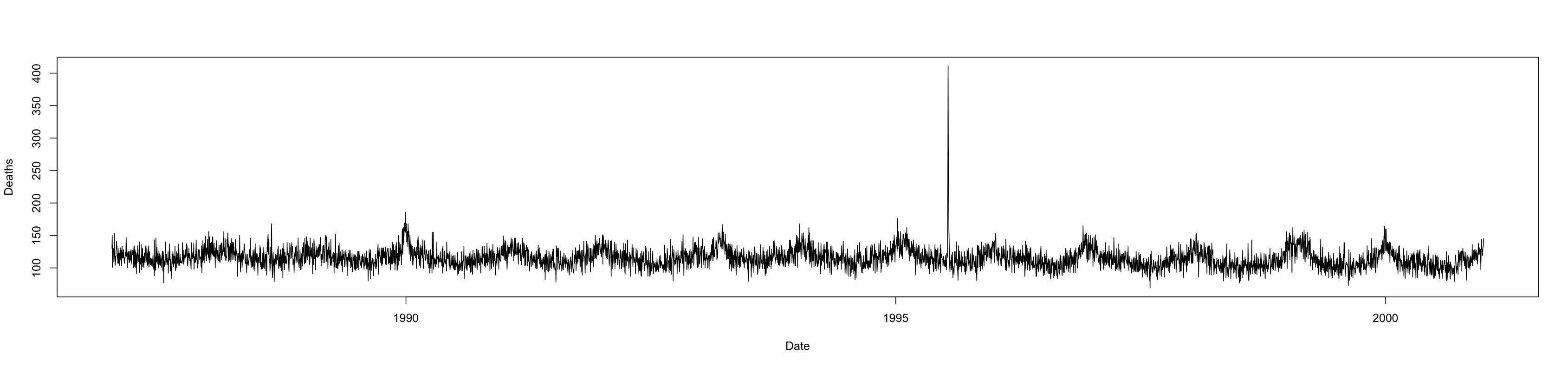
No, not last week’s snow.  To paraphrase Crocodile Dundee: “That’s not an extreme weather event! This is an extreme weather event.” The graph below shows daily deaths in Chicago, over a fourteen year period.  Do you notice anything?

(more…)

August 22, 2011

Spooky action at a distance?

In this week’s Stat of the Week the misinterpretation is not primarily the fault of the individual media outlet, since it was present in the original source.  Still, if a press release or a wire service story told you that the Wallabies had a new training regimen that would improve their game without making them fitter, faster, tougher in the scrum, more accurate with kicking, or better at putting in the elbow, you’d ask questions.  We’d like to see science journalism eventually get up to the standard of sports journalism.

The Herald reported “a new study suggests [TV’s] damaging effects may even rank alongside those from smoking and obesity”. If you look at the British Journal of Sports Medicine, that’s what the authors actually say. They go on to say “TV viewing time may have adverse health consequences that rival those of lack of physical activity, obesity and smoking; every single hour of TV viewed may shorten life by as much as 22 min”. The implication that TV has an effect separate from physical activity and obesity, just as it is separate from the effect of smoking, is reinforced when they say that the associations were adjusted for a whole bunch of cardiovascular risk factors: cholesterol, blood pressure, age, gender, weight, blood glucose, etc.   The implied claim is that TV kills in a way that isn’t explained by any of these risk factors: it’s not that TV-watching uses up fewer calories, or that you are more likely to snack while watching.  Perhaps the mechanism is that watching too much TV makes you believe all the health-related advertising and medical news? (more…)

August 19, 2011

Why is the US driving less?

A post today on Ezra Klein’s ordinarily-reliable blog at the Washington Post looked at statistics for miles driven in the US, and asked why this recession had led to a decrease in driving when previous recessions hadn’t. The post noted that fewer teenagers are getting driving licenses, and speculated that the internet may be replacing car-dependent ways of socializing.  Which could be true.

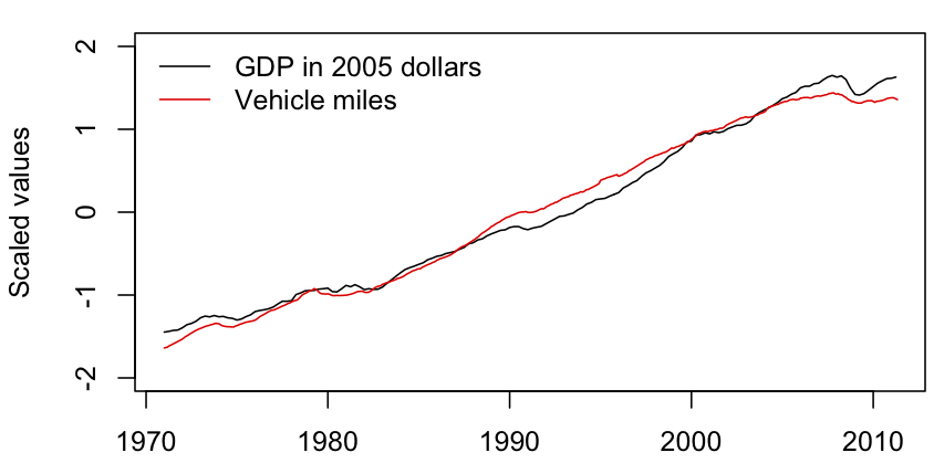
On the other hand, when you look at a longer time series, it seems there’s nothing special about this recession except its depth.

The graph shows US GDP (in 2005 dollars) and vehicle-miles driven in the US, since the driving data started to be collected in 1971.  The two series have been rescaled to the same range, and they track each other very well. Each dip in GDP is matched by a dip in driving.

The only anomaly in the graph is that the most recent dip in driving started before the fall in GDP, and that is easily explained by the spike in petrol prices at that time.

In fact, it looks as though the current Great Recession has had proportionately less impact on US driving than previous recessions.  The absolute dip is larger this time, but so is the economic mess.  Social media may be going save the planet, but it’s not showing up in these time series.


August 16, 2011

More mean than average

As we all know, mean people suck. But do they earn more?

A US study presented at a management conference today looked at measurements of agreeableness, and found that people (or, at least, men) who rated themselves as less agreeable, cooperative, and flexible earned more money.  This isn’t precisely about `mean’ people, but headline writers around the world spontaneously went for the four-letter word (or just copied each other). (more…)