Posts written by Thomas Lumley (2645)

avatar

Thomas Lumley (@tslumley) is Professor of Biostatistics at the University of Auckland. His research interests include semiparametric models, survey sampling, statistical computing, foundations of statistics, and whatever methodological problems his medical collaborators come up with. He also blogs at Biased and Inefficient

October 23, 2020

Compared to what?

From Radio NZ (and ODT)

Analysis by the consultancy firm Dot Loves Data shows that over a five-year period the rate of assaults in Wellington was 10 times higher than the national average.

It considered all reported crimes over a five-year period, and found in the capital there were 2056 counts of assault and 176 counts of sexual assault reported.

It’s pretty clear that Wellington is not going to have a rate of assaults 10 times higher than the national average in any very useful sense.  Unfortunately, I don’t have the report that Dot loves Data are said to have published,  and it’s not clear from the story exactly what comparisons they did, so I’ll have to do this the hard way. The advantage is that you can see what I did, and also see some of the limitations in the data.

Crime data can be found  on policedata.nz.  I looked at ‘Victimisations by Time and Place: Trends’, ie, people who reported getting crimed, regardless of whether the offender was caught and prosecuted, for the five years ending 2020-8-31 (since that’s the end of the data) and where the place of the assault was reported. Having the place reported is a surprising strong restriction: in the last 12 months about 60% of the assaults aren’t assigned to a location* for confidentiality reasons, because they occurred in dwellings. The lack of location data is actually a problem when the point of the story is to compare locations, but let’s pass over it for now and just note that we’re comparing assaults occurring in public rather than all assaults.

For the category  “Acts intended to cause injury”  there were 91472 in New Zealand, 4337 in Wellington City, and 10303 in Wellington Region.   The 91472 acts intended to cause injury that happened in public were about 50,000 ‘common assault’, 17,000 ‘serious assault resulting in injury’ and 23,000 ‘serious assault not resulting in injury’. These aren’t the names of NZ crimes, because (a) they are standardised official-statistics categories and (b) if no-one is arrested or prosecuted it’s a bit hard to be precise about what crime a court would find had occurred. The ‘intended to cause injury’ categories don’t include sexual assault, which is in a separate group and is left as an exercise for the reader.  My figures for assault  don’t accurately match the reported ones, but they probably aren’t exactly the same time frame and might be different in other ways.

The population of New Zealand is about 4.9 million,  of the Wellington Region is about 500,000, and of Wellington City is about 200,000.  Wellington City has about a 9% higher rate per capita of assault victimisation than the country as a whole. Not ten times, 1.09 times. Wellington Region is about 4% higher than the  country as a whole.

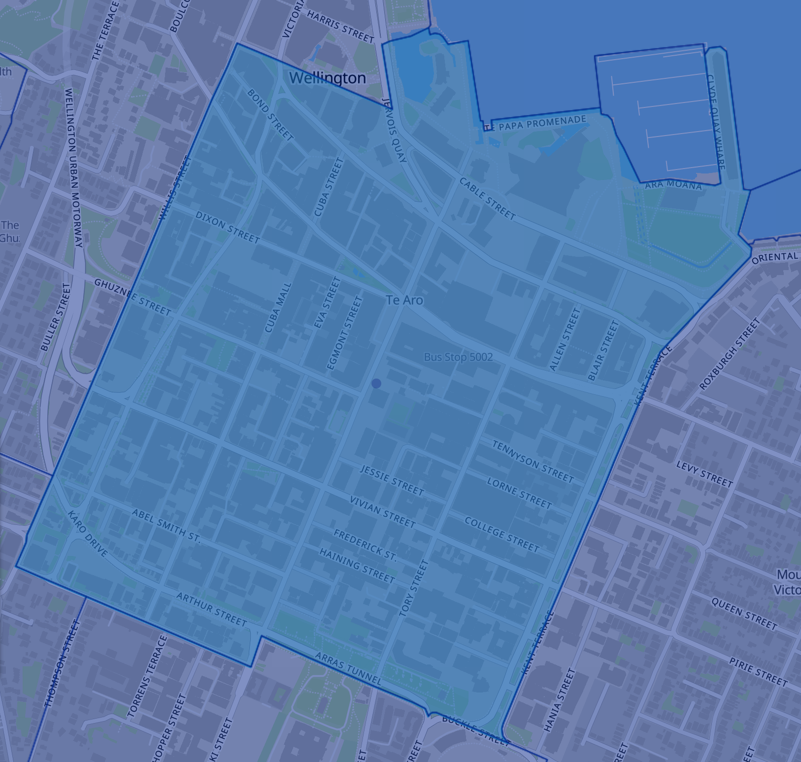
Now, since the story was focused on Courtenay Place and Cuba St, maybe the ‘ten times’ claim was supposed to apply there, rather than to ‘the capital’ as a whole and we should narrow down the geographic focus. The Census Area Unit covering Courtenay Place and Cuba St is “573101 Willis St – Cambridge Terrace”

In that area, there were 1858 ‘acts intended to cause injury’ over five years that happened in public, in an area with a population of 9230. On a per capita population basis that’s  10.8 times the rate for NZ as a whole, suggesting something like this is the analysis being reported.

But why are we dividing by the resident population of Te Aro? Most of the people out partying there don’t live there — they live all over the city and the Wellington region — but they, not the residents, are the relevant denominator. In fact, a lot of assaults of residents will not be in the statistics, because they will happen in someone’s home. At the other extreme, you could leave out population entirely and compare the 1858 assaults in the area unit to the average of 45 for census area units all over NZ — a factor of 40.   That also doesn’t answer any really useful question.

There seem to be two implied statistical questions that are more relevant to the news stories:

  1. Is going out to Te Aro substantially more dangerous than going to bars and nightclubs elsewhere in the country, on an individual party-goer basis?
  2. Would cracking down on the Courtenay Place/Cuba precinct reduce assaults?

Neither question can be answered with administrative data.  For the first question you’d need data on number of visitors to  the area on, say, Friday and Saturday nights and to other areas in the Wellington region and around the country.  For Wellington City it might be feasible to estimate this from parking, rideshare,  and public transport usage, or from cellphone densities, but it would be harder to get data for smaller centres.

The second question depends on the alternative. It’s pretty clear that if we banned going out  to bars and nightclubs the reported assault rate would fall  — we tried that, in April/May, and had about 25% fewer cases nationwide than in 2019 or 2018, and about 50% in the Courtenay Place/Cuba area. It’s also pretty clear we’re not actually going to tackle assaults with nationwide lockdowns.

If we just cracked down on unlawful behaviour in that area, or reduced the number of places selling alcohol, it’s not clear what would happen. It might be that people drink less and fight less. It might be that they just move the party to some other central area. It might be that they spread out across the city. Or, people might get drunk and fight in the comfort and safety of their own homes and streets — we know that assault and sexual assault in the home are badly under-reported (under-reported to police as well as not being in the public data set).

The right comparison will depend on what individual risk or potential policy change you are trying to evaluate, but it’s not likely to be this one.


* I emailed the NZ Police data address to ask about where the missing assaults were; my request is being actioned pursuant to the Official Information Act**

** Yes, I realise that just answering would count as actioning it pursuant to the Official Information Act, but the email still doesn’t make me expect*** a rapid reply

*** And I need to confess to having completely misjudged the police data people, who got back to me the next morning and were extremely helpful

October 22, 2020

Briefly

October 19, 2020

How did the polls do?

There were two (or possibly three) features of the preliminary election results on Saturday being discussed as surprising: the large Labour margin, the win in Auckland Central by Chlöe Swarbrick of the Green Party, and possibly the win in Waiariki by Rawiri Waititi of the Māori Party.  How do these really compare to pre-election polling? I’m going to use Peter Ellis’s poll aggregator, to save having to think about it myself. It’s an obviously sensible approach and has done well in the past.

To start with, I do want to point out that the polls got the broad message correct,  in a way that you would probably not be able to do just by listening to the news and doomscrolling on social media.  The polls said that Labour would do much better than in 2017, and that ACT would do much better than in 2017 and that National would do much worse, and that the miscellaneous new parties would go the way of most miscellaneous new parties.  It’s the details that were off.

In the aggregated polls, Labour were expected to get 59 seats, plus or minus about 3, and National about 42 with similar uncertainties.  In reality, Labour are at 64 and National at 35, way out in the tail of the predictions.  Even taking the uncertainty in the model into account, Labour did surprisingly well.   The predictions for  ACT and NZ First, on the other hand, were spot-on, and for the Greens were well within the predicted range.

In Auckland Central I know of two electorate polls, which had  Chlöe Swarbrick at 24% and 26% — the latter taken 24-30 September, very close to the start of voting.  In reality, she got 34.1% and, if history can be trusted, is likely to move up slightly on special votes.  This wasn’t a straightforward swing away from National; the Labour candidate also did better in polls than in the election. It will be interesting to see if much of Swarbrick’s performance can be explained by improved turnout when we have the final numbers.

Single-electorate polling is always hard, and it’s likely to be even harder for an electorate with a young population that includes many students, and for a three-way race. Hard-to-predict electorates, though, are the only ones where polling is interesting.  Given that two polls were both off by 10+% for the winning candidate, single-electorate polling may just not be worth the effort.

By contrast, I don’t think the Waiariki result should really be surprising — the polling was indicating a good chance of one or two electorates for the Māori Party, and I’m told that people in Māori media had discussed it as plausible.

So why were the polls off nationally? It doesn’t help that the number of polling companies has fallen, but that would be incorporated in the model uncertainty, so it doesn’t explain everything.  Some of it is probably just 2020. Because opinion polls get a low response rate — and worse, a response rate that’s lower for some groups of people than others — pollers have to have ways to correct for the bias.  On top of that, they need ways to estimate who will actually vote in the election.  Given the huge change in people’s working patterns this year, and especially during August and September in Auckland, it would not be even slightly surprising if the relationship between political views and responding to an opinion poll had changed.

In the future, as things settle down, polling companies will be able to adapt to the new normal and get more accurate results (or at least better estimates of error). For now, though, polls may be working less well than they have in the past.

October 18, 2020

‘Close’ counts in horseshoes and clinical trials

Elections are designed  to  produce a  result: someone wins. The losing side doesn’t get to enact a fair share of their program just for getting close.

Clinical trials aren’t like that.  They do feed into regulatory decisions, which may be  yes/no in a similar way, but when we talk about what was learned in a trial it isn’t just binary, or shouldn’t be.  Unfortunately, there’s a tendency for “the trial did not provide convincing evidence of mortality  reductions” to get simplified to “the trial did not provide any evidence of  mortality reductions”  and then to  “the treatment  does not reduce mortality”.

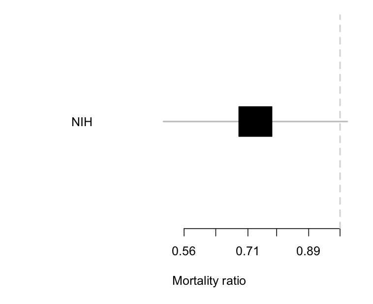
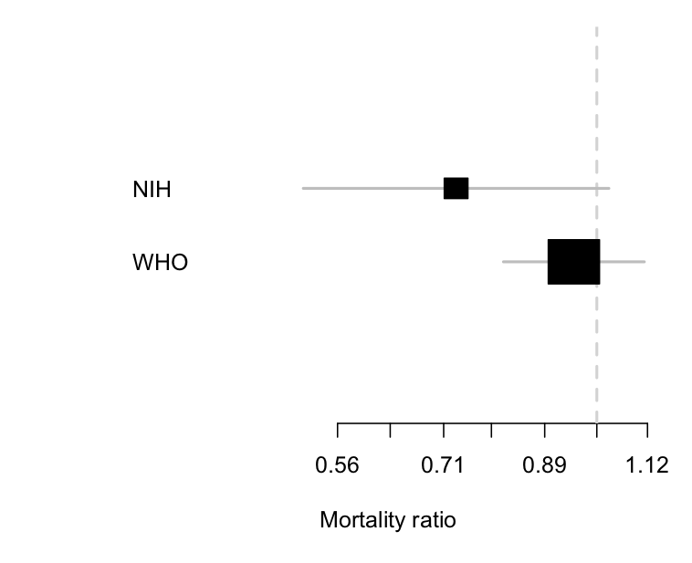
The NIH trial of remdesivir for Covid was a typical example. Here’s the result.

The estimated reduction is about 25% — not a cure, but quite worthwhile if true.  There’s a lot of uncertainty: the trial data are consistent with there being no benefit (a ratio of 1; the vertical line) and equally consistent with a 50% mortality reduction.  The results still got described as “remdesivir does not reduce mortality”.

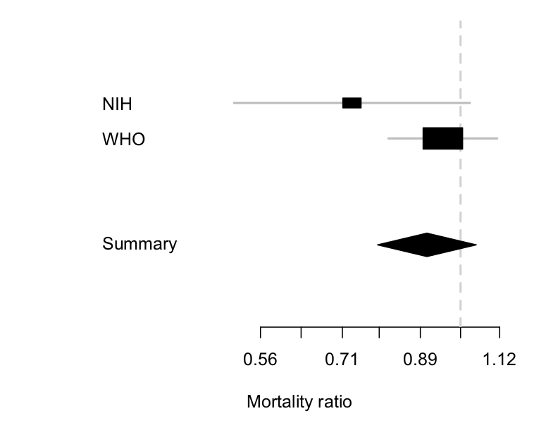
This matters, because we need to distinguish an inconclusive but moderately favourable result from the other sort of negative trial. This week we got results from the larger  SOLIDARITY trial, coordinated by  the WHO.  Here’s a comparison of the two

The two trials are clearly consistent with each other, but the uncertainty around the results is a lot smaller with the WHO  trial.  Importantly,  the estimated  benefit in the WHO trial is a much less impressive 5% reduction, and the lower limit is about 20%.  The WHO trial can reasonably be summarised as  saying ‘there is no substantial reduction in mortality with remdesivir’, and it wouldn’t be too much of a stretch to say ‘remdesivir doesn’t reduce mortality’  (in patients similar to these ones).

We can combine the two sets of information:

The  diamond is the uncertainty interval for the combination of the two trials (it’s a different shape so you  don’t think it’s a third trial).  It mostly follows the larger WHO trial, where most of the information is, but it’s shifted a little to the left because of the more positive information from the NIH trial.  The takeaway point is the same as from just the WHO trial, though: remdesivir doesn’t reduce mortality much, if at all.

October 9, 2020

You could just guess

Q: Newshub says they know the demographic that’s worst at social distancing

A: Presidents? Elderly real-estate developers? Americans?

Q: The headline doesn’t say

A: Well, of course not. Then you might not click. It’s men, and young people

Q: So, the majority of the population is the worst?

A:  Have you been in a supermarket lately?

Q: Fair point. How did they tell who was good and bad at social distancing? Did they use hidden cameras and AI video processing?

A: They asked them

Q: So men and younger people just say they are the worst.

A: Yes, basically.

Q: And this was in Canada and the United States?

A: No, the researchers were in Canada and the United States. The participants were from around the world.

Q: How around?

Q: Well, about 700 from Canada, nearly 200 from UK, 72 from Serbia, 61 from USA, 39 from Malta, 4 from Luxembourg,  1 from Brazil, and … you’re looking impatient

A: How about New Zealand?

Q: None

A: How did they do the sampling?

Q: The research paper says “This cross-sectional study was conducted online with a convenience sample of English-speaking adults”

A: Like — Twitter polls or something?

Q: “The survey was hosted on the Qualtrics platform and was distributed via snowball convenience sampling through co-author’s professional and personal networks and social media accounts (e.g., Twitter, Facebook); ads posted on University of Calgary online platforms; via paid ads (35.00 CAD/day) posted on Facebook targeting English-speaking adults residing in North America and Europe.”

Q: “Snowball convenience sampling”?

A: Translates as “Please retweet for reach”

A: That… sounds like the sort of thing you usually call a bogus poll.

Q: It does, doesn’t it.

A: But it seems to be getting the right answer

Q: If you can tell that, you didn’t need the survey.


October 5, 2020

Auckland is bigger than Wellington

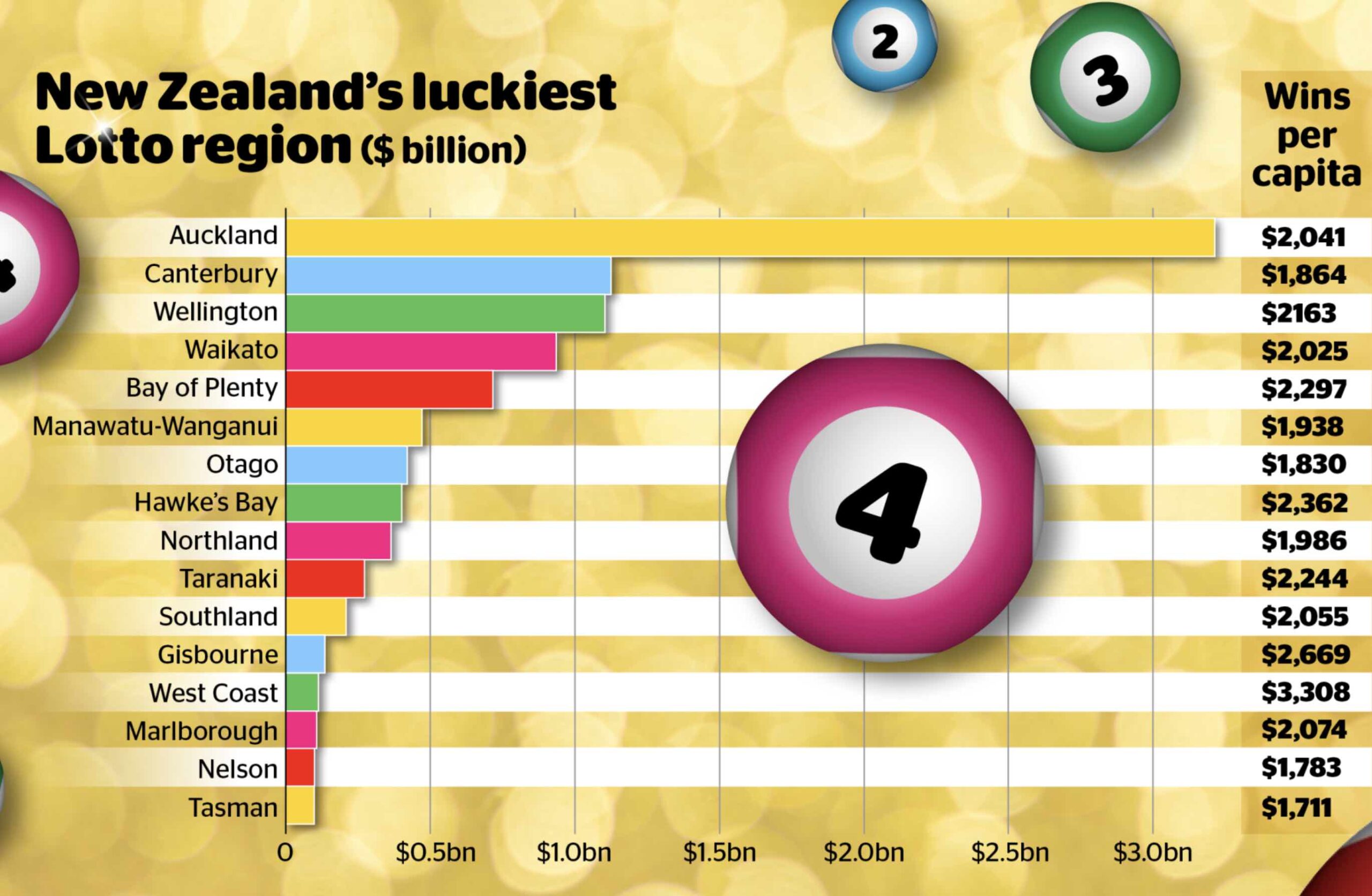
There’s a long interactive in the Herald prompted by the 2000th Lotto draw, earlier this week.  Among other interesting things, it has a graph of purporting to show the ‘luckiest’ regions

Aucklanders have won more money in Lotto prizes than any other region — roughly three times as much as either Canterbury or Wellington. By an amazing coincidence, Auckland has roughly three times the population of Canterbury or Wellington.  The bar chart is only showing population. Auckland is not punching above its weight.

Wins per capita are over on the side, and are much less variable. Some of this will be that people in different regions play Lotto more or less ofter; some probably was luck. It’s possible that some variation is due to strategy — not variation in whether you win, but in how much.

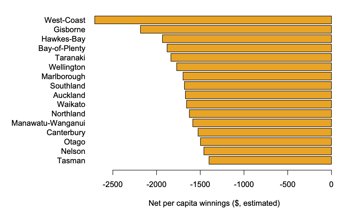
Perhaps more importantly, the ‘wins per capita’ figure is gross winnings, not net winnings.   Lotto NZ didn’t release details of expenditures, but 2000 draws is a long enough period of time that we can work with averages and get a rough estimate.  As the Herald reports, about 55c in the dollar goes in prizes, so the gross winnings will average about 55% of revenue and the net winnings will average -45% of revenue, or -9/11 times gross winnings.

So: as an estimate over the past 2000 draws, the ‘luckiest’ NZ regions


Some of the smaller regions are probably misrepresented here by good/bad luck — if Lotto NZ released actual data on revenue by region I’d be happy to do a more precise version

Auckland outbreak: the genomes

Marc Daalder at newsroom has a very good piece about genome sequencing and its role in handling the Auckland outbreak.

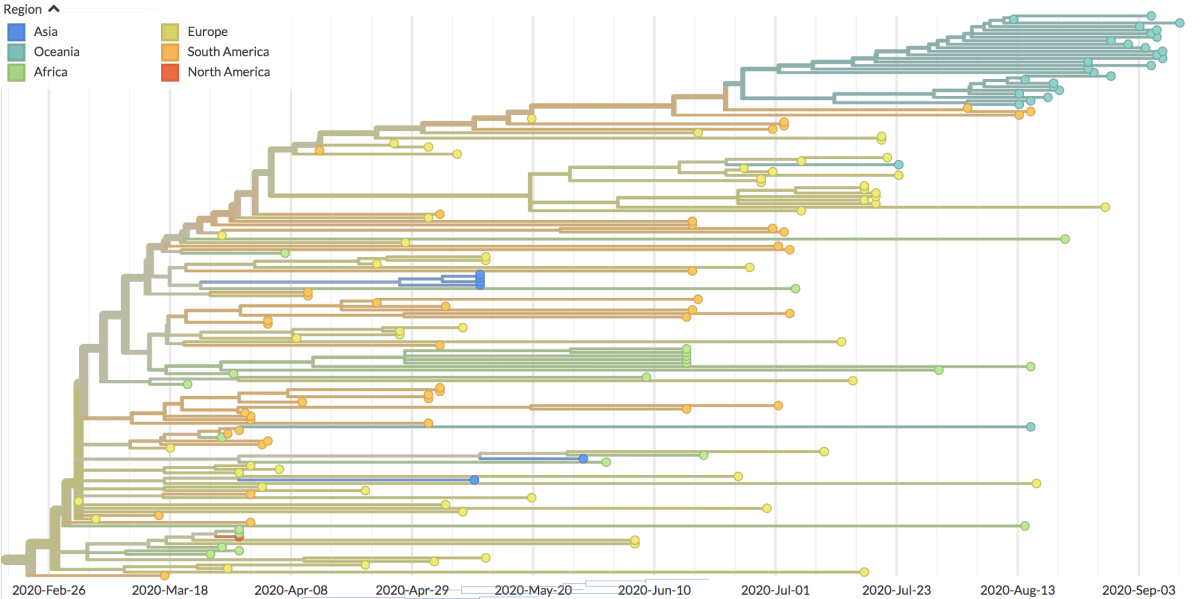
One thing I want to highlight is this family tree. It’s the B.1.1.1 clade of the virus, a particular viral subfamily

The samples from the Auckland outbreak are that blue/green cluster at the top. They’re all more closely related to each other than to any other sample that has been sequenced in NZ or anywhere else in the world, so we know they had a recent common ancestor: the virus that started the outbreak.

I’m mentioning this because I saw discussion on Twitter over the past month or so of the ‘B.1.1.1 clade’ and whether there had been other earlier cases from that clade in NZ and whether that meant the government was hiding something.  B.1.1.1 is a pretty broad family, going back to a common ancestor in late February.   If two samples are from different broad clades, they are different incursions to NZ, but if they’re from the same broad clade they aren’t necessarily the same incursion. You need the full sequence to say how closely viruses are related.

September 20, 2020

Chloroquine trial exaggerations

Q: Did you see hydroxychloroquine is back?

A: No

Q: In the Herald (blamed on news.com.au) Hydroxychloroquine: Divisive drug may hold secrets to stopping Covid-19‘ and ‘Covid 19 coronavirus: Hydroxychloroquine: The drug that could be our saviour‘. What’s the news?

A: There’s a new Australian trial in healthcare workers, to see if taking the drug before you get exposed will protect you  from infection — previously there had only been evidence that it doesn’t help  if you take it when you’re already sick.

Q:  And what were the results?

A: There aren’t any results. There won’t be any results for quite a while.

Q: When?

A: The entry at the Clinical Trials Registry says they plan to finish taking measurements at the end of the year, and the story says the results will be in by January.  Though  the Trials  Registry also  says they plan to recruit 2250 people and follow them for four months, and the story says they have ‘roughly 200’ people now. So it’s not completely clear.

Q: Will it work?

A: We don’t know. That’s the point of the trial.   We know it’s nowhere near 100%  effective,  because people taking hydroxychloroquine for auto-immune diseases have  ended up with COVID, but it’s possible that it provides some useful level of protection. It’s also very possible that it doesn’t.

Q: And healthcare workers are at high risk, so it would be most useful for them?

A: Yes, and healthcare workers are already trying to do all the other protective things, and they are still at high risk, so the drug might be a useful addition even if it’s only moderately effective

Q: And for the rest of us?

A: It’s unlikely to be as safe or effective as masks.

Q: If it does work, it will be pity that the politicisation has slowed it down

A: Well and the fact that it doesn’t work after you get sick. But yes, that’s one of the points the story makes, quoting both the lead researcher and a study participant

Q: This is the story that’s illustrated with a picture of Donald Trump?

A:  <sigh>

Q: Apart from the headline and picture, the story is ok?

A: Well, later on, one of the researchers says

“For example if there was a case in a meatworks or an aged care, you’d go there and give the drug to all the residents or workers to try to prevent them getting Covid-19,” he said.

Q: But how is that before they’re exposed? If there’s a diagnosed case, they’ve already exposed people and they will be isolated in the future and not expose anyone else. It’s the people who are already exposed that are the problem.

A: I hope he’s just saying there’s a potential for using it as post-exposure prophylaxis in the future, after a different trial

Q: That … could have been clearer.

A:  And the biggest problems for healthcare workers in the current Australian outbreak seem to have been a shortage of protective equipment or poor ventilation, so you’d hope irresponsible news headlines about a miracle cure wouldn’t distract from that.

September 18, 2020

Vaccine transparency

Moderna (big long PDF) and Pfizer (big long  PDF) have released their clinical trial protocols.  These specify how  to run the trial: the statistical design, and also a lot of other things  like how  they collect adverse events. There’s a story at Reuters and at Buzzfeed. I’m not the right person to  comment about the detailed collection of safety data, except to say that they do describe how they do it,  so you can ask your favourite immunologist or virologist for an opinion.

The statistical design of early stopping is reasonable in both trials, as you’d hope. Both trials will end up declaring a positive result with an estimated vaccine efficacy  greater than 0.5, and with  0.3 efficacy outside the margin of error.   If the true efficacy is 0.6 they have a  90% chance of  declaring a positive result.

They vary in how they place their bets for the case where the vaccine is more effective than that — and it might be, who  knows?.  If the vaccine is actually 90% effective, you don’t need to test it on as many people, and the urgency of knowing it works is greater. The trials are designed so  they can stop early, but still preserve their overall standards for statistical evidence.

The tradeoff for stopping  earlier is that you have less detailed  information: you  know the vaccine is  good, but you have less precise estimates of how good, and you have somewhat less safety information because you’ve vaccinated fewer people or followed them for less time.  There is an important and nerdy statistical literature on the  pros and cons of basically any possible set of guidelines for stopping early. If you’re interested, this is a good starting place.

Moderna designed their trial more or less the way I would have done, with the so-called O’Brien-Fleming guidelines, which are standard and pretty conservative about early stopping. Pfizer are less conservative: if the vaccine is very effective, they have more chance of  stopping early.   But while they are less conservative, the design is still well in the  range of standard custom and practice.

We still don’t have any idea what the results will be at the early analyses, either for effectiveness or safety.  We don’t know what the US  government will decide to do with the results. But we do know that if the trials follow their protocols, and if the trials stop early, and if there aren’t  prohibitive safety concerns, then we will have good  evidence that  the vaccine works.   We  also will be able to tell if  the companies or  the FDA or anyone changes the standards of evidence after seeing the results.


September 16, 2020

Undetected COVID cases?

The Herald

Researchers from the Australian National University have now developed a new test which picks up previous Covid-19 infection in a patient’s blood

The study indicates eight in 3000 healthy and previously undiagnosed Australians had likely been infected with the virus.

“This suggests that instead of 11,000 cases we know about from nasal swab testing, about 70,000 people had been exposed overall,” Associate Professor Ian Cockburn said.

We had a few of these ‘seroprevalence’ studies a while back. If you’re trying to estimate a proportion as low as 8 in 3000 from a sample, you need a representative sample and you need a test with a false-positive rate that you know is much lower than 8 in 3000.

Let’s look at the preprint:

You don’t need to download the PDF,  just skimming the abstract will tell you how they got the 3000 people, and what the uncertainty is:

 We used this assay to assess the frequency of virus-specific antibodies in a cohort of elective surgery patients in Australia and estimated seroprevalence in Australia to be 0.28% (0 to 0.72%)

Emphasis added: the uncertainty interval goes all the way down to  zero.   In contrast to some of the earlier seroprevalence studies, they seem to have done the analysis right, but I’m not convinced that people getting  surgery are a representative sample — they certainly aren’t a random sample.

If you do click through the PDF, the Discussion section says it even more clearly

Here we report results from the first large scale seroprevalence survey in Australia. We estimate a seroprevalence of 0.28%, which–given a population estimate for Australia of 25.50 million individuals — equates to 71,400 infections(95% CI: 0 to 181,050).

It’s actually pretty impressive  that the test is as good as it is, but it’s still not really up to the challenge of providing reliable evidence on the number of people exposed to Covid in Australia.