Posts written by Thomas Lumley (2645)

avatar

Thomas Lumley (@tslumley) is Professor of Biostatistics at the University of Auckland. His research interests include semiparametric models, survey sampling, statistical computing, foundations of statistics, and whatever methodological problems his medical collaborators come up with. He also blogs at Biased and Inefficient

March 17, 2020

Briefly

  • Statisticians from the Human Rights Data Analysis Group write in the UK literary magazine Granta, about the uncertainty in COVID-19 mortality rates.  They’re saying similar things to what I and other statisticians have said, but should be reaching a new audience, including some influential people.
  • The infectious disease modelling group at Imperial College, London, have put out a new paper on suppressing infections (PDF, Financial Times, Guardian).  The take-home message is the same as the animation in this Spinoff piece by Siouxsie Wiles and Toby Morris: distancing measures can potentially suppress the epidemic, but if they work we need to keep doing them until a vaccine arrives. “The major challenge of suppression is that this type of intensive intervention package – or something equivalently effective at reducing transmission – will need to be maintained until a vaccine becomes available (potentially 18 months or more) – given that we predict that transmission will quickly rebound if interventions are relaxed”
  • Alberto Cairo links to an interesting essay (previously a lecture,PDF) on ‘the ethics of counting’: “But wait!” the kid thinks to himself. “A grown-up lumped these different things together so I guess I’m supposed to consider them as the same.” Notice that when kids learn to count, they’re not just learning number words and symbols; they’re learning how adults see things
  • Via flowingdata.com, a map of all the trees and forests in the United States
  • From Kieran Healy, a map of all the rivers and streams in the US
  • Along similar lines, from the Herald a couple of years ago, a map of NZ with place names coloured by whether they are in te reo.
March 14, 2020

Stimulating the economy

You can divide most of the coronavirus stories in the world media into two groups: accurate and helpful information on the one hand, and harmful misinformation on the other.  The NZ media have been doing pretty well in keeping to the first sort.

There are a few stories in the middle, like this one at Newshub, that seem to be intended mostly as entertainment

Some people are making sure they will enjoy their time in quarantine, should it be enforced upon us. 

New Zealand sex retailer Adult Toy Megastore has reported a surge of sales in lubricant, vibrators and batteries in the wake of the pandemic. 

They don’t sell toilet paper or bottled water, so they’re bound to have somewhat different top products from the supermarkets, and there’s nothing really surprising here. In contrast to the previous StatsChat appearances of this store, they’re sticking to topics where they actually know the data, rather than overinterpreting bogus surveys.

There’s also a pointer to some medical advice, which is where the whole thing gets a bit more dodgy. The only reason I’m keeping this to “a bit” is that I don’t think you’re intended to really take the story seriously:

“Masturbation can produce the right environment for a strengthened immune system,” she told Men’s Health. 

Her views are backed up by a study from the Department of Medical Psychology at the University Clinic of Essen which looked at the effects of orgasm through masturbation on the white blood cell count.

A group of 11 volunteers were asked to participate in a study and the results confirmed that sexual arousal and orgasm increased the number of white blood cells.

The study is actually linked. It’s a paywalled paper, but here’s the abstract.

If you’ve got an experimental study of an intervention that might prevent viral infection, you’d want to know who was being studied, the sample size, and how representative they were.  You’d want to know what effects were being measured and over what period.  And you’d want to know to what extent the intervention was also present in the control group. In a serious clinical trial that sort of information would be in the abstract.

The abstract doesn’t actually say anything about the diversity of study population, apart from “11 volunteers”. The paper says “healthy young males” and notes they were all exclusively heterosexual and had an average age of 37.7 (so ‘young’ is being interpreted relatively broadly).  The participants were asked to refrain from sexual activity for 24 hours before the experiment, but that’s all.

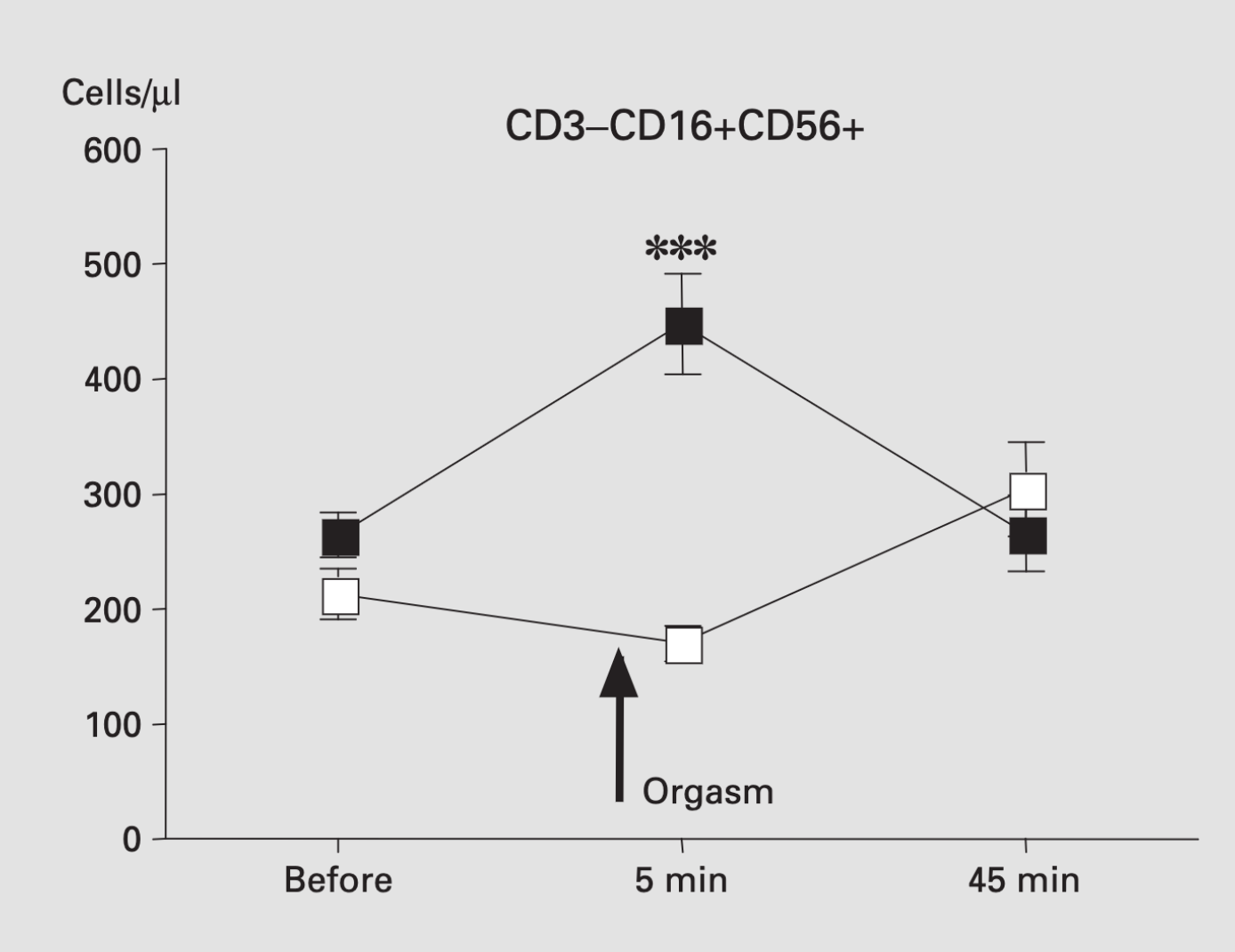
The abstract does talk, importantly, about “transient” changes in hormones. It’s less open about the changes in white blood cells.  The headline effect is that there were more “NK cells“, which are theoretically relevant to viral infection, 5 minutes after orgasm.  It’s not clear whether the increase is big enough to be helpful. However, the increase had gone away again by the second measurement at 45 minutes (so it’s probably safe). Here’s the graph

It’s not clear that we should believe these results, given the well-known problems with reporting and analysis bias in small experiment — and even without any issues in the scientific publication process, you can be pretty confident Newshub wouldn’t have mentioned unconfirmed results from a tiny experiment published in 2004 if it didn’t confirm what they wanted to say.  But suppose we do believe the results.  What does it tell us about COVID-19? Is this, as they say, news you can use? You might consider your times of greatest exposure to other people’s viruses and look for a half-hour window where greater immunity would be relevant. On the other hand, that might cause more problems than it solves. Alternatively, you could just wash your hands (actually, you should wash them either way).

Leaving aside the questions of appropriate time and place, I think the StatsChat advice on red wine and chocolate also applies here. If you’re thinking of a half-hour increase in one type of white blood cells as a convincing argument in favour of orgasms, you may be doing them wrong.

March 13, 2020

Why don’t we know the covid-19 mortality rate?

There are lots of questions about the current pandemic that need expertise in microbiology or international freight logistics or sociology or whatever, but there’s the occasional one that is basically statistical.  In particular,  lots of people would like to know how bad COVID-19 actually is: what’s your (or your kid, or your grandmother’s)  chance of needing hospital treatment or dying?  This post will try to explain why we don’t know the answer, and aren’t going to know the answer for a while, although there are some questions that sound similar where we do know the answer or will know fairly soon.

The mortality rate (case fatality rate) for a disease is the number of people who die from it divided by the number of people who catch it.  For the initial outbreak in China we have a reasonably good idea of the number of people who died (at least if you trust the PRC statistics), and the rest have recovered. We don’t know how many people were infected; the health system had more urgent things to do than testing apparently healthy people. The same is likely true for some of the smaller outbreaks in other Asian countries.  In the rest of the world we don’t even know the numerator of the rate, because most of the people who have been sick are still sick and we have to wait to see how many recover and how many die.

To some extent the mathematical epidemic models can work around this problem.  If people with few or no symptoms are still infectious,  they’ll contribute to the growth of the epidemic, and the number can be estimated from the shape of the epidemic curve.  That doesn’t work perfectly, but it works to some extent.  However, if people with few or no symptoms are less infectious, they’ll tend to be missed. People who have no symptoms and who don’t pass the virus on are invisible to the models, at least until there are enough people like that to get herd immunity working.  This post on Andrew Gelman’s blog looks at two fairly sophisticated modelling attempts, which don’t agree all that closely.

In the long run, it will be possible to get a reliable estimate of the number of people who have been infected, because they will end up with antibodies to the virus, and someone will develop a test for the antibodies and apply it to a suitable population sample.  That sort of data goes into the mortality rate estimates for flu: the mortality rate among people who develop classic, serious, flu symptoms is quite high, but there are a lot of people who are infected without ever knowing it — as much as 10% of the population — so the mortality rate among everyone infected is very low. In the same way, the retrospective mortality rate of COVID-19 will likely be lower (by some unknown factor) than the current ratio.

We do have reasonably good information on what happens to people who get sick enough to need medical attention, and  we know how that number grows with good or not so good control efforts. That’s the number that matters if you get sick. But we don’t know as much as we’d like about the structure of the epidemic and how many people will eventually get seriously ill, because we haven’t been able to find and count the subset of basically healthy cases.

March 10, 2020

Stabbing stats

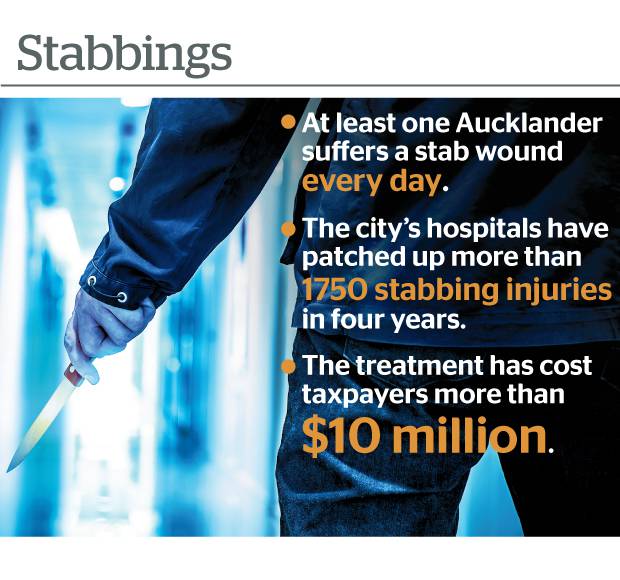
From the Herald (and from the front page in the squashed-trees edition)

I’m not disputing the basic message that people being stabbed is bad and we’d like less of it.  And it’s good that numbers are being given, but there’s at least three issues with those numbers.  On top of the familiar “quote a total over four years because it’s bigger”.

The first is that the numbers don’t refer exclusively to “Aucklanders”.  As the story says

But a spokeswoman noted it was a regional 24/7 trauma centre for patients around Auckland and Northland, meaning many of the most serious trauma cases were directed to Auckland Hospital.

And secondly, the definition of ‘stabbing injury’ varies by DHB: Auckland DHB was reporting only stab wounds from assaults and self-harm, but

Counties Manukau chief executive Fepulea’i Margie Apa said the DHB’s figures included all stabbing injuries from any cause, “not only those from violence”.

Are there many cases of accidental stabbings? Well, we regularly get told about carving-knife accidents at Christmas, and about ‘avocado hand’, so there are some, but it’s hard to guess how many.  If you were doing this seriously, you’d come up with a list of relevant ICD-10 categories and ask the DHBs for numbers in those categories, but that takes medical knowledge and might risk a ‘too hard’ refusal from the DHB.

The third issue is going from 1750 in four years to “at least one every day”.  On average, there were about 1.2 events per day.  At that rate it would be really surprising (and newsworthy) if there was at least one every day. You’d expect them to clump more than that.

The simplest mathematical model for counts of events is the Poisson process, which has no ‘built-in’ clumping: it describes a world where there are no high-risk days (hot, humid Saturday nights? Bad sports results?), and where all stabbings are independent (no multiple-stabbing fights or robberies).  Even under the Poisson model, you would expect about 30% of days to have no stabbings.   In the real world, you’d expect more days with two or more stabbings and more days with zero.

Getting less clumpiness than a Poisson model takes some sort of conspiracy.  The best-known NZ example is two-dimensional (space) rather than one-dimensional (time), as in this photo by Flickr user Alexander Kesselaar


Glow worms in a cave spread out more evenly than a Poisson process would predict, because they keep away from each other. Stabbings probably don’t


February 29, 2020

Viral misinformation misinformation

I wasn’t going to post about this, but I’ve seen two good Kiwi journalists retweet versions of this today already and I’m having a sense of humour failure about it.

A US public relations company did a phone survey. They don’t describe the methodology very clearly (a bad sign), but suppose we assume for the sake of argument that it was competent.  They don’t given the exact question they asked (also a bad sign), but their conclusion was

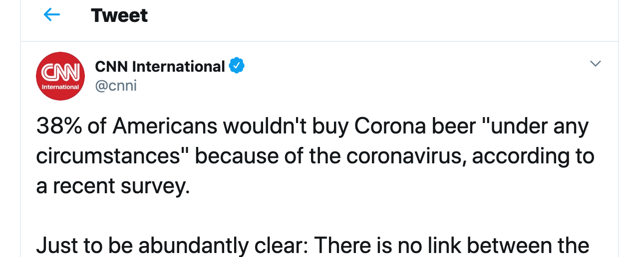
  • 38% of beer-drinking Americans would not buy Corona under any circumstances now

Ten years ago, I lived in the US and would have counted as a ‘beer-drinking American’ for phone survey purposes.  I would probably have answered ‘Never’ to a question on whether I would buy Corona.  Strictly speaking, that might have been an exaggeration (and let me point you to one of the great 1980s Australian beer ads as a possible counterexample), but as far as I recall I didn’t ever buy Corona.

Lots of ‘beer-drinking Americans’ don’t buy Corona because they don’t like the flavour or because it’s advertised for a different social group, or whatever. It wouldn’t be surprising if that came to 38% who always preferred Bud or Molson or Coors or Mirror Pond Pale Ale or PBR.

The survey also asked people who usually drank Corona (clearly a minority of the respondents) whether they would still drink it. 4% said no. Unless your survey is exceptionally well conducted, that’s down at the level of alien abductions and lizard people.

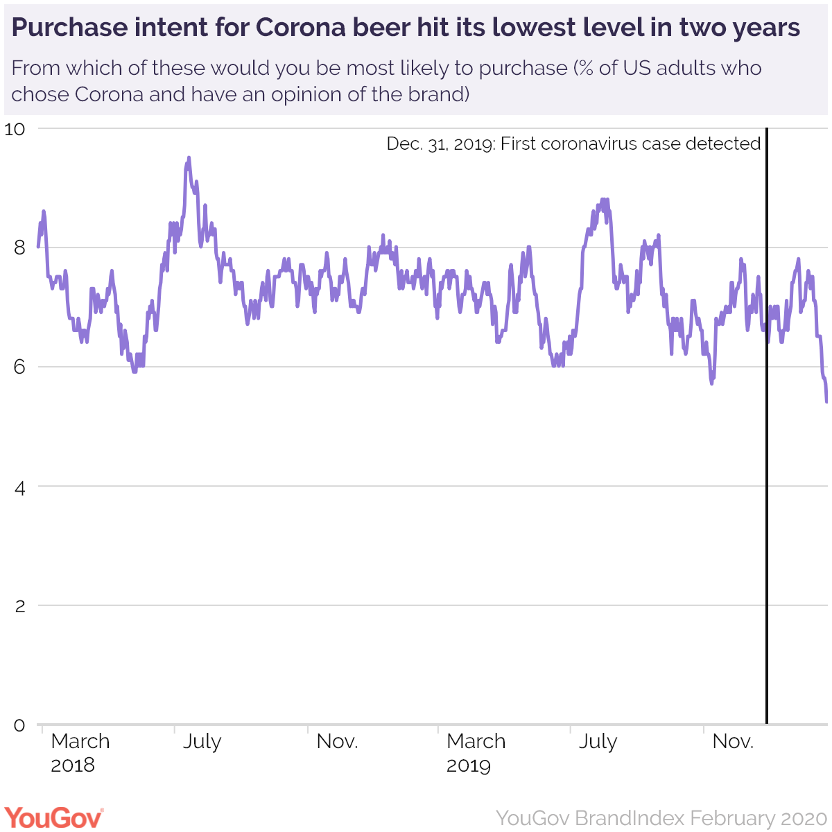
The CNN story also referred to a YouGov survey that said the ‘intent to buy Corona’ was at the lowest level in two years. Here’s the graph

Intent to buy Corona is down about one percentage point from Christmas and maybe two-tenths of a percentage point from October.

While I’m on the topic, I’d like to point out the Infodemic blog. It goes into great detail (with animated gifs and so on) on simple ways to fact-check claims about coronavirus — or anything else.   It’s the same sort of techniques that I use in writing StatsChat, but Mike Caulfield explains them patiently and carefully and I just try to show how I use them.


February 20, 2020

Briefly

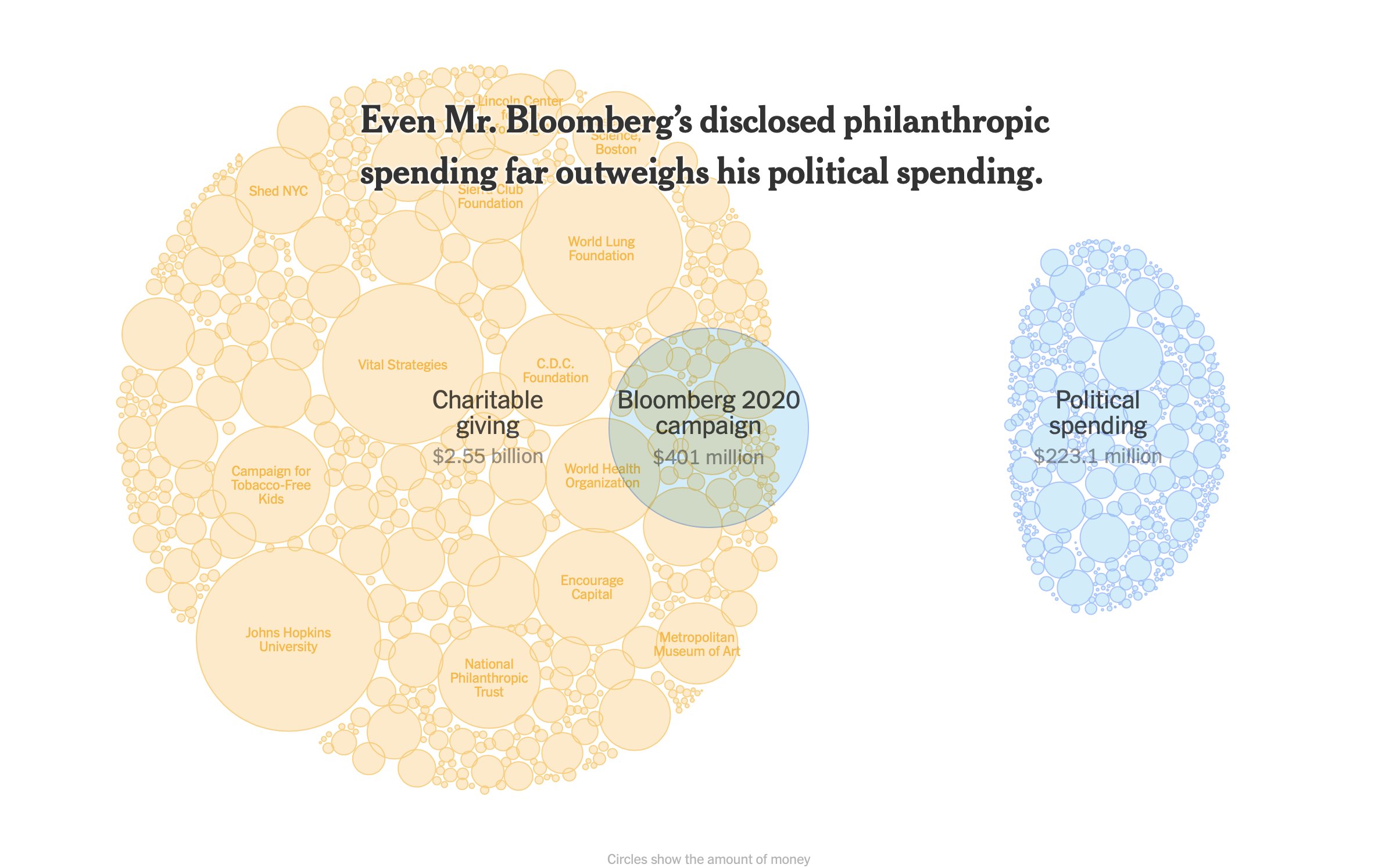
  • “To be clear I’m not saying that the numbers are wrong, I’m just saying that you can’t have a circle representing $401m be smaller than the lump representing $223m” Felix Salmon, about this graphic from a NY Times story. These ‘bubble’ graphics can be seriously misleading, though they probably wouldn’t violate NZ advertising standards
  • A popular self-driving car dataset is missing labels for hundreds of pedestrians
  • The weirdness of UK gold export statistics, from Ed Conway on Twitter
  • A very nice piece from Hamish Rutherford at the NZ Herald, on how Ardern and Bridges can disagree so much about economic growth.
  • NY Post claims ‘majority of serial killers are Taurus’, attributing the ‘research’ to Britain’s Daily Mirror. It would be surprising if this were true, and it isn’t. The Mirror actually saysmore killers on [a thriller author’s] list were Taureans – born between April 20 and May 20 – than any other star sign.” You might then worry how comprehensive or representative this list was.  Or you might wonder whether 8 out of 35 is surprisingly high for the star sign with the most entries on the list.  Or, you might think “astrology <eyeroll emoji>” (James Heathers on Twitter)
February 18, 2020

Census 2018 data quality

Since August 2018, I’ve been on an external data quality review panel looking at the Census 2018 data, as augmented by StatsNZ’s mitigation efforts. Our final report is out now (yesterday).  From the StatsNZ press release

The panel was convened by the Government Statistician in August 2018 to provide an independent, external review of the quality of 2018 Census data and to provide recommendations to the Government Statistician around improvements to census data quality. The eight-member panel includes experts on census methods, statistics, Māori data, demography, and equity.

It was the Government Statistician’s intention that the panel’s reports would be released publicly and unedited, as a matter of transparency, so all New Zealanders could see both the quality of the variables and the composition of the data.

Here’s the complete series

The basic message is that the quality of the data varies enormously, both by variable and depending on what you want to use it for. Some of it is very good; some of it is not. You should read our assessments and the StatsNZ data quality information before doing anything you might later regret.

Are cars bad for you?

One of the problems with looking for health benefits of active transportation is that people who walk or cycle are self-selected weirdos. It’s a free country. You can’t just randomise people to owning a car or not.  You’d think.

As Alex Hutchinson, of the Globe and Mail reports, based on a research paper in the BMJ,

 Because of mounting congestion, Beijing has limited the number of new car permits it issues to 240,000 a year since 2011. Those permits are issued in a monthly lottery with more than 50 losers for every winner – and that, as researchers from the University of California Berkeley, Renmin University in China and the Beijing Transport Institute recently reported in the British Medical Journal, provides an elegant natural experiment on the health effects of car ownership.

The researchers interviewed a sample of 40,000 people across Beijing and asked them questions. Because of the lottery, the results should be more reliable than useful usual.

It’s not quite as simple as that.  First, people who respond to the survey may be unrepresentative (just over 20% responded). Second, the impact of winning the lottery seemed relatively small:

Our results indicate that those individuals winning a lottery permit to purchase a car reported transit use 45% lower than those who did not win…Differences in physical activity became apparent over time. About 2.6 years after winning, winners spent 7% less time walking or bicycling than losers. At 5.1 years the reduction in walking or bicycling rose to 42%.

This may be less surprising if you’ve been to Beijing and seen the traffic congestion. Anyway, the impact on physical activity was very small initially, though it did increase over time.

The main outcome variable measured was weight:

Average weight did not change significantly between lottery winners and losers.

If you look just at people over 50, and wait until five years after the lottery, there’s an estimated 10kg weight difference, but the statistical evidence is pretty weak and the uncertainty is large. The effect could easily be pretty much zero, and that’s without worrying about picking just one age group.

The basic message here is that it’s hard to do experiments on driving — even in one of the world’s biggest cities, the data end up being consistent with anything from no effect to a huge effect.

Counting cases

There have been some fairly large fluctuations in the reported number of cases of COVID-19, the new coronavirus, in China, as the authorities change how they define cases.  That’s not as dodgy as it might sound.

We can divide the population into two groups according to how they feel: do they have symptoms consistent with COVID-19 infection or not.  We can divide them into three groups according to viral testing: positive, negative, not tested yet.  Outside the outbreak area we could also divide people according to whether they had a plausible exposure or not, but at the centre of the outbreak it makes sense to assume basically anyone could have been exposed.  We end up with six groups.

  • The no-symptoms, negative test group clearly shouldn’t be counted as cases.
  • The symptoms, positive test group clearly are cases.

Then it gets harder:

  • The symptoms, no-test group will be mixed.  Many of them will have COVID-19 infection, but others will just have some other influenza-like illness. The likelihood that they are cases will vary according to exactly what symptoms they have.  Most of these people are being tested for the virus, but testing for a new virus is relatively slow and takes expertise, and the testing labs are backed up. The subset of people with lower respiratory tract infection confirmed by chest imaging (x-ray) were recently added to the official case count, but only if they are in Hubei province, China.
  • The symptoms, negative test group are probably not cases of COVID-19.
  • The no-symptoms, positive test group are probably cases, but since few asymptomatic people are being tested, they will be a small and unrepresentative subset of the asymptomatic cases. I have one source that says these were recently subtracted from the count
  • The no-symptoms, no-test group includes nearly everyone, including most of the asymptomatic (or mildly symptomatic) cases.

Who you want to count depends on what you want to do with the data.

February 2, 2020

Graphs don’t matter?

Back in early December, I wrote about a political ad authorised by Simon Bridges, showing the price of fuel.

As I said the, the numbers do not remotely match the graph.  A graph using those numbers would look more like

Dylan Reeve and other people complained to the Advertising Standards Authority, both about the graph itself and about the choice of numbers, which (in his opinion and mine) was cherrypicked in a misleading way.

The ASA decided (in a split decision) that the graphic was not misleading

The majority said the data displayed was correct which saved the hyperbolic graphic from being misleading, given the political medium used and the principles of advocacy advertising.

I believe this is decision is bad in terms of norms for mainstream political advertising, and that it’s likely to be factually incorrect as to the impact of the graphic.

The cherrypicked numbers are misleading, but they are misleading in a way that is, sadly, routine in political advertising.  I’ve written about examples from both parties here since StatsChat started. My starting point for any political advocacy involving numerical comparisons is always that the numbers are likely to be correct as quoted, but chosen to mislead. Given the established norms,  I can understand the ASA not wanting to get involved.

The distorted graph, on the other hand, seems to be new.  I was genuinely surprised at the extent of the distortion — well beyond common tricks of perspective or false baseline.

If writing the numbers on a misleading graph was enough to stop it being misleading, there would be no point having data graphics.  The whole point of data graphics is that they provide a clearer and more forceful impression of the data than just tabulating the numbers.  Misleading graphs are misleading.