Posts written by Thomas Lumley (2645)

avatar

Thomas Lumley (@tslumley) is Professor of Biostatistics at the University of Auckland. His research interests include semiparametric models, survey sampling, statistical computing, foundations of statistics, and whatever methodological problems his medical collaborators come up with. He also blogs at Biased and Inefficient

March 15, 2018

Polls aren’t dead yet

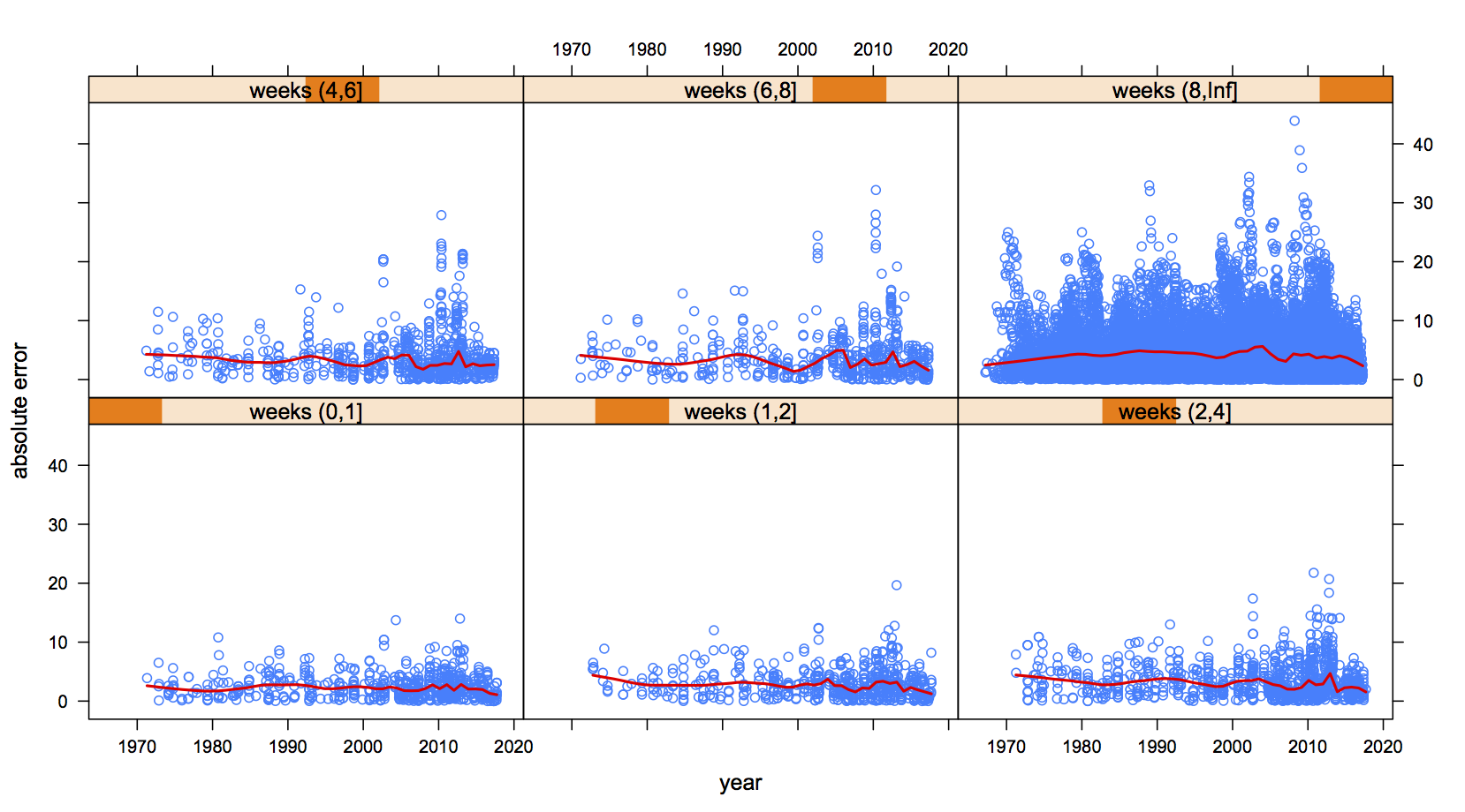
There’s a new paper in the journal Nature Human Behaviour analysing a huge collection of election poll data: over 30,000 polls. The researchers’ conclusion is straightforward: polls have not become less accurate. Unfortunately, all the nice graphs are behind a paywall. Fortunately, the data isn’t, and I can draw you a nice graph of my own

The graph shows all the poll results back to 1970, split up into panels by how many weeks before the election they were.  I’m showing just one party per poll: the data have conveniently been coded so it’s a big party (eg Labour for NZ, Conservatives for UK). Each panel shows the error in the poll plotted against the year of the election; the red line is an average.

The red lines are basically flat. Despite cellphones, the internet, political polarisation, and millennials, average polling error hasn’t changed all that much over the past fifty years.

March 11, 2018

The 7% solution

Astronaut Scott Kelly has been extensively studied after a year in space (and so has his identical twin).  There’s a new, and pretty dramatic, story about some of the results. For example, IFLScience says NASA Sent One Identical Twin Brother To Space For A Year – And It May Have Permanently Changed 7 Percent Of His DNA. So does Business Insider.

If you know that a chimpanzee’s DNA is only about 1% different from a human’s — or that a mouse’s is about 8% different — that sounds weird. It’s even worse than that: the chance you’d still be alive after that sort of mutation load is pretty small.

So what did happen? Well, the story seems to be an example of accumulated mutations itself. In a recent interview for Marketplace, Scott Kelly said

“I did read in the newspaper the other day… that 7 percent of my DNA had changed permanently,” Kelly said. “And I’m reading that, I’m like, ‘Huh, well that’s weird.’” 

We’re seeing reports of someone quoting something from the media, rather than any primary source. If you go to the NASA press release, it says

Although 93% of genes’ expression returned to normal postflight, a subset of several hundred “space genes” were still disrupted after return to Earth.

That seems to be the origin of the ‘7%’ figure.

So what’s the difference? Imagine the genome as a library.  A 7% chance in DNA would be like saying 7% of the words in all the books in the library had been altered.  A change in expression in 7% of genes would be like 7% of the books having a noticeable increase or decrease in how often they were borrowed.

There were also some small changes in Scott’s DNA.  His telomeres, which are the caps on chromosomes that stop them fraying at the ends (like the little plastic bits on shoelaces) were slightly longer — which is probably good. DNA that scientists sequenced from his blood also had “hundreds” of new mutations: more than you’d typically expect, but still only about 0.0000001% of his DNA

March 8, 2018

“Causal” is only the start

Jamie Morton has an interesting story in the Herald, reporting on research by Wellington firm Dot Loves Data.

They then investigated how well they all predicted the occurrence of assaults at “peak” times – between 10pm and 3am on weekends – and otherwise in “off-peak” times.

Unsurprisingly, a disproportionate number of assaults happened during peak times – but also within a very short distance of taverns.

The figures showed a much higher proportion of assault occurred in more deprived areas – and that, in off-peak times, socio-economic status proved a better predictor of assault than the nearness or number of bars.

Unsuprisingly, the police were unsurprised.

This isn’t just correlation: with good-quality location data and the difference between peak and other times, it’s not just a coincidence that the assaults happened near bars, nor is it just due to population density.  The closeness of the bars and the assaults also argues against the simple reverse-causation explanation: that bars are just sited near their customers, and it’s the customers who are the problem.

So, it looks as if you can predict violent crimes from the location of bars (which would be more useful if you couldn’t just cut out the middleman and predict violent crimes from the locations of violent crimes).  And if we moved the bars, the assaults would probably move with them: if we switched a florist’s shop and a bar, the assaults wouldn’t keep happening outside the florist’s.

What this doesn’t tell us directly is what would happen if we dramatically reduced the number of bars.  It might be that we’d reduce violent crime. Or it might be that it would concentrate around the smaller number of bars. Or it might be that the relationship between bars and fights would weaken: people might get drunk and have fights in a wider range of convenient locations.

It’s hard to predict the impact of changes in regulation that are intended to have large effects on human behaviour — which is why it’s important to evaluate the impact of new rules, and ideally to have some automatic way of removing them if they didn’t do what they were supposed to.  Like the ban on pseudoephedrine in cold medicine.

March 6, 2018

Quantifying fairness

A bit more technical than usual, but definitely worth reading: “Reflections on Quantitative Fairness

A couple of less-technical excerpts

Much communication consists of taking one or another of these fairness concepts as obvious or axiomatic and asserting the violation of that principle as a political or moral gotcha. Formalization should not be regarded as a panacea in these debates but perhaps it can help to cement the points that:

  • a lack of clarity can conceal a debate with real content and stakes
  • differences in priorities and understandings of fairness are actually unresolved and in principle unresolvable without trade-offs

and

As statistical thinkers in the political sphere we should be aware of the hazards of supplanting politics by an expert discourse. In general, every statistical intervention to a conversation tends to raise the technical bar of entry, until it is reduced to a conversation between technical experts. As a result, in matters of criminal justice, public health, and employment, the key stakeholders, whose stakes are human stakes, and who typically lack a statistical background, can easily fall out of the conversation.

So are we speaking statistics to power? Or are we merely providing that power with new tools for the marginalization of unquantified political concerns? What is the value of this quantitative fairness conversation to a person or community whose concerns will not be quantified for another decade, if ever?

That is: it’s worth trying to be clear about what the actual question is, but we have to be careful in doing that not to push out the people who know the answer.

March 5, 2018

Briefly

  • The gender gap: JP Morgan claims to pay its women employees 99% of what the men get. Felix Salmon and Matt Levine both take on this statistic: it doesn’t show women are paid the same (they aren’t), it just argues against one particular mechanism for the pay gap.
  • “Starting with no knowledge at all of what it was seeing, the neural network had to make up rules about which images should be labeled “sheep”. And it looks like it hasn’t realized that “sheep” means the actual animal, not just a sort of treeless grassiness.” Janelle Shane.
  • Translation is another example of the amazingly-good results networks can get, but with no grip on what’s actually going on. Douglas Hofstatder writes at the Atlantic about “The Shallowness of Google Translate“, and Mark Liberman at Language Log shows how it will translate random sequences of vowels into Hawaiian gibberish.
  • David Spiegelhalter on how to stop being so easily manipulated by misleading statistics
  • Tickets bought online for NZ Lotto are more likely to win. It’s obvious that there has to be a boring explanation for this. I suggested one that fitted the data.
February 24, 2018

Scare stories: a pain in the neck

From the Herald, from the Daily Mail, on the dangers of painkillers

Researchers have today revealed the exact risk of having a heart attack or stroke from taking several common painkillers.

They discovered, on average, one in 330 adults who have been taking ibuprofen will experience a heart attack or stroke within four weeks.

However, the drug, costing as little as 20c a tablet and available in supermarkets and dairies, was found to be three times less dangerous than celecoxib, which will lead to one in 105 adults experiencing a heart attack or stroke.

Now, that’s obviously not true for people just taking ibuprofen for an injury or a headache. So what’s the true story?

The research paper is here. As the story says, it followed up 56,000 people in Taiwan with high blood pressure.  They were interested in a group of painkillers called “COX-selective” that have a lower risk of causing ulcers and stomach bleeding, but potentially a higher risk of heart attack and stroke.  One familiar COX-selective painkiller in NZ is Voltaren, familiar non-selective ones are ibuprofen and naproxen — but the study wasn’t looking at over-the-counter medications bought in supermarkets and dairies, just at people starting prescriptions.

Over the 7927 people starting prescriptions for ibuprofen, 24 ended up getting a heart attack or stroke, after an average of two weeks’ treatment. Of the  1,779 starting celecoxib prescriptions, 17 ended up getting a heart attack or stroke, after an average of about three weeks’ treatment.  Overall, there was a bit more than one heart attack per ten people per year for those prescribed COX-selective drugs and a bit less than one heart attack per ten people per year for those prescribed non-selective drugs.  And there’s no comparison with people who weren’t taking painkillers

You might wonder how numbers like 24 and 17 are large enough to say anything reliable. They aren’t. The “exact risk” of 1 in 330 from the lead is actually a range from something like 1 in 200 to 1 in 500, even before you consider the uncertainties in generalising from middle-aged to elderly Taiwanese people with hypertension to other groups.

This study on its own provides only very weak evidence that COX-selective drugs are more dangerous. The conclusion is plausible for all sorts of reasons, but it’s hardly conclusive.  Like it says on the packet, don’t take any of these medications for weeks at a time without consulting a more reliable source than the Daily Mail.

Diet and genes: not so simple

One of the potential benefits of genetics in medicine and public health comes when two interventions are about equally good on average, but with a lot of variation between people.  We can hope that genetics explains which intervention works for which people, and lets us pick the right one for each person. So far, this hasn’t happened.

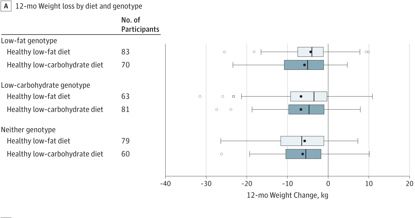
It didn’t happen again this week, with the results of a randomised trial comparing low-fat and low-carb diets.  A group of basically healthy but overweight or obese adults were randomly allocated to being recommended a low-fat diet or a low-carb diet.  After a year, the average weight loss in each group was about 6kg.

There are some genetic variants that have been found in previous studies to predict the success of low-fat vs low-carb diets.  This trial was set up to look at those genetic variants: even though the low-fat diet wasn’t better overall, was it better in people who were expected to be genetically suited to it? Here’s a graph from the research paper showing the distribution of weight losses in each group:


There’s no sign that genetics is helping.

It’s still plausible that genetic differences contribute, and even that we could use them to choose diets if we knew more. But right now, if you want to know whether you’ll lose weight on a particular (reasonable and moderate) diet, the only way to tell is to try it.

February 23, 2018

Briefly

  • Data visibility as a political act: Ben Goldacre and co-conspirators have set up a webpage tracking clinical trials that are violating the FDA Amendment Act (2007) by not having reported any results.  It only became possible to violate the Act this Monday, so the compliance is fairly high so far, nearly 90%.
  • Politician Sam is an expert system from Victoria University Wellington that’s trying to learn NZ political views.  That’s not an unreasonable thing to try, but reading “Unlike a human politician, I consider everyone’s position, without bias, when making decisions” doesn’t make me more optimistic about the project.
  • Which NZ songs get streamed the most here and overseas? Gareth Shute at the Spinoff
  • “Count on Stats” is an effort by the American Statistical Association to rebuild public confidence in US official statistics.
  • Alice Zhao analysed text messages with her (now) husband from the year they married and the year they started dating — a nice illustration of what you can miss by looking at just one source of information.
February 17, 2018

Read me first?

There’s a viral story that viral stories are shared by people who don’t actually read them. I saw it again today in a tweet from Newseum Insititute

If you search for the study it doesn’t take long to start suspecting that the majority of news sources sharing this study didn’t read it first.  One that at least links is from the Independent, in June 2016.

The research paper is here. The money quote looks like this, from section 3.3

First, 59% of the shared URLs are never clicked or, as we call them, silent.

We can expand this quotation slightly

First, 59% of the shared URLs are never clicked or, as we call them, silent. Note that we merged URLs pointing to the same article, so out of 10 articles mentioned on Twitter, 6 typically on niche topics are never clicked

That’s starting to sound a bit different. And more complicated.

What the researchers did was to look at bit.ly URLs to news stories from five major sources, and see if they had ever been clicked. They divided the links into two groups: primary URLs tweeted by the media source itself (eg @NYTimes), and secondary URLs tweeted by anyone else. The primary URLs were always clicked at least once — you’d expect that just for checking purposes.  The secondary URLs, as you’d expect, averaged fewer clicks per tweet; 59% were not clicked at all.

That’s being interpreted as if it were 59% of retweets didn’t involve any clicks. But it isn’t. It’s quite likely that most of these links were never retweeted.  And there’s nothing in the data about whether the person who first tweeted the link read the story: there certainly isn’t any suggestion that person didn’t read the story.

So, if I read some annoying story about near-Earth asteroids on the Herald and if tweeted a bit.ly URL, there’s a chance no-one would click on it. And, looking at my Twitter analytics, I can see that does sometimes happen. When it happens, people usually don’t retweet the link either, and it definitely doesn’t go viral.

If I retweeted the official @NZHerald link about the story, then it would almost certainly have been clicked by someone. The research would say nothing whatsoever about the chance that I (or any of the other retweeters) had read it.


February 16, 2018

Best places to retire?

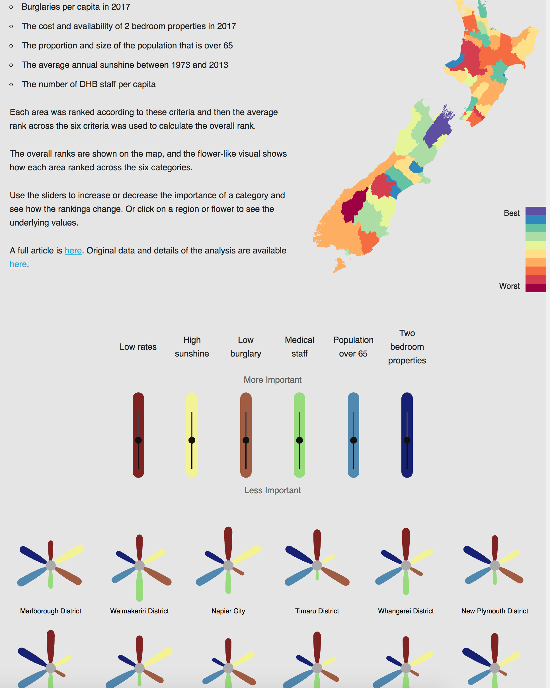
There’s a fun visualisation in the Herald of best places in NZ to retire. Chris Knox’s design lets you adjust the relative importance of a set of factors, and also see which factors are responsible for a good or bad ranking for your favorite region. For nerds, he’s even put up the code and data.

If you play around with the sliders enough, you can get Dunedin or Christchurch to the top, but you can’t get Auckland or Wellington there. Since about 30% of people over 65 actually do live in those two cities, there’s presumably some important decision factors that are left out and that would make cities look better if they were put in.

There’s at least two sorts of factors. First, that many people live in cities. You might well want to retire somewhere close to your friends and whānau.  Second, that you want the amenities of a city: public transport, taxis, libraries, cinemas, museums, stadiums, fair-quality cheap restaurants.

The interactive is just for fun, but similar principles apply to serious decision-making tools.  The ‘best’ decision depends a lot on your personal criteria for ‘best’, and oversimplifying these criteria will give you something that looks like an objective, data-based policy choice, but really isn’t.