Posts written by Thomas Lumley (2645)

avatar

Thomas Lumley (@tslumley) is Professor of Biostatistics at the University of Auckland. His research interests include semiparametric models, survey sampling, statistical computing, foundations of statistics, and whatever methodological problems his medical collaborators come up with. He also blogs at Biased and Inefficient

June 8, 2016

Evidence and stroke

If you’re in New Zealand, there’s a good chance you’ve seen the Stroke Foundation’s new TV ad campaign describing how to recognise a stroke and what to do about it (get the person to hospital Right Now). I often criticise the evidence behind health stories in the news, so it’s worth looking at how different this is.

A Herald story says

Up to half of all stroke cases could be treated with clot-busting drugs if they arrived within three hours of the stroke’s onset at a hospital.

That’s a little optimistic. There are basically three categories:

  • strokes caused by bleeding
  • strokes caused by clots, where the brain cells haven’t had time to die
  • strokes caused by clots, but where the brain cells have had time to die

In the second group, dissolving the blood clot is helpful — it reduces the risk of both death and disability. In the first group it’s definitely harmful, and in the third group it’s unhelpful and risks triggering bleeding. 

If you get a stroke victim to hospital fast, there’s a good chance of getting them through emergency-room triage and diagnosis, and into a CT scan that can distinguish between groups one and two before it’s too late. But even if you react quickly, that’s a lot of things that have to go right — and a lot of them have to happen after you get to hospital.  The current NZ stroke guidelines say that treating 20% of cases is a realistic target: a bit less than half of those who could benefit in a perfect world.

So, how do we know the treatment is helpful, and for whom?  As with clot-dissolving treatment for heart attacks, this isn’t easy.  In particular, it’s fairly obvious which patients are harmed by treatment — they end up with bleeding in their brains — but it’s much harder to tell which patients are helped, and by how much.

The only solution is randomised trials, where patients were randomly assigned to clot-dissolving drugs or the standard treatment.  These trials need careful design, both practically and ethically. You’re introducing new diagnosis and treatment steps into over-stressed hospital emergency rooms; you’re using a treatment that might be life-saving or lethal; you’re targeting people who (by definition) don’t have their brains in good working order.  The trials were done: we now have 27 trials in 10,000 patients, and clot-dissolving treatment does more good than harm — unambiguously, if started within 3 hours from the start of symptoms and probably somewhat later, but not the next day.

In terms of evidence, this isn’t at the levels of getting vaccinated and stopping smoking, but it’s miles ahead of the evidence around fish oil or vitamin supplements or coconut oil or kids these days and their phones and internets.
Ben Goldacre interview at Public Address

Russell Brown interviews Ben Goldacre:

Have the media got any better or worse at science in the time you’ve been writing about these issues?

Ha! Well, I’m not aware of any longitudinal studies that would make a fair comparison over time to say if they’ve got better. But I think the incredibly refreshing thing is that they’ve become less relevant. Wen I started writing about this stuff 15 years ago, mainstream media were the only game in town. It’s incredible to think that 15 years ago, you couldn’t talk back. The internet was not like it is today.

June 7, 2016

Briefly

  • Alex Harrowell at The Yorkshire Ranter writes about two new papers combining large-scale data mining with sampling and human interpretation to study China’s ’50-cent party’ (五毛党) internet commentators
  • Y-axes, from the UK Office of National Statistics
June 4, 2016

How to make predictive models good (and accurate)

Kareem Carr, guest-posting at Mathbabe.org

All three principles have one underlying idea. Bad data science obscures and ignores the real world performance of its algorithms. It relies on little to no validation. When it does perform validation, it relies on canned approaches to validation. It doesn’t critically examine instances of bad performance with an eye towards trying to understand how and why these failures occur. It doesn’t make the nature of these failures widely known so consumers of these algorithms can deploy them with discernment and sophistication.

June 3, 2016

Value-added?

From Stuff

Kiwi researchers have come up with a solution to the global obesity epidemic – a bitter plant extract that suppresses appetite.

As you’d expect, calling it “a solution” is completely over the top at the moment. They’ve done a placebo-controlled trial, but lasting less than one day, in only 20 men. The press release is more detailed and more restrained.

What made me mention this story, though, is the numbers. From Stuff

The researchers found that the Amarasate extract stimulated significant increases in hormones that regulate appetite and reduced food intake from 911 kJ (218 calories) to 944 kJ (226 calories).

That sounds incredibly unimpressive: an 8 calorie reduction. It’s wrong, or at least the press release is different and more plausible

.. both gastric and duodenal delivery of the Amarasate™ extract stimulated significant increases in the gut peptide hormones CCK, GLP-1 and PYY while significantly reducing total (lunch plus snack) ad libitum meal energy intake by 911 kJ (218 calories) and 944 kJ (226 calories), respectively.

They looked at two capsules to control where in the gut the stuff was released, and both types reduced calorie intake by a bit more than 200 calories, compared to placebo. The story was off by a factor of 25 or so.


[update: Those of you who read more carefully than either me or the journalist will have noticed that “reduced .. from 911 kJ .. to 944 kJ ” in the Stuff story is actually an increase, and even less excusable]

[Update next day: The numbers have been fixed —“reduced food intake by up to 944 kJ (226 calories).”  — but not the opening claim. ]

Briefly

  • David Cameron should ban hedge funds from trying to cash in on the EU referendum by commissioning private exit polls to speculate on sterling before the official result, Labour’s deputy leader has said.” (Guardian) But. “If you think that this is bad — and Watson probably isn’t alone in thinking that it’s bad — then it seems to me that you have to identify which part is bad. Is it asking someone how she voted? Is it asking lots of people how they voted? Is it making a prediction about the Brexit vote? Is it trading based on your prediction? Which specific thing would you make illegal?” (Matt Levine)
  • Generation Zero likes trains, and thinks other people also like trains. Rather than just asserting this or putting up a petition, they’re trying to crowdfund a real opinion poll to find out Auckland public opinion on maintaining a train option for the proposed harbour crossing. Obviously they’re doing this because they think they know what the answer will be, but it’s still a welcome step towards evidence-based lobbying.
  • Google’s ‘Digital Ethicist’ on how software design hijacks people’s minds — changing the (implied) question to affect people’s decisions.
June 2, 2016

Headline conclusions on slavery

I didn’t see this Stuff story at the time, but it was discussed on Twitter by Tess McClure (@tessairini).

The 2016 Global Slavery Index examines practices such as forced labour, human trafficking, child exploitation and forced marriage, surveying 43,000 people in 25 countries.

The number of people living in slavery in New Zealand has increased from 600 in the 2014 Global Slavery Index.

New Zealand and Australia have the lowest level of slavery prevalence in the Asia Pacific region with an estimated 0.018 per cent of the population in modern slavery.

If you survey 43,000 people in 25 countries you won’t be surveying very many in New Zealand, so where did this number come from?  The story doesn’t give any more details, but @tessairini found a ‘detailed methodology’ paper (PDF).

They didn’t survey any people in New Zealand. Or in Australia. Nor had they in 2014.

The survey part of the research is pretty much irrelevant to the estimates for New Zealand. The methodology paper describes another approach that

…can be applied in countries where nationally representative random sample surveys will not necessarily work. This is particularly the case in more ‘developed’ countries, where low levels of vulnerability mean that there are few cases to report, where law enforcement is strong and organized crime is more hidden, and where the resulting numbers are so small, that even if they were not hidden, they would be highly unlikely to be found and selected for interview in a random sample survey.

For the UK and the Netherlands the survey used data from the overlap of multiple lists. The UK estimate is described in Significance magazine, the popular-audience publication of the Royal Statistical Society. In all, 2744 victims of human trafficking were identified in the UK, from a total of six sources, so it’s possible to look at how many of these people were missed by each source, and estimate how many more might have been missed completely. The estimated total is between 10,000 and 13,000.

So, there’s survey data for 25 countries not including New Zealand or Australia, and multiple-list data for two further countries not including Australia and New Zealand.  We still haven’t found out where the New Zealand estimate comes from.

The final step is extrapolation from measured countries to unmeasured countries. The researchers measured a whole lot of variables that might be relevant, and divided the countries into groups that looked similar. They then applied the frequencies from the measured countries in each group, with a few adjustments, to the unmeasured countries.  If you look at the data in the Stuff story, Australia and New Zealand have the same estimated prevalence of slavery, 0.018% of the population. That’s also essentially the same as the UK estimate, so presumably we’re in the same group as the UK and that’s where the real data come from.

If you want a global estimate of the number of people affected by slavery, this is a perfectly reasonable approach. It’s probably kind of ok as an estimate for the number in New Zealand. On the other hand, the index data doesn’t support claims of change from year to year in New Zealand, and it doesn’t say anything about particular risks.

It makes sense to get local experts to talk about the industries and practices that might cause problems in New Zealand, as Stuff did, and what can be done about them, but the index estimate is just that New Zealand is about the same as the UK.


May 29, 2016

Life expectancy quiz answers

For Wednesday’s quiz:

Remaining life expectancy for NZ men gets down to five years between ages 85 and 90. That’s true for men and women, and for Māori and for non-Māori, and for Pasifika.  (tables here) — the differences in life expectancy at birth have gone away by that age.


I’ma let you finish

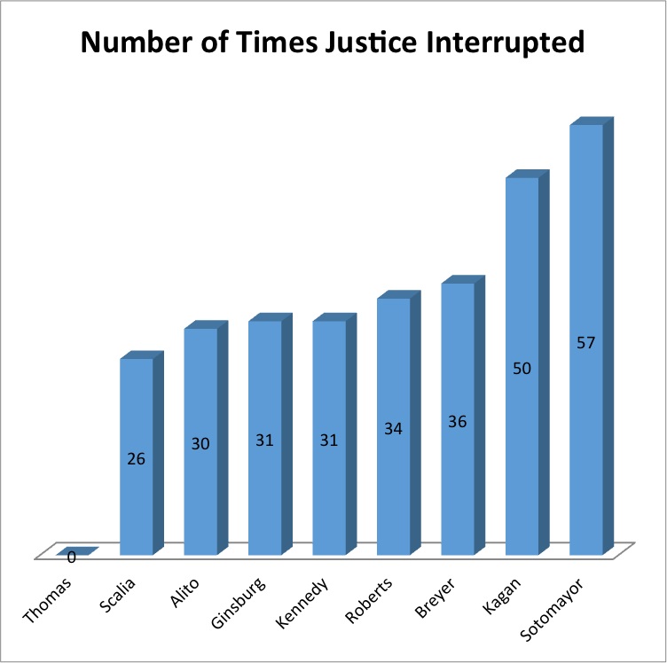
Adam Feldman runs the blog Empirical SCOTUS, with analyses of data on the Supreme Court of the United States. He has a recent post (via Mother Jones) showing how often each judge was interrupted by other judges last year:

Interrupted

For those of you who don’t follow this in detail, Elena Kagan and Sonia Sotomayor are women.

Looking at the other end of the graph, though, shows something that hasn’t been taken into account. Clarence Thomas wasn’t interrupted at all. That’s not primarily because he’s a man; it’s primarily because he almost never says anything.

Interpreting the interruptions really needs some denominator. Fortunately, we have denominators. Adam Feldman wrote another post about them.

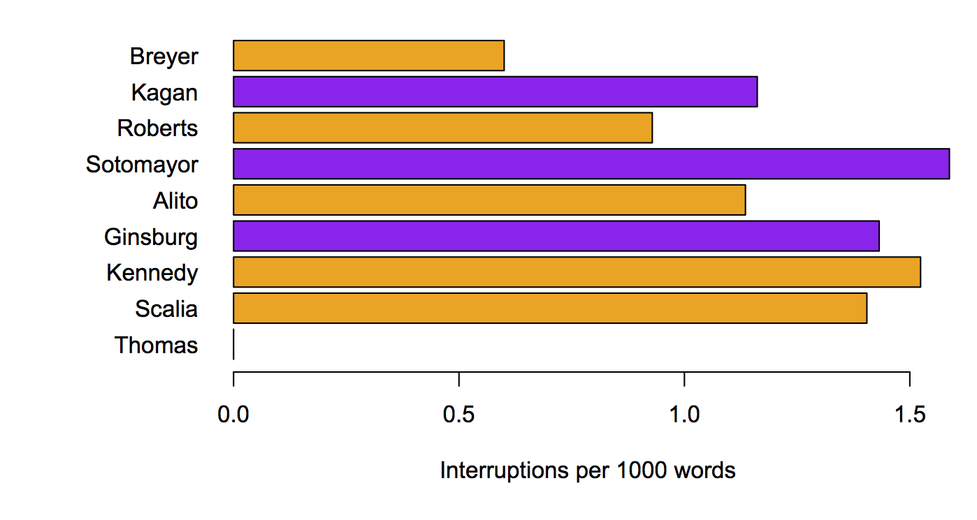
Here’s the number interruptions per 1000 words, with the judges sorted in order of  how much they speak

perword

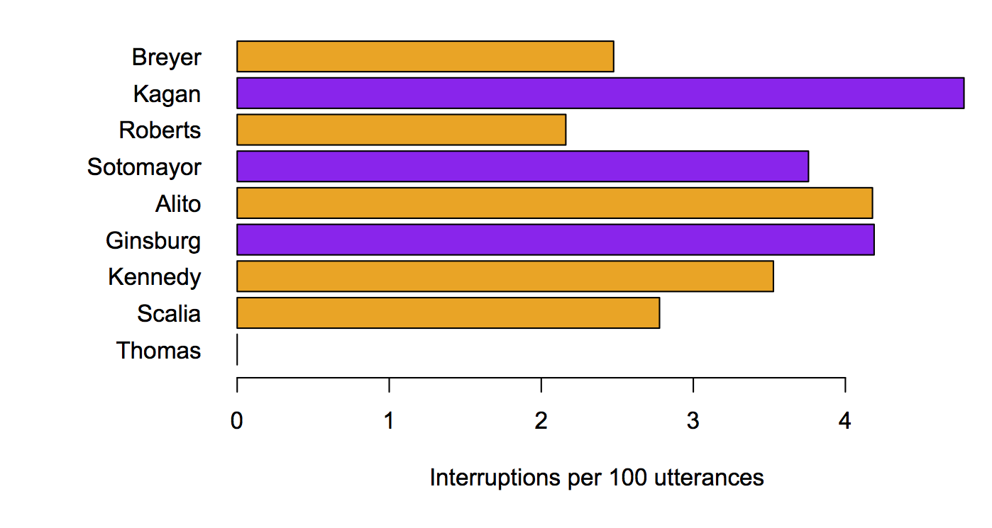
And here’s the same thing with interruption per 100 ‘utterances’

perutterance

It’s still pretty clear that the female judges are interrupted more often (yes, this is statistically significant (though not very)). Taking the amount of speech into account makes the differences smaller, but, interestingly, also shows that Ruth Bader Ginsburg is interrupted relatively often.

Denominators do matter.

May 28, 2016

Defining the question precisely

From the Herald, apparently original (or at least ahead of the UK)

A study from the United Kingdom has found that a glass of beer contains “significantly less” sugar than a can of Coke, a cappuccino or a glass of cordial.

The Campden BRI Food and Innovation study analysed the calorie content of 52 alcoholic drinks and found that most beers have less than 1 gram of sugar per 100ml.

That is, of course, true.  Beer tends to have low sugar because the yeast eats it all.  If anyone’s main concern about the health impact of beer consumption is the sugar, they are indeed worrying about the wrong thing.

Beer does have some other sweet-tasting carbohydrates that are digestible by people, though not by yeast.  More importantly, though, beer has alcohol, and that’s where most of its energy content comes from.

A discussion of sugar in beer, including detailed numbers, focused on health and whether it “makes you fat”, which fails to mention alcohol or total energy content, doesn’t happen by accident.  You’ve got to respect the publicist’s skills.