Posts written by Thomas Lumley (2645)

avatar

Thomas Lumley (@tslumley) is Professor of Biostatistics at the University of Auckland. His research interests include semiparametric models, survey sampling, statistical computing, foundations of statistics, and whatever methodological problems his medical collaborators come up with. He also blogs at Biased and Inefficient

May 27, 2016

Not wisely but too well

Q: Did you see there’s a new hangover cure? An ice-cream?

A: Really?

Q: Well, the Herald and Reuters think so. How does it work?

A: I think that question assumes facts not in evidence.

Q: How do they say it works, then?

A: It’s got 0.7% raisin tree fruit juice.

Q: That … doesn’t sound like very much.

A: About half a gram, probably. One Panadol has half a gram of paracetamol, so they’re claiming pretty high potency.

Q: But don’t they say it works in rats? There’s a journal and science and stuff! How much did the rats get?

A: They don’t link to the paper. Or give researcher names.

Q: Well, of course not. But you can find it, right?

A: I expect so.


<crickets>


A: Ok. That was relatively annoying.

Q: Didn’t you just need to search for ‘raisin tree juice neuroscience’ or something.

A: No, that gets you copies of this story.

Q: What about on PubMed, where you usually find things?

A: The paper turns out not to have “raisin tree juice” in the title. Eventually I found out the botanical name of the plant and searched for that at the journal website, which has full-text search.

Q: <world’s tiniest violin> How much juice did the rats get?

A: They didn’t get juice. They got a single chemical extracted from the juice, dihydromyricetin, injected.

Q: The ice-creams aren’t going to be injected, though?

A: No, I’m glad to say.

Q: What would be a comparable human dose?

A: They based the rat dose on traditional doses of the dried fruit in humans: “Clinically, the Hovenia dosage range used for hangover is 100–650mg/kg”

Q: So in a hypothetical 70kg pers0n?

A: Works out as 7g-45g. And that’s dry, without the extra water in the juice form.

Q: At least 14 ice-creams. How long did it take the rats’ hangovers to go away after being injected?

A: The rats got the chemical at the same time as the alcohol, so the idea was the hangover was being prevented, perhaps by blocking effects of alcohol in the brain so the rats didn’t really get as drunk.

Q: But if it works by not getting drunk there are cheaper ways.

A: Indeed.
May 26, 2016

Budget visualisations

This will likely be updated as I find them

  1. From Keith Ng. Budget now and over time. This gets special mention for being inflation-adjusted (it’s in 2014 dollars). Doesn’t work on my phone, but works well on a small laptop screen
  2. NZ Herald. Works (though hard to read) on a mobile. Still hard to read on a small laptop screen, but attractive on a large screen. I still have reservations about the bubbles.
  3. Stuff has a set of charts. The surplus/deficit one is nicely clear, though there’s nothing about the financial crisis/recession as an explanation for a lot of it.
  4. The government has interactive charts of Core Crown Revenue, Core Crown Expenditure, and breakdown for a taxpayer. On the last one, they lose points for displaying just income tax, when the Treasury are about the only people who could easily do better.

What budget coverage should do

It’s unavoidable that the government’s presentation of the Budget will try to make it look good, and the the various opposition replies will try to make it look bad. What journalists can do is translate some of it.

For example, the total health budget is going up $2.2 billion over four years. It’s hard to interpret that, because there are at least four trends involved

  1. Dollars are getting smaller
  2. The population is getting larger
  3. The average age is increasing
  4. There are exciting and overpriced new medications available

It should be fairly easy to say whether the increase in the health budget keeps up with 1 and 2. That gives some idea of how much real per capita increase there is to keep up with 3, and whether extra money allocated for 4 will have to compete with what the budget currently buys.

Media organisations should have someone who can look at 1 and 2, and major media organisations should have been able to get an expert opinion of how big 3 is going to be.

Whether real age-adjusted per-capita NZ health expenditure should be stable, increasing, or decreasing is a policy question that we elect representatives to answer. Whether it is stable, increasing, or decreasing is the sort of fact question that we underpay the media to check for us.

May 25, 2016

Life expectancy quiz

Life expectancy at birth for men in NZ is about 77 years, but life expectancy is more complicated than it sounds


(answers here)

May 24, 2016

Microplummeting

Headline: “Newshub poll: Key’s popularity plummets to lowest level”

Just 36.7 percent of those polled listed the current Prime Minister as their preferred option — down 1.6 percent — from a Newshub poll in November.

National though is steady on 47 percent on the poll — a drop of just 0.3 percent — and similar to the Election night result.

So, apparently, 0.3% is “steady” and 1.6% is a “plummet”.

The reason we quote ‘maximum margin of error’, even though it’s a crude summary, not a good way to describe evidence, underestimates variability, and is a terribly misleading phrase, is that it at least gives some indication of what is worth headlining.  The maximum margin of error for this poll is 3%, but the margin of error for a change is 1.4 times higher, about 4.3%.

That’s the maximum margin of error, for a 50% true value, but it doesn’t make that much difference– I did a quick simulation to check. If nothing happened, the Prime Minister’s measured popularity would plummet or soar by more than 1.6% between two polls about half the time purely from sampling variation.


Knowing what you’re predicting: drug war edition

From Public Address,

The woman was evicted by Housing New Zealand months ago after “methamphetamine contamination” was detected at her home. The story says it’s “unclear” whether the contamination happened during her tenancy or is the fault of a previous tenant.

There’s no allegation of a meth lab being run; the claim is that methamphetamine contamination is the result of someone smoking meth in the house.

The vendors claim the technique has no false positives, but even if we assume they are right about this they mean no false positives in the assay sense; that there definitely is methamphetamine in the sample.  The assay doesn’t guarantee that the tenant ‘allowed’ meth to be smoked in her house. And in this case it doesn’t even seem to guarantee that the contamination happened during her tenancy.

It’s not just this case and this assay, though those are bad enough. If predictive models are going to be used more widely in New Zealand social policy, it’s important that the evaluation of accuracy for those models is broader than just ‘assay error’, and considers the consequences in actual use.

May 22, 2016

Knowing what you’re predicting

From a Sydney Morning Herald story about brain wave reading.

The faux insurgents were asked to hatch a mock terrorist plot by selecting one of four dates in July, one of four locations in Houston and one of four types of bomb, then jot it all down in a letter to their terrorist boss.

EEG caps on, they were later shown a slew of months of the year, US cities and varieties of terror attack on a computer; and when “July”, “Houston” and “bomb” appeared among them, the P300 spikes were big enough to nab all 12 “culprits”.

The brain fingerprinting technique relies on picking up a signal that the brain recognises some piece of information. The people who make the gadgetry claim this can be done with 100% accuracy (not everyone agrees). However, even if the brain waves can be picked up with 100% accuracy, that’s not 100% accuracy for the real question.

Consider DNA evidence. In the ideal case of a high-quality DNA sample from the scene of a crime, and a high-quality sample from a suspect, and the right combination of ancestries, it is possible to be almost 100% sure that the suspect’s DNA (or that of an identical twin) is present in the crime sample. The scene-of-crime sample could be billions of times more likely if the suspect contributed to it than if a random person from the population did. The DNA expert won’t (or shouldn’t) testify that the suspect is almost certainly guilty, because that’s not a DNA question. Even ruling out police fraud or incompetence, the suspect’s DNA could have present in the sample for some innocent reason. Guilt is not a question that capillary electrophoresis can answer.

The situation is worse for the brain fingerprinting technique, because it’s intended to be used before a terrorist attack has been committed, and potentially before the suspects have even committed a crime such as conspiracy.  Maybe they recognised an attack plan because they’d been thinking about it, or because they’d read a Tom Clancy novel about it. Maybe they recognised “July” and “Houston” from baseball and the bomb from somewhere else entirely.  None of these would be counted as an error by the brain wave enthusiasts — they are entirely genuine indications of recognition — but they aren’t specific evidence of past or future crime.


May 21, 2016

Advertising, health promotion, and lots of latex

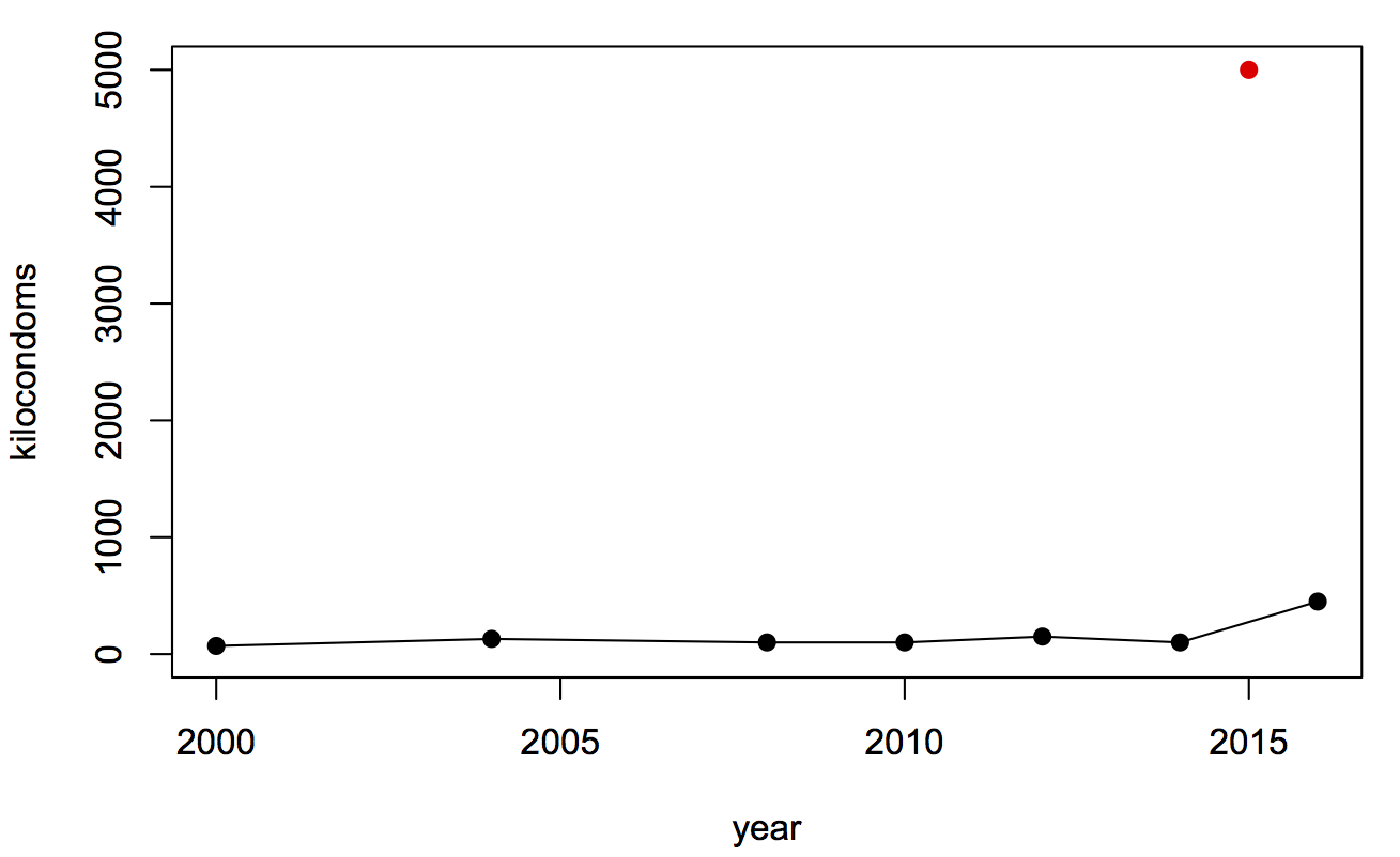
The biennial Olympic condom story is out.  The Rio Olympics are planning to give away 450,000 condoms in the Olympic Village, compared to a mere 150,000 in London, and 90,000 in Sydney (initially 70,000, but they ran out).

This graph shows (with black dots) the publicised numbers for the past Olympics that I could find easily (Torino seems to be keeping quiet, for some reason)

condoms

So, why so many? Condoms are cheap to produce and hard to advertise.  Even buying retail from Amazon you can get 1000 for less than US$150, so 450,000 would cost about US$65k.  In a setting like this, I’m sure the health promotion folks are paying a lot less than that, and the international news coverage implying that Olympic athletes have safe sex is worth far more than the cost of materials.

The red dot? Oh yes. That’s the number handed out by the Health Ministry campaigners at street parties for Carnival this year in Brazil.

May 20, 2016

Briefly

  • The Princeton Web CensusToday I’m pleased to release initial analysis results from our monthly, 1-million-site measurement. This is the largest and most detailed measurement of online tracking to date, including measurements for stateful (cookie-based) and stateless (fingerprinting-based) tracking, the effect of browser privacy tools, and “cookie syncing”.  These results represent a snapshot of web tracking, but the analysis is part of an effort to collect data on a monthly basis and analyze the evolution of web tracking and privacy over time.”
  • Nate Silver on TwitterAn irony is that our early Trump forecasts weren’t based on a statistical model. Just a guesstimate that I got stubborn anchoring myself to. So one lesson is “when in doubt, build a model”. Doesn’t have to be your final answer. But it’s a great starting point. Provides discipline.”
  • From Flowing Data, a visualisation of the changing US diet
  • A visualisation of 24 hours of data flow in a health insurance company: pretty, but not necessarily useful
  • “Mukherjee gives us a Whig history of the gene, told with verve and color, if not scrupulous accuracy. “ A book review/essay at the Atlantic, by Nathaniel Comfort
  • There’s a new White House report on Big Data and Civil RightsUsing case studies on credit lending, employment, higher education, and criminal justice, the report we are releasing today illustrates how big data techniques can be used to detect bias and prevent discrimination. It also demonstrates the risks involved, particularly how technologies can deliberately or inadvertently perpetuate, exacerbate, or mask discrimination.” (via mathbabe.org)

Depends who you ask

There’s a Herald story about sleep

A University of Michigan study using data from Entrain, a smartphone app aimed at reducing jetlag, found Kiwis on average go to sleep at 10.48pm and wake at 6.54am – an average of 8 hours and 6 minutes sleep.

It quotes me as saying the results might not be all that representative, but it just occurred to me that there are some comparison data sets for the US at least.

  • The Entrain study finds people in the US go to sleep on average just before 11pm and wake up on average between 6:45 and 7am.
  • SleepCycle, another app, reports a bedtime of 11:40 for women and midnight for men, with both men and women waking at about 7:20.
  • The American Time Use Survey is nationally representative, but not that easy to get stuff out of. However, Nathan Yau at Flowing Data has an animation saying that 50% of the population are asleep at 10:30pm and awake at 6:30am
  • And Jawbone, who don’t have to take anyone’s word for whether they’re asleep, have a fascinating map of mean bedtime by county of the US. It looks like the national average is after 11pm, but there’s huge variation, both urban-rural and position within your time zone.

These differences partly come from who is deliberately included and excluded (kids, shift workers, the very old), partly from measurement details, and partly from oversampling of the sort of people who use shiny gadgets.