Big Data in NY Times
The trouble with seeking a meaningful needle in massive haystacks of data, says Trevor Hastie, a statistics professor at Stanford, is that “many bits of straw look like needles.”
Read more at New York Times.
The trouble with seeking a meaningful needle in massive haystacks of data, says Trevor Hastie, a statistics professor at Stanford, is that “many bits of straw look like needles.”
Read more at New York Times.
The Dominion-Post is reporting ‘hundreds of unfit teachers in class’. They haven’t made any attempt to scale this by the number of teachers, or compare it to other professions, or basically anything that would make the number interpretable.
The number of teachers employed at State or State Integrated schools in NZ as at April 2011 was 52460. This misses out the non-integrated private schools, but they are a small fraction (4% of students). With 664 complaints over two years, that is a rate of 1 complaint per 158 teachers per year. About half the complaints are dismissed.
For comparison we need other professions where the public can make complaints to independent adjudicators.
In all three professions roughly half the formal complaints that make it to the independent adjudicators are upheld and half are dismissed, but journalists are twice as likely as teachers to receive formal complaints, and police are about forty times more likely.
It’s quite likely that the headline is literally true: there probably are hundreds of unfit teachers, but that’s likely under 1% of all teachers. It’s worth trying to weed them out, but not without considering the costs. In any case, the amount of fainting and clutching of pearls the situations warrants is pretty limited.
Last week’s Sunday Star Times featured inaccurate bubble charts and it has happened again this week:
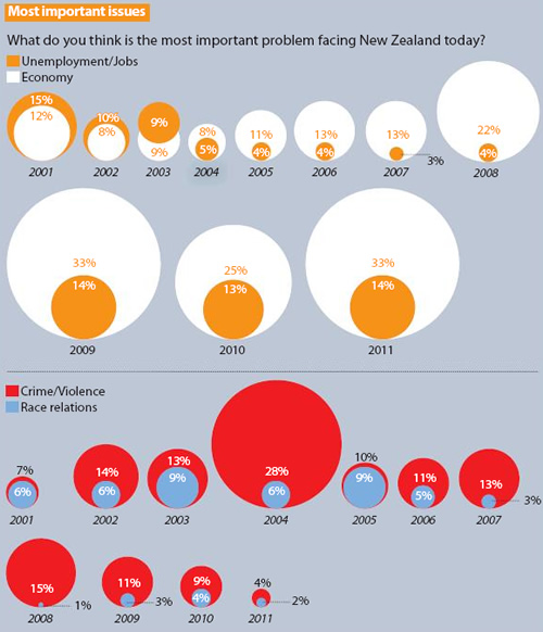
Sunday Star Times, 12 February 2012, “Rugby joy short-lived” A2
You can see that diameters of the circles have been used to represent the percentages, rather than the area. This gives a distorted view of the situation as our eyes notice the area, rather than the diameter/height.
For example, look at the Crime/Violence and Race relations data for 2008 where you are comparing the 1% and 15%. Many more than 15 of those little 1% circles can fit inside the 15% circle.
For comparison, here’s the Crime/Violence and Race relations data as line graphs:
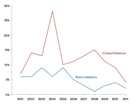
One could be also drawn for the Unemployment/Jobs and Economy data (or overlaid together, depending on what you’d like people to easily compare).
Update: Here’s the bubble chart where the areas represent the figures, rather than the diameters (click to enlarge). I have not included all the details in the graph, just wanted to show a size comparison here.
Hat tip: Murray Jorgensen
Today the Herald is reporting that soft drinks give you asthma and COPD. To be fair, the problems with this story are mostly not the Herald’s fault (except for the headline).
The research paper found that asthma and COPD are more common in people who drink a lot of soft drinks. The main concern with findings like these is that smoking has a huge effect on COPD, and obesity has a fairly large effect, so you would worry that the correlation is just due to smoking and weight. [Or, if you believe some of the other recent new stories, due to bottle-feeding as a baby].
The researchers attempted to remove the effect of smoking and overweight, but their ability to do this is fairly limited. The idea of regression adjustment is that you can estimate what someone’s risk would have been with a different level of smoking or weight, and so you can extrapolate to make the soft-drink and non-soft-drink groups comparable. In this case the data came from a telephone survey, and the information they used for adjustment is a three-level smoking variable (never, former, current) and a two-level overweight variable based on self-reported height and weight (BMI < 25 or >25). If duration of smoking or amount of smoking is important, or if weight distinctions within “overweight” are important, their confounding effects will still be present in the final estimates.
I can’t resist showing you the graph of COPD risks from the paper, which is an excellent example of why not to use fake 3d in graphs. The 3d layout makes it harder to compare the bars — a fairly reliable indication of a bad graph is that it is so unreadable that the data values need to be printed there too.
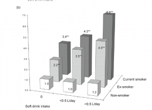
A 2d barchart will almost always be better than a 3d barchart, and this is no exception. The comparisons are clearer, and in particular it is clear how big the effect of smoking really is. It’s only in never-smokers that we have a precise description of smoking, and these are the only group that doesn’t show a trend.
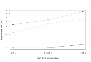
But even the 2d barchart is misleading here. The key rules for a barchart are that zero must be a relevant value, and that uncertainty must be relatively unimportant. Zero relative risk is an impossible value — the “null” value for relative risk is 1.0 — and there is a lot of uncertainty in these numbers (although unfortunately the researchers don’t tell us how much). A dot chart is better, with a logarithmic scale for relative risk so that the `null’ value is 1 rather than 0.
The New Zealand Medical Journal has this month published a review of cycling deaths in New Zealand, with the key finding being that “the helmet law has failed in aspects of promoting cycling, safety, health, accident compensation, environmental issues and civil liberties”. This is a bold claim which should be held to high scrutiny.
The journal article (accessible only by subscription, which we at the University of Auckland are fortunate enough to have) is available at the journal’s website, but for those without subscription access can only be to the media reports of it such as on Stuff.
The article itself is jam-packed full of statistics from various sources, so please bear with me.
The most important is probably Table 1, which shows that whereas pedestrian hours have remained relatively constant from 1989 to 2009, cycling hour have decreased by half, and Table 2, which shows that both pedestrian AND cyclist deaths have decreased from 1989 to 2009. Whereas both have gone down by half, the ratio has remained constant at about one quarter. However these statistics are then ‘corrected’ for the number of hours walked or cycled.
Given that cycling hours have significantly decreased by about 50%, as have the number of cycling deaths by 50% over the same period, the stark result is that cycling deaths per hour cycled have remained about constant over the study period – and certainly not evidence that the introduction of the helmet law, or any other event, has increased the accident rate. Something else is going on with pedestrian deaths altogether, which have encouragingly decreased substantially per walking hour over 1989-2009.
However, the author places emphasis on a new statistic – the ratio of cycling to pedestrian deaths. Whereas pedestrian deaths per hour have markedly gone down, cyclist deaths per hour have not. The ratio of the two means that cycling deaths have apparently increased (but importantly, only relative to pedestrian deaths).
The pedestrian deaths trend is actually a red herring, as we could well compare cycling deaths to any number of trends. According to Statistics New Zealand crime has also gone down since 1994. We could equally posit that the number of cycling deaths relative to crimes has increased, but would this be an alarming statistic? (are the criminals using bicycles as getaway vehicles?).
The article is also loaded with other fascinating statistical statements such as “that life years gained by cycling outweighed life years lost in accidents by 20 times”, which I will not cover the moral implications of here, but is that supposed to be some solace?
The key result from this study seems to in fact be that the rate of accidents for pedestrians has declined significantly over the period of the review, which has to be good news, especially prior to correction for population growth. That cycling hours have halved may well reflect increased awareness of the dangers of cycling in New Zealand.
Regardless of that main finding, the article commits one of the deadly sins of statistics, implying causation from correlation. That the helmet law was introduced in 1994 is about as relevant as TV2 beginning 24 hour programming, or the Winebox enquiry, both in that same year. We could compare trends before and after but with no experimental relationship between the process and the pattern, as tantalising as a relationship between bike helmet laws and accidents might be, it is only a correlation.
The post on road deaths sparked off a bit of discussion in comments about whether there should be a `tolerance’ for prosecution for speeding. Part of this is a statistical issue that’s even more important when it comes to setting environmental standards, but speeding is a familiar place to start.
A speed limit of 100km/h seems like a simple concept, but there are actually three numbers involved: the speed the car is actually going, the car’s speedometer reading, and a doppler radar reading in a speed camera or radar gun. If these numbers were all the same there would be no problem, but they aren’t. Worse still, the motorist knows the second number, the police know the third number, and no-one knows the actual speed.
So, what basis should the police use to prosecute a driver:
The West Island seems to have an even worse problem with bogus polls than we do. The Sydney Morning Herald carried an article on the Friends of Science in Medicine, and their campaign to have medical degrees only teach stuff that actually, you know, works. This article was accompanied by a poll. According to the poll, 230% of readers of the article wanted alternative medicine taught in medical degrees, and the other 570% didn’t. That is, eight times as many people voted as read the article.
It gets better. The SMH followed up with a story about the poll rigging, and for some reason included a new poll asking whether people regarded website poll results as serious, vaguely informative, purely for entertainment, or misleading. Yesterday morning “Serious” had 87% of the vote. Now it’s 95%, with vote totals almost as high as the previous inflated figures.
If you’re even tempted to believe bogus media website polls, we have a bridge we can name after you.
[thanks for the link, Brendon]
Media 7 last week featured our very own mistress of stats, Rachel Cunliffe, discussing why you can’t take a monthly cumulative audience and divide by four to get the weekly cumulative audience.
Media 7 host Russell Brown, in his latest Public Address column, looks at how a distinctly dodgy ‘statistic’ that came out of former broadcasting minister Jonathan Coleman’s office to justify Cabinet’s decision not to renew TVNZ 7’s funding was perpetuated through the media … a must-read.
Our Stat of the Summer Competition is still running! Please submit your nominations and be in with the chance to win a copy of Beautiful Evidence by Edward Tufte:
For more details, see the competition page.
Since Queen’s Birthday weekend 2010, the tolerance has been lowered for speeding drivers to only 4km/h for public holidays, which police say has led to a drop in fatal crashes during these periods.A police spokesperson told the Dominion Post crashes during holiday periods had been cut by 46 per cent.
Clive Matthew-Wilson, editor of the Dog and Lemon Guide, … accused the police of “massaging the statistics to suit their argument”. “When the road toll goes down over a holiday weekend, the police claim credit. When it rises by nearly 50 per cent, as it did last Christmas, they blame the drivers. They can’t have it both ways.”
In fact, it’s not at all impossible that the reduction in deaths was due to the lower speeding tolerance, and that the increase over last Christmas was due to unusually bad driving. The police argument is not logically incoherent. It is, however, somewhat implausible. And not really consistent with the data.
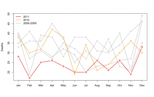 If the reduction during holiday periods since the Queen’s Birthday 2010 was down to the lowered tolerance for speeding, you would expect the reduction to be confined to holiday periods, or at least to have been greater in holiday periods. In fact, there was a large and consistent decrease in road deaths over the whole year. The new pattern didn’t start in June 2010: July, October, and November 2010 had death tolls well inside the historical range.
The real reason for the reduction is deaths is a bit of a mystery. There isn’t a shortage of possible explanations, but it’s hard to find one that predicts this dramatic decrease, and only for last year. If it’s police activities, why didn’t the police campaigns in previous years work? If it’s the recession, why did it kick in so late, and why is it so much more dramatic than previous recessions or the current recession in other countries? The Automobile Association would probably like to say it’s due to better driving, but that’s a tautology, not an explanation, unless they can say why driving has improved.