Not quite, but thanks for playing
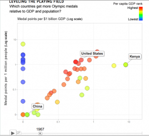
An interesting attempt at data visualization for Olympic medal counts, from US progressive magazine Mother Jones. Dave Gilson looks to have used Google’s Motion Chart tools, which give the look of the GapMinder animations to your own data. Unfortunately, it doesn’t quite work.
The first problem (as the article goes on to admit) is that the Olympics happen only every four years, but the animation is continuous — the snapshot above shows the medal counts for 1967, when the Olympics would have been held 3/4 of the way from Tokyo to Mexico City.
There’s also data problems: the vertical line of blue points should correspond to countries that do well on medals per capita, and poorly on medals per $GDP — ie, infinitely rich countries. They are actually Eastern Bloc countries whose GDP was not available. The article actually says a GDP of zero was used, but that’s not what the graph shows.
The whole idea of standardizing to total GDP and total population doesn’t really make sense here: GDP and population are roughly proportional for large sets of countries, so you’d expect a strong diagonal tendency in the graph even if wealth wasn’t all that important. To spread the points out a bit and help disentangle GDP from population, it would be better to use population on one axis and per capita GDP on the other. Han Rosling, in the original GapMinder animation, uses per capita GDP.
Incidentally, GapMinder also has much more complete data on GDP, which could have improved the medal graph.
Thomas Lumley (@tslumley) is Professor of Biostatistics at the University of Auckland. His research interests include semiparametric models, survey sampling, statistical computing, foundations of statistics, and whatever methodological problems his medical collaborators come up with. He also blogs at Biased and Inefficient See all posts by Thomas Lumley »
