Ethnic diversity here and US
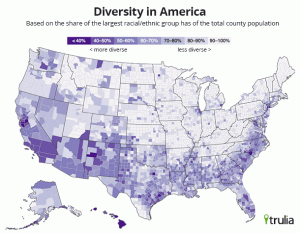
Real-estate data company Trulia has an article on their blog about ethnic diversity in the US, which they measure by the proportion of the population in the largest ethnic group (so low proportions mean more diversity). Here’s their national map (they also have maps of some cities)
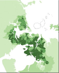
Stats New Zealand have also released maps, though just for Auckland. Their index of ethnic diversity is 100% minus Trulia’s index, so they are equivalent, though the NZ color scheme is darker in the mid-range than the US one. The 2006 map of Auckland looks like
It would be interesting to do this for the whole of NZ using the Census meshblock dataset, but I don’t have time right now. The Auckland map makes the point I made a few weeks ago about modern NZ having more, and more varied, immigration than most people outside the country realise.
Thomas Lumley (@tslumley) is Professor of Biostatistics at the University of Auckland. His research interests include semiparametric models, survey sampling, statistical computing, foundations of statistics, and whatever methodological problems his medical collaborators come up with. He also blogs at Biased and Inefficient See all posts by Thomas Lumley »

