More temperature graphics
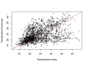
There has been a lot of coverage of Australian weather recently, and people who haven’t been to southeastern Australia in summer may have been struck by how big the reported temperature variations are. There’s a data set of daily maximum temperatures in Melbourne over ten years that has been used as an example in time series research because of the unusual patterns — a bimodal distribution in day-to-day temperature change.
The graph shows Melbourne maximum temperatures from November through March for ten years. The basic pattern is that tomorrow’s maximum is either slightly higher than today’s, or is about 21C. The temperature keeps increasing day to day as long as the wind is from the land, then you get a cold front and people can sleep for a few nights.
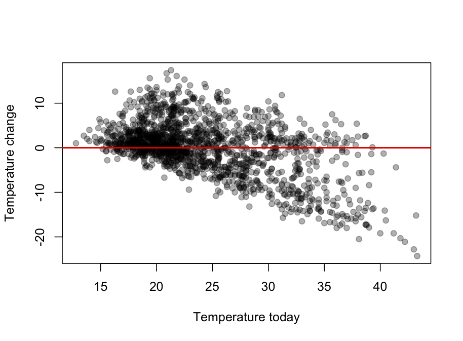
It looks even more dramatic (why?) when the change in temperature is plotted against today’s temperature
Thomas Lumley (@tslumley) is Professor of Biostatistics at the University of Auckland. His research interests include semiparametric models, survey sampling, statistical computing, foundations of statistics, and whatever methodological problems his medical collaborators come up with. He also blogs at Biased and Inefficient See all posts by Thomas Lumley »