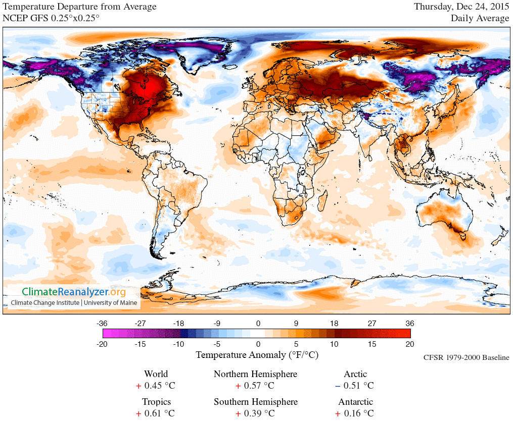
It’s warm out there
We’re seeing a lot of international news stories about cold weather in the US, and here in NZ we’re also seeing a lot of stories about hot weather locally and in Australia. You might think from the news coverage that the northern hemisphere is currently colder than usual and the southern hemisphere is currently warmer than usual.
This map (from) shows ‘temperature anomaly’, that is, the difference between the temperature today and the 1979-2000 average for the time of year.
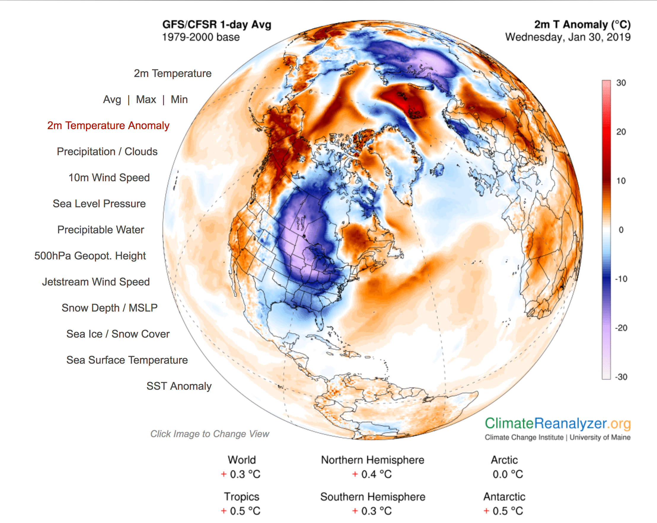
There are some cold spots on the map: the north-east of North America and parts of northern Russia are much colder than usual. There are also hot spots, in Alaska and in the Arctic Sea. And as the summaries under the map show, the northern hemisphere is more unusually hot (on average) than the southern hemisphere.
Weather is what matters to us day to day: especially the weather around us and the weather in places with English-speaking television stations. That can give a very misleading view of the state and trend of global climate.


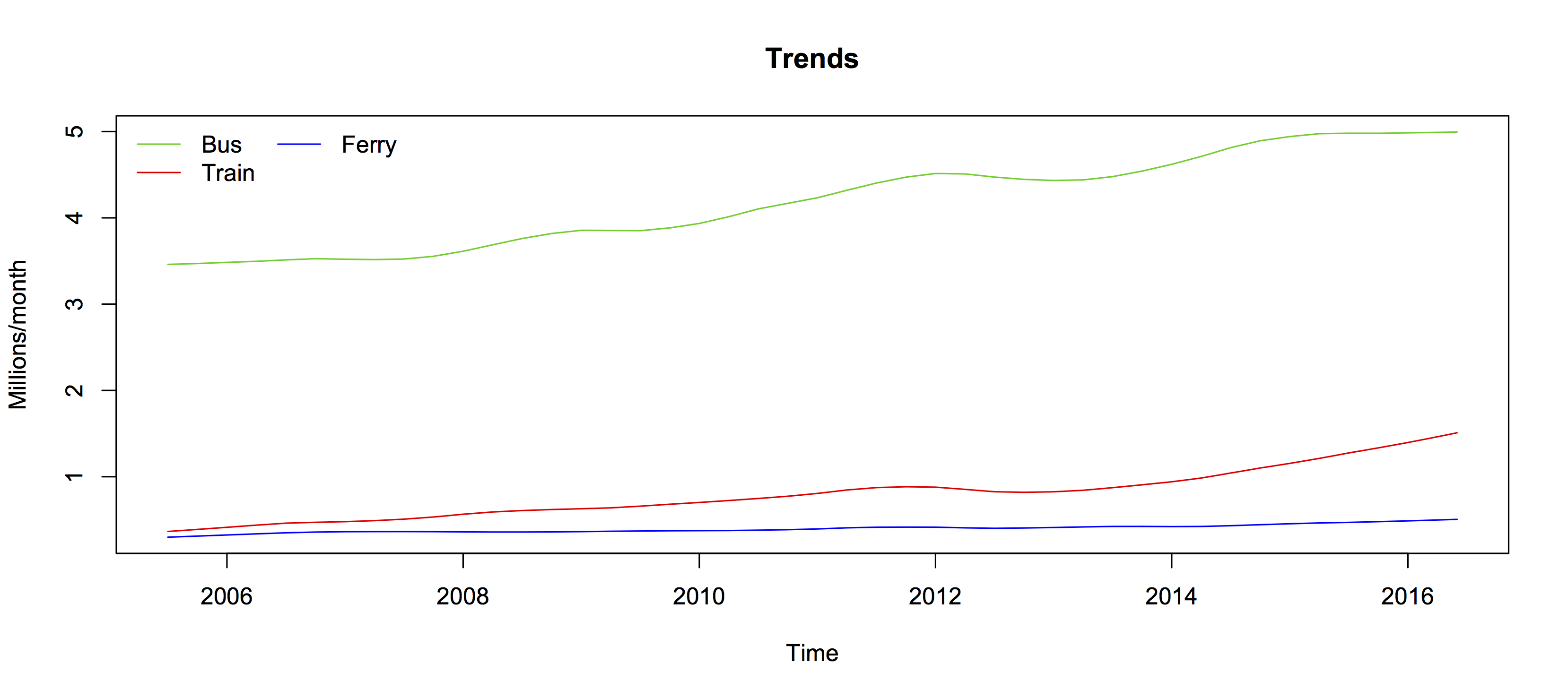
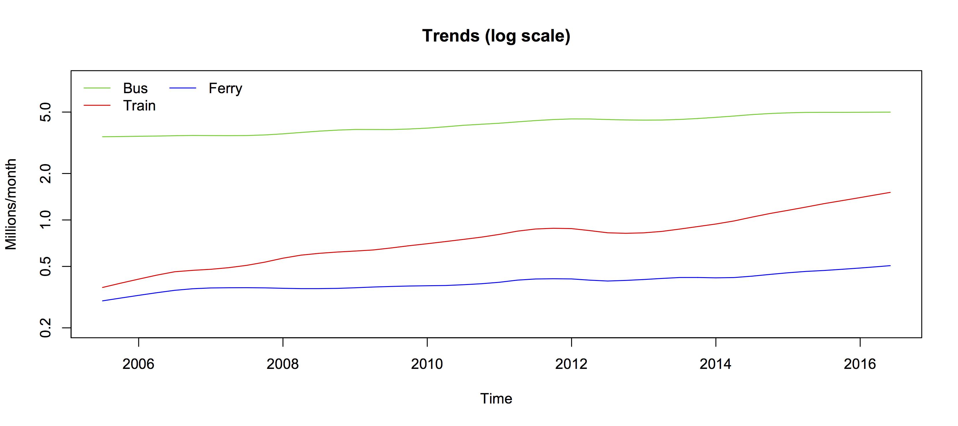
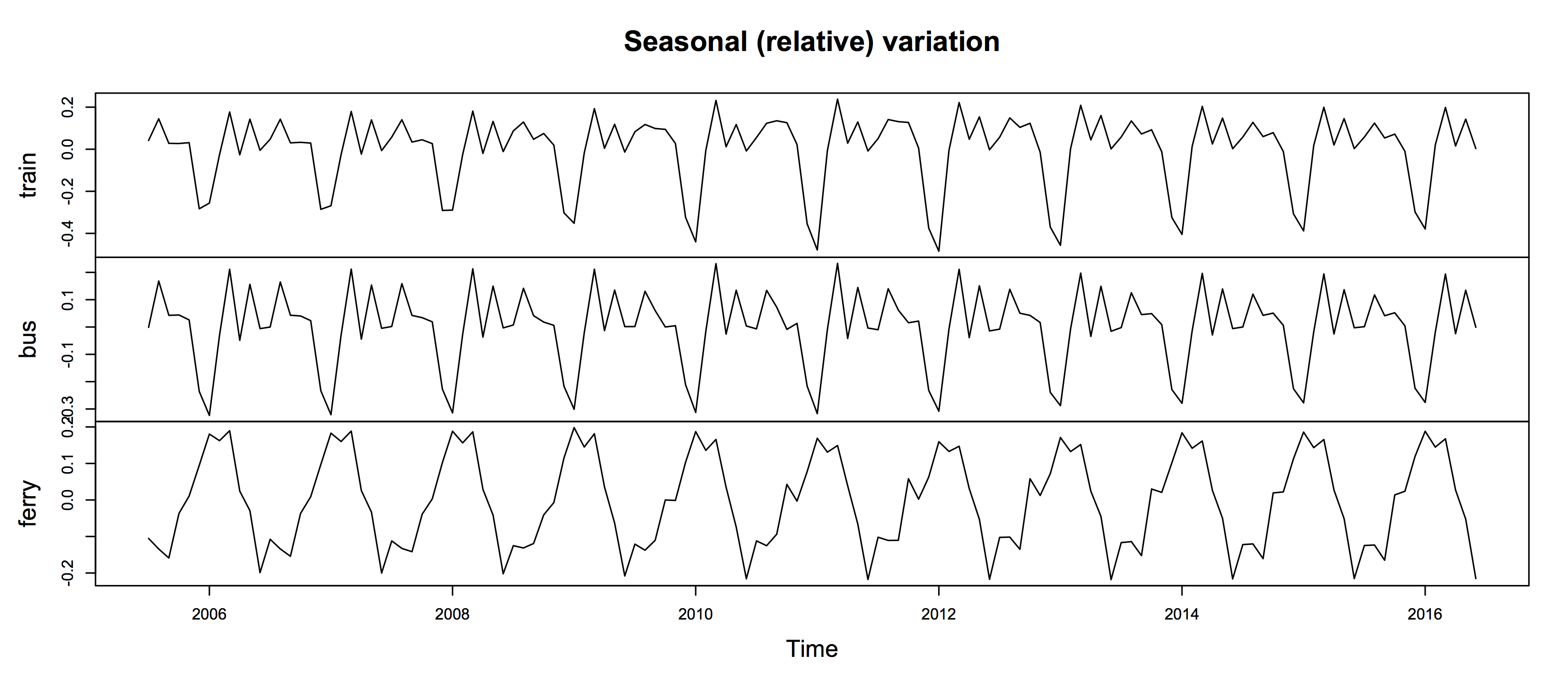
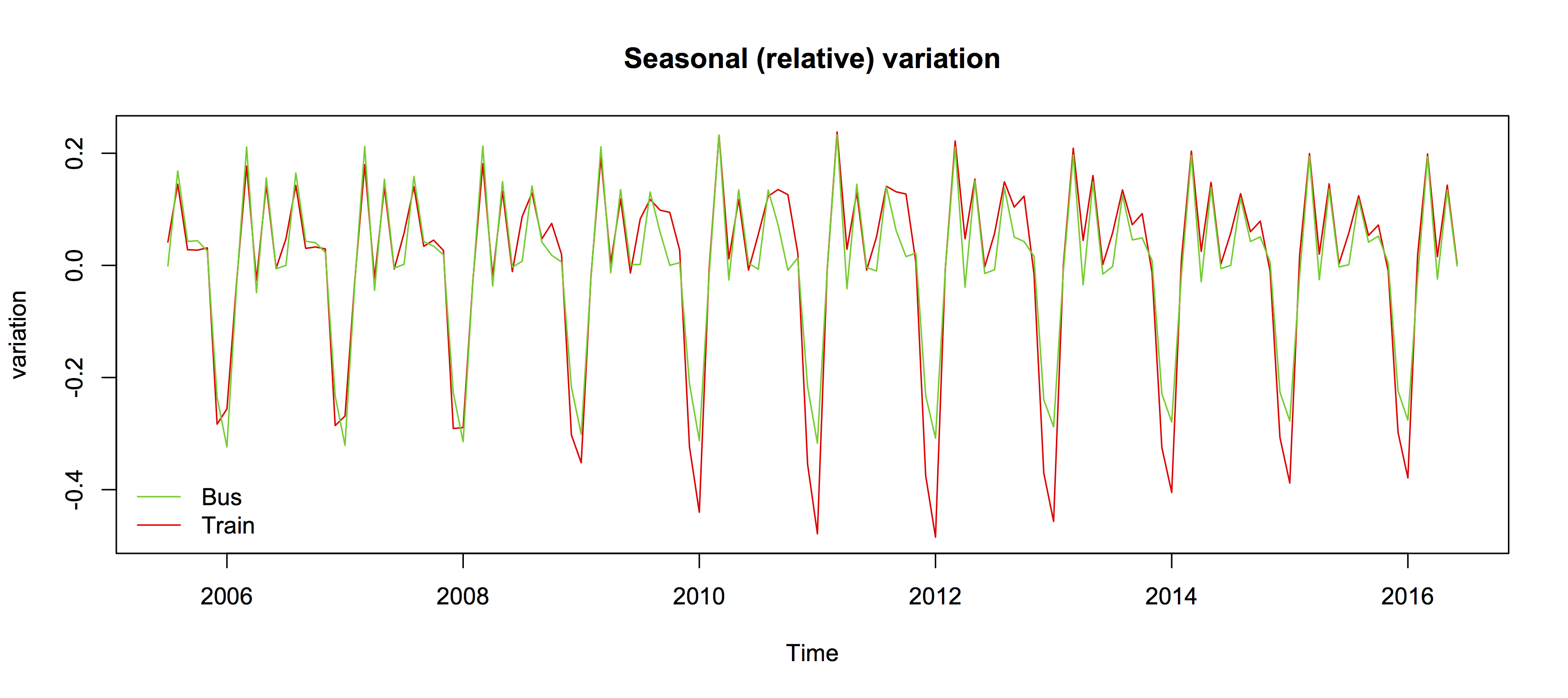
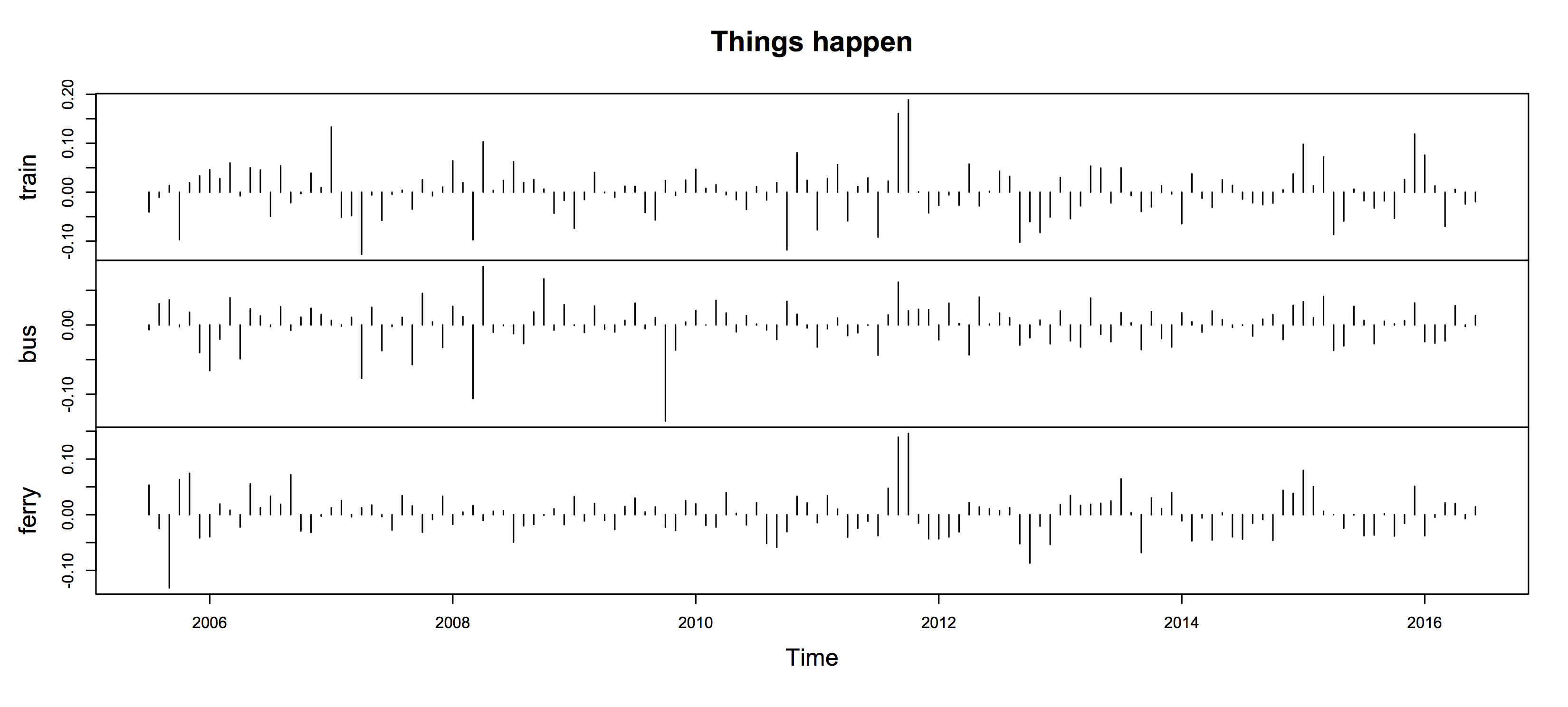

 Every summer, the Department of Statistics offers scholarships to a number of students so they can work with staff on real-world projects. Oliver, right, is working on visualising conservation data with Associate Professor Rachel Fewster. Oliver explains:
  orts with Associate Professor Rachel Fewster. Hubert explains: