But that’s not the worst part
Andrew Gelman passes on this infographic from the Carbon Trust
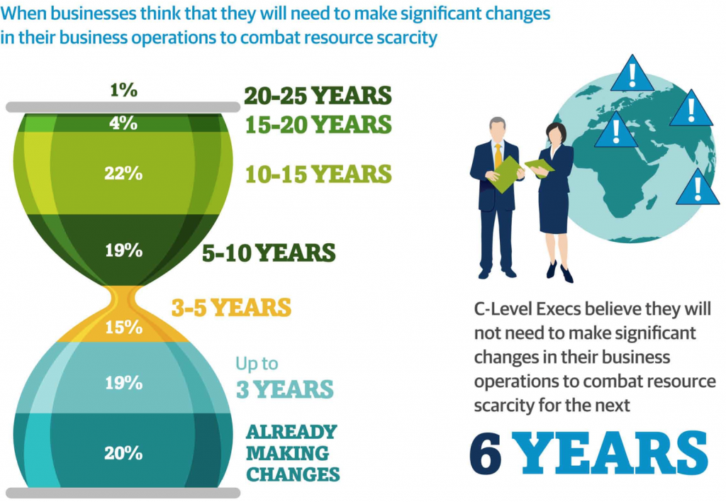
His correspondent points out that the colour scheme is awful, and that the hourglass metaphor would only make sense if the ‘pinch point’ in the hourglass was ‘now’, not 3-5 years in the future.
But that’s not the worst part: Andrew points out that the teeny orange area is actually highest rate per year over the whole time period, a fact that’s masked by the design.
But that’s not the worst part. The data in the graph come from telephone interviews with some unspecified set of senior executives (CEO, CIO, CTO, COO, etc) selected in an unspecified way with an unspecified response rate, from companies of varying but unspecified size in varying but unspecified industries, so it isn’t really as if the numbers mean much anyway.
Thomas Lumley (@tslumley) is Professor of Biostatistics at the University of Auckland. His research interests include semiparametric models, survey sampling, statistical computing, foundations of statistics, and whatever methodological problems his medical collaborators come up with. He also blogs at Biased and Inefficient See all posts by Thomas Lumley »