Infographic of the week
Every so often, someone comes up with a creative way to make pie charts less informative. This week’s innovation comes to you from Wired magazine.
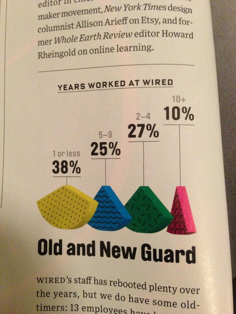
Note that it’s structured like a bar chart, except that all the `bars’ are the same height, and the wedges are turned at different angles, to make the widths harder to estimate. The numbers are presented as if their heights mean something, but actually not.
There are also some subtleties to the design. For example, at first glance you might think the left-to-right order of the wedges reflects the time period each one corresponds to, so that the fact they aren’t largest to smallest means something. Sadly, no.
(via @acfrazee and @kwbroman)
Thomas Lumley (@tslumley) is Professor of Biostatistics at the University of Auckland. His research interests include semiparametric models, survey sampling, statistical computing, foundations of statistics, and whatever methodological problems his medical collaborators come up with. He also blogs at Biased and Inefficient See all posts by Thomas Lumley »