Good information display
Recommended by Noah Iliinsky (@noahi), via @keith_ng, a display from the US travel-booking site Hipmunk (click to embiggen)
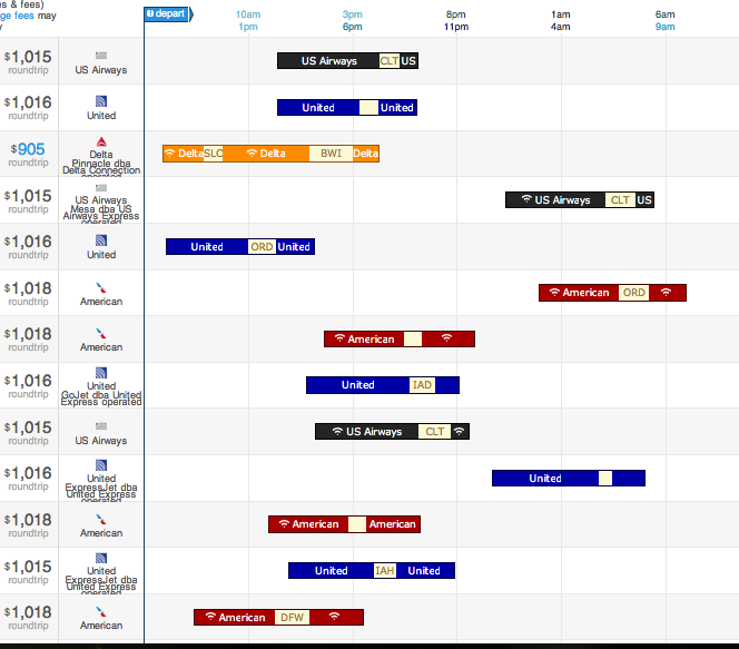
The bars display options for, in this case, a flight from Seattle (where I used to live) to Raleigh, NC, where the Environmental Protection Agency lives. The coloured segments are flights; the pale segments are layovers (labelled with the airport). The colour indicates the airline, and there are also symbols indicating availability of WiFi on the plane.
From the graph you can see at a glance that there’s no good way to get from Seattle to Raleigh, but also what all the options are.
Noah Iliinsky also has relatively sparse blog (Complex Diagrams) and gives a lot of talks. A good short one is “Data Visualizations Done Wrong”, where he does a lot of the easy pointing and laughing, but also talks about the relationship between the structure of information and its display.
Thomas Lumley (@tslumley) is Professor of Biostatistics at the University of Auckland. His research interests include semiparametric models, survey sampling, statistical computing, foundations of statistics, and whatever methodological problems his medical collaborators come up with. He also blogs at Biased and Inefficient See all posts by Thomas Lumley »