September 21, 2013
Pie chart of the week
Originally from jobvine.co.za, via a Harvard Business Review piece on data visualisation, this graph is supposed to show salary ranges for different positions.
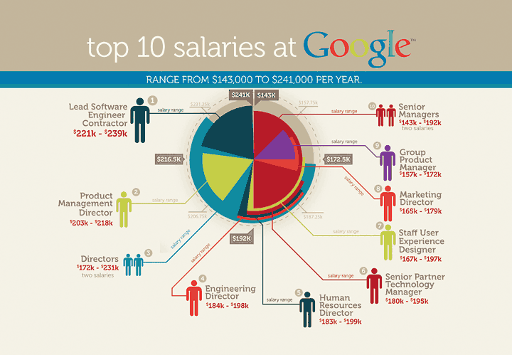
It really doesn’t. Read the HBR story for a better version.
Thomas Lumley (@tslumley) is Professor of Biostatistics at the University of Auckland. His research interests include semiparametric models, survey sampling, statistical computing, foundations of statistics, and whatever methodological problems his medical collaborators come up with. He also blogs at Biased and Inefficient See all posts by Thomas Lumley »
Have you done these ones before?
http://unconditional.co.nz/greigs/
13 years ago