Real estate data visualisation
Det Mackey suggested we look at Grieg’s Hamilton and their graphs.
Some of these are quite good.
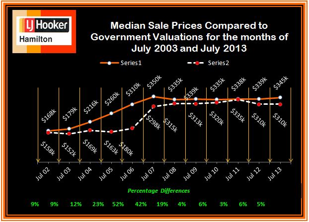
For example, this one shows how median sale price and CV change over time. The increase of sale price relative to government valuation in the boom is clear, as is the lack of increase since then. Also, the variations in the median CV would give some idea of the extent to which differences in median price are due to changes in which houses are selling, versus changes in how much they are selling for. The lack of a legend on the two series is a bit unfortunate, but it’s pretty obvious which is which. A graph like this would improve a lot of the newspaper stories about real estate prices.
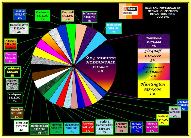
This graph, on the other hand, I think is supposed to show a comparison of median sale price across suburbs. Apart from aesthetic objections, it doesn’t really work because median sale prices by suburb are not components of a total in any meaningful way, so the ‘pie’ metaphor isn’t doing any useful work.
The other graphs on the site fall somewhere in between: they convey information, but often in ways that could have been more effective.
Thomas Lumley (@tslumley) is Professor of Biostatistics at the University of Auckland. His research interests include semiparametric models, survey sampling, statistical computing, foundations of statistics, and whatever methodological problems his medical collaborators come up with. He also blogs at Biased and Inefficient See all posts by Thomas Lumley »
Also, those four suburbs appear to have been summed just because they were the biggest four (in whatever the percentage means!).
In this one, they happen to be neighbouring suburbs, so maybe valid if there was some story their, but other pie charts aren’t neighbouring suburbs.
13 years ago
Yes, they aren’t covering themselves in glory with those pie charts.
If it wasn’t for them, the aesthetic issues could all be part of the advertising message: he’s not some latte-sipping JAFA graphic designer, just a bloke who knows the figures on Hamilton real estate.
13 years ago
Yes.
And as an extension: I immediately felt a bit bad after making my comment. It’s good to see more statistics effort*, even if shakey, than none.
* So long as improvements continue, and it’s not deliberately bad use of statistics for lobbying/selling newspaper reasons
13 years ago
Aren’t rating valuations revised only every three years (at least in ChCh, including in 2007). So this pattern is almost exactly what would have been expected given the boom in house prices pre-2008, which GV would have lagged and then undershot? Not sure if they are nationally synchronised though.
13 years ago
The ratings jump is exactly what you’d expect, but one of the concerns in interpreting median sales prices, especially in unusual economic circumstances, is that the median house for sale could change a lot. That is, you could get a decrease in median sale price when smaller or less expensive houses are a larger fraction of those sold, even if they are selling for a higher price (or vice versa, mutatis mutandis, et cetera).
That’s why comparing median valuation of the houses sold to median sale price is useful.
13 years ago