Overstating income inequality
The graph below is from Kevin Drum at Mother Jones, and is supposed to show US income inequality among college graduates (giving the mean and 10th and 90th percentiles) and between college graduates and people with only a high school education (the zero line). The graph is originally from a report by the Center for American Progress (page 7). Look at the labelling of the y-axis.
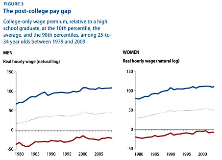
As Chad Orzel points out, there is no way these numbers can be right. The blue lines for both men and women cross 100. That should mean the logarithm of the ratio of 90th percentile college-graduate income to high-school graduate income is 100; the top 10% of college graduates would have to earn at least 25 million trillion trillion trillion times more than the average for people with only a high-school education.
Even in the US, income inequality isn’t that bad.
Thomas Lumley (@tslumley) is Professor of Biostatistics at the University of Auckland. His research interests include semiparametric models, survey sampling, statistical computing, foundations of statistics, and whatever methodological problems his medical collaborators come up with. He also blogs at Biased and Inefficient See all posts by Thomas Lumley »