The all-purpose ordinal bar chart
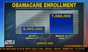
Edward Tufte coined the phrase ‘the Pravda school of ordinal graphics’, reminding us that numbers have a magnitude as well as a direction. Nowadays, he might have named the problem for Fox News.
I wrote about this one last month
Today’s (historical) effort, via Ben Atkinson
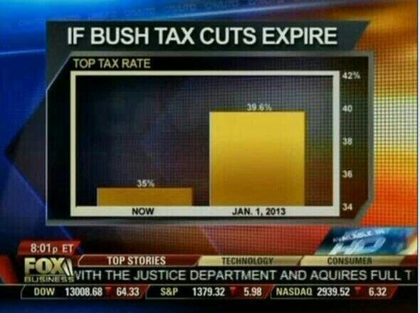
Interestingly, although they could use exactly the same barchart every time, they don’t. The Obamacare chart representing the data ratio 7066/6000 = 1.17 by a height ratio of 2.8; the tax cut chart represents the very similar data ratio 36.9/35 = 1.13 by a height ratio of 5.
“Waste, Fraud, and Abuse” is a common slogan for cutting government spending. Here, the fraud and abuse is obvious in the bar charts, but I hadn’t realised the extent of wasted effort that must go into redrawing it each time.
Thomas Lumley (@tslumley) is Professor of Biostatistics at the University of Auckland. His research interests include semiparametric models, survey sampling, statistical computing, foundations of statistics, and whatever methodological problems his medical collaborators come up with. He also blogs at Biased and Inefficient See all posts by Thomas Lumley »