Posts from December 2014 (46)

December 31, 2014

Duck! Here comes another year.

This year the visits to StatsChat have been about 1/3 for rugby prediction, about 1/3 for other posts, and about 1/3 for the home page. We had a slight increase in page views over last year.

Some specific things I’d like to highlight:

December 30, 2014

Briefly

  • From Matt Levine at Bloomberg View, a good example of why multidimensional visualisation is interesting, and easy to get wrong: If you’ve ever dreamed of being able to “process financial information easily without ever seeing a single number or percentage,” then you are mad, but also someone has built a thing for you. You wear it on your face and walk around looking at your stock portfolio; be careful not to trip over Radio Shack!

How dangerous was flying this year?

The Washington Post says

With yet another airliner gone missing over Southeast Asian airspace, there’s no question that 2014 has been a year beset by mysterious air tragedies. But there’s a surprising fact hiding behind this year’s high-profile air tragedies: 2014 has been the safest year for flying since, well, ever.

When you look at their data, the claim is true if you are an aeroplane. If you are a passenger, the claim is false.

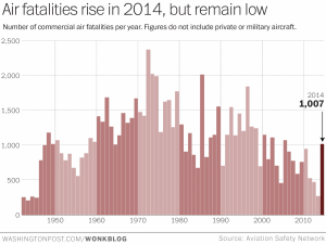
That is, 2014 (so far) has had 20 crashes by commercial flights carrying 14 or more passengers. That’s the lowest on record.

On the other hand, there have been 1007 fatalities in crashes of commercial flights carrying 14 or more passengers, which is about four times the number in 2013. You have to go back to the 1990s before 1000 deaths in a year becomes normal.

What has been unusual this year is that big planes have crashed. The missing AirAsia flight is an A320, the two Malaysia Airlines planes were 777s, the Air Algérie plane was an MD-83.

So is flying more dangerous? It’s hard to say. The trend over the past decade is still downwards, and the two Malaysia Airlines flights probably don’t indicate a pattern that applies to other airlines (even if it might make one nervous about that airline).  It’s too soon to say for the Air Asia flight.

The absolute risk was still extremely low: in 2013 there were 3 billion air passenger departures, so 1000 deaths would be one in three million.

imrs-1


December 29, 2014

What’s not in a name

I passed up this reprinted advertising-oriented survey story  about “The naughtiest names” the first time it came around. It’s back.

The findings come from a survey that looked at the names of more than 63,000 school children who logged good behaviour or achievement awards in online sticker books.

Those with the most good behaviour awards were named Jacob and Amy, closely followed by Georgia and Daniel.

Coincidentally, I’ve been listening to the BBC production of Good Omens, by Terry Pratchett and Neil Gaiman. It’s available online for the next three weeks. People who like that sort of  thing will find it’s the sort of thing they like. Early on, names are being suggested for a baby who turns out to be the Antichrist:

“Wormwood’s a nice name..Or Damien. Damien’s very popular….Or Cain. Very modern sound, Cain, really.”

This attempt to suggest ‘the naughtiest name’ failed dismally, and that’s probably true of the British survey as well.  The survey is probably a bit more representative of the population, but Good Omens is probably more realistic about the impact of names on the behaviour of children.

If you go to the original source, you see the originators of the survey didn’t really believe it either:

Neil Hodges, School Stickers Managing Director says, “The annual ‘Santa’s Naughty and Nice list’ is just a bit of fun, and obviously there are many Ella’s and Joseph’s that are perfect little angels, just as I’m sure there are many Amy’s and Jacobs that can be a bit of a handful.

though most of the mainstream media stories lost the disclaimer. This time it wasn’t the press release that was to blame.

It’s not that names have no effect. There’s a lot of research showing that identical job applications, for example, may be handled differently if different names are attached. There’s also a lot of social information in names — the story mentions research showing that you’re much more likely to get into Oxford or Cambridge if you’re called Eleanor than if you’re called Jade.

It’s possible there is some effect beyond social stratification and teacher prejudices, but this sort of survey is hopelessly unfit to reveal it.  That’s not the worst aspect, though. Even if the patterns of behaviour and name were real, they are soon going to be out of date. Patterns of first names change quite quickly, and this data presumably refers to kids who were named 5-10 years ago.  ‘Eleanor’ is now one of the names on the Naughty list.


How headlines sometimes matter

From the New Yorker, an unusual source for StatsChat, an article about research on the impact of headlines.  I often complain that the headline and lead are much more extreme than the rest of the story, and this research looks into whether this is just naff or actually misleading.

In the case of the factual articles, a misleading headline hurt a reader’s ability to recall the article’s details. That is, the parts that were in line with the headline, such as a declining burglary rate, were easier to remember than the opposing, non-headlined trend. Inferences, however, remained sound: the misdirection was blatant enough that readers were aware of it and proceeded to correct their impressions accordingly. […]

In the case of opinion articles, however, a misleading headline, like the one suggesting that genetically modified foods are dangerous, impaired a reader’s ability to make accurate inferences. For instance, when asked to predict the future public-health costs of genetically modified foods, people who had read the misleading headline predicted a far greater cost than the evidence had warranted.

Set to a possibly recognisable tune

The Risk Song: One hundred and eight hazards in 80 seconds

(via David Spiegelhalter)

December 27, 2014

The Lesser Spotted Hutt Man Drought

From the Christmas Eve edition of the Upper Hutt Leader, which you can read online:

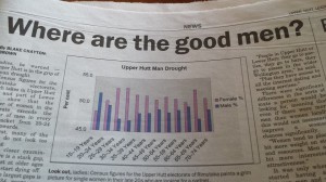
Ladies, be warned — Upper Hutt is in  the grip of a man drought

Here’s the graph to prove it (via Richard Law, on Twitter)

 upperhuttleader


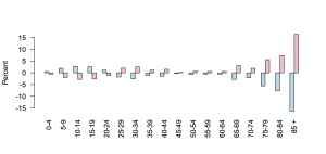
As the graph clearly indicates, women outnumber men hugely in the 25-35 age range, and (of course) at the oldest ages. The problem is, the y-axis starts at 45%. For lines or points that’s fine, but for bar charts it isn’t — because the bars connect the points to the x-axis.

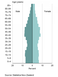
This is Stats New Zealand’s version of the graph, in standard ‘population pyramid’ form. It’s much less dramatic.

dbimages

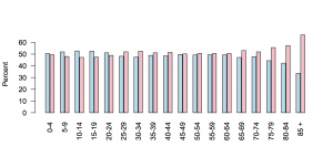
We could try a barchart with axis at zero

huttzero

It’s still much less dramatic — and you can see why the paper chopped the ages off at 75, since using the full range available in the data wouldn’t have fit on their axes.  The y-axis wasn’t just trimmed to fit the data; it was trimmed beyond the data.

You could make a case that ‘zero’ in this example is actual 50%: we (well, not we, but journalists who have to fill space) care about the deficiency or surplus of members of the appropriate sex.

hutt50

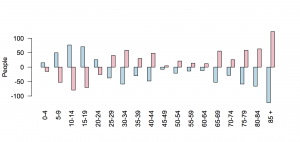
Or, you could look at deficiency or surplus of individuals, rather than percentages

huttdiff

Using individuals makes the younger age groups look more important, which helps the story, but on the other hand shows that the scale of this natural disaster isn’t all that devastating.

That’s basically what the expert quoted in the story says. Prof Garth Fletcher, from VUW, says

“People in Upper Hutt or Lower Hutt, they go to parties, they go to bars, they go to places in the wider Wellington area.”

It was only when you started having a gap between men and women of more than 5 or 10 percent that there would be real world implications, he said.


[Update: My data and graphs are for Upper Hutt (city). That’s about 2/3 of the Rimutaka electorate, which is where the paper’s data are for]

December 26, 2014

Safety and effectiveness in data mining

New medications have to demonstrate safety and effectiveness before they are marketed. Showing effectiveness is usually fairly straightforward, if slow and expensive. Safety is more difficult, because it’s mostly about uncommon events, edge cases, interactions.

Automated decisions based on data mining and algorithms have a similar problem.  It’s fairly easy to make sure they do what you intended them to do. It’s much harder to make sure they don’t also do things you didn’t think of.

Sometimes this is just human error, like the problems with RepricerExpress rules that led UK small businesses to post prices as low as 1p for goods on Amazon before Christmas, leading to massive losses. Sometimes it’s an algorithm than optimises the wrong thing.

Eric Meyer has written a post about Facebook’s “Year in Review”, which (repeatedly) pops up a picture in his feed saying “Eric, here’s what your year looked like!”. The algorithm is right. Horribly right.

But for those of us who lived through the death of loved ones, or spent extended time in the hospital, or were hit by divorce or losing a job or any one of a hundred crises, we might not want another look at this past year.

If I could fix one thing about our industry, just one thing, it would be that: to increase awareness of and consideration for the failure modes, the edge cases, the worst-case scenarios.  And so I will try.


December 25, 2014

From Wikimedia Commons

December 23, 2014

What’s the chance of that?

The best law-of-large-numbers scene in modern cinema.

“A spectacular vindication of the principle that each individual coin, spun individually, is as likely to come down heads as tails, and therefore should cause no surprise each individual time it does”