Graph of the week
Via @ian_sample on Twitter, a UK election ad
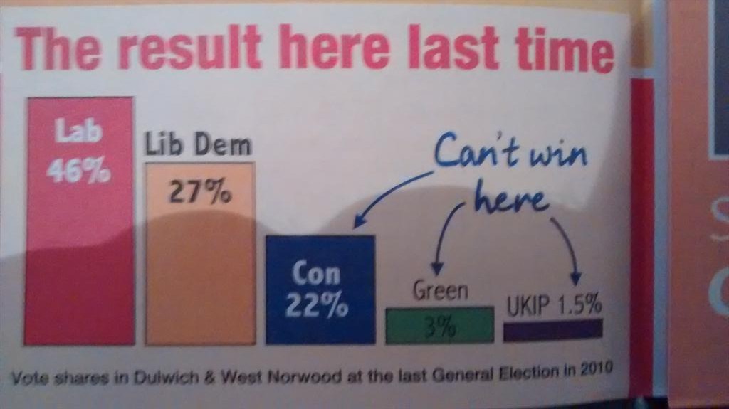
The basic approach has been traditional with the Liberal Party since before they merged with the Social Democratic Party; the accuracy has been, let’s say, variable. In this example, the 19-point difference between Labour and Liberal Democrats is shown as larger smaller than the 5-point difference between Liberal Democrats and Conservatives.
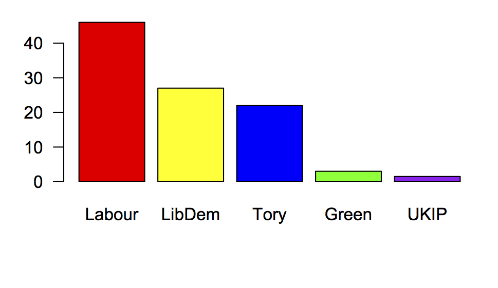
Here’s what those numbers really look like:
Thomas Lumley (@tslumley) is Professor of Biostatistics at the University of Auckland. His research interests include semiparametric models, survey sampling, statistical computing, foundations of statistics, and whatever methodological problems his medical collaborators come up with. He also blogs at Biased and Inefficient See all posts by Thomas Lumley »
I think you meant to say “is shown as smaller …”?
11 years ago