Housing affordability graphics
Another nice Herald interactive, this time of housing affordability.
Affordability comes in two parts: down payment and monthly mortgage costs. The affordability index from Massey University looks at monthly payments; this one looks at the 20% down payment.
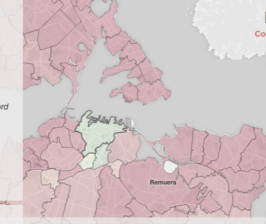
The difference between Auckland and the rest of the country is pretty dramatic, but there are other things to see. Above, the centre of Auckland is much less expensive than the rest of the city: 75% of properties are valued at under $500,000 by CoreLogic. That’s the apartments, but they mostly aren’t the sort of apartments people are planning to stay in long-term.
Another interesting feature for Auckland is that the neighbourhoods really are ordered in price — you don’t see the spatial trends changing as you move the slider, so there aren’t areas where the low-end houses are especially cheap and the high-end houses especially expensive.
You can also see the difficulty of relating valuations to prices. In Point Chev, the valuations say 70% of homes are valued at over $1 million. On the other hand, the median sale price is $990,00, so less than half the homes that changed hands went for over a million.
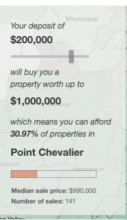
Both those numbers are correct. Well, ok, I assume they are both correct; they are both what they are supposed to be. It’s just that home sales aren’t a random sample of all homes. But if the median sale price is $990k and the median valuation for all homes is $1.2m, you can see that interpreting these numbers is harder than it looks.
Thomas Lumley (@tslumley) is Professor of Biostatistics at the University of Auckland. His research interests include semiparametric models, survey sampling, statistical computing, foundations of statistics, and whatever methodological problems his medical collaborators come up with. He also blogs at Biased and Inefficient See all posts by Thomas Lumley »