Posts from June 2016 (41)

June 28, 2016

Updated Super Rugby Predictions

I posted predictions for Round 15 before the international games. I have just updated the predictions because I had not taken into account that the Chiefs versus Crusaders game is to be on a neutral ground.

See the updated post atSuper 18 Predictions for Round 15

NRL Predictions for Round 17

Team Ratings for Round 17

The basic method is described on my Department home page.

Here are the team ratings prior to this week’s games, along with the ratings at the start of the season.

Current Rating Rating at Season Start Difference
Cowboys 9.60 10.29 -0.70
Storm 8.57 4.41 4.20
Broncos 6.39 9.81 -3.40
Sharks 5.71 -1.06 6.80
Bulldogs 4.96 1.50 3.50
Raiders 2.90 -0.55 3.50
Eels 1.23 -4.62 5.90
Panthers -0.59 -3.06 2.50
Roosters -1.35 11.20 -12.60
Dragons -2.11 -0.10 -2.00
Sea Eagles -2.14 0.36 -2.50
Warriors -2.56 -7.47 4.90
Rabbitohs -3.23 -1.20 -2.00
Titans -3.37 -8.39 5.00
Wests Tigers -5.23 -4.06 -1.20
Knights -17.13 -5.41 -11.70


Performance So Far

So far there have been 118 matches played, 71 of which were correctly predicted, a success rate of 60.2%.
Here are the predictions for last week’s games.

Game Date Score Prediction Correct
1 Panthers vs. Rabbitohs Jun 24 28 – 26 6.30 TRUE
2 Knights vs. Dragons Jun 25 18 – 30 -12.00 TRUE
3 Sharks vs. Warriors Jun 25 19 – 18 14.10 TRUE
4 Bulldogs vs. Broncos Jun 25 40 – 14 -2.30 FALSE
5 Titans vs. Raiders Jun 26 22 – 30 -2.40 TRUE
6 Storm vs. Wests Tigers Jun 26 29 – 20 18.10 TRUE
7 Cowboys vs. Sea Eagles Jun 27 30 – 26 16.50 TRUE


Predictions for Round 17

Here are the predictions for Round 17. The prediction is my estimated expected points difference with a positive margin being a win to the home team, and a negative margin a win to the away team.

Game Date Winner Prediction
1 Roosters vs. Bulldogs Jun 30 Bulldogs -3.30
2 Broncos vs. Storm Jul 01 Broncos 0.80
3 Warriors vs. Titans Jul 02 Warriors 4.80
4 Wests Tigers vs. Panthers Jul 02 Panthers -1.60
5 Sharks vs. Eels Jul 02 Sharks 7.50
6 Raiders vs. Knights Jul 03 Raiders 23.00
7 Rabbitohs vs. Cowboys Jul 03 Cowboys -9.80
8 Sea Eagles vs. Dragons Jul 04 Sea Eagles 3.00


June 27, 2016

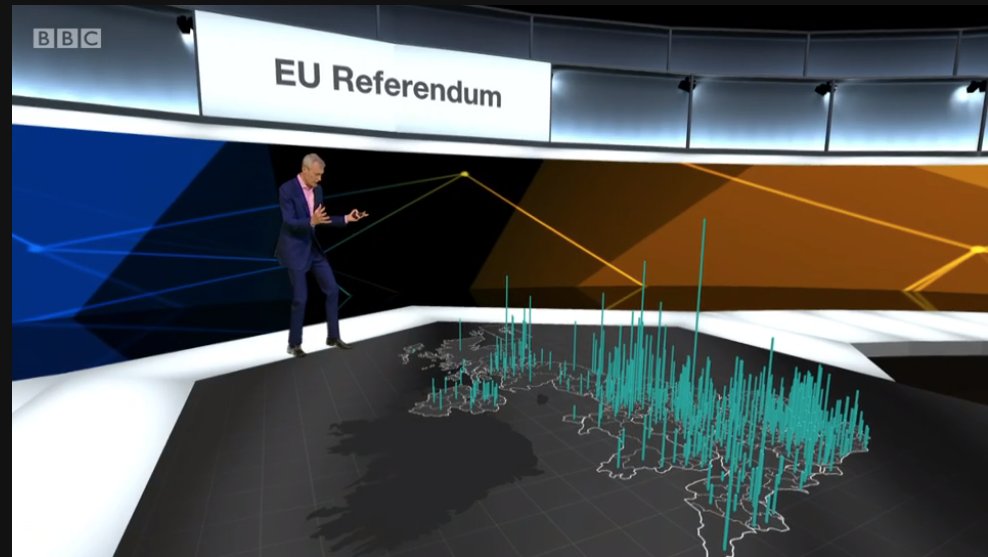
Graph of the week

bbc-eu
From the BBC coverage of the Brexit referendum. With great power comes great responsibility.

Briefly

  • In Brexit, the YouGov estimate that I mentioned last week was pretty accurate, but the result genuinely was too close to call.  The real-time forecasts from Chris Hanretty at the University of East Anglia seemed to work well.
  • If you combine turnout estimates with voting estimates by age group, the proportion of 18-24 year olds voting Remain (75% of the 36% turnout) was less than the proportion of 65+ year olds (39% of the 83% turnout).  Turnout matters.
  • You’re much more likely to survive a cardiac arrest on TV than in real life.
  • What theoretical physicists (statisticians, etc,) look like when working (Dr Katie Mack, astrophysics/cosmology). No lab coats; no brighly coloured Erlenmeyer flasks.

Stat of the Week Competition: June 25 – July 1 2016

Each week, we would like to invite readers of Stats Chat to submit nominations for our Stat of the Week competition and be in with the chance to win an iTunes voucher.

Here’s how it works:

  • Anyone may add a comment on this post to nominate their Stat of the Week candidate before midday Friday July 1 2016.
  • Statistics can be bad, exemplary or fascinating.
  • The statistic must be in the NZ media during the period of June 25 – July 1 2016 inclusive.
  • Quote the statistic, when and where it was published and tell us why it should be our Stat of the Week.

Next Monday at midday we’ll announce the winner of this week’s Stat of the Week competition, and start a new one.

(more…)

Stat of the Week Competition Discussion: June 25 – July 1 2016

If you’d like to comment on or debate any of this week’s Stat of the Week nominations, please do so below!

June 23, 2016

Or the other way around

It’s a useful habit, when you see a causal claim based on observational data, to turn the direction around: the story says A causes B, but could B cause A instead? People get annoyed when you do this, because they think it’s silly. Sometimes, though, that is what is happening.

As a pedestrian and public transport user, I’m in favour of walkable neighbourhoods, so I like seeing research that says they are good for health. Today, Stuff has a story that casts a bit of doubt on those analyses.

The researchers used Utah driver’s-licence data, which again included height and weight, to divide all the neighbourhoods in Salt Lake County into four groups by average body mass index. They used Utah birth certificates, which report mother’s height and weight, and looked at 40,000 women who had at least two children while living in Salt Lake County during the 20-year study period.  Then they looked at women who moved from one neighbourhood to another between the two births. Women with higher BMI were more likely to  move to a higher-BMI neighbourhood.

If this is true in other cities and for people other than mothers with new babies, it’s going to exaggerate the health benefits of walkable neighbourhoods: there will be a feedback loop where these neighbourhoods provide more exercise opportunity, leading to lower BMI, leading to other people with lower BMI moving there.   It’s like with schools: suppose a school starts getting consistently good results because of good teaching. Wealthy families who value education will send their kids there, and the school will get even better results, but only partly because of good teaching.

June 22, 2016

Eat up your doormats

Q: Did you see food allergies are caused by diet?

A: That makes sense, I suppose.

Q: Does it make sense that low-fibre diets are why people get peanut allergy more now?

A: Ah. No.

Q: Why not?

A: Because fibre in the typical diet hasn’t changed much in recent years and peanut allergies have become much more common.

Q: It could still be true that adding more fibre would stop people getting peanut allergies, though?

A: Could be.

Q: And that’s what the research found?

A: Up to a point.

Q:  Mice?

A: Mice.

Q: But peanut allergy and dietary fibre?

A: Yes, pretty much. And a plausible biological reason for how it might work.

Q: So it’s worth trying in humans?

A: Probably, though getting little kids to eat that much fibre would be hard.

Q: But the story just says “a simple bowl of bran and some dried apricots in the morning”

A: Sadly, yes.

Q: So how much fibre did they give the rats?

A: They compared a zero-fibre diet to 35% fibre

Q: Is 35% a lot?

A: Well, it’s more than All-Bran, and that was their whole diet.

Q: A more reasonable dose might still work, though?

A: Sure. But you wouldn’t want to assume it did before the trials happened.
 

Briefly

  • The Data Journalism Awards from the Global Editors Network (scroll down past the ceremony stuff to get the links to the award-winners). And a commentary from Simon Rogers
  • Colorado legalised cannabis recently. They have data on teenage cannabis use over time. It hasn’t gone up, probably because teens who wanted pot could already get it.
    I still haven’t seen anything on the two more important potential health impacts: do car crashes go up or down, does alcohol consumption go up or down.
  • A nice detailed explanation of how YouGov is doing its predictions for the Brexit referendum.  At the moment they are robustly unsure, estimating 48%-53% vote for “Leave”.  They do discuss how badly the last election polling went, and conclude  “if we have a problem, it will probably not be the same problem as last time.” (via Andrew Gelman)

Making hospital data accessible

From the Guardian

The NHS is increasingly publishing statistics about the surgery it undertakes, following on from a movement kickstarted by the Bristol Inquiry in the late 1990s into deaths of children after heart surgery. Ever more health data is being collected, and more transparent and open sharing of hospital summary data and outcomes has the power to transform the quality of NHS services further, even beyond the great improvements that have already been made.

The problem is that most people don’t have the expertise to analyse the hospital outcome data, and that there are some easy mistakes to make (just as with school outcome data).

A group of statisticians and psychologists developed a website that tries to help, for the data on childhood heart surgery.  Comparisons between hospitals in survival rate are very tempting (and newsworthy) here, but misleading: there are many reasons children might need heart surgery, and the risk is not the same for all of them.

There are two, equally important, components to the new site. Underneath, invisible to the user, is a statistical model that predicts the surgery result for an average hospital, and the uncertainty around the prediction. On top is the display and explanation, helping the user to understand what the data are saying: is the survival rate at this hospital higher (or lower) than would be expected based on how difficult their operations are?