Election maps: what’s the question?
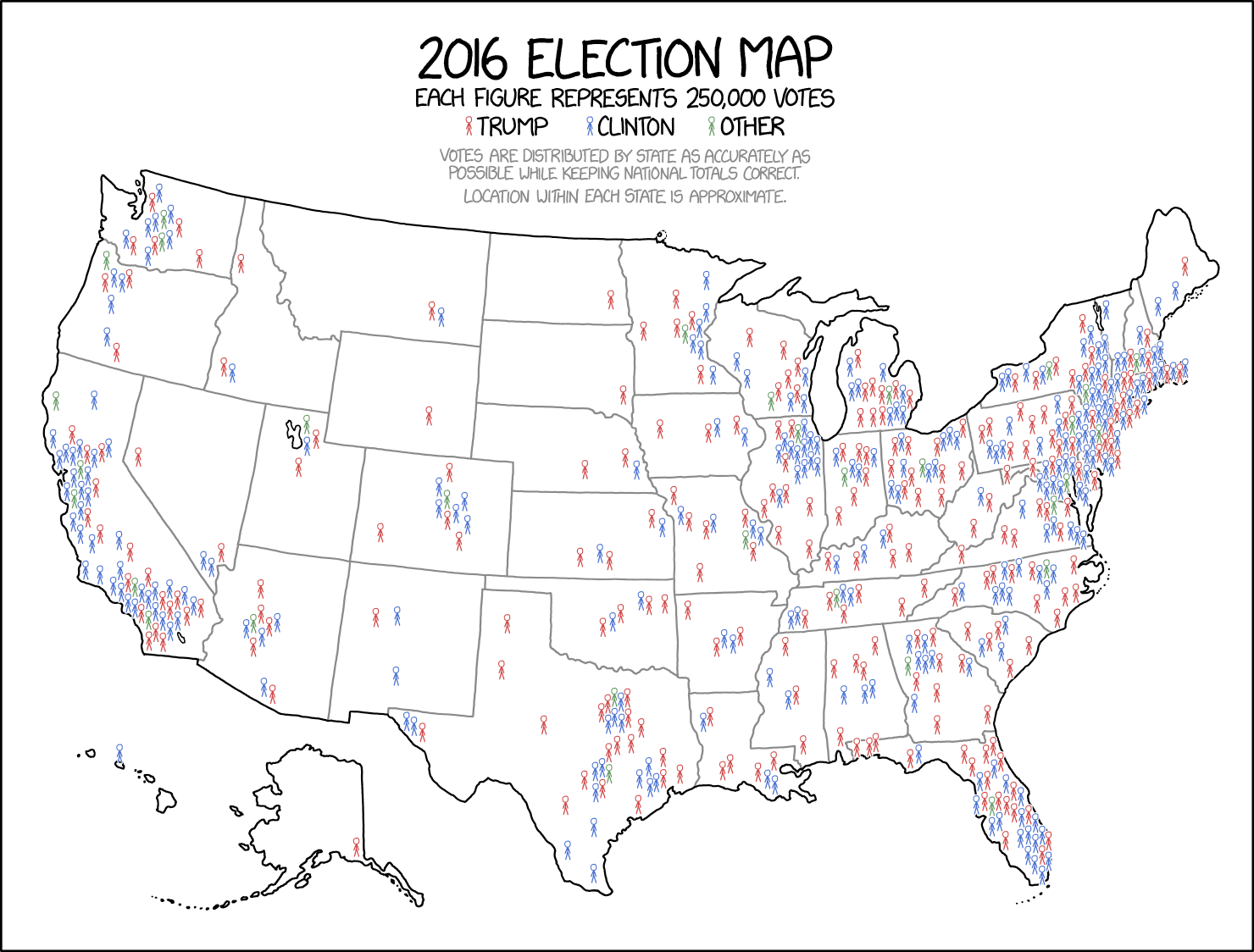
XKCD has come out with a new map of the 2016 US election
In about 2008 I made a less-artistic one of the 2004 elections on similar principles
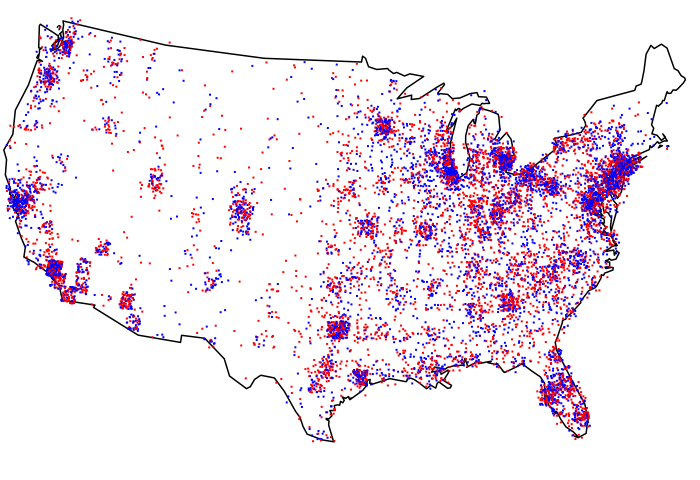
These maps show some useful things about the US vote:
- the proportions for the two parties are pretty close, but
- most of the land area has very few voters, and
- most areas are relatively polarised
- but not as polarised as you think, eg, look at the cities in Texas
What these maps are terrible at is showing changes from one election to the next. The map for 2004 (Republicans ahead by about 2.5%) and 2016 (Republicans behind by about 3%) look very similar. And even 2008 (Republicans behind by 7%) wouldn’t look that different.
Like a well-written thousand words, a well-drawn picture needs to be about something. Questions matter. The data don’t speak for themselves.
Thomas Lumley (@tslumley) is Professor of Biostatistics at the University of Auckland. His research interests include semiparametric models, survey sampling, statistical computing, foundations of statistics, and whatever methodological problems his medical collaborators come up with. He also blogs at Biased and Inefficient See all posts by Thomas Lumley »