Map whining
I’ve seen this map several times on Twitter. It’s originally from a British company, ThirtyFifty. It gives a really nice idea of where the world’s wine regions are, and why, in terms of temperature.
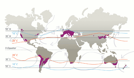
There’s one problem, which is probably more obvious to New Zealanders than northern-hemisphere people. The latitude lines are wrong.
The 50N line and the equator are right, but the 30N line is a little too far north; the 30S line is a little too far north; and the 50S line is way too far north — it’s at about 45S, measured by the southern tip of Tasmania and the middle of NZ’s South Island.
Thomas Lumley (@tslumley) is Professor of Biostatistics at the University of Auckland. His research interests include semiparametric models, survey sampling, statistical computing, foundations of statistics, and whatever methodological problems his medical collaborators come up with. He also blogs at Biased and Inefficient See all posts by Thomas Lumley »
They should grow some wine in Alaska and Greenland–they’re so huge, just look at the map!
8 years ago