April 19, 2022
Briefly
- The Herald has a story on a penis size ‘survey’ from a UK online pharmacy specialising in men’s health, who “used Google data to rank the average penis size of 86 countries – and New Zealand has placed 50th”. That’s not an indication of worrying privacy leaks in Android phones; it seems they did just Google for the results. The pharmacy obviously wants to get publicity because being unknown will be its biggest business problem. In the UK, they did well and got a mention in The Sun. Being in the Herald doesn’t do them much good, though.
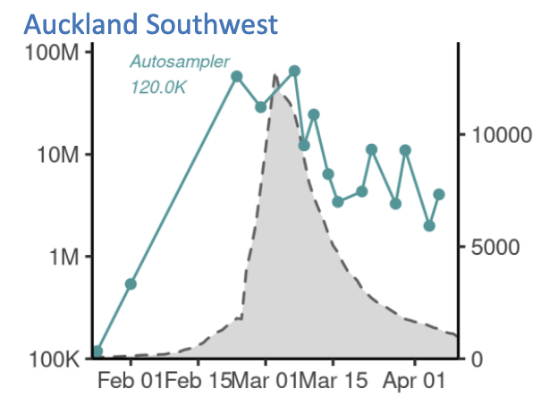
- ESR is now publishing detailed wastewater Covid data, which is great — the big advantage of wastewater data is that the sampling is independent of Covid prevalence, in contrast to data on testing, where you tend to miss more cases as the prevalence goes up.
- One thing I don’t like about the current ESR graphs is that they use a log scale for viral load and a linear scale for cases, which is one reason the peak for wastewater looks so much broader than the peak for cases (the other reason is that wastewater measures total active cases, not daily new cases)

- Ben Schmidt has made an interactive map of ethnicity in the US, based on Census data — in the sense that it has a dot for each of the 300-odd million people recorded in the Census
- Interesting Twitter thread about the case against the continued existence of Ivory-billed Woodpeckers in the US. Not precisely statistical, but definitely statistics-adjacent.
- Somewhat dodgy graphic from Labour about housing consents. If this is an area graph, the axis should go down to zero. It’s not as bad as some I’ve covered in the past, but it’s annoying. The second graph is an edited version where the axis does go down to zero and the areas are meaningful


Thomas Lumley (@tslumley) is Professor of Biostatistics at the University of Auckland. His research interests include semiparametric models, survey sampling, statistical computing, foundations of statistics, and whatever methodological problems his medical collaborators come up with. He also blogs at Biased and Inefficient See all posts by Thomas Lumley »
The ethnicity map of US when you zoom in shows some interesting details. Choose congressional district boundaries overlay and its clear the gerrymandering follows ethnic boundaries. Memphis has one district for most of the core city but the majority white suburbs in one narrow sector are cut off to be included in the larger district surrounding the city
4 years ago