Posts written by Thomas Lumley (2645)

avatar

Thomas Lumley (@tslumley) is Professor of Biostatistics at the University of Auckland. His research interests include semiparametric models, survey sampling, statistical computing, foundations of statistics, and whatever methodological problems his medical collaborators come up with. He also blogs at Biased and Inefficient

September 17, 2015

Kids these days

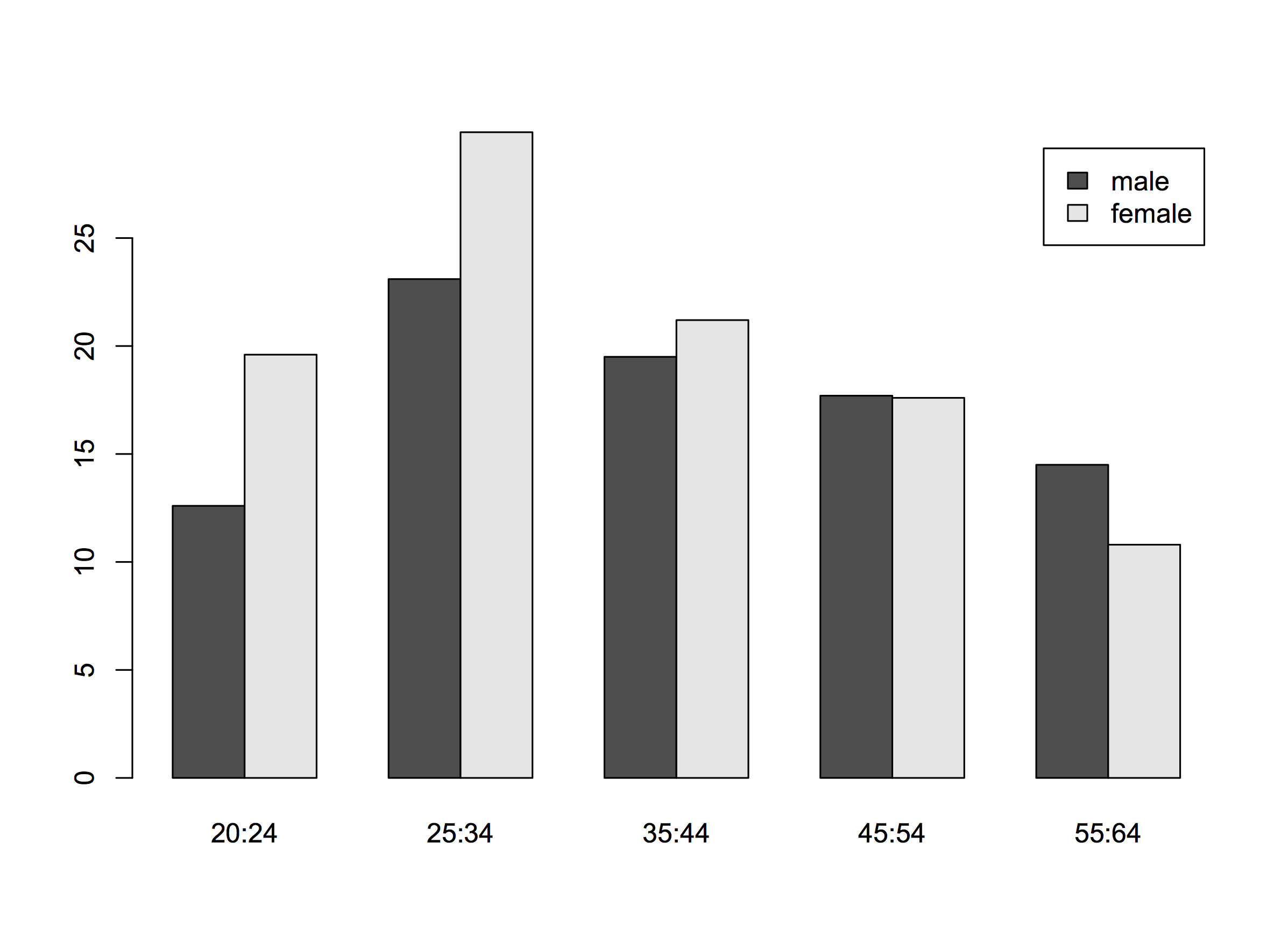
I made this graph for a lecture on longitudinal data, then thought I’d share it. It shows the percentage of New Zealanders with post-secondary qualifications, by age and sex (data from 2006). The proportion with qualifications goes down after age 35.

age-cohort-degree

Obviously NZ universities aren’t taking people’s degrees away (except occasionally), so as individual get older, their qualifications either stay the same or increase. The downward trend is a cohort effect — people born in the 1950s are less likely to end up with post-secondary qualifications than people born in the 1970s.  Ten years earlier, the proportion in the 25-34 age group was 14.7% for men and 13.1% for women, so this cohort of people, now 35-44, do have more qualifications than they did ten years ago.

In this case the explanation is obvious, but often news stories talk about Kids These Days and how they should, eg, Get Off Our Lawns The Internet. After checking that the trend is real (a disturbingly important step) it’s worth asking whether the story’s attribution of the problem to age effects or cohort effects is right.

September 16, 2015

How many immigrants?

Before reading on, what proportion of New Zealand residents do you think were born overseas? (more…)

September 10, 2015

Do preferential voting and similar flags interact badly?

(because I was asked about Keri Henare’s post)

Short answer: No.

As you know, we have four candidate flags. Two of them, the Lockwood ferns, have the same design with some colour differences. Is this a problem, and is it particularly a problem with Single Transferable Vote (STV) voting?

In the referendum, we will be asked to rank the four flags. The first preferences will be counted. If one flag has a majority, it will win. If not, the flag with fewest first preferences will be eliminated, and its votes allocated to their second-choice flags. And so on. Graeme Edgeler’s Q&A on the method covers the most common confusions. In particular, STV has the nice property that (unless you have really detailed information about everyone else’s voting plans) your best strategy is to rank the flags according to your true preferences.

That’s not today’s issue. Today’s issue is about the interaction between STV and having two very similar candidates.  For simplicity, let’s consider the extreme case where everyone ranks the two Lockwood ferns together (whether 1 and 2, 2 and 3, or 3 and 4). Also for simplicity, I’ll assume there is a clear preference ranking — that is, given any set of flags there is one that would be preferred over each of the others in two-way votes.  That’s to avoid various interesting pathologies of voting systems that aren’t relevant to the discussion. Finally, if we’re asking if the current situation is bad, we need to remember that the question is always “Compared to what?”

One comparison is to using just one of the Lockwood flags. If we assume either that there’s one of them that’s clearly more popular, or that no-one really cares about the difference, then this gives the same result as using both the Lockwood flags.

Given that the legislation calls for four flags this isn’t really a viable alternative. Instead, we could replace one of the Lockwood flags with, say, Red Peak.  Red Peak would then win if a majority preferred it over the remaining Lockwood flag and over each of the other two candidates.  That’s the same result that we’d get adding a fifth flag, except that adding a fifth flag takes a law change and so isn’t feasible.

Or, we could ask how the current situation compares to another voting system. With first-past-the-post, having two very similar candidates is a really terrible idea — they tend to split the vote. With approval voting (tick yes/no for each flag) it’s like STV; there isn’t much impact of adding or subtracting a very similar candidate.

If it were really  true that everyone was pretty much indifferent between the Lockwood flags or that one of them was obviously more popular, it would have been better to just take one of them and have a different fourth flag. That’s not an STV bug; that’s an STV feature; it’s relatively robust to vote-splitting.

It isn’t literally true that people don’t distinguish between the Lockwood flags. Some people definitely want to have black on the flag and others definitely don’t.  Whether it would be better to have one Lockwood flag and Red Peak depends on whether there are more Red Peak supporters than people who feel strongly about the difference between the two ferns.  We’d need data.

What this argument does suggest is that if one of the flags were to be replaced on the ballot, trying to guess which one was least popular need not be the right strategy.

September 9, 2015

Assessing popular opinion

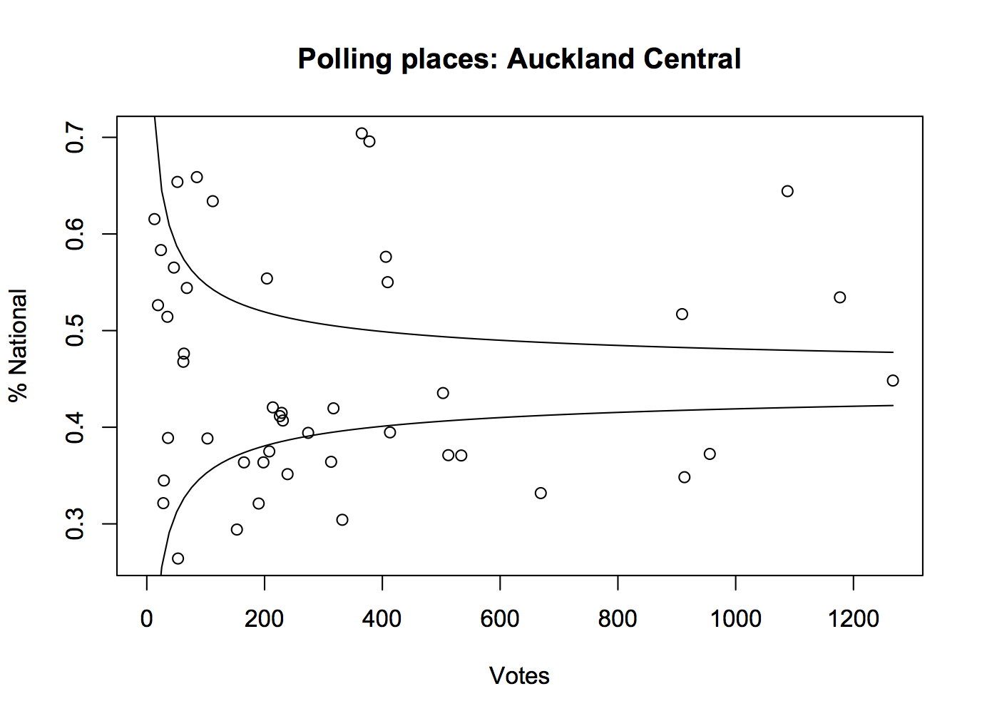
One of the important roles played by good-quality opinion polls before an election is getting people’s expectations right.  It’s easy to believe that the opinions you hear everyday are representative, but for a lot of people they won’t be.  For example, here are the percentages for the National Party for each polling place in Auckland Central in the 2014 election. The curves show the margin of error around the overall vote for the electorate, which in this case wasn’t far from the overall for the whole country.

kael

For lots of people in Auckland Central, their neighbours vote differently than the electorate as a whole.  You could do this for the whole country, especially if the data were in a more convenient form, and it would be more dramatic.

Pauline Kael, the famous New York movie critic, mentioned this issue in a talk to the Modern Languages Association

“I live in a rather special world. I only know one person who voted for Nixon. Where they are I don’t know. They’re outside my ken. But sometimes when I’m in a theater I can feel them.”

She’s usually misquoted in a way that reverses her meaning, but still illustrates the point.

It’s hard to get hold of popular opinion just from what you happen to come across in ordinary life, but there are some useful strategies. For example, on the flag question

  • How many people do you personally know in real life who had expressed a  preference for one of the Lockwood fern flags and now prefer Red Peak?
  • How many people do you follow on Twitter (or friend on Facebook, or whatever on WhatsApp) who had expressed a  preference for one of the Lockwood fern flags and now prefer Red Peak?

For me, the answer to both of these is “No-one”: the Red Peak enthusiasts that I know aren’t Lockwood converts. I know of some people who have changed their preferences that way — I heard because of my last StatsChat post — but I have no idea what the relevant denominator is.

The petition is currently just under 34,000 votes, having slowed down in the past day or so. I don’t see how Red Peak could have close to a million supporters.  More importantly, anyone who knows that it does must have important evidence they aren’t sharing. If the groundswell is genuinely this strong, it should be possible to come up with a few thousand dollars to get at least a cheap panel survey and demonstrate the level of support.

I don’t want to go too far in being negative. Enthusiasm for this option definitely goes beyond disaffected left-wing twitterati — it’s not just Red pique — but changing the final four at this point really should require some reason to believe the new flag could win. I don’t see it.

Opinion is still evolving, and maybe this time we’ll keep the Australia-lite flag and the country will support something I like next time.


September 8, 2015

Petitions and other non-representative data

Stuff has a story about the #redpeak  flag campaign, including a clicky bogus poll that currently shows nearly 11000 votes in support of the flag candidate. While Red Peak isn’t my favourite (I prefer Sven Baker’s Huihui),  I like it better than the four official candidates. That doesn’t mean I like the bogus poll.

As I’ve written before, a self-selected poll is like a petition; it shows that at least the people who took part had the views they had. The web polls don’t really even show that — it’s pretty easy to vote two or three times. There’s also no check that the votes are from New Zealand — mine wasn’t, though most of them probably are.  The Stuff clicky poll doesn’t even show that 11,000 people voted for the Red Peak flag.

So far, this Stuff poll at least hasn’t been treated as news. However, the previous one has.  At the bottom of one of the #redpeak stories you can read

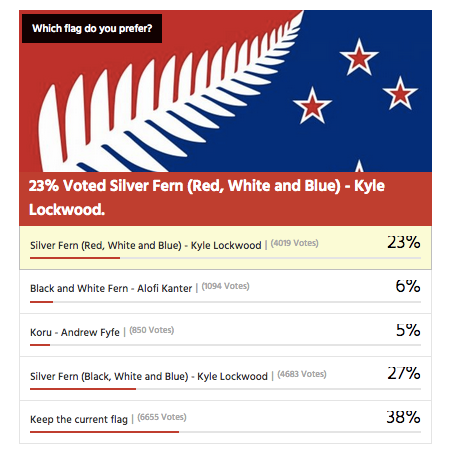
In a Stuff.co.nz poll of 16,890 readers, 39 per cent of readers voted to keep the current flag rather than change it. 

Kyle Lockwood’s Silver Fern (black, white and blue) was the most popular alternate flag design, with 27 per cent of the vote, while his other design, Silver Fern (red, white and blue), got 23 per cent. This meant, if Lockwood fans rallied around one of his flags, they could vote one in.

Flags designed by Alofi Kanter – the black and white fern – and Andrew Fyfe each got 6 per cent or less of the vote

They don’t say, but that looks very much like this clicky poll from an earlier Stuff flag story, though it’s now up to about 17500 votes
flagpoll

You can’t use results from clicky polls as population estimates, whether for readers or the electorate as a whole. It doesn’t work.

Over approximately the same time period there was a real survey by UMR (PDF), which found only 52% of people preferred their favourite among the four flags to the current flag.  The referendum looks a lot closer than the clicky poll suggests.

The two Lockwood ferns were robustly the most popular flags in the survey, coming  in as the top two for all age groups; men and women; Māori; and Labour, National and Green voters. Red Peak was one of the four least preferred in every one of these groups.

Only 1.5% of respondents listed Red Peak among their top four.  Over the whole electorate that’s still about 45000, which is why an online petition with 31000 electronic signatures should have about the impact it’s going to have on the government.

Depending on turnout, it’s going to take in the neighbourhood of a million supporting votes for a new flag to overturn the current flag. It’s going to take about the same number of votes ranking Red Peak higher than the Lockwood ferns for it to get on to the final ballot.

In the Stuff story, Graeme Edgeler suggests “Perhaps if there were a million people in a march” would be enough to change the government’s mind. He’s probably right, though I’d say a million estimated from a proper survey, or maybe fifty thousand in a march should be enough. For an internet petition, perhaps two hundred thousand might be a persuasive number, if there was some care taken that they were distinct people and eligible voters.

For those of us in a minority on flag matters, Andrew Geddis has a useful take

In fact, I’m pretty take-it-or-leave-it on the whole point of having a “national” flag. Sure, we need something to put up on public buildings and hoist a few times at sporting events. But I quite like the fact that we’ve got a bunch of other generally used national symbols that can be appropriated for different purposes. The silver fern for putting onto backpacks in Europe. The Kiwi for our armed forces and “Buy NZ Made” logos. The Koru for when we’re feeling the need to be all bi-cultural.

If you like Red Peak, fly it. At the moment, the available data suggest you’re in as much of minority as me.

September 7, 2015

Don’t take sex advice from the Daily Mail

I usually don’t bother commenting on unsourced ‘nutrition’ claims, but the Herald has this one on the front page of the website, only four stories down from the increase in the number of Syrian refugees

mail

It’s from the Daily Mail  and it’s about sex. That’s never a good sign.

Some of the advice is plausible — they say the same things about alcohol that the Porter does in Macbeth, though less felicitously phrased. At the other extreme

The trans-fats found in most fried foods are known to decrease the libido in both men and women by increasing abnormal sperm production (lower sperm count and slower sperm movement) in men and interfering with gestation in women.

That’s fertility, not libido. The difference is kind of important.

Chocolate is always a favourite of this sort of story

A known aphrodisiac, chocolate is absolutely delightful, as it is full of anandamide and phenylethylamine, two ingredients that cause the body to release the happy hormones, known as endorphins. However, while the happy hormones are great, cocoa also contains methylxantines, which can make us lethargic and lower the libido.

The concentrations of anandamide and phenylethylamine have been demonstrated to be too small to have an effect.  Also, anandamide doesn’t release endorphins — it has a direct effect (in larger doses) as a cannabis analogue. And phenylethylamine doesn’t release endorphins; it has direct but different drug-like effects (again, in larger doses).  Methylxanthines are actually present in chocolate at what might be biologically relevant levels, but that description of their effects is very unusual: the best known one is caffeine.

There’s also the common sort of  translation problem with stories from the other side of the world.  Red meat in New Zealand typically doesn’t contain hormones used to promote animal growth — it’s illegal for lamb or venison and rare for beef. [Update: actually, this part wouldn’t be true in the UK either]

Overall, the food effects are either untrue or exaggerated, which is pretty much what you’d expect given the topic and the source.  If your favourite member of the appropriate sex likes chocolate, giving them some might or might not have the desired effect. If it doesn’t, the problem probably isn’t the methylxanthines.


Some refugee numbers

First, the Gulf States. It has been widely reported that the Gulf States have taken zero refugees from Syria.  This is by definition: they are not signatories to the relevant UN Conventions, so people fleeing to the Gulf States do not count as refugees according to the UNHCR. Those people still exist. There are relevant questions about why these states aren’t signatories, and about how they have treated the (many) Syrians who fled there,  and about whether they should accept more people from Syria, and about their humanitarian record in general. The official figure of zero refugees isn’t a good starting point, though.


Second, New Zealand. The Government has announced an increase in the refugee quota, but the announcement is a mixture of annual figures and figures added up across two and a half years. It would be clearer if the numbers used the same time period.

The current quota is 750 per year. Over the next 2.5 years that would be 1875 people. We are increasing this by 600, to 2475.  The current budget is $58 million/year. Over the next 2.5 years that would be $145 million. We are increasing this by an estimated $48 million, to $193 million. Either by numbers or by dollars, this is about a 1/3 increase.

August 31, 2015

Gender gap

As I’ve noted in the past, one of the big components of the remaining gender pay gap is lower pay for jobs that attract more women. I thought this was an issue where direct action would be infeasible. Maybe not.

Two New Zealand groups are now trying to target this, as described by Kirsty Johnson and Nicholas Jones in the Herald. When trying legal action, midwives and education support workers have the advantage that their wages are set by the government.

Having set wages for a large group gives the case someone to target, and it also weakens the counterargument based on individual differences. I don’t know whether this sort of claim is likely to succeed under NZ law, or what the impact would be if it did. I don’t even known whether success is desirable. But it’s an interesting approach to a real problem.

Graph of the day

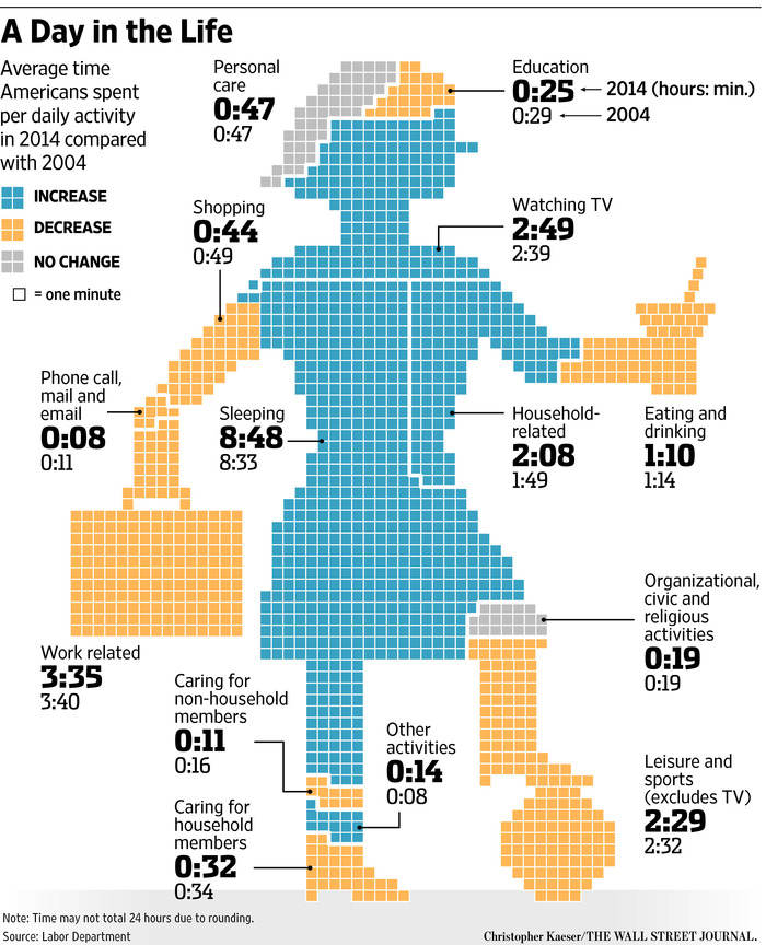
Literally, this time. I got this from Andrew Gelman, but it’s too good not to share. It’s originally from the Wall Street Journal

image001

Apart from the attempts to make the body part representative of the activity, the unwisdom of playing soccer in high heels, and the mystery of what it actually is that she’s eating or drinking (a martini? an icecream?), there are some generalisable graphical points.

First, comparison of area between different shapes is hard, and so isn’t a good way to display data: it’s not immediately clear whether the Knee of Religion is larger than the Forehead of Education or the Shoe of Caring.

Second, trying to code the direction of change with colour means you can’t use colour (consistently) to distinguish categories.

Third, some of the figures aren’t very helpful because they average over everyone: only about 60% of the adult population is in paid employment, and only a small proportion are in education. For people who work or study the time spent is a lot more than the average, for everyone else it’s zero.

And finally, if you have to write all the numbers on the graph, the graph isn’t doing its job.

August 30, 2015

Briefly

  • “If you get the software a little bit wrong, you will break the law thousands of times” A different sort of big data story from Matt Levine
  • The number of ‘moderate’ voters is seriously overestimated, from Vox
  • You can do randomised controlled trials of natural products, as in the trial of kānuka honey for acne, covered by Jamie Morton at the Herald.  The trial doesn’t show the product is better than ordinary honey or that it’s better than other acne treatments, but it does show it’s better than just soap and water.