Posts written by Thomas Lumley (2645)

avatar

Thomas Lumley (@tslumley) is Professor of Biostatistics at the University of Auckland. His research interests include semiparametric models, survey sampling, statistical computing, foundations of statistics, and whatever methodological problems his medical collaborators come up with. He also blogs at Biased and Inefficient

August 30, 2015

Genetically targeted cancer treatment

Targeting cancer treatments to specific genetic variants has certainly had successes with common mutations — the most well known example must be Herceptin for an important subset of  breast cancer.  Reasonably affordable genetic sequencing has the potential for finding specific, uncommon mutations in cancers where there isn’t a standard, approved drug.

Most good ideas in medicine don’t work, of course, so it’s important to see if this genetic sequencing really helps, and how much it costs.  Ideally this would be in a randomised trial where patients are randomised to the best standard treatment or to genetically-targeted treatment. What we have so far is a comparison of disease progress for genetically-targeted treatment compared to a matched set of patients from the same clinic in previous years.  Here’s a press release, and two abstracts from a scientific conference.

In 72 out of 243 patients whose disease had progressed despite standard treatment, the researchers found a mutation that suggested the patient would benefit from some drug they wouldn’t normally have got. The median time until these patients starting getting worse again was 23 weeks; in the historical patients it was 12 weeks.

The Boston Globe has an interesting story talking to researchers and a patient (though it gets some of the details wrong).  The patient they interview had melanoma and got a drug approved for melanoma patients but only those with one specific mutation (since that’s where the drug was tested). Presumably, though the story doesn’t say, he had a different mutation in the same gene — that’s where the largest benefit of sequencing is likely to be.

An increase from 12 to 23 weeks isn’t terribly impressive, and it came at a cost of US$32000 — the abstract and press release say there wasn’t a cost increase, but that’s because they looked at cost per week, not total cost.  It’s not nothing, though; it’s probably large enough that a clinical trial makes sense and small enough that a trial is still ethical and feasible.

The Boston Globe story is one of the first products of their new health-and-medicine initiative, called “Stat“. That’s not short for “statistics;” it’s the medical slang meaning “right now”, from the Latin statum.
August 28, 2015

Trying again

CNbxnQDWgAAXlKL

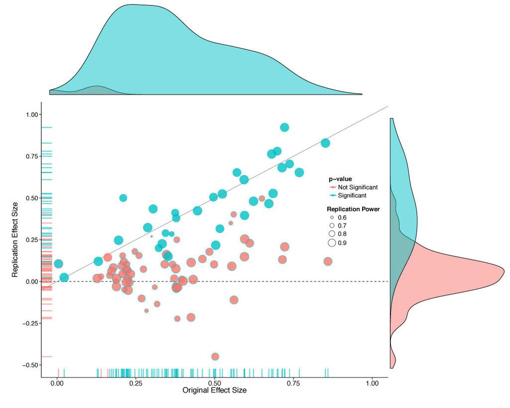
This graph is from the Open Science Framework attempt to replicate 100 interesting results in experimental psychology, led by Brian Nozek and published in Science today.

About a third of the experiments got statistically significant results in the same direction as the originals.  Averaging all the experiments together,  the effect size was only half that seen originally, but the graph suggests another way to look at it.  It seems that about half the replications got basically the same result as the original, up to random variation, and about half the replications found nothing.

Ed Yong has a very good article about the project in The Atlantic. He says it’s worse than psychologists expected (but at least now they know).  It’s actually better than I would have expected — I would have guessed that the replicated effects would average quite a bit smaller than the originals.

The same thing is going to be true for a lot of small-scale experiments in other fields.

August 26, 2015

The death of the novel?

So, the Guardian has a list of the top-100 best ever novels written in English.  There’s the usual problem that lit people have with genre (can it really be true that The Moonstone is the best detective novel in English?), but I’m not an expert in novels.

There have been complaints about the diversity of the list, and that’s where there’s a definite statistical anomaly. The books are old. For example, 33 of them come from before the start of the twentieth century and none of them from after the end of the twentieth century, even though many more novels were published in the latter period.

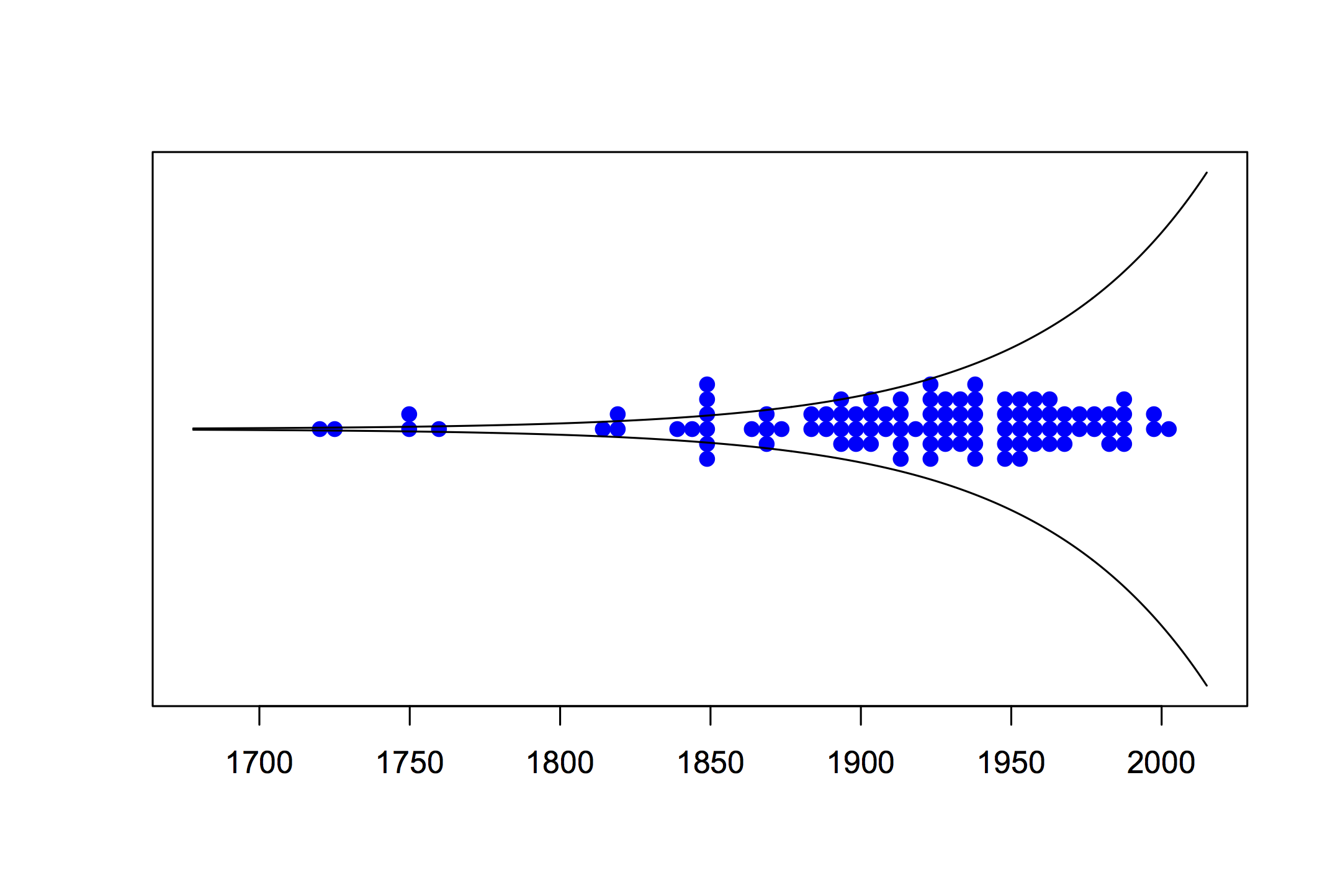
An article in Seed magazine, and its technical notes tried to estimate the number of new book authors each year over time. That’s not quite the same thing, since we aren’t considering only first books and are considering only novels. However, it’s a reasonable surrogate. Using their estimates, as many books were published before 1930 (55 places on the list) as after 2000 (no places on the list).  Here’s a graph, with the dots indicating books on the list and the lines indicating total published.

arthurs

As I said, this isn’t my field. Maybe nineteenth century novels really were hundreds of times more likely to be ‘great’ than modern novels. But it’s not the only possible explanation.

August 25, 2015

Computation and art

fishiness

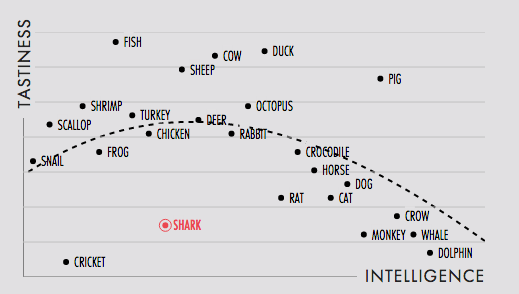
Normally I wouldn’t be linking favourably to this scatterplot, which has an ill-defined sampling scheme, and where at least the y-axis data are objectively wrong.  On the other hand, normally the scatterplot would be there to convey information.  In this case it’s just an index to some beautiful animated triangular art

shark

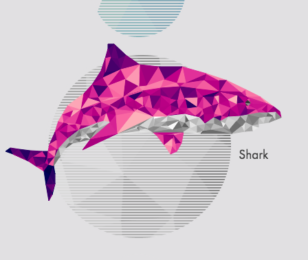
The point, and the relevance to this blog, is the way Matt Daniels has written software to make these pictures (relatively) easy to create.


Incidentally, before anyone starts complaining that sharks and fish are separate, that bit is exactly correct.  Fish (typical fish with bones, such as the swordfish in the animation) have a more recent common ancestor with sheep than with sharks.

August 23, 2015

Barcharts with delusions of grandeur

The cricket graphics system now allows 3-d barcharts projected over the playing field, and casting actual virtual shadows.

chartjunk1

Yeah, nah.

Briefly

  • I can’t resist mentioning a pointless number puzzle originating in New York. How does this sequence continue: 50, 42, 34, 23, 14,…
  • Big Data: from Jennifer Gardy, a Canadian genomic epidemiologist, on Twitter. This is 5000TB, ie, about 5 million gigabytes, of genetic sequence data CMtfy0YWIAE4PAQ
  • From Upshot at the New York Times again, How to Know Whether to Believe a Health Study. StatsChat readers will be familiar with most of this.
  • Another problem with errors in automatic classifications, for apps that purport to recognise bird songs
    If it tells you a nuthatch’s call is in fact a great tit (a bird which, by the way, is thought to have over 40 different types of call), you’ll take that mistake away with you and carry on misdiagnosing nuthatches.
    (On the other hand, I completely disagree with the argument that recognising bird songs should take work, dammit)
  • Nathan Yau, at Flowing Data, is recreating the Statistical Atlas of the United States, using modern data and the 1870-style graphics.
August 22, 2015

Changing who you count

The New York Times has a well-deserved reputation for data journalism, but anyone can have a bad day.  There’s a piece by Steven Johnson on the non-extinction of the music industry (which I think makes some good points), but which the Future of Music Coalition doesn’t like at all. And they also have some good points.

In particular, Johnson says

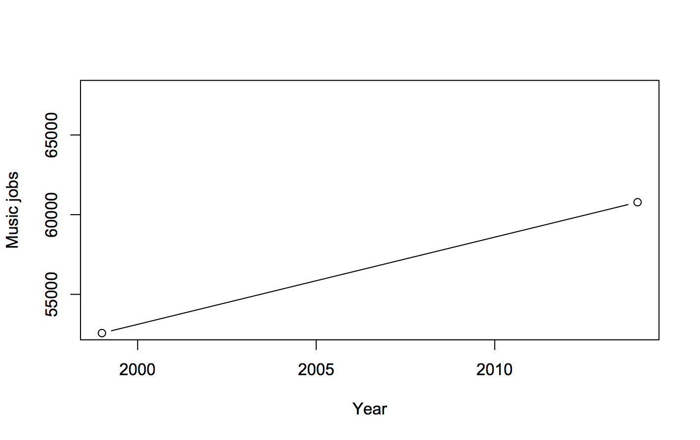
“According to the OES, in 1999 there were nearly 53,000 Americans who considered their primary occupation to be that of a musician, a music director or a composer; in 2014 more than 60,000 people were employed writing, singing, or playing music. That’s a rise of 15 percent.”


He’s right. This is a graph (not that you really need one)

twopoints

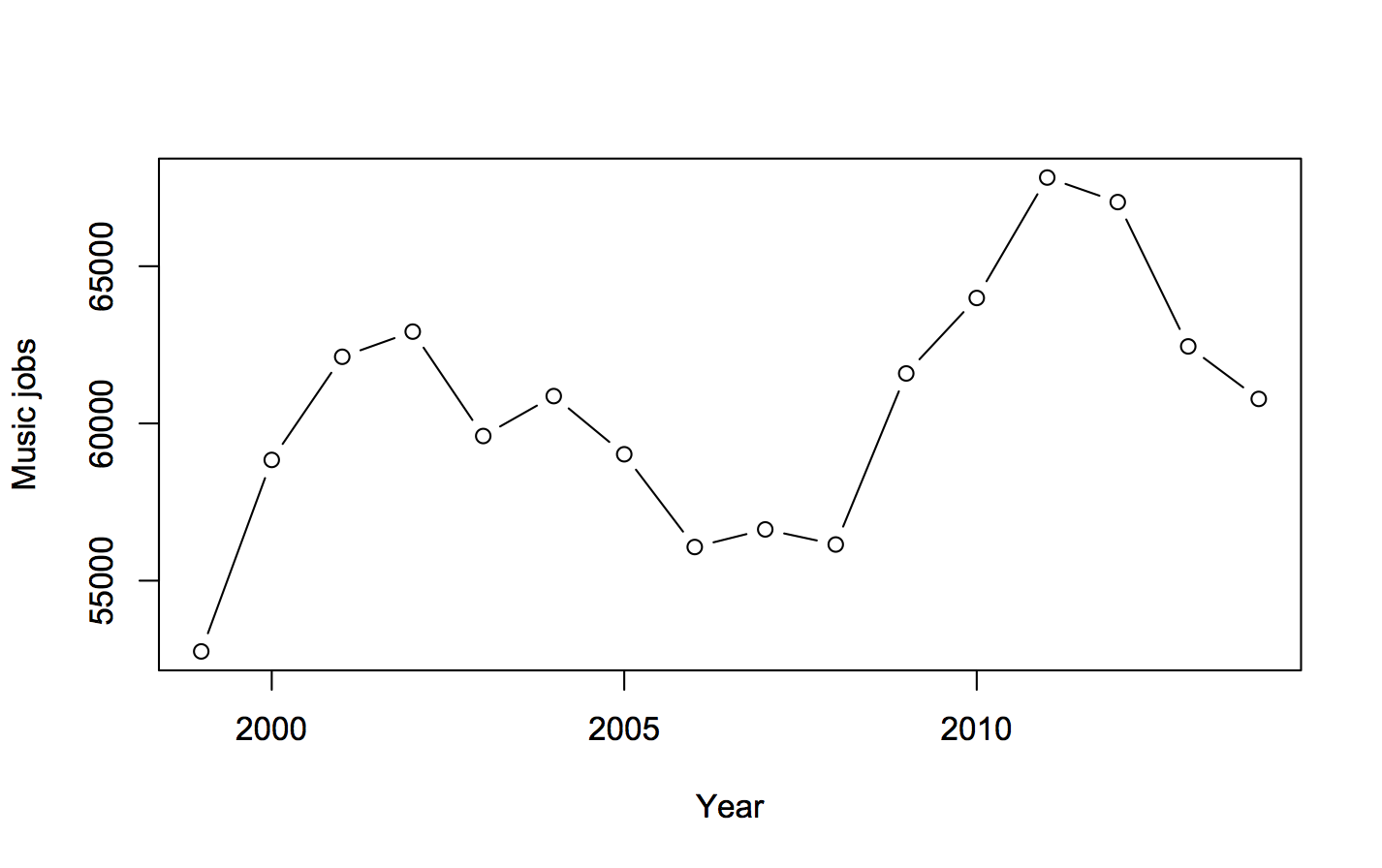
The Future of Music Coalition give the numbers for each year, and they’re interesting. Here’s a graph of the totals:

allpoints

There isn’t a simple increase; there’s a weird two-humped pattern. Why?

Well, if you look at the two categories, “Music Directors and Composers” and “Musicians and Singers”, making up the total, it’s quite revealing

twolines

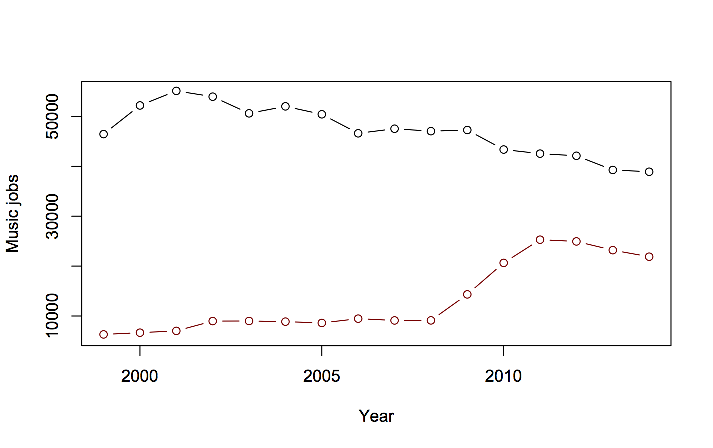
The larger category, “Musicians and Singers”, has been declining.  The smaller category, “Music Directors and Composers” was going up slowly, then had a dramatic three-year, straight-line increase, then decreased a bit.

Going  into the Technical Notes for the estimates (eg, 2009), we see

May 2009 estimates are based on responses from six semiannual panels collected over a 3-year period

That means the three-year increase of 5000 jobs/year is probably a one-off increase of 15,000 jobs. Either the number of “Music Directors and Composers” more than doubled in 2009, or more likely there was a change in definitions or sampling approach.  The Future of Music Coalition point out that Bureau of Labor Statistics FAQs say this is a problem (though they’ve got the wrong link: it’s here, question F.1)

Challenges in using OES data as a time series include changes in the occupational, industrial, and geographical classification systems

In particular, the 2008 statistics estimate only 390 of these people as being employed in primary and secondary schools; the 2009 estimate is 6000, and the 2011 estimate is 16880. A lot of primary and secondary school teachers got reclassified into this group; it wasn’t a real increase.

When the school teachers are kept out of  “Music Directors and Composers”, to get better comparability across years, the change is from 53000 in 1999 to 47000 in 2014. That’s not a 15% increase; it’s an 11% decrease.

Official statistics agencies try not to change their definitions, precisely because of this problem, but they do have to keep up with a changing world. In the other direction, I wrote about a failure to change definitions that led the US Census Bureau to report four times as many pre-schoolers were cared for by fathers vs mothers.

August 20, 2015

The second-best way to prevent hangovers?

From Stuff: “Korean pears are the best way to prevent hangovers, say scientists.”

This is precisely not what scientists say; in fact, the scientist in question is even quoted (in the last line of the story) as not saying that.

Meanwhile, as a responsible scientist, she reminded that abstaining from excess alcohol consumption is the only certain way to avoid a hangover.

At least Stuff got ‘prevention’ in the headline. Many other sources, such as the Daily Mail, led with claims of a “hangover cure.”  The Mail also illustrated the story with a photo of the wrong species: the research was on the Asian species Pyrus pyrifolia,  rather than the European pear Pyrus communis. CSIRO hopes that European pears are effective, since that’s what Australia has vast quantities of, but they weren’t tested.

What Stuff doesn’t seem to have noticed is that this isn’t a new CSIRO discovery. The blog post certainly doesn’t go out of its way to make that obvious, but right at the bottom, after the cat picture, the puns, and the Q&A with the researcher, you can read

Manny also warns this is only a preliminary scoping study, with the results yet to be finalised. Ultimately, her team hope to deliver a comprehensive review of the scientific literature on pears, pear components and relevant health measures.

That is, the experimental study on Korean pears isn’t new research done at CSIRO. It’s research done in Korea, and published a couple of years ago. There’s nothing wrong with this, though it would have been nice to give credit, and it would have made the choice of Korean pears less mysterious.

The Korean researchers recruited a group of young Korean men, and gave alcohol (in the form of shoju), preceded by either Korean pear juice or placebo pear juice (pear-flavoured sweetened water).  Blood chemistry studies, as well as research in mice by the same group, suggest that the pear juice speeds up the metabolism of alcohol and acetaldehyde. This didn’t prevent hangovers, but it did seem to lead to a small reduction in hangover severity.

The study was really too small to be very convincing. Perhaps more importantly, the alcohol dose was nearly eleven standard drinks (540ml of 20% alcohol) over a short period of time, so you’d hope it was relevant to a fairly small group of people.  Even in Australia.


August 19, 2015

Stereotype and caricature

I’ve posted a few times about the maps, word clouds, and so on that show the most distinctive words by gender or state — sometimes they are even mislabelled as the “most common” words.  As I explained, these are often very rare words; it’s just that they are slightly less rare in one group than in the others.

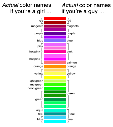
An old post from the XKCD blog gives a really good example. Randall Munroe set up a survey to show people colours and ask for the colour name. He got five million responses, from over 200,000 sessions, and came up with nearly 1000 reasonably well-characterised colours.  You can download the complete data, if you care.

The survey asked participants about their chromosomal sex, because two of the colour receptor genes are on the X-chromosome and this is linked to colour blindness (and possibly to tetrachromatic vision). It turned out that the basic colour names were very similar between male and female respondents, though women were slightly more likely to use modifiers (“lime green” vs “green”).

However, Munroe also looked at the responses that differed most in frequency between men and women. These were all uncommon responses, but all from multiple people, and after extensive spam filtering.

You can probably guess which group is which:

  1. Dusty Teal
  2. Blush Pink
  3. Dusty Lavender
  4. Butter Yellow
  5. Dusky Rose


  1. Penis
  2. Gay
  3. WTF
  4. Dunno
  5. Baige

(Presumably this is a gender effect, not an X-linked language defect.)


August 17, 2015

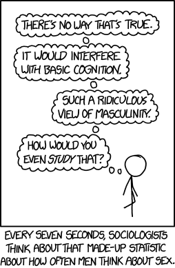
How would you even study that?

From XKCD

every_seven_seconds

“How would you even study that?” is an excellent question to ask when you see a surprising statistic in the media. Often the answer is “they didn’t,” but sometimes you get to find out about some really clever research technique.