Posts written by Thomas Lumley (2645)

avatar

Thomas Lumley (@tslumley) is Professor of Biostatistics at the University of Auckland. His research interests include semiparametric models, survey sampling, statistical computing, foundations of statistics, and whatever methodological problems his medical collaborators come up with. He also blogs at Biased and Inefficient

September 29, 2015

When variation is the story

A familiar trope of alternative cancer therapy is the patients who were given just months to live and are still alive years later.  The implication is that their survival is surprising and the cancer therapy was responsible.  Falling foul of the post hoc ergo propter hoc fallacy isn’t the big problem here. The big problem is that it’s not surprising that some people live a lot longer than the median.

Our intuition for variation is developed on measurements that aren’t like cancer survival. Most adults are pretty close to the average height — very few are more than a foot taller or shorter. Most people in Western countries die at close to the average age: for example, by the NZ life tables, the median life expectancy for NZ men born now is 81 years, and the tables predict half will die between 73 and 88 years.

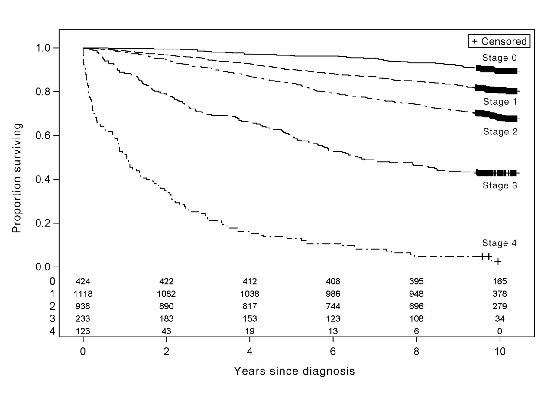
For many types of cancer, survival isn’t like that. Here’s a graph from a big Canadian study of breast cancer

F1.large

The median survival for women with stage IV cancer in this group is about a year; half of them are still alive after a year. About half of those are still alive after two years; about half of those are still alive after three years, and some live much longer.

Variation in cancer survival — the long tail — should be welcome, but not surprising. Some people will be alive three, four, five or more years after ‘being given a year to live’.  We should be just as cautious about crediting them with finding a cure as we should be about blaming those who died sooner.


September 28, 2015

Popeye, mānuka, and keeping healthy

  • Good story in the Herald: A survey from Southern Cross Health Insurance estimates that about 750,000 people in NZ regularly take vitamins and dietary supplements. Contrary to what some supporters say, there have been quite a lot of randomised trials of vitamin supplements — it’s just that they tend to give disappointing results.  There are a few exceptions (such as folate in pregnancy) and a few arguably open questions (such as higher-dose vitamin D) but not many.
  • Entertaining legal report in NBR: NZ Honey is fighting the Ministry for Primary Industries over whether it makes unsupported health claims for mānuka honey. The fun part is that the controversy isn’t whether there’s evidence for health benefits, it’s over whether brand names such as “Manuka Doctor” and “Manuka Pharm” are so clearly just puffery that no-one would mistake them for health claims
  • People often claim spinach is very high in iron. Other people often claim this is due to a misplaced decimal point in early German research, and that Popeye didn’t know what he was talking about and spinach is a terrible source of iron. Still other people look into this more carefully and find that the error was not German, or a misplaced decimal point, and that Popeye’s health claims weren’t iron-related. In the end, spinach actually is a moderately good source of iron. (Karl Kruszelnicki, ABC Science)

Seeing the margin of error

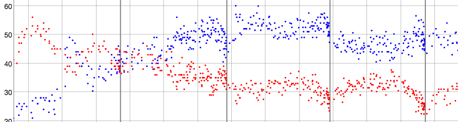
A detail from Andrew Chen’s visualisation of all the election polls in NZ:

polls

His full graph is somewhat interactive: you can zoom in on times, select parties, etc. What I like about this format is how clear it makes the poll-to-poll variability.  The poll result for, say, National isn’t a line, it’s a cloud of uncertainty.

The cloud of uncertainty gets narrower for minor parties (as detailed in my cheatsheet), but for the major parties you can see it span an entire 10-percentage-point grid cell or more.

September 26, 2015

US:China graph of the day

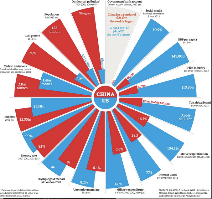
This (via @albertocairo) is from the Guardian, two years ago.

china

At first it looks like a pie chart, but it isn’t. It’s a set of bar charts warped into a circle, so that the ratio of blue and red areas in a wedge is the square of the ratio of the numbers. Also, the circle format means the longest wedge in each pair must be the same length: 8.6% unemployment rate is the same as 4.6% military expenditure, 104% market capitalisation, and 46 Olympic gold medals.

Many of these are proportions or per-capita figures, but not all. Carbon emissions are national totals, making China look worse. Film industry revenues and exports are totals; they are also gross revenues — because the whole visual metaphor falls apart completely for numbers that can be negative. That’s why the current-year budget surplus/deficit isn’t treated like the other numbers.

There are also some unusual definitions. “Social media”, the bar where China is furthest behind, is defined just by the proportion who use Facebook, which obviously underestimates the social-media activity of the US (and also, perhaps, of China).

The post has some discussion of the difficulties — for example, the measurement and even the definition of unemployment in the two counties — and is much better than the graph.

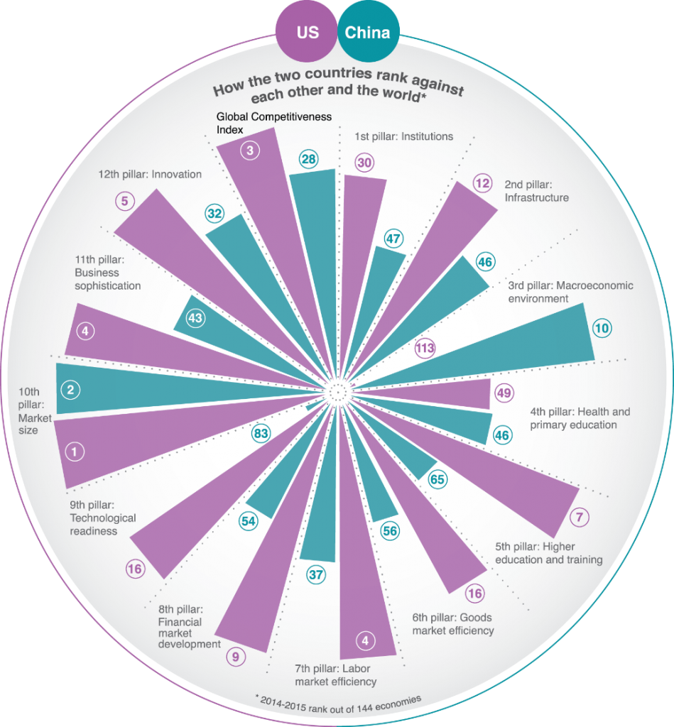
Here’s a different take on the same countries, in the same format, from the World Economic Forum

uschina-949x1024

They have similar problems with total vs proportion/mean variables. They solve the y-axis problem by working with international ranks, which at least gives a common scale. However, having 1 as the largest rank and some unspecified large number as the smallest rank does make the relationship between area and number fairly weird.  It also means that the actual numbers for each wedge aren’t fractions of a total in any sensible way.

If the main point is to be an eye-catching hook for the story, the Guardian graph is more successul

September 23, 2015

Briefly

  • Properly conducted web-based surveys aren’t necessarily that bad (from Pew Research) “Of 406 separate estimates taken from nine waves of the American Trends Panel, just nine of them differed by 5 percentage points or more. Perhaps not surprisingly, all nine are related to internet or digital technology use. A Web-only survey estimated that 82% of the public uses the internet on a daily basis, while the full sample (including non-internet users) finds 69% go online daily.”
  • Aardwolf Research is doing a flag-preference poll (mentioned in Stuff).  On the good side, they have sensible ways of looking at lots of possible flags. On the bad side, we don’t have lots of possible flags any more. On the good side they collect demographic data that could be used to get fairly representative weighted results from their self-selected internet sample. On the bad side, their results from the first wave don’t seem to use the demographic data at all.

Expensive drugs for a different reason

Usually, when there’s a very expensive medication in the news it’s because some company has just invented it and is trying to make as much money as possible before there’s competition– either from other similar drugs or from generic versions.   This is (presumably) the issue that Hillary Clinton is planning to address. The manufacturer is charging all the market will bear, but it’s not precisely a case of the uncaring free market. The drugs can only be that expensive because the government deliberately gives one company a monopoly, which we do as a strategy by society to bribe companies to invent drugs that work.  Like lots of people, I think the details could be improved but the basic idea is sensible.

Yesterday’s story (Stuff, Herald) is somewhat different. An existing, off-patent, treatment is having its price jacked up enormously. It’s about 50 times what it was recently, and 750 times what it was in 2010 when the drug was owned by a huge multinational, GSK. Derek Lowe (a drug company chemist) has some good posts about this. I’m mostly summarising.

There have been a few of these cases over the past few years, with different mechanisms.  The first is a well-meaning but poorly-designed idea of the FDA to collect evidence about drugs that were already in use when effectiveness testing was brought in. For some of these drugs, knowing whether (or how well) they actually work would be valuable. In return for doing the clinical trials to modern standards, a company can get a period of ‘marketing exclusivity’ on an old off-patent drug. Unfortunately, a company can pick up a drug where there isn’t any real doubt about effectiveness, so the trials provide little benefit, and then raise the price through the roof.

The second approach is to pick a drug that has no alternatives but where the total market is small enough that getting through the FDA approval process even for a generic is enough of an obstacle to keep out competitors.  One of the recent stories was about cycloserine, a last-ditch treatment for drug-resistant tuberculosis. There are still very few cases of this in the US — about 90 per year — so even a twenty-fold price increase doesn’t open up much of a market opportunity. The regulatory problem here is the impact of high standards for demonstrating manufacturing safety. Ordinarily that’s something you want, but for very rare diseases it provides a barrier to competition.

The third mechanism really looks like a regulatory loophole, and that’s what just happened with Daraprim for treating toxoplasmosis. The active ingredient of Daraprim, pyrimethamine, is off patent. There isn’t any FDA marketing exclusivity, either. But you can’t sell it as a drug unless you show that your formulation of pyrimethamine delivers a sufficiently-similar dose with sufficiently-similar timing to the formulation that was originally approved.

Toxoplasmosis isn’t as rare as drug-resistant TB, and historically the idea was that  an attempt to charge extortionate prices couldn’t work because someone would make a generic competitor. The trick is that you would need a supply of Daraprim to show that your formulation is close enough. You can’t do that if they won’t sell it to you.

As a concept, this goes back to a lawsuit over thalidomide (which now has a couple of genuine medical uses). One US company, Celgene, had the patent. Another company, Lannett, wanted to buy some of their drug to do bioequivalence studies, and claimed Celgene was refusing only to block competition. Celgene claimed they were just worried about Lannett’s safety procedures — which, in the case of thalidomide, could be fair enough.  They settled the case and it doesn’t really matter who was right; whether Lannett was paranoid or Celgene was cheating the system, the idea was out.

September 22, 2015

Minimum, median

From the Herald

Auckland renters can expect to pay a minimum $400 a week – regardless of property type or size, according to Trade Me Property’s monthly report on median rents across New Zealand.

From a quick TradeMe search for Auckland rentals, with an upper limit of $350 a week: 525 listings.

trademe

What they mean is that the median is at least $400/week in every category of property type or size, not the minimum.  That’s a bit clearer from the press release, which has data tables that the Herald didn’t print, but even that starts

A property renter in Auckland can now expect to pay $400 per week regardless of property size or type


September 21, 2015

Dominating social media?

dominating

No. No, it isn’t.

According to my searches, maybe half a dozen people asked a version of that question before the Herald headline turned up. If you count the retweets and favourites you might possibly get to twenty.

As a failure to actually search, this might beat the Netsafe CTO saying, a couple of years ago

You type ‘kiwi chicks’ into Google and the images that come back won’t be small feathered birds.”


It’s bad enough without exaggerating

This UK survey report is being a bit loose with the details, in a situation where that’s not even needed

stem for boys

The survey of more than 4,000 girls, young women, parents and teachers, demonstrates clearly that there is a perception that STEM subjects and careers are better suited to male personalities, hobbies and brains. Half (51 percent) of the teachers and 43 percent of the parents surveyed believe this perception helps explain the low uptake of STEM subjects by girls. [emphasis added]

Those aren’t the same thing at all.  I believe this perception helps explain the low uptake of STEM subjects by girls. Michelle ‘Nanogirl’ Dickinson believes this perception helps explain the low uptake of STEM subjects by girls. It’s worrying that nearly more than half of UK teachers don’t believe this perception helps explain the low uptake of STEM subjects by girls.

On the other hand, this is depressing and actually does seem to be what the survey said:

Nearly half (47 percent) of the young girls surveyed said they believe such subjects are a better match for boys.

as does this

difficult subjects It would fit with NZ experience if a lot of boys felt the same about the difficulty of science and maths, but that wouldn’t actually make it any better.


September 18, 2015

Compared to what? (transport chaos edition)

A while back, it looked as though the negotiations between NZ Bus and its drivers would break down and we would have bus strikes in Auckland. I considered various contingency plans: working from home for all or part of  a day, taking a train to Newmarket or Britomart and walking to the University, cycling, or catching a ride with a colleague who lives nearby. Some of these were options because we would have a week or so of warning before the strike.

If public transport in Auckland became permanently bad — if it went back to its state 20 years ago — I would have different options. I probably wouldn’t live in a house in Onehunga; I’d live in an apartment near the city centre. Moving to the city centre wouldn’t be a sensible response to a single day’s stoppage, but it would be sensible if the lack of buses was permanent.

Transport Blog has a post about the congestion benefits of the Wellington rail system, based on the week in June 2013 that it was taken out by a storm. On weekdays during this period, about 4000 people who would normally take the train into Wellington couldn’t. The roads became much more congested, and these delays can be valued (using plausible-looking assumptions) as worth over $5 million. Scaling this up to a full working year, the benefit to drivers in reduced driving time is worth rather a lot more than the public subsidy to the entire Wellington public transit system.

There’s a problem with simply scaling up the costs. If the Hutt Valley train line didn’t exist, some of those 4000 people would either live somewhere else or work somewhere else. Driving for an extra two hours each way was a rational response by them to a short-term outage, but in the long term they would reorganise their lives to not do it.

Now, there’s obviously a cost to moving from the Hutt to Wellington for these people — otherwise they’d be living in Wellington already — but the cost is less than would be estimated from the travel time during the outage. It’s hard to tell how much less without a lot more data and modelling.

On the other hand, while the storm data almost certainly overestimate the congestion-cost benefits of the train line, the magnitude of the estimated benefit is so large that the conclusion could quite easily hold even with better estimates.