Posts written by Thomas Lumley (2645)

avatar

Thomas Lumley (@tslumley) is Professor of Biostatistics at the University of Auckland. His research interests include semiparametric models, survey sampling, statistical computing, foundations of statistics, and whatever methodological problems his medical collaborators come up with. He also blogs at Biased and Inefficient

August 2, 2015

Pie chart of the week

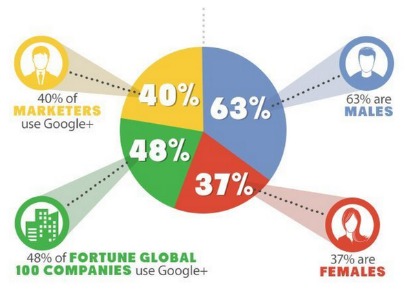
A year-old pie chart describing Google+ users. On the right are two slices that would make up a valid but pointless pie chart: their denominator is Google+ users. On the left, two slices that have completely different denominators: all marketers and all Fortune Global 100 companies.

On top of that, it’s unlikely that the yellow slice is correct, since it’s not clear what the relevant denominator even is. And, of course, though most of the marketers probably identify as male or female, it’s not clear how the Fortune Global 100 Companies would report their gender.

CLW5t4PWUAAvPNp

From @NoahSlater, via @LewSOS, originally from kwikturnmedia about 18 months ago.

August 1, 2015

Ebola vaccine trial

You’ve probably heard that there are positive results from an Ebola vaccine trial (3News, Radio NZ, Stuff, Herald). The stories are all actually good. Here’s the (open-access) research paper

The vaccine was genetically engineered: it’s a live virus for an animal disease that doesn’t spread in humans, modified to produce just one Ebola protein. Having a live virus makes the immune system respond more enthusiastically, but you wouldn’t want to risk a vaccine containing anything even remotely like live Ebola virus. Genetic engineering produces a live virus that contains none of the functional bits of Ebola, so that even if it (improbably ) turned out to be able to spread, it wouldn’t be a big deal.

The basic trial design was to find Ebola cases and vaccinate their contacts and the contacts of their contacts, with randomisation between immediate vaccination and vaccination 21 days later.  The design was a good compromise: the public-health authorities need to know if the vaccine works in order to decide whether it can be used to control future epidemics, but since it probably does little harm, most people would want to be vaccinated.  With this design, everyone the doctors talk to will get the vaccine, either immediately or in three weeks. The design is also cost-effective, since everyone you need to vaccinate is someone the public health system would want to check up on anyway.

In practice, not everyone eligible will be end up being vaccinated: some will refuse, and some will not be contactable. You have to decide how to include the unvaccinated people in the analysis.  In this trial, no-one in the immediate-vaccination group who actually got vaccinated ended up with Ebola, which is what gives the headline 100% success rate. If you compare people who were randomised to immediate vaccination, whether they got it or not, with those who were randomised to delayed vaccination (a more common analysis strategy), the vaccine was still estimated as 75% effective.

There’s still some work to do: when the vaccine is used, it will be important to keep track as far as possible of how well it works. That’s important because we need to know if it’s worth working on a new vaccine, or whether to divert resources to research on treatments for those who are infected, or to other diseases.  For a change, though, this is good news.


NZ electoral demographics

Two more visualisations:

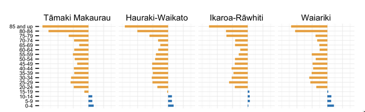
Kieran Healy has graphs of the male:female ratio by age for each electorate. Here are the four with the highest female proportion,  rather dramatically starting in the late teen years.

healy-electorates


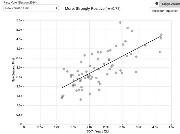
Andrew Chen has a lovely interactive scatterplot of vote for each party against demographic characteristics. For example (via Harkanwal Singh),  number of votes for NZ First vs median age

CLSSKS8UMAETS7_


July 31, 2015

Doesn’t add up

Daniel Croft nominated a story on savings from switching power companies for Stat of the Week.  The story says

The latest Electricity Authority figures show 2.1 million consumers have switched providers since 2010, saving $164 on average for the year. In 2014, 385,596 households switched over, collectively saving $281 million.

and he argues that this level of saving without any real harm to the industry shows there was serious overcharging.  It turns out that there’s another reason the story is relevant to StatsChat. The savings number is wrong, and this is clear based on other numbers in the story.

A basic rule of numbers in journalism is that if you have two numbers, you can usually do arithmetic on them for some basic fact-checking.  Dividing $281 million by 385,596 gives an average saving of over $700 per switching household. I find that a bit hard to believe — it’s a lot bigger than the ads for whatsmynumber.org.nz suggest.

Looking at the end of the story, we can see average savings for people who switched in each region of New Zealand.  The highest is $318 for Bay of Plenty. It’s not possible for the national average to be more than twice the highest regional average. The numbers are wrong somewhere.

We can compare with the Electricity Authority report, which is supposed to be the source of the numbers.  The number 281 appears once in the document (ctrl-F is your friend):

If all households had switched to the cheapest deal in 2014 they collectively stood to save $281 million.

So, the $281 million total isn’t the estimated total saving for the 385,596 households who actually switched, it’s the estimated total saving if everyone switched to the cheapest available option — in fact, if they switched every month to the cheapest available option that month — and if they didn’t use more electricity once it was cheaper, and if prices didn’t increase to compensate.

All the quoted savings numbers are like this, averages over all households if they switched to the cheapest option, everything else being equal, rather than data on the actual switches of actual households.


Reproducibility and journalism

Today’s newspaper wants to tell you what is new today. It turns out that’s a problem.

Felix Salmon, at Fusion

But here’s the thing: it turns out that the scientific world is actually far, far ahead of the journalistic world on these matters. Yes, the world of online journalism is full of parasites, and a lot of those parasites have real value. But all that the parasites have to go on are published articles: no one is transparent about the process that created those articles. No one shows their work, and no one ever tries to replicate anything.


Briefly

  • Silk, a tool for publishing data graphics online
  • Figure.nz is a charity devoted to getting people to use data about New Zealand: “We do this by pulling together New Zealand’s public sector, private sector and academic data in one place and making it easy for people to use in simple graphical form for free through this website.”
July 28, 2015

Recreational genotyping: potentially creepy?

Two stories from this morning’s Twitter (via @kristinhenry)

  • 23andMe has made available a programming interface (API) so that you can access and integrate your genetic information using apps written by other people.  Someone wrote and published code that could be used to screen users based on sex and ancestry. (Buzzfeed, FastCompany). It’s not a real threat, since apps with more than 20 users need to be reviewed by 23andMe, and since users have to agree to let the code use their data, and since Facebook knows far more about you than 23andMe, but it’s not a good look.
  • Google’s Calico project also does cheap public genotyping and is combining their DNA data (more than a million people) with family trees from Ancestry.com. This is how genetic research used to be done: since we know how DNA is inherited, connecting people with family trees deep into the past provides a lot of extra information. On the other hand, it means that if a few distantly-related people sign up for Calico genotying, Google will learn a lot about the genomes of all their relatives.

It’s too early to tell whether the people who worry about this sort of thing will end up looking prophetic or just paranoid.

July 27, 2015

Cheat sheet on polling margin of error

The “margin of error” in a poll is the number you add and subtract to get a 95% confidence interval for the underlying proportion (under the simplest possible mathematical model for polling).  Pollers typically quote the “maximum margin of error”, which is the margin of error when the reported value is 50%. When the reported value is 0.7%, reporting the maximum margin of error (3.1%) is not helpful.  The Conservative Party is unpopular, but it’s not possible for them to have negative support, and not likely that they have nearly 4%.

Here is a cheat sheet, an expanded version of one I posted last year. The first column is the reported proportion and the remaining columns are the lower and upper ends of the 95% confidence interval for a sample of size 1000 (Here’s the code).   The Conservative Party interval is  (0.3%,1.4%), not (-2.4%, 3.8%).

       l    u
0.1  0.0  0.6
0.2  0.0  0.7
0.3  0.1  0.9
0.4  0.1  1.0
0.5  0.2  1.2
0.6  0.2  1.3
0.7  0.3  1.4
0.8  0.3  1.6
0.9  0.4  1.7
1.0  0.5  1.8
1.5  0.8  2.5
2.0  1.2  3.1
2.5  1.6  3.7
3.0  2.0  4.3
3.5  2.4  4.8
4.0  2.9  5.4
4.5  3.3  6.0
5.0  3.7  6.5
10   8.2 12.0
15  12.8 17.4
20  17.6 22.6
25  22.3 27.8
30  27.2 32.9
35  32.0 38.0
50  46.9 53.1

As you can see, the margin downwards is smaller than the margin upwards for small numbers (because you can’t have fewer than no supporters). By the time you get to 30% or so, the interval is pretty close to what you’d get with the maximum margin of error, but below 10% the maximum margin of error is seriously misleading.

You can get a reasonable approximation to these numbers by taking the number (not percent) of supporters (eg, 0.7% is 7 out of 1000), taking the square root, adding and subtracting 1, then squaring again: (then converting back into percent: ie, dividing by 10 for a poll of 1000).

    approx l approx u
0.1     0.00     0.40
0.2     0.02     0.58
0.3     0.05     0.75
0.4     0.10     0.90
0.5     0.15     1.05
0.6     0.21     1.19
0.7     0.27     1.33
0.8     0.33     1.47
0.9     0.40     1.60
1       0.47     1.73
1.5     0.83     2.37
2       1.21     2.99
2.5     1.60     3.60
3       2.00     4.20
3.5     2.42     4.78
4       2.84     5.36
4.5     3.26     5.94
5       3.69     6.51
10      8.10    12.10
15     12.65    17.55
20     17.27    22.93
25     21.94    28.26
30     26.64    33.56
35     31.36    38.84
50     45.63    54.57

which is pretty easy on a calculator, or with an Excel macro. For example, for 1000-person polls, if you put the reported percentage in the A1 cell, use =(sqrt(A1*10)-1)^2/10 and =(sqrt(A1*10)+1)^2/10

Briefly

    • Profile of Auckland Stats almnus Hadley Wickham at Priceonomics
    • The kiwi (Apteryx, not Actinidia) genome was recently sequenced by a non-NZ research group. There’s a push for NZ-led sequencing of nationally-significant genomes: a taonga genomes project
    • Linguist Jack Grieve (@JWGrieve) has been tweeting maps of various swearwords on (US) Twitter. These are relative to total number of tweets, so the don’t have the usual problem

  • From Jonathan Marshall, the age distribution of NZ electorates, and their political hue: there’s a clear trend, and Ilam seems a bit of an outlier.


July 25, 2015

Some evidence-based medicine stories

  • Ben Goldacre has a piece at Buzzfeed, which is nonetheless pretty calm and reasonable, talking about the need for data transparency in clinical trials
  • The Alltrials campaign, which is trying to get regulatory reform to ensure all clinical trials are published, was joined this week by a group of pharmaceutical company investors.  This is only surprising until you think carefully: it’s like reinsurance companies and their interest in global warming — they’d rather the problems would go away, but there’s not profit in just ignoring them.
  • The big potential success story of scanning the genome blindly is a gene called PCSK9: people with a broken version have low cholesterol. Drugs that disable PCSK9 lower cholesterol a lot, but have not (yet) been shown to prevent or postpone heart disease. They’re also roughly 100 times more expensive than the current drugs, and have to be injected. None the less, they will probably go on sale soon.
    A survey of a convenience sample of US cardiologists found that they were hoping to use the drugs in 40% of their patients who have already had a heart attack, and 25% of those who have not yet had one.