Posts written by Thomas Lumley (2645)

avatar

Thomas Lumley (@tslumley) is Professor of Biostatistics at the University of Auckland. His research interests include semiparametric models, survey sampling, statistical computing, foundations of statistics, and whatever methodological problems his medical collaborators come up with. He also blogs at Biased and Inefficient

July 24, 2015

Are beneficiaries increasingly failing drug test?

Stuff’s headline is “Beneficiaries increasingly failing drug tests, numbers show”.

The numbers are rates per week of people failing or refusing drug tests. The number was 1.8/week for the first 12 weeks of the policy and 2.6/week for the whole year 2014, and, yes, 2.6 is bigger than 1.8.  However, we don’t know how many tests were performed or demanded, so we don’t know how much of this might be an increase in testing.

In addition, if we don’t worry about the rate of testing and take the numbers at face value, the difference is well within what you’d expect from random variation, so while the numbers are higher it would be unwise to draw any policy conclusions from the difference.

On the other hand, the absolute numbers of failures are very low when compared to the estimates in the Treasury’s Regulatory Impact Statement.

MSD and MoH have estimated that once this policy is fully implemented, it may result in:

• 2,900 – 5,800 beneficiaries being sanctioned for a first failure over a 12 month period

• 1,000 – 1,900 beneficiaries being sanctioned for a second failure over a 12 month period

• 500 – 1,100 beneficiaries being sanctioned for a third failure over a 12 month period.

The numbers quoted by Stuff are 60 sanctions in total over eighteen months, and 134 test failures over twelve months.  The Minister is quoted as saying the low numbers show the program is working, but as she could have said the same thing about numbers that looked like the predictions, or numbers that were higher than the predictions, it’s also possible that being off by an order of magnitude or two is a sign of a problem.


July 23, 2015

Diversity is (very slightly) good for you

This isn’t in the local news, but there are stories about it in the world media: a new paper in Nature on associations between genetic diversity and various desirable characteristics.  I’m one of the authors — and so is pretty much everyone else, since this research combines analyses from over 100 cohort studies.  The Nature paper is actually the second publication in this area that I’ve worked on.  My first Auckland MSc student in Statistics, Anish Scaria, did some analysis for a different definition of genetic diversity, and that plus data from a smaller group of cohort studies was published last year.

What did we do? Humans, like most animals and many plants1, have two copies of our complete genome2. We looked at how similar these two copies were, essentially measuring small amounts of inbreeding from distant ancestors.

Each cohort study had measured a large number of binary genetic variants, ranging from 300,000 to 1,000,000. In the first paper we looked at just the proportion of variants where the two copies were the same3. In the new paper we looked at contiguous chunks of genome where all the variants were the same in the two copies, which gives a more sensitive indication of the chunks of genome being inherited from the same distant ancestor. We compared people based on the proportion of genome that was in these contiguous chunks.

The comparisons were done separately within each cohort and the associations were then averaged: obviously you would get different genetic diversity in a cohort from Iceland versus a cohort of African-Americans, and we need to make sure that sort of difference didn’t get incorporated in the analysis. Similarly, for cohorts that recruited people of different ancestries, the comparisons were done between people of the same basic ancestry and averaged.

Our first paper found that people with more difference between their two genomic copies lived (very slightly) longer on average; the new paper found that (to a very small extent) they were taller, had higher average scores on IQ tests, and had lower cholesterol. The basic direction of the results wasn’t surprising, but the lack of association for specific diseases and risk factors was — there was no sign of a difference in diabetes, for example.

Scientifically, the data provide a little bit of extra support for height and whatever IQ tests measure having been under evolutionary selection, and a bit of negative evidence on diabetes and heart disease having been under evolutionary selection in human history. And also a bit of support for the idea that you can actually get more than a hundred groups of independent and fiercely territorial academics to work together sometimes.


1. Some important crop plants, such as wheat, cabbage, and sugarcane, are insanely more complicated
2. Yes, I’m ignoring the sex chromosomes here.
3. “Homozygous” is the technical term.

July 22, 2015

Are reusable shopping bags deadly?

There’s a research report by two economists arguing that San Francisco’s bag on plastic shopping bags has led to a nearly 50% increase in deaths from foodborne disease, an increase of about 5.5 deaths per year.  I was asked my opinion on Twitter. I don’t believe it.

What the analysis does show is some evidence that emergency room visits for foodborne disease have increased: the researchers analysed admissions for E. coli, Salmonella, and Campylobacter infection, and found an increase in San Francisco but not in neighbouring counties. There’s a statistical issue in that the number of counties is small and the standard error estimates tend to be a bit unreliable in that setting, but that’s not prohibitive. There’s also a statistical issue in that we don’t know which (if any) infections were related to contamination of raw food, but again that’s not prohibitive.

The problem with the analysis of deaths is the definition: the deaths in the analysis were actually all of the ICD10 codes A00-A09. Most of this isn’t foodborne bacterial disease, and a lot of the deaths from foodborne bacterial disease will be in settings where shopping bags are irrelevant. In particular, two important contributors are

  • Clostridium difficile infections after antibiotic use, which has a fairly high mortality rate
  • Diarrhoea in very frail elderly people, in residential aged care or nursing homes.

In the first case, this has nothing to do with food. In the second case, it’s often person-to-person transmission (with norovirus a leading cause), but even if it is from food, the food isn’t carried in reusable shopping bags.

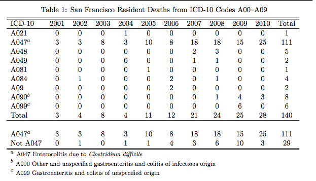
Tomás Aragón with the San Francisco department of Public Health, has a more detailed breakdown of the death data than were available to the researchers. His memo I think is too negative on the statistical issues, but the data underlying the A00-A09 categories are pretty convincing:

aragon

Category A021 is Salmonella (other than typhoid); A048 and A049 are other miscellaneous bacterial infections; A081 and A084 are viral. A090 and A099 are left-over categories that are supposed to exclude foodborne disease but will capture some cases where the mechanism of infection wasn’t known.  A047 is Clostridium difficile.   The apparent signal is in the wrong place. It’s not obvious why the statistical analysis thinks it has found evidence of an effect of the plastic-bag ban, but it is obvious that it hasn’t.

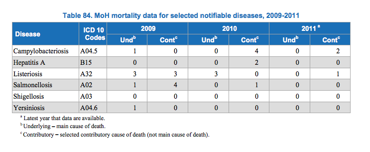
Here, for comparison, are New Zealand mortality data for specific foodborne infections, from foodsafety.govt.nz, the most recent year available

nz

Over the three years, there were only ten deaths where the underlying cause was one of these food-borne illnesses — a lot of people get sick, but very few die.


The mortality data don’t invalidate the analysis of hospital admissions, where there’s a lot more information and it is actually about (potentially) foodborne diseases.  More data from other cities — especially ones that are less atypical than San Francisco — would be helpful here, and it’s possible that this is a real effect of reusing bags. The economic analysis,however, relies heavily on the social costs of deaths.

July 20, 2015

Pie chart of the day

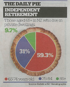
From the Herald (squashed-trees version, via @economissive)

CKUXF6iUsAAWPr-

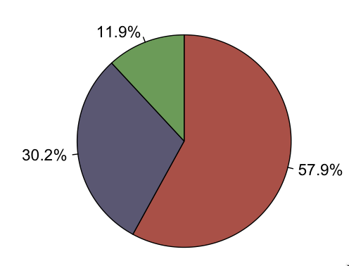
For comparison, a pie of those aged 65+ in NZ regardless of where they live, based on national population estimates:

CKUbriWVAAAWbpT

Almost all the information in the pie is about population size; almost none is about where people live.

A pie chart isn’t a wonderful way to display any data, but it’s especially bad as a way to show relationships between variables. In this case, if you divide by the size of the population group, you find that the proportion in private dwellings is almost identical for 65-74 and 75-84, but about 20% lower for 85+.  That’s the real story in the data.

July 19, 2015

Briefly

  • In the interests of balance, a post at Public Address by Rob Salmond, who did the analysis in the ‘Chinese names’ real-estate leak.  And a robust twitter discussion with him, Keith Ng, and Tze Ming Mok.
  • Stats New Zealand has a new standard question about gender identity (as distinguished from sex), acknowledging that it isn’t as simple as some people would like it to be.
  • The most important aspects of health seem to vary by age: “older raters gave significantly more weight to functional limitations and social functioning and less to morbidities and pain experience, compared to younger raters.” (via @hildabast)
  • Priceonomics has a post on the most common and most distinctive ingredients in recipes from around the world. The list illustrates the problem with the ‘distinctiveness’ metric (as Kieran Healy pointed out: whiskey is really not the distinctive signature of Irish food).  It also shows up other problems: for example, “African” and “Asian” are both listed as cuisines. Fundamentally, the limitation in is the recipe lists and the approximations made: galangal shows up as a reasonable candidate for most-distinctive Thai ingredient partly because there aren’t any substitutes; cayenne is the most widely used ingredient in the Mexican recipes because it’s being substituted for other chillis.
July 16, 2015

Don’t just sit there, do something

The Herald’s story on sitting and cancer is actually not as good as the Daily Mail story it’s edited from. Neither one gives the journal or researchers (the paper is here). Both mention a previous study, but the Mail goes into more useful detail.

The basic finding is

Longer leisure-time spent sitting, after adjustment for physical activity, BMI and other factors, was associated with risk of total cancer in women (RR=1.10, 95% CI 1.04-1.17 for >6 hours vs. <3 hours per day), but not men (RR=1.00, 95% CI 0.96-1.05)

The lack of association in men was a surprise, and strongly suggests that the result for women shouldn’t be believed. It’s also notable that while the estimated associations with a few types of cancer look strong, the lower limits on the confidence intervals don’t look strong:

risk of multiple myeloma (RR=1.65, 95% CI 1.07-2.54), invasive breast cancer (RR=1.10, 95% CI 1.00-1.21), and ovarian cancer (RR=1.43, 95% CI 1.10-1.87).

Since the researchers looked at eighteen subsets of cancer in addition to all types combined, and these are the top three, the real lower limits are even lower.

The stories referred to previous research, published last year, which summarised many previous studies of sitting and cancer risk.  That’s good, but the summary wasn’t entirely accurate. From the Herald:

Previous research by the University of Regensburg in Germany found that spending too much time sitting raised the risk of bowel and lung cancer in both men and women.

In fact, the previous research didn’t look separately at men and women (or, at least, didn’t report doing so). While you would expect similar results in men and women, that study doesn’t address the question.

The Mail does have one apparently good contextual point

However, this previous study – which reviewed 43 other studies – did not find a link between sitting and a higher risk of breast and ovarian cancer. 

But when you look at the actual figures, there’s no real inconsistency between the two studies: they both report weak evidence of higher risk; it’s just a question of whether the lower end of the confidence interval happens to cross the ‘no difference’ line for a particular subset of cancers.

Overall, this is a pretty small risk difference to detect from observational data. If you didn’t already think that long periods of sitting could be bad for you, this wouldn’t be a reason to start.

July 15, 2015

A modest proposal

Positive-looking results are more likely to be published in scientific journals, much more likely to get press releases, and hugely more likely to end up in the news. This trend is exaggerated if the size of the association is large.  The most likely way to get a large association is to do a very small study and be lucky enough (by chance or sloppiness) to overestimate the strength of association, so the news selects for small, early-stage, and poorly-done research.

One way to reduce this bias would be for media to quote the lower (less impressive) end of the uncertainty interval (confidence interval, credibility interval) rather than quoting the midpoint of the interval as scientists usually do. In small studies, the lower end of the interval will be close to no association, even if the midpoint of the interval is a strong association. In large, well-designed studies the change in practice would have little impact.

Isn’t that biased?

If you assume that in most cases the association being tested is smaller that the uncertainty in the experiment (ie, close to zero), and that positive results are more likely to make the news then it’s less biased than using the middle of the interval.

Scientists would’t be able to use tests that don’t produce confidence intervals.

How sad. Anyway, they would, they just wouldn’t be able to get their press releases into the papers

Press releases often don’t report uncertainty estimates.

So those ones wouldn’t get in the papers. The silver linings are just piling up.


Bogus poll story, again

From the Herald

[Juwai.com] has surveyed its users and found 36 per cent of people spoken to bought property in New Zealand for investment.

34 per cent bought for immigration, 18 per cent for education and 7 per cent lifestyle – a total of 59 per cent.

There’s no methodology listed, and this is really unlikely to be anything other than a convenience sample, not representative even of users of this one particular website.

As a summary of foreign real-estate investment in Auckland, these numbers are more bogus than the original leak, though at least without the toxic rhetoric.

July 14, 2015

Another test for Alzheimer’s?

The Herald (from the Telegraph) has a story today about a Google Science Fair contestant, under the headline “Has a 15-year-old found a way to test for Alzheimer’s?“. This is the sort of science story it’s good to see in the papers, but it would be better if it were more accurate.

Krtin Nithiyanandam’s research is impressive even if you ignore the fact that he was only 14. But claiming he

 has developed a “Trojan horse” antibody which can penetrate the brain and attach itself to the toxic proteins present in the disease’s early stages.

is a bit of an exaggeration.

The project write-up describes how he attached antibodies to fluorescent quantum dots. These, cleverly, fluoresce at a near-infrared wavelength which passes through tissue, skin, and bone.  If the project works, it would be possible to screen for Alzheimer’s without even a lumbar puncture.

That’s still ‘if’. Despite what the story says, Krtin hasn’t tested the antibody on any actual brains. Theoretically, it binds to a transporter protein in the right way to penetrate the brain, but it needs testing. It also needs testing for toxicity — if it’s going to be used for screening, it will be injected into large numbers of healthy people, so has to be safe. After all that, it would have to be tested for predictive accuracy: to be useful, the test would have to have a very low false-positive rate. And, on top of that, for testing to really be helpful there would need to be some treatment that showed some sign of actually working. We’re not there yet.

You might also wonder how this relates to the four other early Alzheimer’s tests the Herald has reported on in the past year or so, or the other two proposed by Google Science Fair finalists.  Testing for Alzheimer’s has been an area with a lot of recent research, which is going to be useful if we ever have promising drugs to test.


July 11, 2015

What’s in a name?

The Herald was, unsurprisingly, unable to resist the temptation of leaked data on house purchases in Auckland.  The basic points are:

  • Data on the names of buyers for one agency, representing 45% fo the market, for three months
  • Based on the names, an estimate that nearly 40% of the buyers were of Chinese ethnicity
  • This is more than the proportion of people of Chinese ethnicity in Auckland
  • Oh Noes! Foreign speculators! (or Oh Noes! Foreign investors!)

So, how much of this is supported by the various data?

First, the surnames.  This should be accurate for overall proportions of Chinese vs non-Chinese ethnicity if it was done carefully. The vast majority of people called, say, “Smith” will not be Chinese; the vast majority of people called, say, “Xu” will be Chinese; people called “Lee” will split in some fairly predictable proportion.  The same is probably true for, say, South Asian names, but Māori vs non-Māori would be less reliable.

So, we have fairly good evidence that people of Chinese ancestry are over-represented as buyers from this particular agency, compared to the Auckland population.

Second: the representativeness of the agency. It would not be at all surprising if migrants, especially those whose first language isn’t English, used real estate agents more than people born in NZ. It also wouldn’t be surprising if they were more likely to use some agencies than others. However, the claim is that these data represent 45% of home sales. If that’s true, people with Chinese names are over-represented compared to the Auckland population no matter how unrepresentative this agency is. Even if every Chinese buyer used this agency, the proportion among all buyers would still be more than 20%.

So, there is fairly good evidence that people of Chinese ethnicity are buying houses in Auckland at a higher rate than their proportion of the population.

The Labour claim extends this by saying that many of the buyers must be foreign. The data say nothing one way or the other about this, and it’s not obvious that it’s true. More precisely, since the existence of foreign investors is not really in doubt, it’s not obvious how far it’s true. The simple numbers don’t imply much, because relatively few people are housing buyers: for example, house buyers named “Wang” in the data set are less than 4% of Auckland residents named “Wang.” There are at least three other competing explanations, and probably more.

First, recent migrants are more likely to buy houses. I bought a house three years ago. I hadn’t previously bought one in Auckland. I bought it because I had moved to Auckland and I wanted somewhere to live. Consistent with this explanation, people with Korean and Indian names, while not over-represented to the same extent are also more likely to be buying than selling houses, by about the same ratio as Chinese.

Second, it could be that (some subset of) Chinese New Zealanders prefer real estate as an investment to, say, stocks (to an even greater extent than Aucklanders in general).  Third, it could easily be that (some subset of) Chinese New Zealanders have a higher savings rate than other New Zealanders, and so have more money to invest in houses.

Personally, I’d guess that all these explanations are true: that Chinese New Zealanders (on average) buy both homes and investment properties more than other New Zealanders, and that there are foreign property investors of Chinese ethnicity. But that’s a guess: these data don’t tell us — as the Herald explicitly points out.

One of the repeated points I  make on StatsChat is that you need to distinguish between what you measured and what you wanted to measure.  Using ‘Chinese’ as a surrogate for ‘foreign’ will capture many New Zealanders and miss out on many foreigners.

The misclassifications aren’t just unavoidable bad luck, either. If you have a measure of ‘foreign real estate ownership’ that includes my next-door neighbours and excludes James Cameron, you’re doing it wrong, and in a way that has a long and reprehensible political history.

But on top of that, if there is substantial foreign investment and if it is driving up prices, that’s only because of the artificial restrictions on the supply of Auckland houses. If Auckland could get its consent and zoning right, so that more money meant more homes, foreign investment wouldn’t be a problem for people trying to find somewhere to live. That’s a real problem, and it’s one that lies within the power of governments to solve.