Posts written by Thomas Lumley (2645)

avatar

Thomas Lumley (@tslumley) is Professor of Biostatistics at the University of Auckland. His research interests include semiparametric models, survey sampling, statistical computing, foundations of statistics, and whatever methodological problems his medical collaborators come up with. He also blogs at Biased and Inefficient

August 17, 2015

More diversity pie-charts

These ones are from the Seattle Times, since that’s where I was last week.
IMAG0103

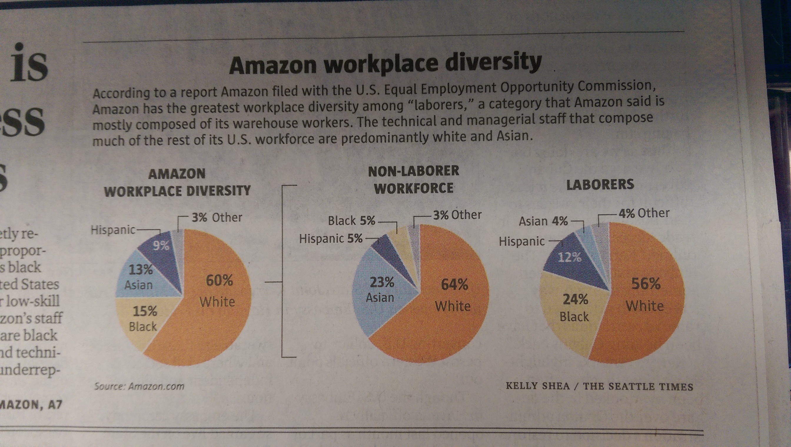
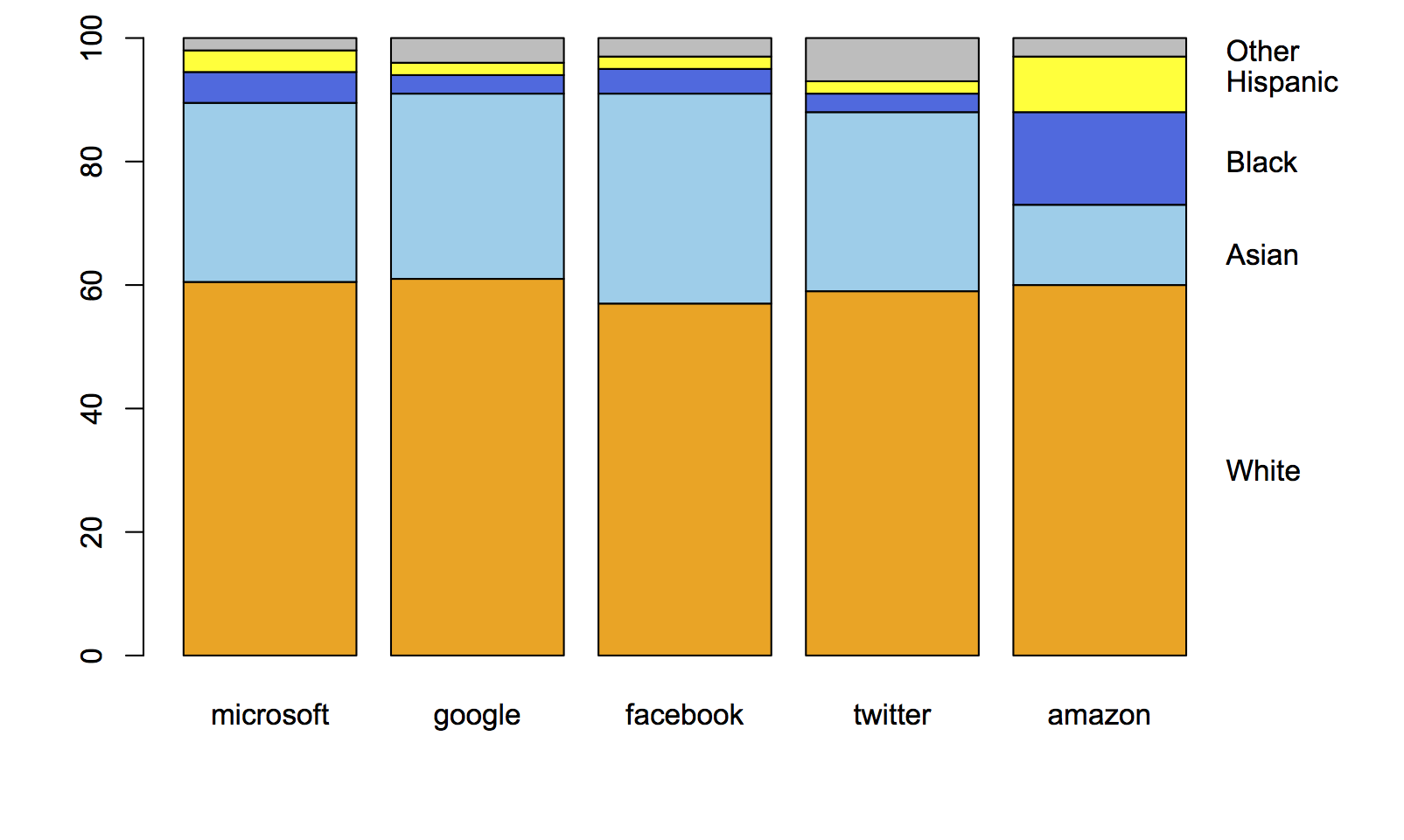
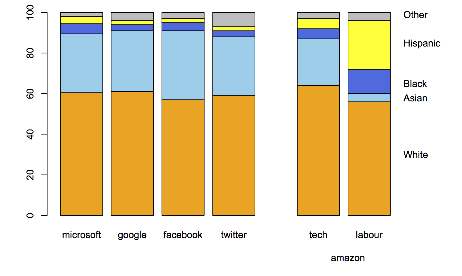
Amazon.com, like many other tech companies, had been persuaded to release figures on gender and ethnicity for its employees. On the original figures, Amazon looked  different from the other companies, but Amazon is unusual in being a shipping-things-around company as well as a tech company. Recently, they released separate figures for the ‘labourers and helpers’ vs the technical and managerial staff.  The pie chart shows how the breakdown makes a difference.

In contrast to Kirsty Johnson’s pie charts last week, where subtlety would have been wasted  given the data and the point she was making, here I think it’s more useful to have the context of the other companies and something that’s better numerically than a pie chart.

This is what the original figures looked like:
amazon-1

Here’s the same thing with the breakdown of Amazon employees into two groups:
amazon-2

When you compare the tech-company half of Amazon to other large tech companies, it blends in smoothly.

As a final point, “diversity” is really the wrong word here. The racial/ethnic diversity of the tech companies is pretty close to that of the US labour force, if you measure in any of the standard ways used in ecology or data mining, such as entropy or Simpson’s index.   The issue isn’t diversity but equal opportunity; the campaigners, led by Jesse Jackson, are clear on this point, but the tech companies and often the media prefer to talk about diversity.
 

August 14, 2015

Briefly

  • “As the polar ice caps melt and the earth churns through the Sixth Extinction, another unprecedented phenomenon is taking place, in the realm of sex,” says Vanity Fair.Yeah, nah” says New York magazine. If you only talk to top Tindr users, (especially in New York) you’re going to get strange ideas about sex.
  • “How Statistics guided me through life, death, and ‘The Price is Right'” by Elisa Long, in Washington Post. Dr Long writes about her breast cancer and her appearance on the famous US game show.
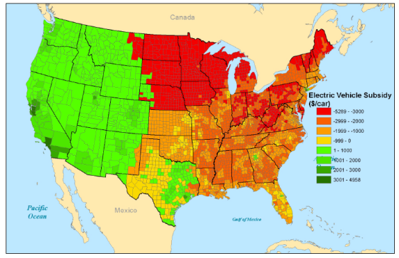
  • At Vox EU, an analysis of the environmental benefits or otherwise of electric cars. The cars don’t emit any pollution as they run, but the power has to come from somewhere. In about half of the US, enough of the electricity comes from coal to make electric cars worse than efficient petrol or diesel cars. In NZ my impression is that a predictable night-time load would largely come from hydro, so electric cars would be green. In Australia, probably not.
    holland fig1 7 aug
  • You probably saw the Herald story on speeding by NZTA staff. A nice example of using data (obtained under the Official Information Act) to show the extent of an issue

Sometimes a pie chart is enough

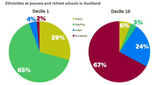
From Kirsty Johnson, in the Herald, ethnicity in the highest and lowest decile schools in Auckland.

CMUU_JjUYAAsWbG

Statisticians don’t like pie charts because they are inefficient; they communicate numerical information less effectively than other forms, and don’t show subtle differences well.  Sometimes the differences are sufficiently unsubtle that a pie chart works.

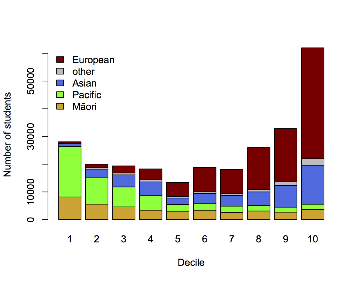
It’s still usually not ideal to show just the two extreme ends of a spectrum, just as it’s usually a bad idea to show just two points in a time series. Here’s the full spectrum, with data from EducationCounts

ethdec


[The Herald has shown the detailed school ethnicity data before in other contexts, eg the decile drift story and graphics from Nicholas Jones and Harkanwal Singh last year]

I’ve used counts rather than percentages to emphasise the variation in student numbers between deciles. The pattern of Māori and Pacific representation is clearly different in this graph: the numbers of Pacific students fall off dramatically as you move up the ranking, but the numbers of Māori students stabilise. There are almost half as many Māori students in decile 10 as in decile 1, but only a tenth as many Pacific students.

If you’re interested in school diversity, the percentages are the right format, but if you’re interested in social stratification, you probably want to know how students of different ethnicities are distributed across deciles, so the absolute numbers are relevant.


August 8, 2015

Sampling error and measurement error

There’s this guy in the US called Donald Trump. You might have heard of him. He currently has a huge lead in the opinion polls over the other candidates for the Republican nomination.

Trump’s lead isn’t sampling error. He has an eleven percentage point lead in the poll averages, with sampling error well under one percentage point. That’s better than the National Party has ever managed. It’s better than the Higgs Boson has ever managed.

Even so, no serious commentator thinks Trump will be the Republican candidate. It’s not out of the question that he’d run as an independent — that’s a question of individual psychology, and much harder to answer — but he isn’t going to win the Republican primaries.

At the moment, Trump is doing well because people know who he is and because they aren’t actually making decisions. The question is something like:

If the Republican primary for President were being held today, and the candidates were Jeb Bush, Ben Carson, Chris Christie, Ted Cruz, Carly Fiorina, Jim Gilmore, Lindsey Graham, Mike Huckabee, Bobby Jindal, John Kasich, George Pataki, Rand Paul, Rick Perry, Marco Rubio, Rick Santorum, Donald Trump, and Scott Walker, for whom would you vote?

or

I know the 2016 election is far away, but who would you support for the Republican nomination for president if the candidates were…


We know from history that the answer to this sort of question at this time in the campaign doesn’t correspond to anything about the election.

There’s a temptation to believe that something you can measure very precisely must exist. There are always two other explanations to consider: your measurement process might always give precise results regardless of any reality, or you might be measuring something real but different from what you’re trying to measure.

August 6, 2015

Feel the burn

Q: What did you have for lunch?

A: Sichuan-style dry-fried green beans

Q: Because of the health benefits of spicy food?

A: Uh.. no?

Q: “Those who eat spicy foods every day have a 14 per cent lower risk of death than those who eat it less than once a week.” Didn’t you see the story?

A: I think I skipped over it.

Q: So, if my foods is spicy I have a one in seven chance of immortality?

A: No

Q: But 14% lower something? Premature death, like the Herald story says?

A: The open-access research paper says a 14% lower rate of death.

Q: Is that just as good?

A: According to David Spiegelhalter’s approximate conversion formula, that would mean about 1.5 years extra life on average, if it kept being true for your whole life.

Q: Ok. That’s still pretty good, isn’t it?

A: If it’s real.

Q: They had half a million people. It must be pretty reliable, surely?

A: The problem isn’t uncertainty so much as bias: people who eat spicy food might be slightly different in other ways.Having more people doesn’t help much with bias. Maybe there are differences in weight, or physical activity.

Q: Are there? Didn’t they look?

A: Um. Hold on. <reads> Yes, they looked, and no there aren’t. But there could be differences in lots of other things. They didn’t analyse diet in that much detail, and it wouldn’t be hard to get a bias of 14%.

Q: Is there a reason spicy food might really reduce the rate of death?

A: The Herald story says that capsaicin fights obesity, and the Stuff story says bland food makes you overeat

Q: Didn’t you just say that there weren’t weight differences?

A: Yes.

Q: But it could work some other way?

A: It could. Who can tell?

Q: Ok, apart from your correlation and causation hangups, is there any reason I shouldn’t at least use this to feel good about chilis?

A: Well, there’s the fact that the correlation went away in people who regularly drank any alcohol.

Q: Oh. Really?

A: Really. Figure 2 in the paper.

Q: But that’s just correlation, not causation, isn’t it?

A: Now you’re getting the idea.


Graph legends: ordering and context

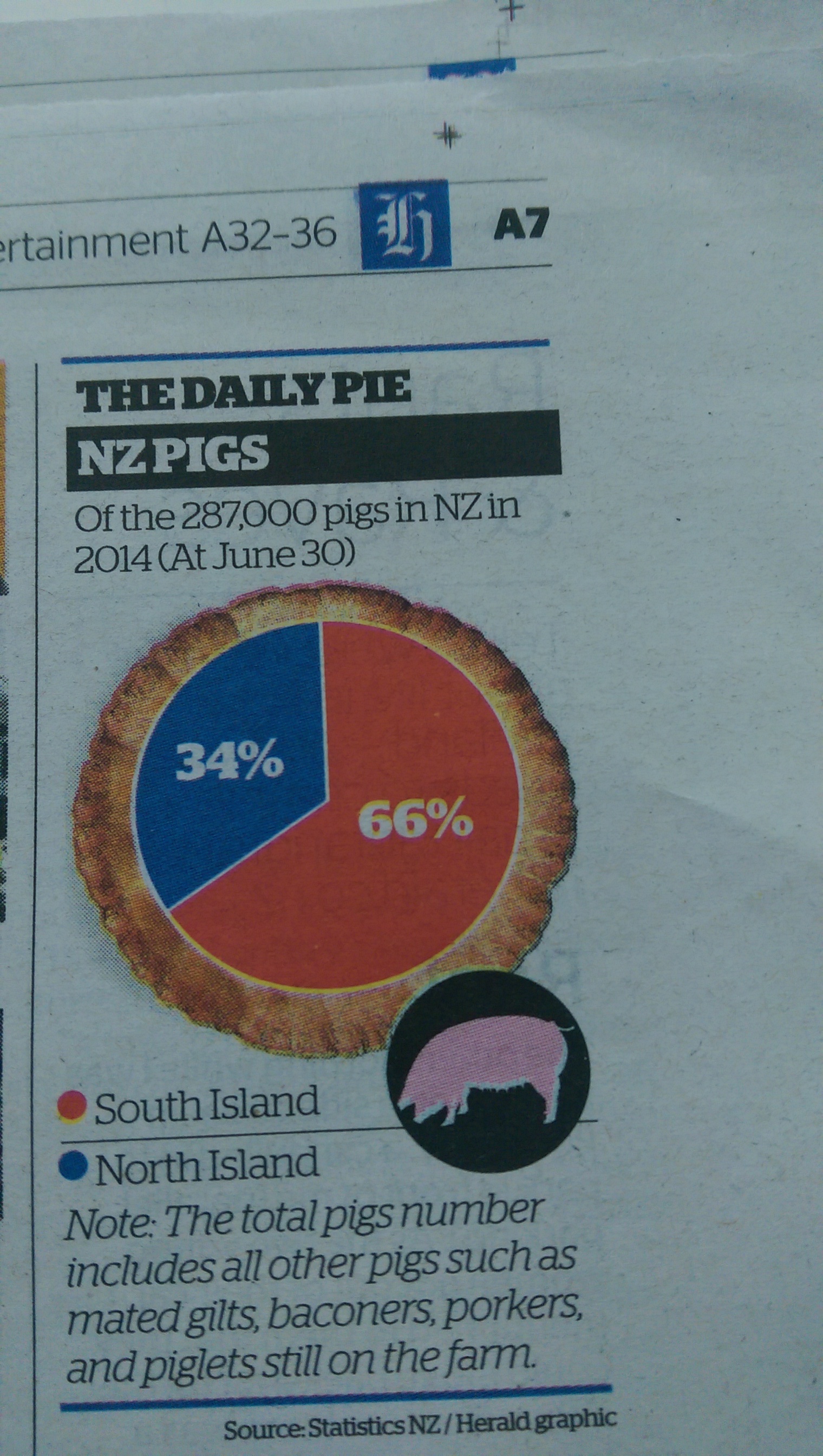
I’m not going to make a regular habit of criticising the Herald’s Daily Pie — for a start, it only appears in the print version, which I don’t see.  Today’s one, though, illustrates a couple of issues in graph legends

IMAG0098

The first issue is ordering. That’s almost trivial with just two values, but I actually found it distracting to have “South Island” at the top of the legend, especially when the corresponding red wedge is higher on the page than the blue wedge. I had to look twice to work out which wedge was which.  Reordering with “North Island” at the top would have helped, as would putting the labels on the pie (instead of the numbers).

Second, there’s the Note:

The total pigs number includes all other pigs such as mated gilts, baconers, porkers, and piglets still on the farm.

which comes directly from the StatsNZ table (of data from the Agricultural Production Survey). I know that, because these tables are the only place Google can find even the sub-phrase “such as mated gilts”.  In the context of the table, the note says that the “at June 30” columns for total pigs include the “Breeding sows (1-year-old and over)” given in earlier columns of the table, plus other categories that someone interested in the data would probably be familiar with. Without the earlier columns, the reaction should be “other than what?”.

Looking at the StatsNZ table you also learn the reason why “At June 30” in the title is important. The total “includes piglets still on the farm”, but not the much larger number of ex-piglets that have become part of the pork products industry: there were over 600,000 piglets weaned on NZ farms during the year, but only 287,000 pigs still on farms as of June 30.

August 5, 2015

What does 90% accuracy mean?

There was a lot of coverage yesterday about a potential new test for pancreatic cancer. 3News covered it, as did One News (but I don’t have a link). There’s a detailed report in the Guardian, which starts out:

A simple urine test that could help detect early-stage pancreatic cancer, potentially saving hundreds of lives, has been developed by scientists.

Researchers say they have identified three proteins which give an early warning of the disease, with more than 90% accuracy.

This is progress; pancreatic cancer is one of the diseases where there genuinely is a good prospect that early detection could improve treatment. The 90% accuracy, though, doesn’t mean what you probably think it means.

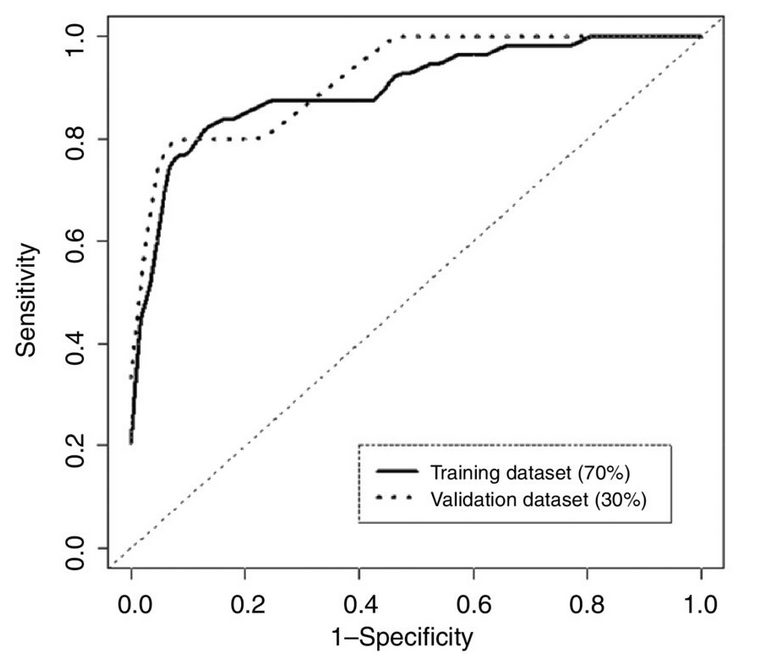
Here’s a graph showing how the error rate of the test changes with the numerical threshold used for diagnosis (figure 4, panel B, from the research paper)

pancreatic

As you move from left to right the threshold decreases; the test is more sensitive (picks up more of the true cases), but less specific (diagnoses more people who really don’t have cancer). The area under this curve is a simple summary of test accuracy, and that’s where the 90% number came from.  At what the researchers decided was the optimal threshold, the test correctly reported 82% of early-stage pancreatic cancers, but falsely reported a positive result in 11% of healthy subjects.  These figures are from the set of people whose data was used in putting the test together; in a new set of people (“validation dataset”) the error rate was very slightly worse.

The research was done with an approximately equal number of healthy people and people with early-stage pancreatic cancer. They did it that way because that gives the most information about the test for given number of people.  It’s reasonable to hope that the area under the curve, and the sensitivity and specificity of the test will be the same in the general population. Even so, the accuracy (in the non-technical meaning of the word) won’t be.

When you give this test to people in the general population, nearly all of them will not have pancreatic cancer. I don’t have NZ data, but in the UK the current annual rate of new cases goes from 4 people out of 100,000 at age 40 to 100 out of 100,000 people 85+.   The average over all ages is 13 cases per 100,000 people per year.

If 100,000 people are given the test and 13 have early-stage pancreatic cancer, about 10 or 11 of the 13 cases will have positive tests, but so will 11,000 healthy people.  Of those who test positive, 99.9% will not have pancreatic cancer.  This might still be useful, but it’s not what most people would think of as 90% accuracy.


What’s in a browser language default?

Ok, so this is from Saturday and I hadn’t seen it until this morning, so perhaps it should just be left in obscurity, but:

Claims foreign buyers are increasingly snapping up Auckland houses have been further debunked, with data indicating only a fraction of visitors to a popular real estate website are Asian.

Figures released by website realestate.co.nz reveal about five per cent of all online traffic viewing Auckland property between January and April were primary speakers of an East Asian language.

Of that five per cent, only 2.8 per cent originated from outside New Zealand meaning almost half were viewing from within the country.

The problem with Labour’s analysis was that it conflated “Chinese ethnicity” and “foreign”, but at least everyone on the list had actually bought a house in Auckland, and they captured about half the purchases over a defined time period. It couldn’t say much about “foreign”, but it was at least fairly reliable on “Chinese ethnicity” and “real-estate buyer”.

This new “debunking” uses data from a real-estate website. There is no information given either about what fraction of house buyers in Auckland used the website, or about what fraction of people who used the website ended up buying a house rather than just browsing, (or about how many people have their browser’s language preferences set up correctly, since that’s what was actually measured).  Even if realestate.co.nz captured the majority of NZ real-estate buyers, it would hardly be surprising if overseas investors who primarily prefer to use non-English websites used something different.  What’s worse, if you read carefully, is they say “online traffic”: these aren’t even counts of actual people.

So far, the follow-up data sets have been even worse than Labour’s original effort. Learning more would require knowing actual residence for actual buyers of actual Auckland houses: either a large fraction over some time period or a representative sample.  Otherwise, if you have a dataset lying around that could be analysed to say something vaguely connected to the number of overseas Chinese real-estate buyers in Auckland, you might consider keeping it to yourself.

August 3, 2015

There’s nothing like a good joke

We (already!) have a Stat of the Week nomination, for the Herald’s

Conservative estimates are that the average man will lose 12,547 umbrellas during his lifetime.

At first sight this looks like deadpan humour rather than a statistic, but in that case you’d expect a by-line on the piece.  The Google, which knows all and tells all, finds thirty other examples of the statistic.  It looks as though the primary source is the Telegraph

Conservative and not at all plucked-out-of-thin-air estimates suggest that the average man will lose 12,547 umbrellas during his lifetime.

which does have a by-line, and is also attributed as the source by Monster.co.uk.  And is marginally more amusing.


August 2, 2015

Some retail arithmetic

From a Retail New Zealand Media Fact Kit

The amount New Zealanders spend on goods from foreign websites is approaching $1.5 billion and this number is growing all the time.

GST is 15%, so the total GST payable on an amount approaching $1.5 billion would be approaching $225 million.

Since $1.5 billion would be approaching $900 per household (1.68 million households according to StatsNZ), I assume it includes quite a few business purchases as well. For these, any increase in GST on the purchase would later be deducted from the business’s GST liability, leaving a net zero.

For non-business purchases, some of that GST is already payable under current law (if the total value of a single package is over $400). Some would still not be payable if the threshold was lowered to $25.  Also, some might not be payable and definitely would not be easily collectable at the border because the purchase is an electronic download — e-books or music, for example.

Putting all these together, the potential increase in revenue has to be less than 15% of $1.5 billion, though it’s hard to say how much less.

The Media Fact Kit says

The Government misses out on at least $200 million in tax (maybe as much as $500 million) every year

Based on their expenditure numbers, that doesn’t look plausible. Still, maybe their numbers are wrong and it really is more than $200 million, and maybe even as much as $500 million.  GST would still cost something to collect, and more than it does (per dollar) within New Zealand, so the net gain to the Government would be noticeably smaller than this. They don’t even pretend to take the costs into account, they just talk about how many hip replacements could be funded with all the free money.

One of the differences between a Treasury Regulatory Impact Statement and a “Fact Kit” from a lobby group is that the numbers in the RIS have to add up and the document needs to give sources. If, as Radio New Zealand reports, there will be a proposal for Cabinet this month, we might be able to get some real numbers about the likely revenue and costs, and perhaps even how the economic impact would compare to other ways of raising taxes.