Posts written by Thomas Lumley (2645)

avatar

Thomas Lumley (@tslumley) is Professor of Biostatistics at the University of Auckland. His research interests include semiparametric models, survey sampling, statistical computing, foundations of statistics, and whatever methodological problems his medical collaborators come up with. He also blogs at Biased and Inefficient

June 16, 2015

Briefly

  • NZ Defence Force say they have seized “260kg of high-grade heroin worth about $235m” (via Stuff). That would be $900/gram. Presumably the figure is supposed to be street price ignoring any distribution costs and assuming it’s all sold. Even so it seems steep. NZDF also say “they were destined for east Africa and likely into Europe.” European street prices for heroin vary depending on who you ask, but they aren’t anywhere near that high.
  • 3News had a story on the rise in Indian-style weddings in New Zealand. I noticed the line “The average Indian wedding costs up to $100,000 – that is more than three times the average New Zealanders spend on tying the knot.” We know the figure of $30,000 for an average NZ wedding is bogus; it’s hard to tell whether the figure for Indian weddings is more or less inflated.
  • When the FDA doesn’t approve an application to market a new drug, it sends what it calls a “complete response letter”.  An analysis in the medical journal BMJ compares the letters to company press releases. In 21% of cases no information in the press release matched the letter. In 19 of 32 cases where the FDA had said more clinical trials would be needed, there was no mention of this in the press release.
  • The top ten finalists from a competition for optical illusions. Knowing about optical illusions is useful for data visualisation: they are extreme versions of things you want to avoid.
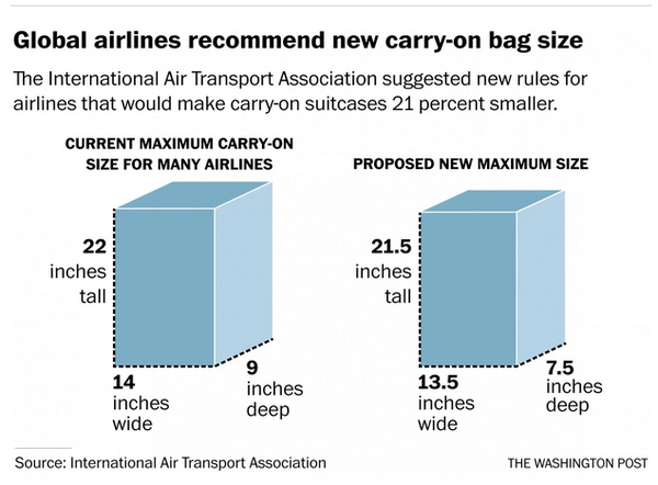
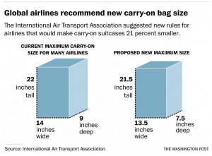
  • From the Washington Post, an illustration of why you want to avoid the optical illusion of 3-d in your graphics. The box on the right is 21% smaller than the box on the left. Really. Do the maths.
    CHFiVSwW8AMf0zf
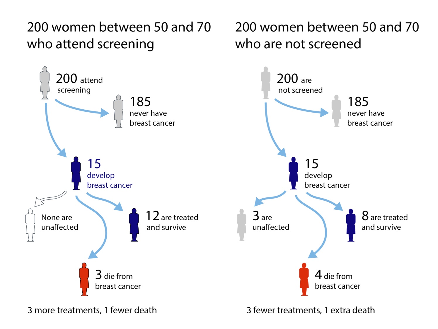
  • A good example of risk communication, from the British NHS:
    breast-200-tree
    (via David Spiegelhalter who also writes about the conflict between targeting information at the people who theoretically need it versus the people who will actually take advantage of it)
June 13, 2015

In a bit of a pickle

Q: Isn’t this microbiome stuff cool?

A: <suspiciously> Yes?

Q: In the Herald. “Eating sauerkraut, pickles and yoghurt may be the answer for young adults suffering from social anxiety.” We didn’t know that before scientists starting measuring gut microbes, did we?

A: I’m not sure we know that now.

Q: They even found “the effect was greatest among those at genetic risk for social anxiety disorder as measured by neuroticism”.  This sort of interdisciplinary approach is a real step forward, surely? Genes and microbes and personality changes?

A: Yes, in principle, but there weren’t any genes or microbes or personality changes measured in this research.

Q: Not any?

A: No

Q: Oh.

A: They asked, on one occasion, about what they called ‘fermented foods’ and measured social anxiety, and found a correlation.

Q: How strong?

A: ‘Fermented food’ intake explained nearly 2% of the variation in social anxiety

Q: You mean nearly 20%?

A: I mean nearly 2%. The correlation was -0.13, and you square it to get proportion of variation explained.

Q: Oh. Um. Sometimes the story says ‘fermented’ and sometimes it says ‘pickles’ and then there’s this mention of chocolate? What’s up with that?

A: They asked about ten food classes: fruit and veg, and nine things they lumped together into ‘fermented foods’. From the research paper

2. yogurt, 3. kefir, or food or beverages that contain yogurt; 4. soy milk, or foods or beverages that contain soy milk; 4. miso soup; 5. sauerkraut; 6. dark chocolate; 7. juices that contain microalgae; 8. pickles; 9. tempeh; and 10. kimchi

Q: But soy milk isn’t fermented. Or dark chocolate. And what do they include in ‘pickles’?

A: Whatever a US undergraduate student would include, so probably more vinegar-preserved cucumbers and peperoncini than real lactic-fermented pickles

Q: And they just added these all up?

A: Yes. And then took the inverse hyperbolic sine.

Q: The what now?

A: Some people reported eating much more fermented food than the rest, so they used a mathematical transformation to reduce the impact of these measurements. The effect is that they’re focusing mostly on low levels of consumption (weekly), not high levels (multiple per day).

Q: Is that a problem?

A: No, it’s fine. It’s just that they seemed to have done it because they have a thing about Normal distributions rather than because that’s what they wanted to focus on.

Q: I thought it was statisticians who had a thing about Normal distributions?

A: Not for a few decades now, but yes, our bad originally.

Q: Ok, how about the genes. How did they avoid measuring any genes?

A: Look more carefully at what you quoted. They defined “at genetic risk of social anxiety” by a measure of neuroticism

Q: How genetic is … no, wait, we’ve been there. You’re going to tell me the estimated heritability, then explain it doesn’t answer my question.

A: Glad to see someone’s paying attention.

Q: Could it just be that there are cultural differences in reporting social anxiety and also in eating things like tempeh, miso, and kimchi?

A: It’s not out of the question.

June 11, 2015

Comparing all the treatments

This story didn’t get into the local media, but I’m writing about it because it illustrates the benefit of new statistical methods, something that’s often not visible to outsiders.

From a University of Otago press release about the work of A/Prof Suetonia Palmer

The University of Otago, Christchurch researcher together with a global team used innovative statistical analysis to compare hundreds of research studies on the effectiveness of blood-pressure-lowering drugs for patients with kidney disease and diabetes. The result: a one-stop-shop, evidence-based guide on which drugs are safe and effective.

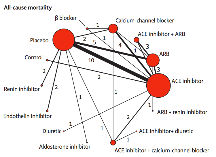
They link to the research paper, which has interesting looking graphics like this:
netmeta

The red circles represent blood-pressuring lowering treatments that have been tested in patients with kidney disease and diabetes, with the lines indicating which comparisons have been done in randomised trials. The circle size shows how many trials have used a drug; the line width shows how many trials have compared a given pair of drugs.

If you want to compare, say, endothelin inhibitors with ACE inhibitors, there aren’t any direct trials. However, there are two trials comparing endothelin inhibitors to placebo, and ten trials comparing placebo to ACE inhibitors. If we estimate the advantage of endothelin inhibitors over placebo and subtract off the advantage of ACE inhibitors over placebo we will get an estimate of the advantage of endothelin inhibitors over ACE inhibitors.

More generally, if you want to compare any two treatments A and B, you look at all the paths in the network between A and B, add up differences along the path to get an estimate of the difference between A and B, then take a suitable weighted average of the estimates along different paths. This statistical technique is called ‘network meta-analysis’.

Two important technical questions remain: what is a suitable weighted average, and how can you tell if these different estimates are consistent with each other? The first question is relatively straightforward (though quite technical). The second question was initially the hard one.  It could be for example, that the trials involving placebo had very different participants from the others, or that old trials had very different participants from recent trials, and their conclusions just could not be usefully combined.

The basic insight for examining consistency is that the same follow-the-path approach could be used to compare a treatment to itself. If you compare placebo to ACE inhibitors, ACE inhibitors to ARB, and ARB to placebo, there’s a path (a loop) that gives an estimate of how much better placebo is than placebo. We know the true difference is zero; we can see how large the estimated difference is.

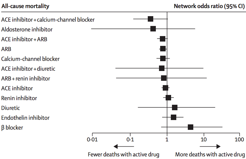
In this analysis, there wasn’t much evidence of inconsistency, and the researchers combined all the trials to get results like this:
netmeta-ci

The ‘forest plot’ shows how each treatment compares to placebo (vertical line) in terms of preventing death. We can’t be absolutely sure than any of them are better, but it definitely looks as though ACE inhibitors plus calcium-channel blockers or ARBs, and ARBs alone, are better. It could be that aldosterone inhibitors are much better, but also could be that they are worse. This sort of summary is useful as an input to clinical decisions, and also in deciding what research should be prioritised in the future.

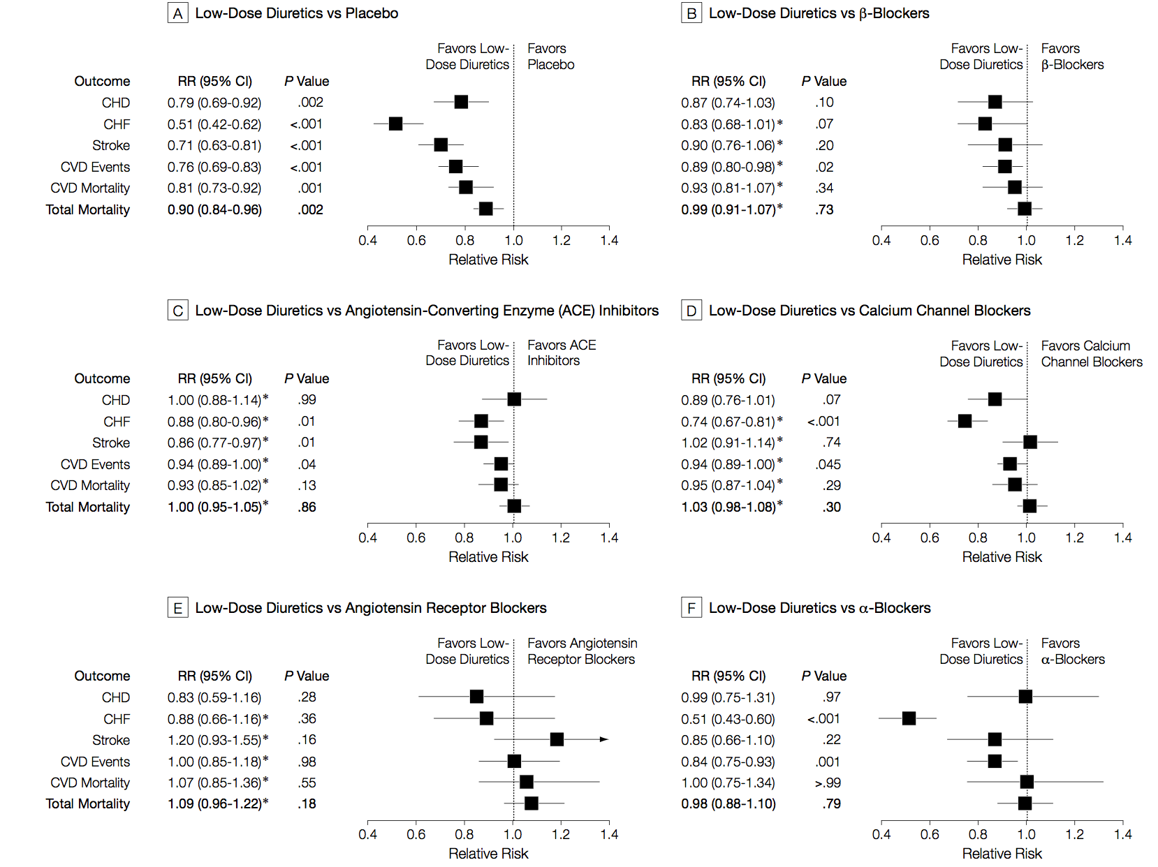
I said the analysis illustrated progress in statistical methods. Network meta-analysis isn’t completely new, and its first use was also in studying blood pressure drugs, but in healthy people rather than people with kidney disease. Here are those results
netmeta-me

There are different patterns for which drug is best across the different events being studied (heart attack, stroke, death), and the overall patterns are different from those in kidney disease/diabetes. The basic analysis is similar; the improvements since this 2003 paper are more systematic and flexible ways of examining inconsistency, and new displays of the network of treatments.

‘Innovative statistical techniques’ are important, but the key to getting good results here is a mind-boggling amount of actual work. As Dr Palmer put it in a blog interview

Our techniques are still very labour intensive. A new medical question we’re working on involves 20-30 people on an international team, scanning 5000-6000 individual reports of medical trials, finding all the relevant papers, and entering data for about 100-600 reports by hand. We need to build an international partnership to make these kind of studies easier, cheaper, more efficient, and more relevant.

At this point, I should confess the self-promotion aspect of the post.  I invented the term “network meta-analysis” and the idea of using loops in the network to assess inconsistency.  Since then, there have been developments in statistical theory, especially by Guobing Lu and A E Ades in Bristol, who had already been working on other aspects of multiple-treatment analysis. There have also been improvements in usability and standardisation, thanks to Georgia Salanti and others in the Cochrane Collaboration ‘Comparing Multiple Interventions Methods Group’.  In fact, network meta-analysis has grown up and left home to the extent that the original papers often don’t get referenced. And I’m fine with that. It’s how progress works.

 

Women and dementia risk

A Herald story headlined “Women face greater dementia risk – study” has been nominated for Stat of the Week, I think a bit unfairly. Still, perhaps it’s worth clarifying the points made in the nomination.

People diagnosed with dementia are more likely to be women, and the story mentions three reasons. The first is overwhelmingly the most important from the viewpoint of population statistics: dementia is primarily a disease of old people, the majority of whom are women because women live longer.

In addition, and importantly from the viewpoint of individual health, women are more likely to have diagnosed dementia than men in  a given age range

European research has indicated that although at age 70, the prevalence of dementia is the same for men and women, it rapidly diverges in older age groups. By 85, women had a 40 per cent higher prevalence than men.

There could be many reasons for this. A recent research paper lists possibilities related to sex (differences in brain structure, impact of changes in hormones after menopause) and to gender (among current 85-year-olds, women tend to be less educated and less likely to have had intellectually demanding careers).

The third statistic mentioned in the Stat of the Week nomination was that “Women with Alzheimer’s disease (AD) pathology have a three-fold risk of being diagnosed with AD than men.”  This is from research looking at people’s brains.  Comparing people with similar amounts of apparent damage to their brains, women were more likely to be diagnosed with Alzheimer’s disease.

So, the differences in the summary statistics are because they are making different comparisons.

Statistical analysis of Alzheimer’s disease is complicated because the disease happens in the brain, where you can’t see. Definitive diagnosis and measurement of the biological disease process can only be done at autopsy. Practical clinical diagnosis is variable because dementia is a very late stage in the process, and different people take different amounts of neurological damage to get to that point.


June 10, 2015

Availability bias

Nathan Rarere, on this week’s Media Take, Mãori TV (video, about 18:35)

Everybody outside of Auckland thinks that Auckland is this incredible crime wave. Because you work in a newsroom and you’ve basically got a day to do the story, and you’ve got the car — “Where’re you taking it?” — you’ve got to sign it out and fill in the book, so whatever crime you can get to within about 55k of work.

June 8, 2015

Meddling kids confirm mānuka honey isn’t panacea

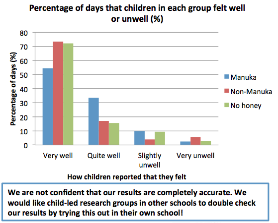
The Sunday Star-Times has a story about a small, short-term, unpublished randomised trial of mānuka honey for preventing minor illness. There are two reasons this is potentially worth writing about: it was done by primary school kids, and it appears to be the largest controlled trial in humans for prevention of illness.

Here are the results (which I found from the Twitter account of the school’s lab, run by Carole Kenrick, who is  named in the story)CGuGbSiWoAACzbe

The kids didn’t find any benefit of mānuka honey over either ordinary honey or no honey. Realistically, that just means they managed to design and carry out the study well enough to avoid major biases. The reason there aren’t any controlled prevention trials in humans is that there’s no plausible mechanism for mānuka honey to help with anything except wound healing. To its credit, the SST story quotes a mānuka producer saying exactly this:

But Bray advises consumers to “follow the science”.

“The only science that’s viable for mānuka honey is for topical applications – yet it’s all sold and promoted for ingestion.”

You might, at a stretch, say mānuka honey could affect bacteria in the gut, but that’s actually been tested, and any effects are pretty small. Even in wound healing, it’s quite likely that any benefit is due to the honey content rather than the magic of mānuka — and the trials don’t typically have a normal-honey control.

As a primary-school science project, this is very well done. The most obvious procedural weakness is that mānuka honey’s distinctive flavour might well break their attempts to blind the treatment groups. It’s also a bit small, but we need to look more closely to see how that matters.

When you don’t find a difference between groups, it’s crucial to have some idea of what effect sizes have been ruled out.  We don’t have the data, but measuring off the graphs and multiplying by 10 weeks and 10 kids per group, the number of person-days of unwellness looks to be in the high 80s. If the reported unwellness is similar for different kids, so that the 700 days for each treatment behave like 700 independent observations, a 95% confidence interval would be 0±2%.  At the other extreme, if 0ne kid had 70 days unwell, a second kid had 19, and the other eight had none, the confidence interval would be 0±4.5%.

In other words, the study data are still consistent with manūka honey preventing about one day a month of feeling “slightly or very unwell”, in a population of Islington primary-school science nerds. At three 5g servings per day that would be about 500g honey for each extra day of slightly improved health, at a cost of $70-$100, so the study basically rules out manūka honey being cost-effective for preventing minor unwellness in this population. The study is too small to look at benefits or risks for moderate to serious illness, which remain as plausible as they were before. That is, not very.

Fortunately for the mānuka honey export industry, their primary market isn’t people who care about empirical evidence.

June 7, 2015

What does 80% accurate mean?

From Stuff (from the Telegraph)

And the scientists claim they do not even need to carry out a physical examination to predict the risk accurately. Instead, people are questioned about their walking speed, financial situation, previous illnesses, marital status and whether they have had previous illnesses.

Participants can calculate their five-year mortality risk as well as their “Ubble age” – the age at which the average mortality risk in the population is most similar to the estimated risk. Ubble stands for “UK Longevity Explorer” and researchers say the test is 80 per cent accurate.

There are two obvious questions based on this quote: what does it mean for the test to be 80 per cent accurate, and how does “Ubble” stand for “UK Longevity Explorer”? The second question is easier: the data underlying the predictions are from the UK Biobank, so presumably “Ubble” comes from “UK Biobank Longevity Explorer.”

An obvious first guess at the accuracy question would be that the test is 80% right in predicting whether or not you will survive 5 years. That doesn’t fly. First, the test gives a percentage, not a yes/no answer. Second, you can do a lot better than 80% in predicting whether someone will survive 5 years or not just by guessing “yes” for everyone.

The 80% figure doesn’t refer to accuracy in predicting death, it refers to discrimination: the ability to get higher predicted risks for people at higher actual risk. Specifically, it claims that if you pick pairs of  UK residents aged 40-70, one of whom dies in the next five years and the other doesn’t, the one who dies will have a higher predicted risk in 80% of pairs.

So, how does it manage this level of accuracy, and why do simple questions like self-rated health, self-reported walking speed, and car ownership show up instead of weight or cholesterol or blood pressure? Part of the answer is that Ubble is looking only at five-year risk, and only in people under 70. If you’re under 70 and going to die within five years, you’re probably sick already. Asking you about your health or your walking speed turns out to be a good way of finding if you’re sick.

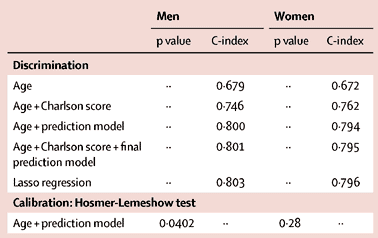
This table from the research paper behind the Ubble shows how well different sorts of information predict.

si2

Age on its own gets you 67% accuracy, and age plus asking about diagnosed serious health conditions (the Charlson score) gets you to 75%.  The prediction model does a bit better, presumably it’s better at picking up a chance of undiagnosed disease.  The usual things doctors nag you about, apart from smoking, aren’t in there because they usually take longer than five years to kill you.

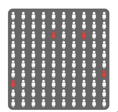
As an illustration of the importance of age and basic health in the prediction, if you put in data for a 60-year old man living with a partner/wife/husband, who smokes but is healthy apart from high blood pressure, the predicted percentage for dying is 4.1%.

The result comes with this well-designed graphic using counts out of 100 rather than fractions, and illustrating the randomness inherent in the prediction by scattering the four little red people across the panel.

ubble

Back to newspaper issues: the Herald also ran a Telegraph story (a rather worse one), but followed it up with a good repost from The Conversation by two of the researchers. None of these stories mentioned that the predictions will be less accurate for New Zealand users. That’s partly because the predictive model is calibrated to life expectancy, general health positivity/negativity, walking speeds, car ownership, and diagnostic patterns in Brits. It’s also because there are three questions on UK government disability support, which in our case we have not got.


Briefly

  • Bad things happen to innocent numbers in the news for several reasons. One is the craft norm that it’s OK — even expected — to be bad with numbers. Another is that news stories are. well, stories: they put information into narrative contexts that make sense.” From editing blog headsup
  • From the Atlantic (via @beck_eleven) : Should Journalists Know How Many People Read Their Stories?  From Scientific American, The Secret to Online Success: What Makes Content Go Viral. The answer given is ’emotion’, but if you look at their research paper, the ‘controls’ such as position on the page, length, and type of content have a much bigger influence.
  • From Felix Salmon at Fusion “The way Uber fares are calculated is a mess”
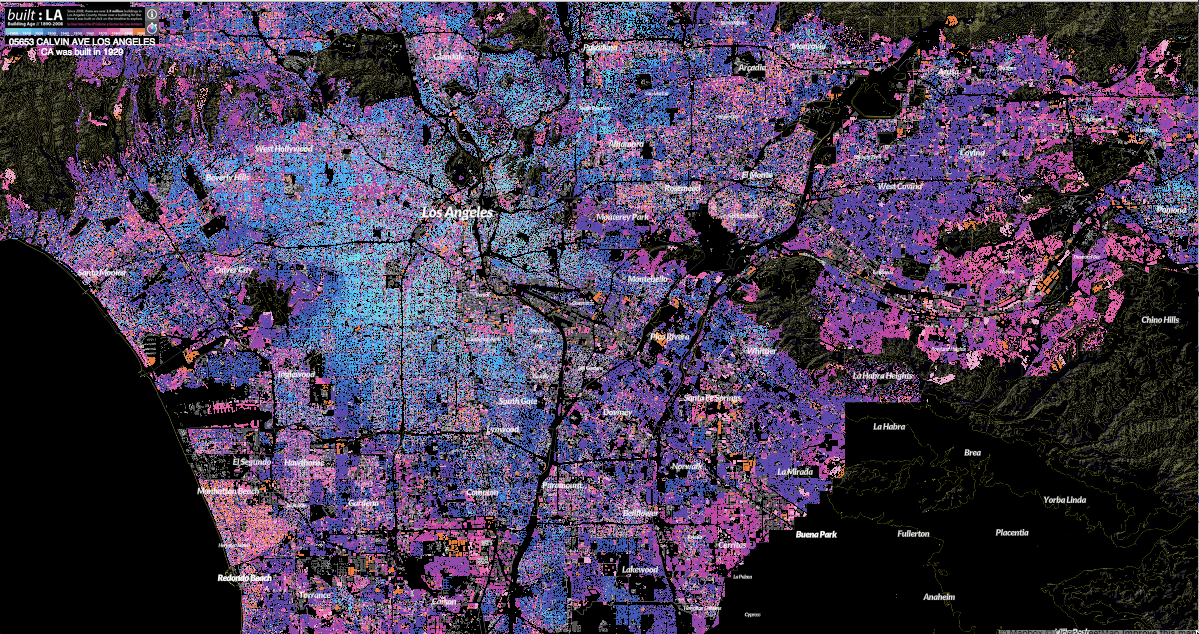
  • Mapping Los Angeles’ sprawl: story from Wired about the Built:LA interactive map of age of buildings in LA County. Light blue shows the early 20th century city, with dark purple post-WWII shading to pink and orange for recent consturction
    la
  • From Medium, a piece on how internet data gathering and advertising can control your world. If this really worked, you’d think online advertising would be much more lucrative than it seems to be.
June 5, 2015

Peacocks’ tails and random-digit dialing

People who do surveys using random-digit phone number dialing tend to think that random-digit dialling or similar attempts to sample in a representative way are very important, and sometimes attack the idea of public-opinion inference from convenience samples as wrong in principle.  People who use careful adjustment and matching to calibrate a sample to the target population are annoyed by this, and point out that not only is statistical modelling a perfectly reasonable alternative, but that response rates are typically so low that attempts to do random sampling also rely heavily on explicit or implicit modelling of non-response to get useful results.

Andrew Gelman has a new post on this issue, and it’s an idea that I think should be taken more further (in a slightly different direction) than he seems to.

It goes like this. If it becomes widely accepted that properly adjusted opt-in samples can give reasonable results, then there’s a motivation for survey organizations to not even try to get representative samples, to simply go with the sloppiest, easiest, most convenient thing out there. Just put up a website and have people click. Or use Mechanical Turk. Or send a couple of interviewers with clipboards out to the nearest mall to interview passersby. Whatever. Once word gets out that it’s OK to adjust, there goes all restraint.

I think it’s more than that, and related to the idea of signalling in economics or evolutionary biology, the idea that peacock’s tails are adaptive not because they are useful but because they are expensive and useless.

Doing good survey research is hard for lots of reasons, only some involving statistics. If you are commissioning or consuming a survey you need to know whether it was done by someone who cared about the accuracy of the results, or someone who either didn’t care or had no clue. It’s hard to find that out, even if you, personally, understand the issues.

Back in the day, one way you could distinguish real surveys from bogus polls was that real surveys used random-digit dialling, and bogus polls didn’t. In part, that was because random-digit dialling worked, and other approaches didn’t so much. Almost everyone had exactly one home phone number, so random dialling meant random sampling of households, and most people answered the phone and responded to surveys.  On top of that, though, the infrastructure for random-digit dialling was expensive. Installing it showed you were serious about conducting accurate surveys, and demanding it showed you were serious about paying for accurate results.

Today, response rates are much lower, cell-phones are common, links between phone number and geographic location are weaker, and the correspondence between random selection of phones and random selection of potential respondents is more complicated. Random-digit dialling, while still helpful, is much less important to survey accuracy than it used to be. It still has a lot of value as a signalling mechanism, distinguishing Gallup and Pew Research from Honest Joe’s Sample Emporium and website clicky polls.

Signalling is valuable to the signaller and to consumer, but it’s harmful to people trying to innovate.  If you’re involved with a serious endeavour in public opinion research that recruits a qualitatively representative panel and then spends its money on modelling rather than on sampling, you’re going to be upset with the spreading of fear, uncertainty, and doubt about opt-in sampling.

If you’re a panel-based survey organisation, the challenge isn’t to maintain your principles and avoid doing bogus polling, it’s to find some new way for consumers to distinguish your serious estimates from other people’s bogus ones. They’re not going to do it by evaluating the quality of your statistical modelling.


June 4, 2015

Round up on the chocolate hoax

Science journalism (or science) has a problem:

Meh. Unimpressed.

Study was unethical